
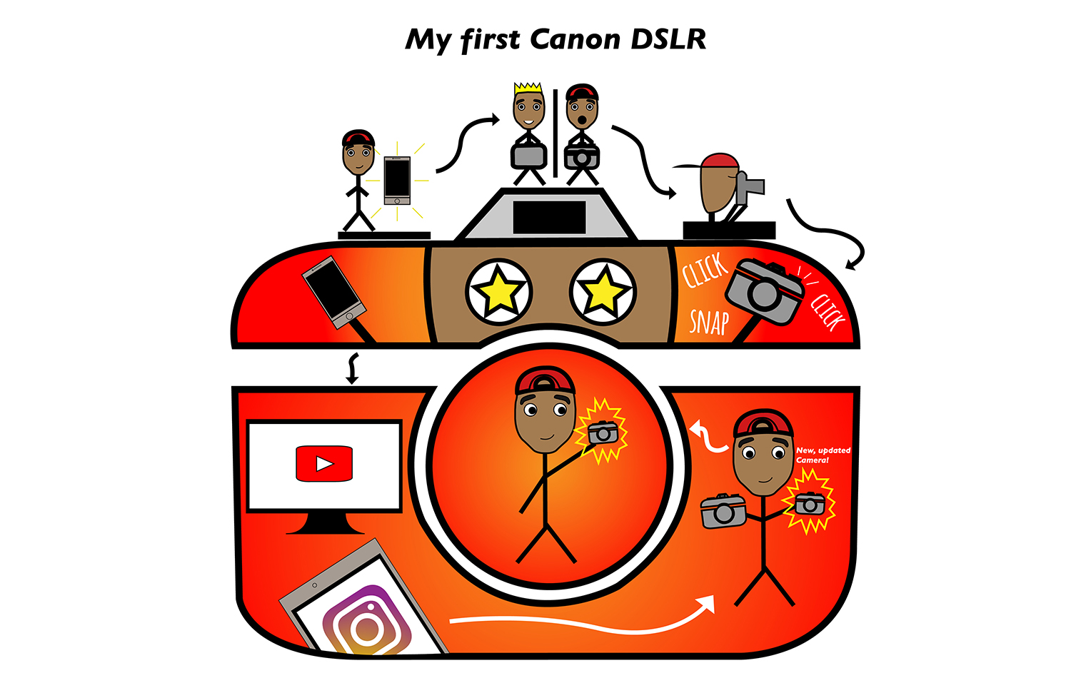
 For my comic, my creative plan was to tell the story of the first time I got a DSLR. Specifically a Canon DSLR because it’s my favorite camera company. While coming up with the design, I wanted to be as creative as I could while not being too extra and adding too many elements where things could look chaotic. I wanted to focus on telling a story over style. My comic lives in and around a camera. It starts with the reader’s normal left-to-right expectations. However, there are a couple of times where I feel like the reader would be confused with the order (which is why I included arrows that guide the reader) like towards the end where the second to the last frame is all the way towards the right and the last frame is in the middle of the camera on the lens. I think that regarding closure, by seeing that I outlined the new camera that I got, the reader can come to the conclusion that it is an important object to me and that it holds great significance to me. I used the linguistic mode in my comic, but very few. I provided a title to my comic, used onomatopoeias, and a little note as to what the outlined camera exactly was. Regarding the passage of time, I would say that from the beginning of my comic to the end, it’s obvious that time has passed because I was only using my phone for photos and video, but then I was introduced to my first DSLR in which I played around with and eventually I was able to obtain a newer, updated camera. I think that the reader can tell that a lot of time has passed throughout my journey of creating media through photos and videos.
This is not my first time using Illustrator, I’ve been using it for about a year now. I did learn how to make clipping masks, however. I actually used clipping masks to mask out areas of the phone in the lower left-hand part of the camera outline that was sticking out. In terms of iconography, I used lines and outlines to help display significance to my phone and camera. To help back up the onomatopoeias of ‘click’ and ‘snap’, I had three lines coming from the shutter button. To help make the reader feel that the new camera was highly significant to me, I outlined it with yellow. To me, yellow is a happy color and I chose it to try to back up the idea that the camera is important and me being happy about it. For me, the most important tools were the pen tool and using clipping masks. The pen tool was able to let me make original shapes and the clipping mask was able to let me hide parts of the phone that I didn’t want in the lower left-hand corner. I would say that I was not confused throughout the process of making my comic in Illustrator. This was a fun project. I really enjoyed the process of making it as well as the end product!
