
My initial plan for Project #2 was to create a two frame comic depicting two individuals being interrogated regarding a crime they each witnessed. Each frame was going to be similarly structured with a thought/speech bubble drawing the reader’s attention up to the main focus of the comic. Each item/scene the witness’ described was going to be a frame within the frame; a flashback to the event that was focused on a single topic.. I wanted to take advantage of the unreliability of memories and have differences appear in how the two individuals witnessed the crime scene. Words were not going to be used as I wanted the comic to be taken in as a whole scene and words could distract the viewer’s eyes and give a sense of a shorter time period.
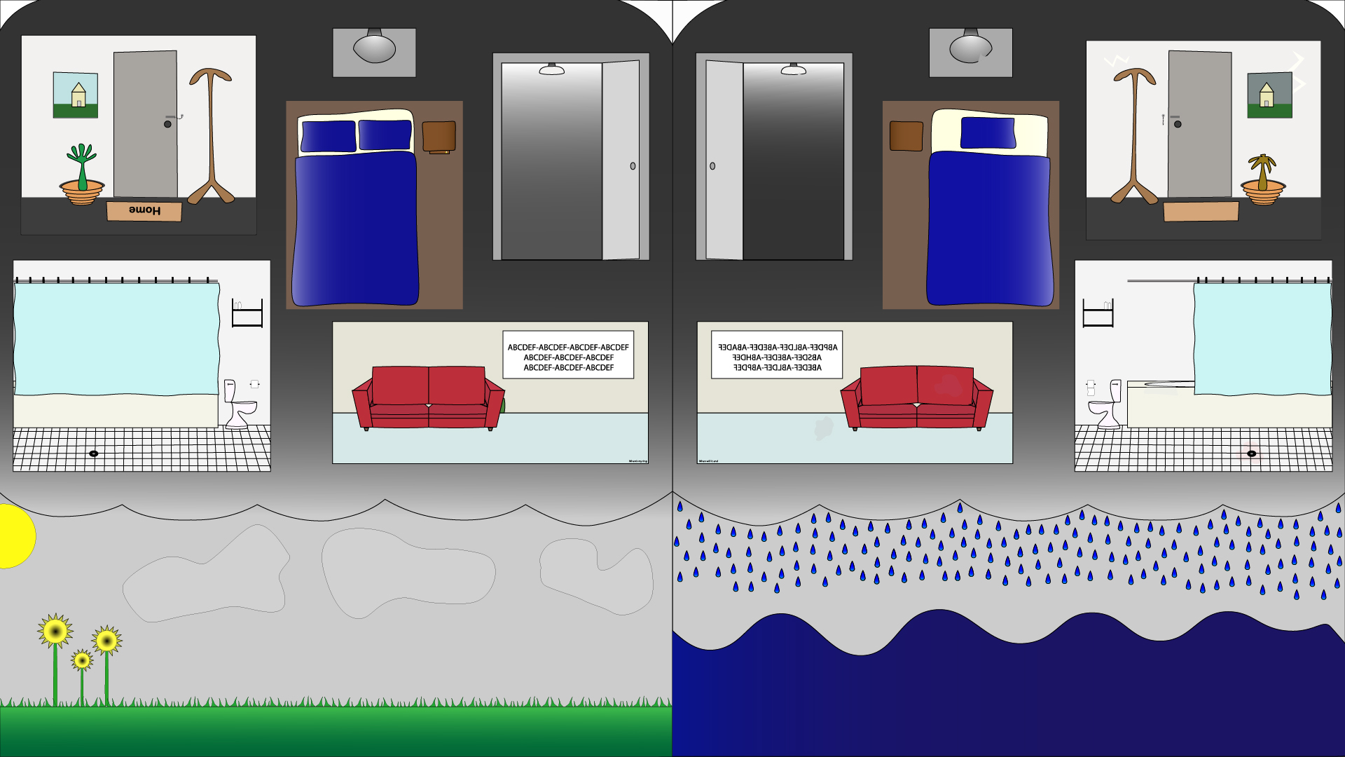
I had never used Illustrator before, apart from the tutorials, and once I started I had a wave of nostalgia that brought back the days of click and scroll games from the early-mid 2000s. Many of these, such as “Escape the…” type games, had the player overlook every detail of the art and attempt to figure out the story line and use items to unlock more areas to explore. I took this inspiration to create a story of this person, whom is specifically not included in the artwork to allow viewer relations, and the two possibilities of their struggle through depression. The left frame shows two pillows indicating they have someone in their life who can be there for them and make sure they get through each day the best they can. The right frame however only has a single pillow and is much messier and neglected. Even so, neither frame has a sense of total control nor happiness. The sky in the left frame is still grey even though the sun is shining.
Closure, or the space and time between frames, is intermingled throughout the art as the reader experiences both frames at the same time. I avoided using narrative linguistics so the reader can make their own decisions on where their eyes want to go and where they story begins. I left a lot up to interpretation and my meaning behind the work may not be what the reader interprets. Maybe they see the difference between frames to be when a relationship was together and the aftermath of a breakup. The reader may see a widow fall into depression after the loss of a partner. I really wanted to make this poster open to interpretation but maintain an obvious meaning.
Illustrator, as great of a program it may be, was a completely new experience for me. Its limitations compared to pixel based graphics was one of the reasons I changed the artwork’s topic. A crime scene has sounds, smells, and heavy visuals that, in my mind, cannot be portrayed easily with vector graphics. If I had a few months to work on the project then perhaps I could create what I had originally envisioned. I decided on an iconography similar to what I had experienced in my younger years as previously mentioned. Straight lines are boring and being able to add a small curve allows for a much more relaxed image. I used the Anchor Point Tool a lot to achieve this affect and kept the iconography constant. One aspect of Illustrator I could not for the life of me figure out was how to combine lines and shapes together without losing their respective layers. To combat this, I would lock anything I wasn’t working on and keep every object within its respective layer group/folder and was able to move things around smoothly with that instead. The project was overall a blast and I loved getting to know how to use Illustrator at least a little bit. I think it may be a better tool for informational posters and the like, but trying out artwork on this platform was definitely an experience.
