
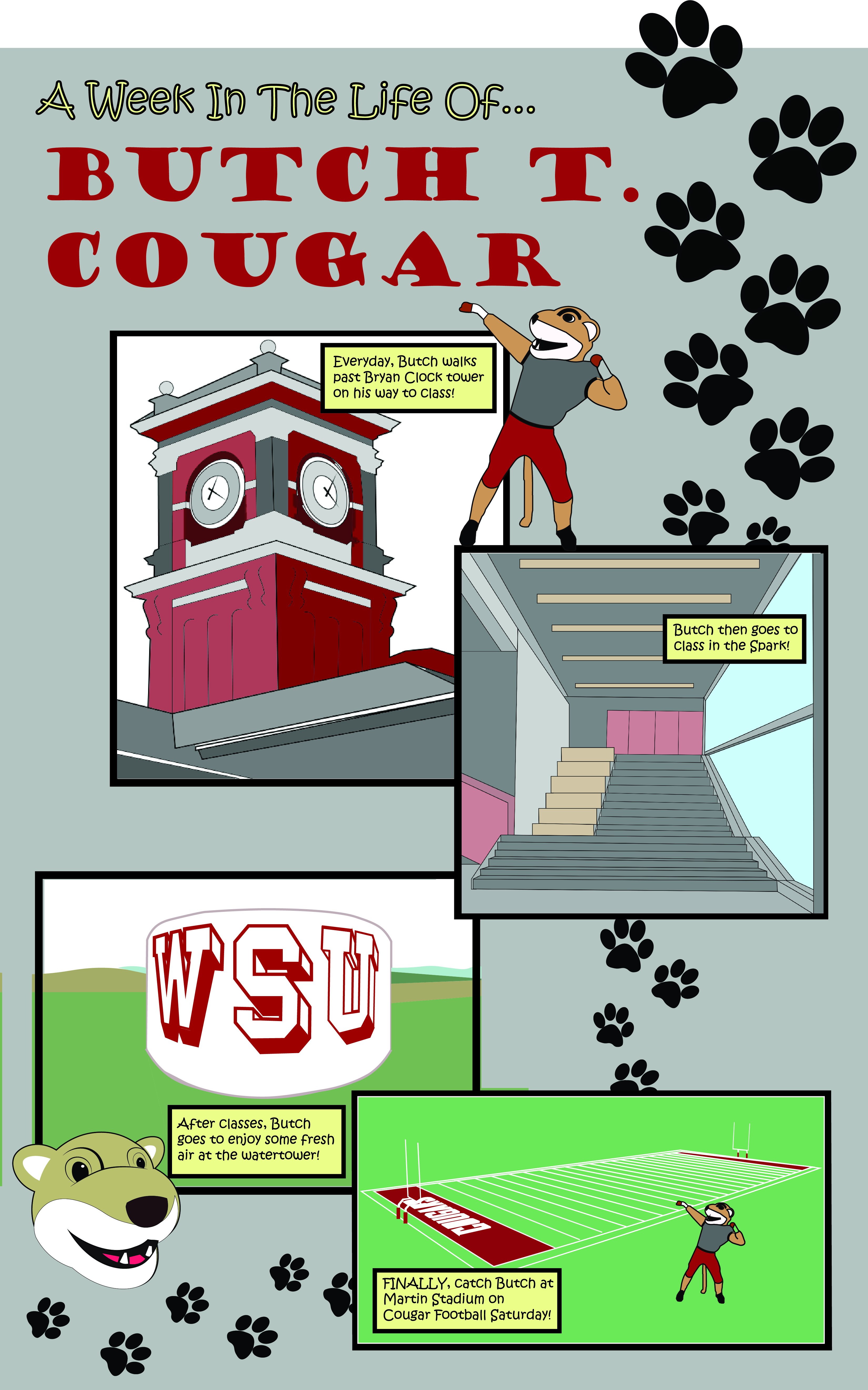
A Week in the Life of Butch
When I began to think about my Comic poster for project two, I did not know the kind of story I wanted to tell, but I knew the layout I wanted to use. I chose to have 4 panels in my layout all offset and each one overlapping another. I also wanted to have some character or aspects from my comic breaking out into the gutters to add variety. I chose to write about Butch T. Cougar because he is a very well-liked character on the WSU campus. To add the effect of time to my comic, I designed a week in the life of butch, as I would imagine it. Each panel is a different scene of Butch’s week, including walking past Bryan Clock tower, going to class in the Spark, going to the WSU water tower, and of course, at Martin Stadium for Cougar Football Saturday. I chose to do this in this order because I wanted my viewer to visualize Butch walking around campus in places that we as students know so well. This creates a scene-to-scene type of closure to my comic because as my viewers see Butch going through the average day of a WSU student, I hoped that they will visualize each ‘scene’ in their days and imagine Butch doing what they do, because that is what the viewer can relate to in my comic.
The text I put into my comic was a simple narration of what and where Butch is going on campus and in Pullman. This text-image relationship would be additive because the text explains what Butch is doing well but the images of the buildings and the character of Butch really adds to the story and shows the places that Butch sees, as well as gives the viewer a reminder of what each place looks like if they do not know or cannot remember.
This was not my first-time using Adobe Illustrator. I used it a lot in my Design Communication class at the beginning of this semester, creating a lot of pen drawings of buildings and interiors. From this project, I learned how to use the painting tool, as before, I would usually place my drawing into Photoshop to color in. I worked mostly with the pen tool to create my detailed buildings. I tried to make each panel look as realistic as I could because each image is so specific to WSU and I wanted to portray it well. Also, when I created the Butch character, I based them on the actual mascot, because he is already cartoon-
ish as is. I think the style I chose works well because each aspect in my poster blends together well and is very recognizable and relatable to the viewer.
