
Final Poster Comic created by Kristine Zorn in October 2019
My creative process started with a story idea that I came up with a long time ago but never put down to paper. I picked a scene from my story and just started sketching. My first rough sketch started out with 20 frames. After I went back and though more about how to challenge the reader’s expectations I combined some frames and ended up with 15 frames. My comic challenges normal expectations because after reading the first two panels normally the story moves downward one panel and then to the left. Then the whole bottom row is read left-to-right and then the story moves upward, to the right once and down a few panels before you end up back at the tunnel panel. The first time you read the first three panels the girl is climbing down into the passageway but the second time you come across them she is climbing back out of the passage and into her bedroom.
Close up of Final Poster Comic created by Kristine Zorn in October 2019
I would say most of my comic is action-to-action closure. The girl opens a trap door under her bed and then climbs down a ladder into a tunnel and in the next panel climbs out of the tunnel, etc.. Panels follow her character step by step. I think an argument could be made that the two panels in the top right corner are aspect to aspect where it shows the outside of the cave and then inside. It is possible that someone could interpret no time has passed in between these frames. However, I intended there to be a small passage of time between these frames, showing that the characters have reached the door to the cave and then entered the cave in the next frame so I probably wouldn’t consider the two frames to truly be aspect-to-aspect.

Close up of Final Poster Comic created by Kristine Zorn in October 2019
I think the frame showing the close-up of the book is interdependent. Without the text, it would be impossible to know they are looking at combat spells since the book in the image is written in a fictional alphabet. Without the image, it isn’t clear that they are looking at a book written in some strange, magical language. The frame where the guy is saying not to panic is a word-specific panel. Most of the importance is in what the characters are saying and the picture is just there to illustrate them talking.
I think my strategy was inventive because of how the comic starts and ends. The girl goes on this adventure to the forest to practice magic, meets a stranger who is also able to use magic, and practices with him. In the end, though, she ends up in the same place she started and the comic started her bedroom. The beginning is the end and the end is the beginning.
This was my very first time using Illustrator. I have dealt with vectors a little bit before using the shapes tools and line tools in Photoshop so I knew a minuscule amount about how to use the curvature tool. However, it was still difficult to get used to vectors. I found myself frustrated more than once when I realized there were ideas I had that couldn’t be executed in Illustrator the same way they could be in Photoshop.
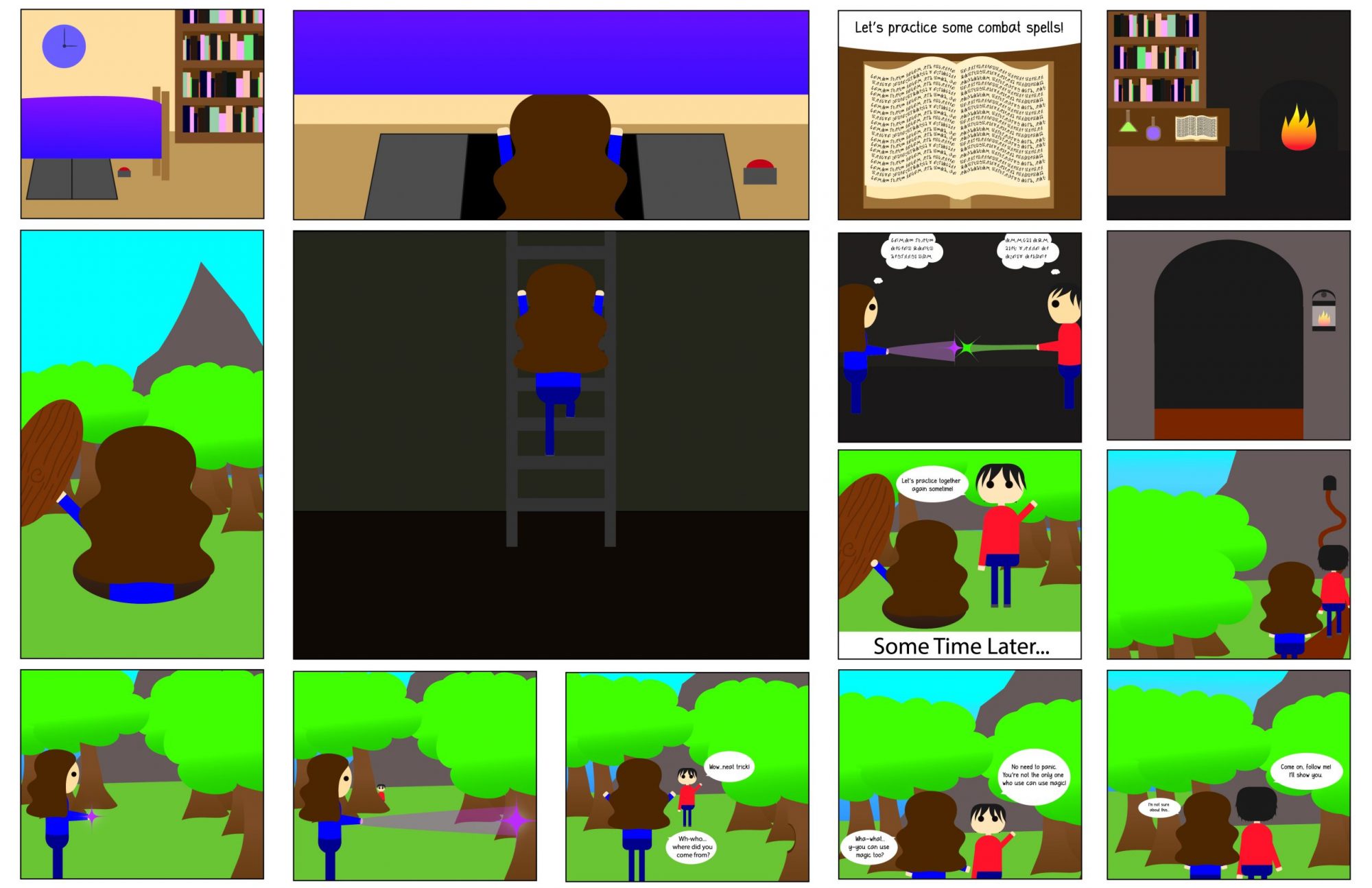
I don’t know exactly what kind of style I would call the iconography. It was based on an art style I started using a few years ago which was originally based on the “chibi” style and then simplified. “Chibi” is something like a very cutesy, simplified version of the anime/manga style. After simplifying the “chibi” style even more it has lost most of its resemblance to anime/manga at all. It is definitely a more abstracted style with oversized, blob-shaped heads and black circles for eyes. It is so abstracted the characters don’t even have mouths or noses.
All of the art that I do in my free time for fun uses linework. My lines always have varying line weights and tapered edges. The lines are important for adding character to the artwork. I couldn’t get that same effect in Illustrator. Even though you can change the width of the stroke so you can have different sized lines throughout the artwork each line itself doesn’t have any varying line weight. To get varied lines like I usually used each line would have had to have actually been a closed shaped rather than just a line. Creating the lines as shapes like that I found was time-consuming and wasn’t very practical. my favorite tool I learned about in the tutorials was the text on a path tool. It came in handy when I was trying to create the magic text on the book where the pages were wavy rather than flat.
