Pattern Design Reflection: Lillie Williams

For this pattern design project, I decided to take my inspiration from my heritage. I was adopted from China in a small place called Lianhua (Lee-an-whoo-ah). Lianhua translated means lotus flower. Therefore, I decided to make designs that focused around lotus flowers.
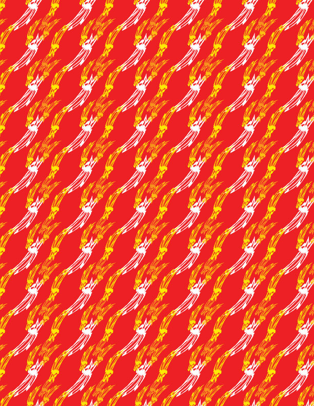
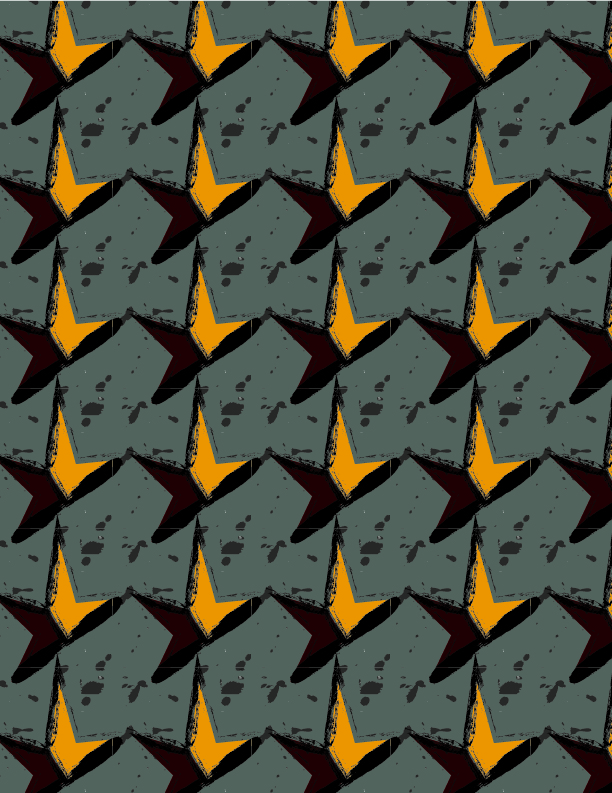
Tiger-Lotus Pattern 

My first pattern I tried to make the lines of a tiger because I was born the year of the tiger. I decided to use the charcoal-pencil style under the brush tool to draw my lotus flower. The reason I chose that style was because I wanted it to show an older, almost faded look to it. The reason for the faded look was because even though that my heritage is a part of who I am it can sometimes be forgotten. It’s not something that I think about all the time. I used the envelope distort to give the lotus a more settle movement as well and it made the pattern look more organic.


Experimenting colors: Tiger-lotus

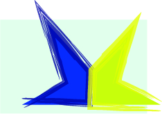
I chose a set of analogous colors and different tones of yellow because it reminded me of Chinese royal colors. I wanted to keep to the theme of my heritage. However, that did not stop me from experimenting with other colors as well. I looked at orange and black because those were the colors of a tiger. I also looked at nature colors, traditional colors that can be found at a Chinese festival, and natural lotus colors. I can see this design as a wallpaper or maybe a scarf.

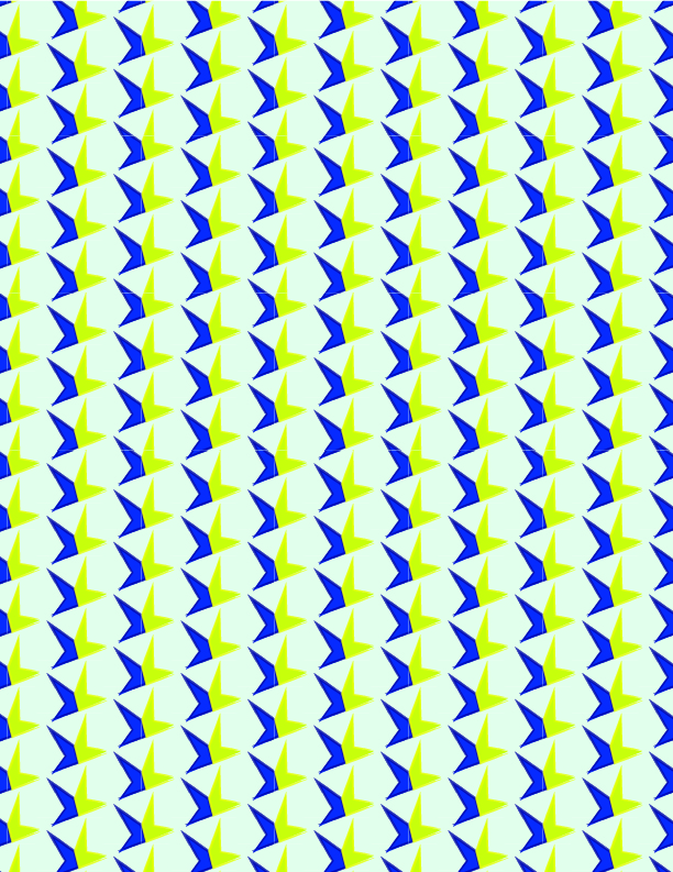
Exploring Lotus Pattern

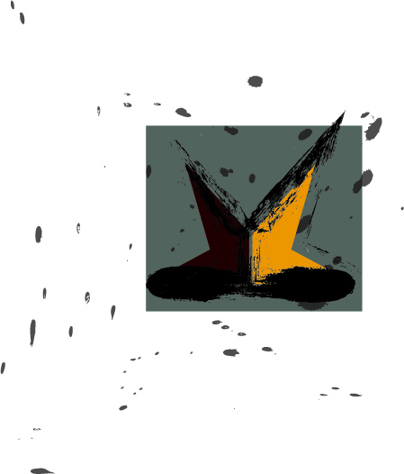
My second pattern I used the petals of the main flower to create an illusion of it spreading apart. The center represents my roots and where I came from and then the flower petals that are spreading represent myself growing as an individual. I wanted to show that my heritage is always a part of who I am and where I started.


Experimenting colors: Exploring lotus

The colors I chose were colors I think of when I imagine space. Space has limitless possibilities and discoveries that I thought that would enhance my idea of the petals representing growth. There is more to be seen and to explore in my life. The colors in my final pattern design creates a contrast due to the range of values in it. The other colors I experimented with gave another mood to the pattern. For example, there was a more settle mood in the third design due to less contrast from a majority of the design. I can see this design as maybe a pillow for furniture.

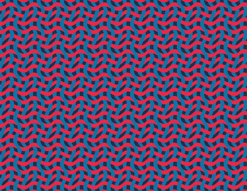
Tiger-lotus bezold effect

Exploring lotus bezold effect

Posted in Fall 2017 Archive (336) | Leave a comment

Pattern Design Reflection: Sulaiman Ambusaidi

I took these pictures in Lewson garden in Pullman.

For my first pattern, I got inspired by the flowers I found in Lewson garden here in Pullman. I went to Lewson garden and I found a lot of kinds of flowers. I decided to make my pattern based on these flowers. Also, I made my color schemes from these flowers. I liked how the combination of the colors from nature so I decided to make all of my color schemes based on these colors.


Flower Spread Pattern

This is my first pattern called it “Flower Spread Pattern.” I made this pattern based on the flowers I took in the Lewson garden. I made it with flower shape that I got inspired from the small white flowers from the reference image. The colors I made are all from the reference image and I chose them because the represent nature and the work well with each other. This pattern can be used in products that made from flowers.


Flower Spread Pattern 2

I took this picture of a fabric using my phone.

This fabric inspire me to make my second pattern which I called “Fabric Waves Pattern.” I took this picture while I was in my art class doing my fabric project. I found this pattern interesting so I decided to made one based of it. Also, I decided to add wave like shape to make it more interesting.


Fabric Wave Pattern

I made this pattern based on my fabric image and I called it “Fabric Wave Pattern.” I first created a fabric like pattern without the wave look so I stopped thinking for minutes and I decided to make it looks like a wave. I use the wave distortion in illustrator. This distortion helped me make my rectangle looks like a wave. Then, I copied the shape several times and stacked them together to make this pattern. This pattern can be used in fabric products or fabric packaging.

Fabric Wave Pattern 2

Posted in Fall 2017 Archive (336) | Leave a comment

Pattern Design Reflection: Joshua Yi

I started off this pattern by finding color palettes I liked.  My favorite color is pink so naturally my first color palette was going to be shades of pink like I did previously in the last part.  The second palette, I had some trouble finding a theme in the color scheme.  I was experimenting with hues and I found that I really liked pale colors so I decided to use pale hues of red, yellow, green, blue, and gray.  I was thinking about incorporating purple but I liked the pale gray in this palette better.

Both themes of the pattern was personal.  I wanted them to display who I was as a person.  The first pattern is based on the crest of my family’s surname: Yi.  My last name has a rich background in Korean history, dating all the way back to the foundation of the Joseon Dynasty.  I took homage to the family crest and took my spin on it by designing the flower from a hexagonal base.  Surprisingly, the color palettes had an opposite effect in their purpose.  I thought the pink intensity palette should be more spring like and vibrant but the gray background bases the pattern in more stern way.  In comparison, the pale blue color really makes the flower pop in the other design, something I wasn’t expecting to happen.

Pale Fever Flower

Pink Intensity Flower

For my second pattern, I wanted to shy away from just using shapes and polygons.  I had an interest in using letters for my pattern, but something unique.  So I took the Korean Characters and spelled my Korean name for this pattern.  I took out the fill for the circular characters and only used stroke, like how traditional Korean Characters are.  For the pale fever palette, it came out very playful, like a palette for a kid’s show or book.  The pink intensity palette in the other hand was more like a mature book cover.  Overall, I was very pleased with this design.

Pale Fever Korean Name

Pink Intensity Korean Name

Posted in Fall 2017 Archive (336) | Leave a comment

Pattern Design Reflection: Riley Cagle

Artboard 1

Aqua Waves

Artboard 3

Green Spiral

Artboard 4

Warm Golf

Artboard 5

Cool Golf

The first two patterns were inspired by my love of water. I used a wave-like shape and used cool colors for both. The color choices were more blue and aqua for the first, and more greens in the second, both cool colors though. I wanted to create a pattern that flowed through the whole art board and had a sense of unity with the colors, and not to much contrast. I feel both represent that. I see these in the real world as a outdoor table cover, on a portable pool or even a child’s swimsuit.

For My second pattern, I used a more geometric shape that was inspired to me by the great game of golf. I didn’t want to make it to busy due to the openness of the golf course, and I also wanted the sharp edges to differentiate from the first pattern. The colors for the first are all warm and bright colors to represent the summer time in which the game is played. Unlike the first two designs matching, these two contrast each other. The second design has very dark and cool colors. I wanted to do a color scheme away from the bright colors and the cool golf design is in high contrast to the warm golf design. I can maybe see these designs on socks or maybe some crazy shorts. Cool Golf might go well for a carpet design in a building.

Posted in Fall 2017 Archive (336), Uncategorized | Leave a comment

Pattern Design Reflection: Whitney Demarest

I LOVE blankets. For this assignment, I wanted to create a pattern that could be transformed into a heavy knit fabric blanket that would then be sold at a place like Target or Home Goods. My personal style is reflected through Scandinavian culture, so I pulled inspiration for the Scandinavian-esk pieces in my own home.

The pictures below are what I used for inspiration within my two patterns.

Inspiration

Pattern Inspiration


For my first pattern titled “Butterscotch Knit”, I specifically used elements from the cactus, and yarn wall hanging photos to guide my design. The circle and unique hand drawn half circles that make up the horizontal white lines and outer rings of the circle are the abstract representation of the cactus, while the white strands in the tapered shape of a “V” represent the yarn wall hanging.

Screen Shot 2017-10-05 at 11.18.26 AM.png

demarest-patterndesign_Butterscotch-Knit

Butterscotch Knit By: Whitney Demarest

In order for this design to translate into a cozy blanket, the color had to be carefully selected. While the yellow is still vibrant, it is a color with a low saturation, as are most of the colors in the pattern. Blue is traditionally a cool color, opposite from yellow which is warm, but the value of the blue lends itself better to the warm color family in this case.  The overall pattern has a muted saturation. I purposefully chose colors that were not complimentary because I didn’t want there to be a stark contrast in the colors, and wanted to evoke a warm and cozy feel. While the plaid inspiration isn’t highlighted in this pattern, I utilized two different background colors of varying navy values to give a subtle nod to the plaid inspiration. Using the two navy values gives the pattern a more randomized and abstract feel.

This pattern went through several version… below are the first two that I worked on. The first I think is over complicated and too abstract, while the second is too simple and expected. the “Butterscotch Knit” pattern I featured above is a good balance of these two trial versions.

Frayed-and-Frantic

Tribal-Knit


This second pattern iteration takes more inspiration from the knit blanket, and plaid textile photos. If I had to pick which design I would rather see translated into a blanket, it would be the previous design, but I still think this version is an interesting interpretation.

demarest-patterndesign_Blanket-Pot-Pie

Blanket Pot Pie By: Whitney Demarest

This pattern titled, “Blanket Pot Pie” got it’s name because of the way the blanket knit pattern I created in the shape of a triangle similarly represents the classic shape of a chicken pot pie. I created the plaid pattern for the inside triangle, as well as the knit pattern that encompasses the various triangles. It uses the same color scheme as the previous design.

I made versions of the two featured designs in a different cotton candy-esk color scheme. I wanted to use colors completely opposite of what I used above, so I went with the main colors of pale pink, blue, and purple. These colors are all next to each other on the color wheel, and with the exception of the bright pink and white, are all within the same dull saturation range. These colors don’t lend themselves very well to the Scandinavian feel I was wanting to achieve, but they offer good contrast to my preferred color scheme.

Laffy Taffy Knit By: Whitney Demarest

Blanket Candy By: Whitney Demarest

Posted in Fall 2017 Archive (336) | Leave a comment

Pattern Design Reflection: Jessica Colvin

My designs are inspired by two different companies that my friends and I are starting.  My first design is made for a company called SparkThinks.  It’s an online tech blog and it needed a logo and some pattern design to use as background fills online.  The shape for this design was inspired by a spark.  From there I created two different styles of sparks to fit with this assignment and to allow my team to choose which one they felt best represents the company.

SparkThinks logo for warm organic feeling pattern.

In this logo design I wanted to capture the underground/based-out-of-our garage feel of our company.  This is why I picked a warm muted color pallet and added this messy organic feeling outline.  The two colors on the shape along with the outline I think help give this image the motion that a real spark would have.


SparkThinks logo, cool electronic colors for pattern

In this logo design I wanted to capture and exciting youthful electronic/online feel so I picked colors that are bright and vibrant and altered the outline to be more angular and less organic.


In the final patterns for these two designs I tilted them to accentuate the feeling of motion.

SparkThinks final warm organic pattern.

SparkThinks final bright electronic pattern.


My second design is for a company called 457 Kits who makes electronic build-able kits for kids.

Yellow green color scheme pattern for 475Kits

Blue color scheme pattern for 475Kits

This pattern has a big story behind it.  Basically, our company structure was breaking down because we have three dominate personalities that were tearing the team apart until we added another member who literally stood between us and calmed the situation down.  In this pattern I tried to capture that by having the small circles stand between and act as a buffer zone between the larger circles.  The lines I added to show how the team is all connected, but only through the help of the small circles.

My color schemes are general electronic/tech color schemes that our currently popular in kids toys.  One I leaned more towards blue and one I leaned more to the green/yellows.  These patterns will be used on packaging material and in backgrounds on websites.
Personally, I prefer the blue pattern, I like how bold it is and how much the little circles pop, but for the purpose of packaging that needs to have text over it, the yellow/green pattern will be better because it is a bit more muted and the lighter color will make text easier to read.

Posted in Fall 2017 Archive (336) | Leave a comment

Katrina Bittner: CDSC- Creative Commons Workshop Extra Credit Write Up

The creative commons workshop was a very valuable and interesting workshop that helped refresh me on my knowledge of copyright laws. This workshop relates to our class because when you are creating a website, you must understand where your images/ videos/ creative content is coming from and if it is available for use. Otherwise your website would be taken down and you are taking credit for someone else’s work. This is especially relevant when designing websites, where you would be taking images from the Internet to use in a website. Many DTC and English courses require that you are familiar with copyright laws, and that you use them as though you are a professional and not a student. It is important to understand where someone’s work is coming from, and how you can use it. I really enjoyed this workshop, even though it was all review for me. Last year we went to the same room in the library and had the exact same presentation. I really only remember this, because of the drawing that the librarian used as an example. Even so, I still thought the workshop was interesting and helpful. I think that it is always important to review copyright laws as they change often, are easy to get confused, and are very important for creative work. This workshop helped remind me that I really need to pay better attention when using someone else’s work and make sure that they have deemed it okay to use or remix.

Posted in Uncategorized | Leave a comment

Point, Line, Plane: Kira Norman

20160106_11173120161226_17465820170630_104900

One of my favorite aspects of photography is the use of negative space and lines. In two of my pictures, the blue lit one and the construction zone, I made it a point to highlight the geometry in the area. The lines from the blue lit one go straight up and down while the lines in the construction zone seem to angle all over the place, but somehow remain spaced correctly.

The picture I took of the two guys diving off that cliff (from a trip to the Caribbean) makes excellent use of negative space! The cliff is contrasted harshly by the ocean and horizon line. I may just be stretching it a bit but there are also hints of point in the construction scene in the with the traffic lights. Though they might not be the focus of the picture I still find them to be important. If this photo was cropped a bit more then it would definitely be the focus.

The space and volume of each photo is different. Like I said earlier, the negative space in the cliff picture is clear and is spaced in such a way that the cliff stands out. in the second picture, I would say that the way the room is built helps evenly space out the lines of the lights. The third picture has a lot going on in it. There are obvious parts like the lines from the cranes and building infrastructures but the bus and street also play a large role in the dynamic nature of the photo.

Posted in Fall 2017 Archive (336) | Leave a comment

Point, Line, Plane: Kim Santos

02
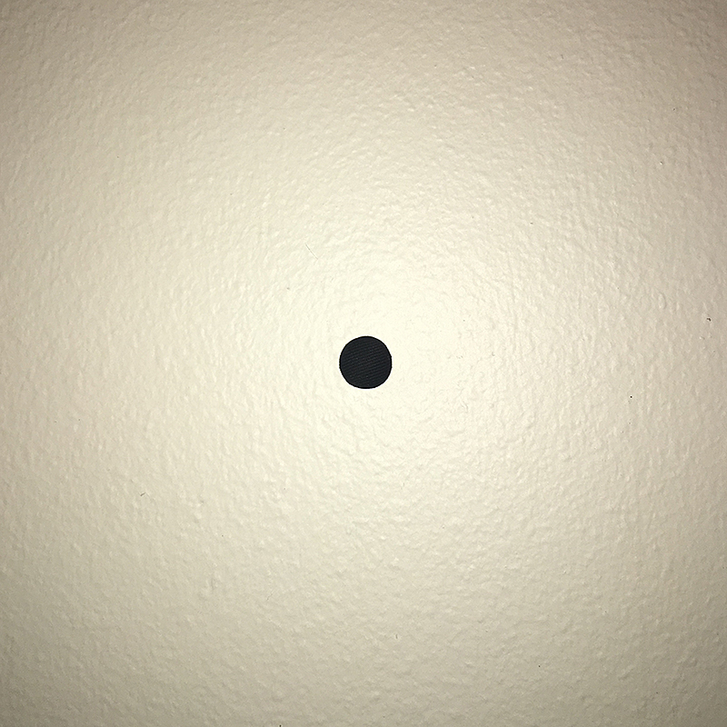
This photo is an example of a point in space. If you ignore the magnet, that I could not for the life of me get off on my door, it is a clear focal point and contrasts well from the door itself. Although color does not really contribute to this contrast, the space around the point does this well because of the geometric embossed elements. The point is round and stands out.

01

This photo is a simple example of a line. A line can be straight or curved. If there is a beginning and an ending it is a called a line. It can be put together with other lines & still be a line. It is a combination of many points. It can be thick or skinny. It can be a positive mark or a negative gap. In this picture there are horizontal lines & vertical lines. There are many lines in this picture as you can tell. The lines can combine to be even more lines. Almost everything in this picture is a line because lines are combined points.

03

For plane, I took a photo of my Rubik’s cube. This example of a plane is made up of a height and width with the same measurements, creating a perfect square. Of course it is obvious because it is made up of smaller individual squares which along with it, create lines and form a structured pattern.

Posted in Fall 2017 Archive (336), Uncategorized | Leave a comment

Point, Line, Plane: Sulaiman Ambusaidi

This example I took in my apartment’s wall.

This picture is a good example to represent a point in space. I found this pin in my apartment and I hang it in the wall to represent the point. I found that the wall can be a free space that can make the point contrasted from the background. This point represents a position in space as it said in the book “Graphic Design: The New Basics.” The point is the first step to make any shape or volume.


I took this picture while I was walking to the campus.

This example represents a line in space. The line must have at least two points. One point is the beginning of the line and the other one is the end of the line. In this example, I choose a straight line however the line can be curved. The line is the element that made the shapes which all shapes made with several lines. However, lines are made with points so points are the first element to start any shape.


I took this picture in my apartment while I was working on my computer.

This is an example of a plane. I think this paper is representing the plane because it is flat and has hight and width. plane can represent a shape. In this case, it represents rectangular shape. To make a plane, you need to have at least three lines and three points. This example made up with four lines and four points. The plane can also make the space and the volume of thee dimensional objects.

Posted in Fall 2017 Archive (336) | Leave a comment