
Photo by Sara Nielsen
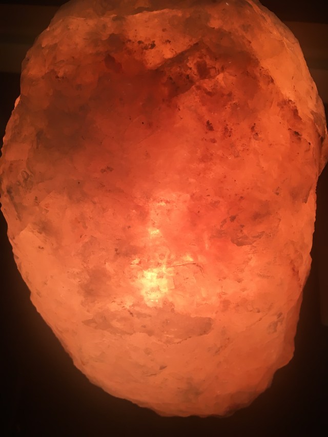
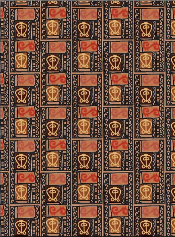
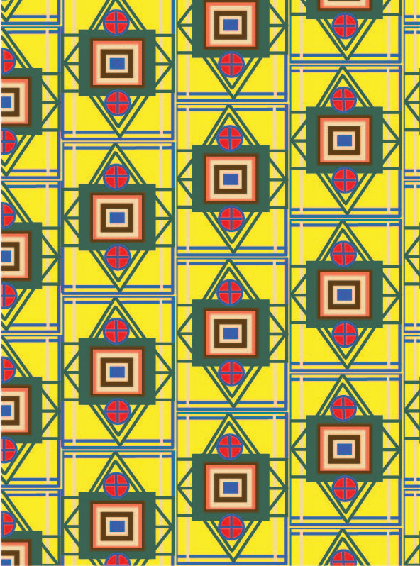
For my final pattern design project, I was inspired to create two very different patterns that varied in color, shape, and mood. More specifically, I was inspired by everyday objects that I own and how they are incorporated in nature. My first design was influenced by a Himalayan salt rock lamp that I own. This rock lamp projects a warm and saturated hue that gave me the feeling of warmth and light. This reminder inspired me to make my first pattern since the shape of a sun stands out to me, and I also admire what the sun stands for through symbolism.
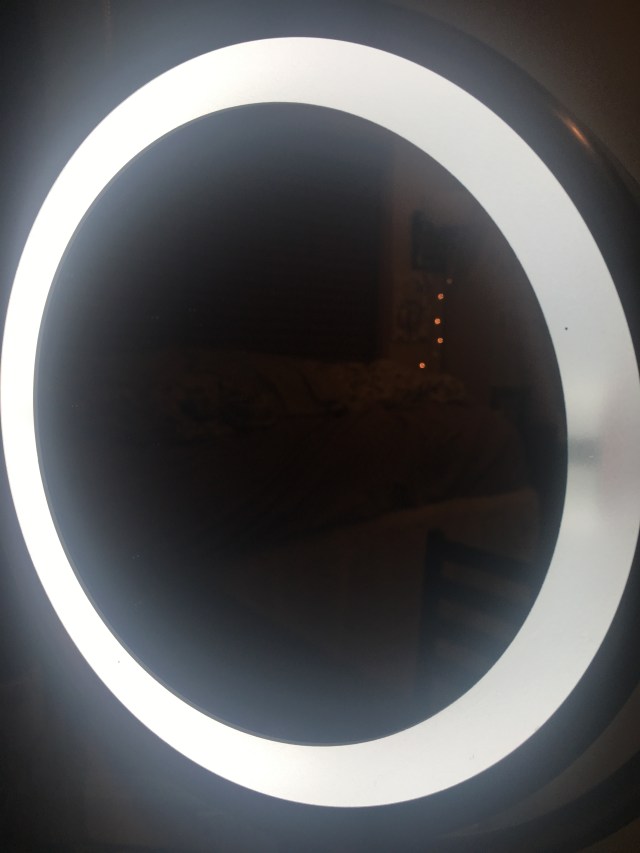
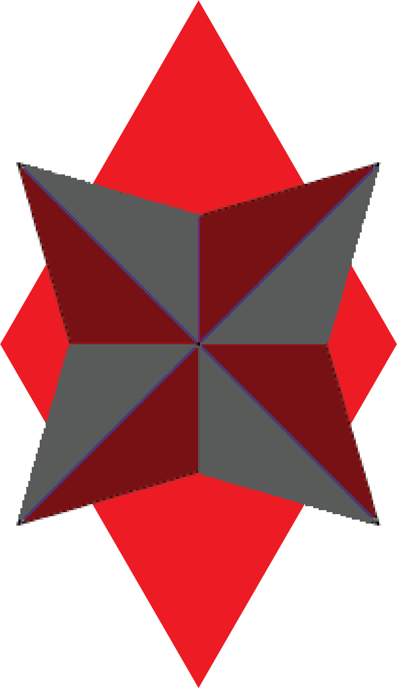
Photo by Sara Nielsen
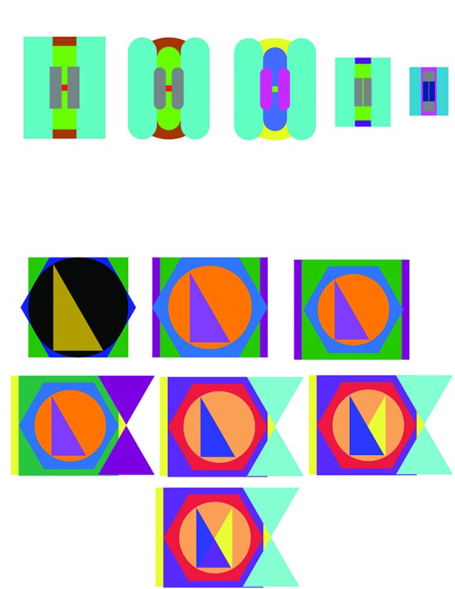
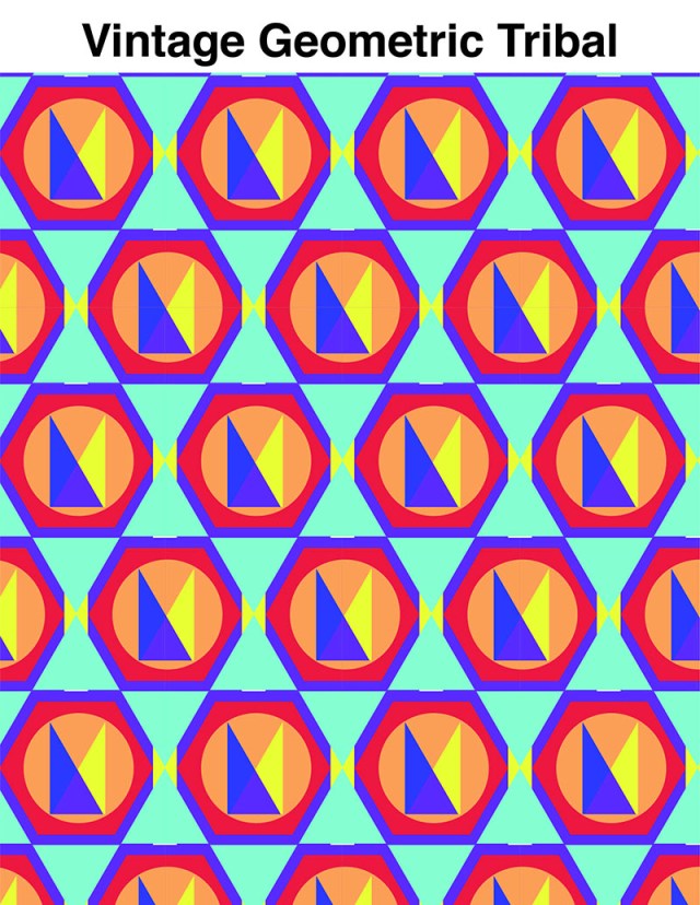
My second pattern drew inspiration from a vanity that I utilize on a regular basis. This LED mirror that I recently purchased is rounded in shape, with multiple “rings” existing between the circular mirror, light, and frame of the mirror. Unlike my first design, I wanted this pattern to be cooler in color and more abstract in shape. Also, by expanding on the circular motif, I created an egg symbol that grows smaller and smaller inside the shape itself while incorporating more hues than in my first design.


Creating these designs through Adobe Illustrator proved to be challenging since I have little experience with the application. For instance, there was some minor overlap with my first “sun” design given I kept the black outline in tact. Coloring within the shape also proved to be difficult since the paint bucket tool was unresponsive with some lines. My second design was much easier to generate. Since I wanted the second version to be more abstract I left one panel in the lower left with only 2 instead of all 4 shapes. The pattern design tool was helpful in producing both of my finishing products. The line, ellipses, and paint bucket tools were among my most used while working with Illustrator.
I can visualize my first pattern being used for a fabric since it is the more attention-grabbing design of the two I created. My second pattern, which is less graphic, has potential to be used for a rug or some form of 60s inspired project.


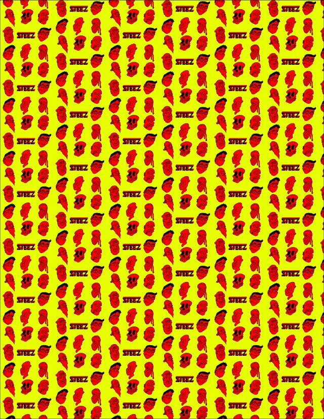
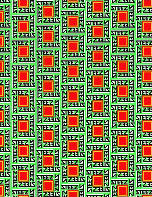
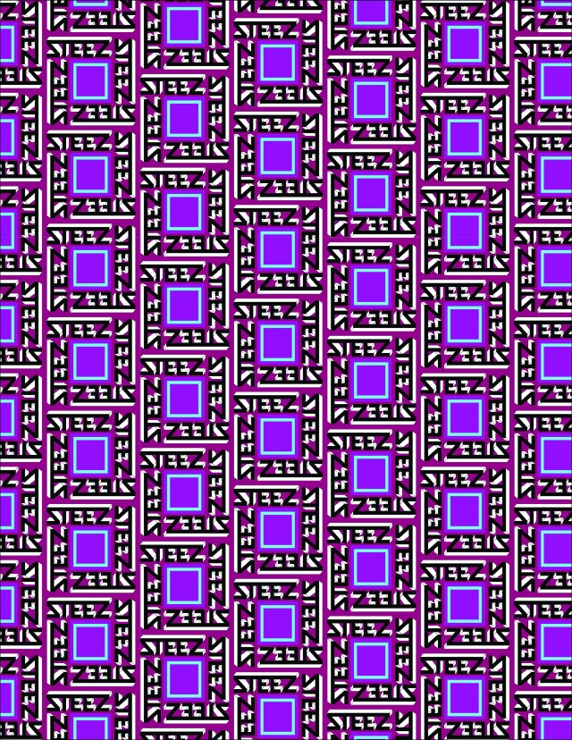
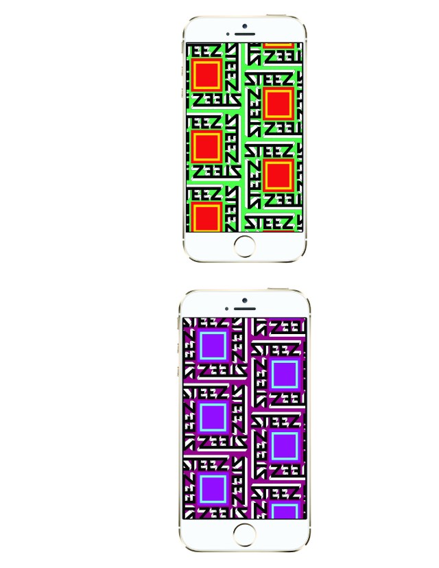
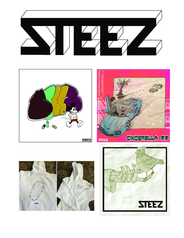 Some examples of what I’ve done with my brand, including clothing, album covers and drawings.


 I was walking down the paths on the WSU campus and began to notice certain patterning within the bricks and concrete. Some of it was colored but only slightly different than the rest. I found that there are certain places that do have very colorful concrete and pattering such as children’s playgrounds, schools, and museums. There may be more but these are where I decided to get my inspiration to use color. I found some circular concrete pattering that I really thought was nice so I decided to create a variation on that.

