Invisible Emotion: Min Kim

A page from the cartoon short “Crash” depicting a rambunctious mess of collisions and cars zooming by. (Crash, Charles Burns, 1981, pg 88)

In this page of  “Crash”, there is a hectic mess of oil, collided cars, and passengers as man in a shanty kart zooms across. As explored in Scott McCloud’s explanation of lines and how they convey meaning, the lines in the first panel communicates a loud thud as what appears to be that the kart had throttled over the wreckage of the truck. The long curving lines all over the panels indicate movement, direction, and speed. In addition, the squiggly lines and symbols depicts these emotions of disarray, chaos, and loudness.

In another concept explored by Scott McCloud, he elaborates on the utilization of pictures and words to convey meaning in a work. The example I chose was from Will Eisner’s narrative portfolio, “The City” and it serves as a prime representation for word-specific combination.

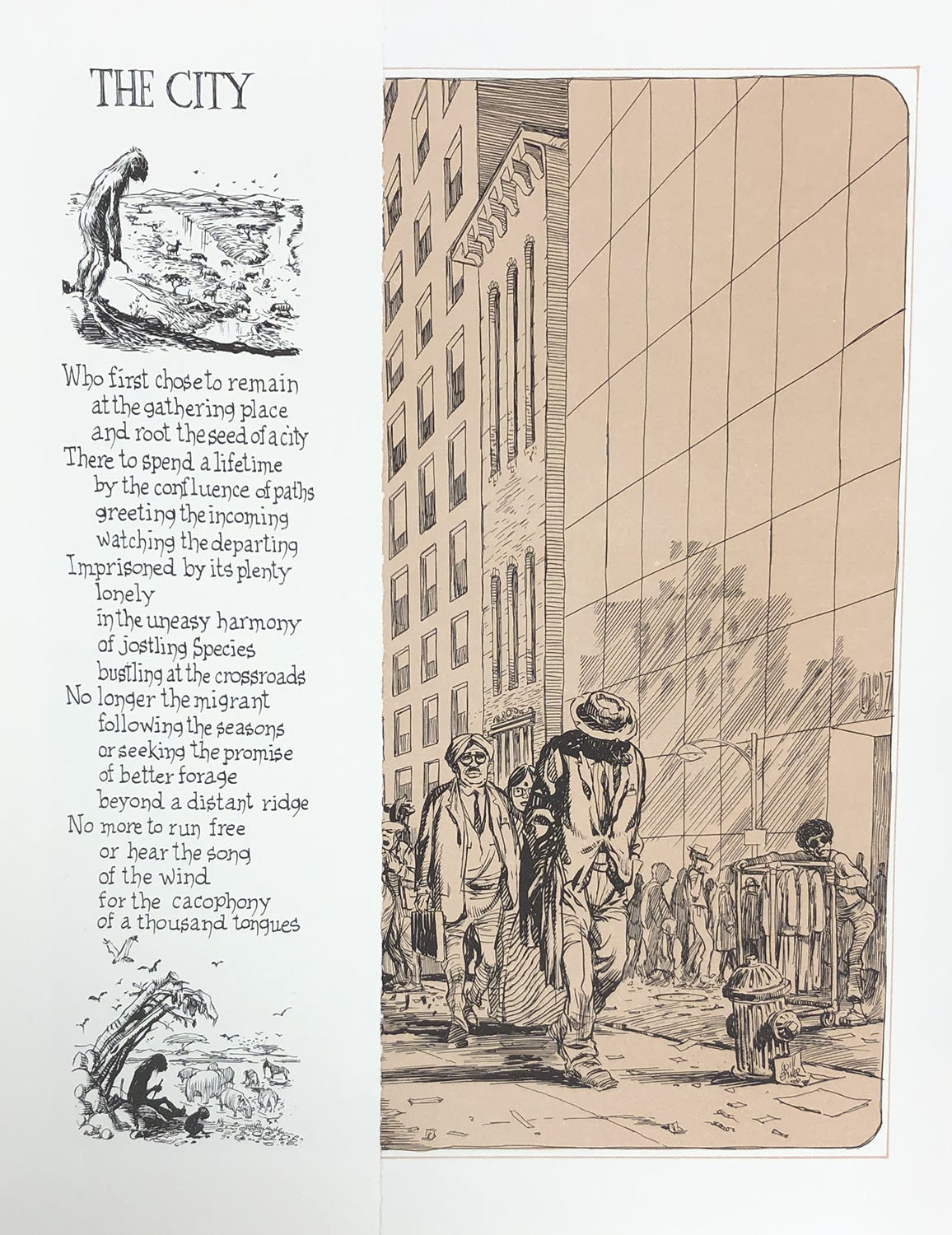
A page from “City” with a passage about the drudgery of urban life along with a illustration of a city street. (City: A Narrative Portfolio, Will Eisner, 1980)

As seen here, when the reader reads the passage, it can stand alone as a complex text and convey its message without any explicit drawing or illustration. It can be completely visualized by the readers themselves without the need of an image. The picture provided illustrates an interpretation of the urban streets; however, the reader may have their own ideation of the city based on the text of the message of a dreary urban life, slaving away from the isolating feeling of a bustling city life.

Posted in Fall 2019 Archive (201 Blog), Uncategorized | Leave a comment

Invisible Emotion: Ruby Pitts-Cranston

Picture of Crazy men Go Wild taken at the MASC

When we went to the MASC on Tuesday there were a lot of options to chose from for line and interdependent text. For an example of line I looked at the comic Crazy Men go Wild. I chose this because the comic uses a variety of different types of lines to create the characters and narrative. I especially like how the comic has a road that winds through each page and leads you through the booklet. The characters themselves are also made up of very abstracted and unnatural lines compared to how normal human features look. This can give a sense of confusion and chaos.

Picture of the Nuremberg Chronicle taken at the MASC

For an example of interdependent text and word, I looked at the Nuremberg Chronicle. I chose this because of the page with the apostles on it, because they are labeled with their names on scrolls next to them. I found that this was a good example because without the names, many people may not know who the people in the image are. I also like this example because the artist blended the text and imagery together so the words look like they are a part of the image.

Posted in Fall 2019 Archive (201 Blog) | Leave a comment

Invisible Emotion: Helena Matheson

The Golden Legend

I was very interested by the Golden Legend from the 1400s and its use of line quality, as it was quite different from most modern art. The image I chose was a depiction of Saint Stephen being persecuted against by wealthy and important looking people in the first half, and in the second half  being stoned to death by middle class looking men. If you don’t look closely, you are unable to see the detail on the image, especially in each of the men’s faces. The man who looks to be sitting on a throne has his hand up toward Saint Stephen. When you look into his face, it is one that could be pleading for Stephen to discontinue his worship. The lines around his eyes thin and tired, and the lines around his hand seem limp. Stephen, however, looks confident in himself, and keeps his arms crossed across his body. His eyes look defiant, and are used with a thicker line. Without a closer look into this image, many details are overlooked.

Atom Bomb by Brian Moriarty

I found a really good example of interdependent images in the Atom Bomb by Brian Moriarty. There is a set of three images that would not make sense unless the words were placed in the third square. In the first square, there is what looks to be a giant ball of light, maybe a blast of fire. In the second square, you can see what looks to be an atomic explosion, as it has that familiar mushroom-like shape to it. In the third square, there are four men all looking very excited and triumphant, two of them shaking hands. All alone, these wouldn’t make much sense together. But above the men inside the third square, there is a speech bubble that says “the war is over”. I wasn’t able to read much of the book, but I know that US forces dropped the first atomic bomb on Hiroshima, Japan on August 6th (coincidentally my birthday), ending WWII. I am pretty sure that is what these images portray, and it is done through an additive approach.

Posted in Uncategorized | Leave a comment

Invisible Emotion: Maria Alvarez

“Crazy Men Deluxe” 1985
Line Quality

Living in line by Scott McCloud taught me how to look at lines and see what they can mean. For this example, I chose to evaluate a page of Crazy Men Deluxe which shows the harshness of some lines. For this example, the lines are bold which can be interpreted as anger. The lines are not soft and convey some sort of anxiety because you don’t know where they are going or where they are going to end. The line quality is also very sharp and has purpose. If these lines were softer and less bold, I don’t think the image would be portraid as crazy as the author wanted it to be. Due to the boldness of the lines, I can tell that the author wanted this image to convey some sort of anxiety to the readers.

“El Mundo” August 30, 1896
Interdependent

For the interdependent example, I chose to examine a comic in the book El Mundo (the world) which shows the creation of man/humans. In this example, the words can be miracles in the sense that when I first looked at this comic (without reading the story), I saw god creating humans on top of a bicycle. But after more reading, I understood that he created people because he created bicycles first and he wanted someone to ride them. There was more context than I thought there was. This is a perfect example of Duo-Specific. Both the words and pictures show and convey the same message about this comic. Both the picture and words show how god gets bored and he decides to make a bike, then he starts off with the legs, then the arms, then the rest of the body, then a head, and the final result is a human. The words say the same thing.

Posted in Uncategorized | Leave a comment

Invisible Emotion: Tom McLean

Image from “Trinity” – Infocom 1986

The first image to the right is my example of good use of line quality to convey emotion from the reader. To be more specific about where the good use is in the image is at the bottom right of the page. The illustration casts a shadow on the man giving the statement “We must be the first!”. The use of the shadow behind him gives off a serious tone to the reader and shows that the situation that the characters are currently in is a serious one. To me, the emotion that I felt from this was one that wanted me to feel a sense of urgency. This comic was about World War 2 and the construction of the first atomic bomb used by the United States. With this information, it became clear to me that the emotion of the comic was one that was a serious one.

Bat/Catman Comic

The next comic is my example of good use of interdependent. To be more specific, looking at the top of the comic shows that the entire first 1/2 of the page is dedicated to just one action taking place in the frames. The sound effects roll over frames and these words are needed in order to let the reader know what is going on. Without the words being used as sound effects, the reader would not know what they would be looking at. The use of these words gives the page a sense of action and how fast the object is coming towards Robin in the comic. When the combination of the words and the pictures comes together, it creates a sense of tone and structure when the reader is going form frame to frame. It lets the reader know that they should read the next frames faster than normal.

Posted in Fall 2019 Archive (201 Blog) | Leave a comment

Invisible Emotion: Arron Borja

The comic that I chose from the MASC visit today that demonstrates line quality and how it conveys emotion is the 3D Batman comic. I chose this comic because the way that the lines are behind each other to make the figures three-dimensional is very interesting. Also, from McCloud, he stated that all lines hold “expressive potential” and I feel that the lines in this comic really do portray expressive potential. I have chosen the left page in this picture because the dragon in the biggest frame really pops out thanks to the effective use in line behind it and throughout its body. The rugged lines and shapes throughout the dragon’s body suggest anger/hostility and a rugged/scaly feel to its body. I think that this comic is a great example of how line quality conveys emotion in comics.


Cecil C. Addle’s poster comics are a great example of an interdependent word/picture combo. This comic uses mainly the characters in each scene with very little background or location detail. I feel that this is because the author wanted the viewer to strictly focus on the words and pictures depicted in the frames. This seems like a very traditional way of making comics, but I just feel that this poster comic in particular is a great example because of how the author made it so that the viewer had to mentally picture the environment with the information given from the words and drawings. To conclude, I think that this comic is duo-specific because of the equal-seeming amount of effort from both words and drawings. Regardless of the effort balance however, I feel like it is as long as the message/story was projected effectively, this comic will still have been successful. Also in this comic, the author modified the spelling of certain words and it seems like this was for kids to relate because some of the words are spelt in the way that kids pronounce them.

Posted in Fall 2019 Archive (201 Blog) | Leave a comment

Invisible Emotion: Isaiah Wilkerson

contentcom.microsoft.office.outlook.fileprovideroutlookfiledatadatacom.microsoft.office.outlookcachefile-downloadfile-1409527029IMG_0076In the MASC, I found some very interesting lines that expressed many different emotions. The one that I chose was The City: A Narrative Portfolio by Will Eisner. This art used many horizantal and diagnol lines that were very close and far apart to indecate dark and light shading.  It is very interesting because none of the lines are bolder than the other, they’re just closer to seem bolder. The thinness of these lines brings emotions of coldness, sadness, and depression which definately does its job to set the theme for this comic. The direction of the lines are repetative that also helps set the “dark and gloomy” theme that brings the audiences in the story.

contentcom.microsoft.office.outlook.fileprovideroutlookfiledatadatacom.microsoft.office.outlookcachefile-downloadfile-1443081461IMG_0077For Chapter 6: Show and Tell from Understanding Comics, one of term that I focused on for this comic: Sacred and Profance by Justin Green, is Picture-Specific. Picture-Specific is where words do little more than add a soundtrack to a visually told sequence. This example is shown on the sequence where the man is pulling his “imaginary brother” from the stop sign, then releases him which caused him to fall and injure him. This comic showed this sequence of events by using words to describe what words go with what action. Another term that I focused on is Montage. Montage is where words are treated as integral parts of the picture. This term also works with the same visual concept as the Picture-Specific example. My final term that I focused on is Interdependent. Interdependent is where words and pictures go hand in hand to convey an idea that neither could convey alone. This example is shown after the man releases his “imaginary brother” and calls him a “Meek Guy.” This is a great example because you wouldn’t describe the imaginary brother as a “Meek Guy” if they were no text and the same vise versa.

Posted in Fall 2019 Archive (201 Blog), Uncategorized | Leave a comment

Invisible Emotion: Grace Kannberg

After reading Living of Line from. Scott McCloud’s Understanding Comics, I learned how lines can be used to show so many different things. Sound, emotions, weather (cold and hot). In many ways, Lines are used in many different ways to convene an idea or emotion in the mind of the viewer. With this in mind, looking at the different examples during our visit to the MASC, I have found that the best example of lines comes from an old two-page panel called Pantheon sive Idola Judeorum and from a panel from The Amazing Spiderman comic.

A panel from Pantheon sive Idola Judeorum. Grace Kannberg-October 15, 2019.

The Pantheon sive Idola Judeorum uses lines differently in each small section of the whole panel. Each one has a different emotion effect on a viewer. The lines in the first square, located in the top right-hand corner, show swirling fire. It not only has a warm effect but also creates the emotion of tension within the scene. Each square in the panel has its own use for line, creating a unique story when it is looked at as a whole. The line work and emotion used in this are more complicated from my next comic, The Amazing Spiderman.

The Amazing Spiderman- The Goblin Power. July’98. Grace Kannberg-October 15, 2019

When looking at the panel from the Spiderman comic, the linework here is simpler in comparison. The majority of the lines used in this comic are strongly horizontal or vertical. The lines that make up this exception are the ones in the ceiling framing the characters. These lines aren’t like the others, and this was deliberately done by the artist. They did this to emphasis on the attention to the characters. The emotion of urgency and anxiety is shown through these strong, uneven, lines.

Religious panel from the MASC. Grace Kannberg-October 15, 2019.

In addition to learning about the importance of lines from reading Scott McCloud’s book, I also learned how the combination of word and pictures are interdependent. This means that together both words and a picture show an idea that neither can show on its own. When exploring the MASC I found one example of this from one of the oldest printed books. In this one-page panel, Jesus is talking to Saints around him. The words used in this panel name each individual in the photo for the viewer to understand what is going on. Without the words, the viewer doesn’t fully understand or know what is going on.

Posted in Fall 2019 Archive (201 Blog) | Leave a comment

Invisible Emotion: Emily Bartholomew

This week we went to the Manuscripts, Archives, and Special Collections (MASC), and we looked at all different types of comics. The first table that had books on them was very old and was one of the first books ever created with little comics within them. The second table had underground comics, to me, these books reminded me of alternative comic books. There were a couple of adult comic books from the 70’s, little colorful zines made in the 80’s, and little interview comic books made just a couple of years ago. The third table had your basic comic books, Spiderman, Marvels, Riche Rich comic books. The last table had a poster like comics on them, the comics on this table were big with their drawings and the size of the paper the author decided to use.

“Crazy” Men Comix- 1982 Michael Roden

When we got set free in the Reading Room, I gravitated to the underground comics. I really liked all of the comics that were on the table because they weren’t your normal graphic comics that everyone thinks of. One of my favorite comic on that table was the “Crazy” Men comix by Michael R. Roden made in 1982. It caught my eye because of the red cover with the black lines on the front. The pages that made me think of lines were the two pages that had Dance of Death. I wanted to take a picture of these pages because of all the things that are going on both of the pages. On the Left page, the lines throughout that page add more depth to the skeletons with shading on their faces and bones. But when you look at the Right page, there’s not as much of that shading going on with the skeletons. There’s more of a bold look on this side with the darker thicker lines on the skeletons and plants.

Zap Comics #8- Robert Crumb, August 1975

The last comic I decided to use was the Zap Comix #8 by Robert Crumb. These comics were created in the 70’s but the one I decide to use was made in 1975. What I really liked about this comic was the use of the line on this page. The lines on this page add movement and texture in the comic that the text can’t. For example, of movement there’s a little spaceship in the second to last frame and to make it look like it’s moving the author added lines to make a path of where it came from. The example of texture in the comic is in the last frame in the comic. There are five businessmen acting tired, but when you look at their jackets and pants that they’re wearing the lines add texture to their clothing.

Posted in Fall 2019 Archive (201 Blog), Uncategorized | Leave a comment

Closure and Time Frames: Sydney Seay

Page from The Lightening Thief, originally by Rick Riordan, but adapted by Robert Venditti.

This page of The Lightening Thief shows aspect-to-aspect closure in my opinion. The shoes with wings are implied to be very important, but there is no text or explanation. The creator is requiring active participation by the reader to make a connection as to why the shoes are so important.  Having them like this makes the reader question if the shoes are ascending, meaning they are a good important, or if they are falling, and a bad important. They could be floating, which could mean they are going to be a permanent fixture of importance for the future of the story. There are no frames, which usually give the readers slight guidance as to importance, direction or time. One may infer that is because something of large importance of the story cannot be put into a frame, due to it squishing the significance.


Page from The Lightening Thief, originally by Rick Riordan, but adapted by Robert Venditti.

These frames are an interesting example of how creators control the time in a comic. The two frames on the top are starting in space, then an outside view of the house that the characters are sitting in, we presume. The following frames take place inside a house, which a reader assumes to be the house that was zoomed in on from space in the frames prior. The reader assumes that these images are all at the exact same time, and zooming in like in a movie, however there is no definite reason for that. A reader could argue these are meant minutes, hours or even days apart so the story of the hurricane from Poseidon hitting the home. There is text in the bottom frames that hints that they may be simultaneous, but they can still be inferred that they are not.

Posted in Fall 2019 Archive (201 Blog) | Leave a comment