Final Web Comic: Nicholas Kawaguchi

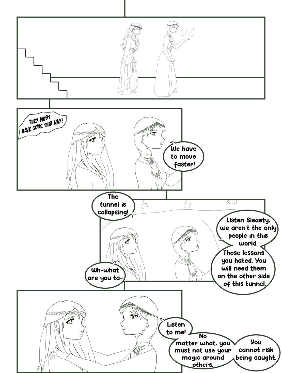
Creating this comic for the web presented some new challenges that were quite challenging. The top challenge was dealing with the limitations the web possesses. This becomes very apparent when realizing that I had to change from attempting to learn and create a website through HTML and CSS to utilizing Wix as a platform for the comic. In the attempt to make an HTML website, I ambitiously strived to implement elements such as GIF’s and even have it be interactive in the way that McCloud’s comics were. I thought that that would be one of the best ways to fully use the capabilities, within reason, of HTML, but unfortunately, my actions could not keep up with aspiring ideas. Moving on to Wix, base elements of design are much easier to get a grasp on, but possibilities are also taken away. Making most of what I could, I arranged my comic in such a way where it is read top to bottom, having the reader go from right to left to view panel after panel. Although it has a linear design, I intended it to have it read downwards rather than simply keeping it in a tight area where every panel can be seen or having the panels be viewed by horizontally scrolling. This is because, for most platforms, using a finger to scroll down a screen or a mouse wheel seems much more convenient and intuitive than pushing the screen right or left. With this type of layout, I would expect McCloud to have a relatively positive reaction or at least I would hope so. This comic is slightly similar to that of some of his other comics such as the ones where he details the use of new technology in creating comics. Each has a fairly linear flow that has some sort of guidance, his arrows, and my texts, to guide the audience down the screen.  


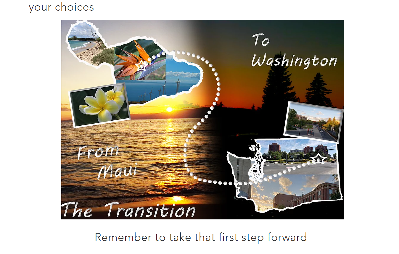
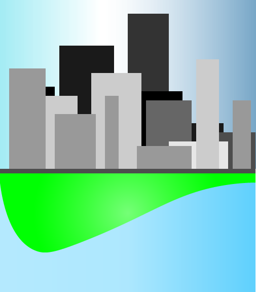
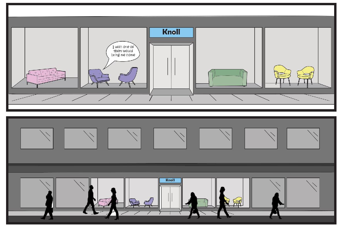
The one panel created in Photoshop illustrating the journey from Maui to Pullman

As far as actually constructing this webcomic, I mostly utilized Illustrator for the majority of the panels with one panel being made in photoshop. I had originally planned to work the opposite with photoshop being the priority and illustrator being the secondary source of artwork. However, actually getting into the thick of the project made me realize that I lack a lot of the resources I needed to make the comic fully in photoshop, so I turned to Illustrator where I could create objects, figures, and other elements from scratch. Going through the comic, there is a prominent difference from one slide to the rest and that would be because that one panel was created in photoshop. It was the only panel that I had enough pictures to create while also fitting into the type of story line I had in mind. In making both this and the other panels, I really had to think creatively to put all the elements together, especially when considering its implementation into a website format where these files become JPGs rather than the easily alterable files in their respective platforms. As I previously mentioned, I originally intended to use the HTML route, but it proved a bit complicated for my current skill set. With Wix, it just involved literally dropping them into the website creator and orienting them in the way that I preferred, although with some restrictions. The whole transferring into web format was made a lot simpler, taking away some of the stress of figuring out the intricacies of placement with HTML.

Posted in Fall 2019 Archive (201 Blog) | Leave a comment

Final Web Comic: Keanna Maki

A Trip To Space By Keanna Maki (Final Frame)

Link to website- https://keannamaki16.wixsite.com/webcomic

This web comic project challenged me in many ways, but I see how it was able to help me develop skills I didn’t have before. Finding out what I was going to do for these comic assignments had always been difficult for me because I either have lots of ideas or very little. I was intrigued with the fact that we were given the opportunity to actually design some kind of web comic. I then thought of making my own gifs to make this comic unique. Unfortunately, I decided that I did not feel like I was at that point of understanding, so I ended up creating a comic through illustrator and putting it in a website instead. I am glad I took this route because it took me so long to create my comic. I was even worried that, even with the extension, I was not going to finish on time. Luckily, I was able to pull through and produce something that I am proud of.

As far as creativity in my comic, I based it on a story about an astronaut and alien in space becoming friends. This was an idea that I wasn’t sure about in the beginning, because again, I had so much flexibility surrounding this project, but the more I thought about the story I knew I wanted to pursue it. Even though, I realized many other people ended up having the same ideas of their characters being astronauts and taking place in space, I think my comic still had its own originality to it. The process of creating the comic was all through Illustrator. I used my familiarity with shapes and combining shapes to create most of the animation. I tried out different brush types to create different looks. I also tried colors that blended with each other to create images that would stand out. This comic was a step-by-step process. I started off with an idea for the beginning of my story and then frame by frame, I worked myself through the story of my comic, having what I wanted to include in my mind at all times.

I embraced web viewing by having the basic scrolling method. So, when you go to my comic website, you will reach a home screen and then click on a button that says “Launch” and then that button will take you to my main comic where you will start at the top and then scroll through it till you reach the bottom. The possibilities of web presentation that inspired me is how creative you are able to be with your comic. Instead of reading a basic comic, you can add more enjoyment for a viewer through the presentation of the comic. Limitations of web presentation is putting in that extra effort of scrolling or clicking through images. I think that there is lots of potential when it comes down to using the web. I hope a reader will understand the story of my comic. I know that my web presentation is a common way to portray my content, so it is up to my comic to really highlight the individuality. My web comic is meant to be viewed on a desktop or laptop only. I did try to view it on my phone, but it appeared to have some weird glitch and I am not sure why. I wish it could be viewed on more devices, but I think that is something I would have to go back in and alter some kinds of settings that I am not familiar with yet.

I would think Scott McCloud would comment how my comic captures the essence of what a web comic should look like. Scott McCloud pretty much shared that there are no limits to how one can portray a comic or what they can portray. I feel that in every piece of work I have done, I have had some kind of aesthetic appeal to it which does connect to his definition of comics. Again, I used Illustrator to produce my comic because I was more familiar with creating animations and actually felt more comfortable using it. What really helped me create my comic was the artboards in Illustrator because then I could get a sense of what my comic would look like as a whole. The process of putting my comic on a website was quite difficult for me. I started off wanting to produce a website with WordPress and then found that route not quite what I was looking for. I then switched to the web software WIX where I found it to be way more flexible and allowed me to create my own website exactly how I wanted it to be. I would say the switch was necessary and gave me what I was looking for.

In order to get my files from Illustrator to my website, I followed the directions of saving my images to a PDF and JPG. After that, I used the single frame images of my comics and uploaded them all at once to my website. I then had to organize each frame one by one which took some time. Something that let me down was that even though I saved my images with 300 resolution, some of them still came out grainy and not how I pictured it to be, so I had to make some last-minute adjustments. Overall, I learned that there are so many possibilities and opportunities working with and without technology. During this project, I was able to try out different things such as creating more appealing work through Illustrator and finding ways that I can showcase my comics. I feel that I will definitely use this experience and learned skills in my future.

Posted in Uncategorized | Leave a comment

Final Web Comic: Jake Bailey

Link to my web comic: https://thewebcomicadventure.weebly.com/

For my comic once I decided that I was going to do the choose your own adventure idea as my comic style, being on the web made it a lot easier to enact. Being able to use the buttons and different web pages was really nice and exactly how I imagined the story to be told. The viewer is meant to follow the path of my comic and use the buttons at the end of the necessary panels to be taken to a new web page to continue the comic. As for being viewed on different medias I have checked both laptop and on my phone and both ways the comic looks and works just how I want, almost better on mobile as it is more condensed and the extra web page space is eliminated. I think Scott McCloud would like my comic as it does follow his definition of juxtaposed pictures and words as well as being a different sort of style then you see in everyday print comics and digital comics.

A Screen Capture taken from my web comic showing both a panel and the buttons that play a big role in advancing the comic

I used Illustrator for the sole reason that it felt a lot easier for someone not as digital design skilled as myself. Also, Illustrator I feel allowed me more creative liberty in being able to draw exactly what I want to draw using lines, changing in my own image, rather than just pictures used together. For getting my comic on a web page I used weebly because its the only website building software I have a decent amount of knowledge in, having to have used it for high school. Another reason I choose weebly is because I knew they had the button tool and that was a big part of my comic that needed to be available, and it ended up working out just like I wanted. To get the files onto the website I simply just created the pages with the side drawings, converted them to jpg, and then the inserted the images onto the site. As for what I learned that was new, I finally figured out how to use the gradient tool, which I utilized a lot for the cave and darkness effect. Also, I was just able to get better at using the software and making what my mind imagined after never using illustrator before.

Posted in Fall 2019 Archive (201 Blog) | Leave a comment

Final Web Comic: Kristine Zorn

This is the fourth page/ image of my comic. Here I took advantage of having a webcomic by using
“trails” and a zigzag pattern with the panels.

I’ve have read a lot of webcomics on my phone and found that I always enjoyed scrolling vertically through the comic, especially when the comic and webpage were designed to have no gaps in between images. I knew right from the beginning that I wanted to have a vertically scrolling comic where the images seamlessly led from one to the other.  I liked that I was still able to organize my comic in pages when I was drawing it but I didn’t have to stick to the usual rules with pages in a book. For example, while some of my comic has images designed like a page in a printed comic book where the frames fill the pages, I was also able to have images where the frames didn’t fill the page and perhaps moved back and forth in a vertical zigzag.

I expect that the reader will scroll vertically through the comic as that is how it was designed and it cannot be scrolled through in any other way unless the viewer zoomed-in quite a bit. I used the concept of “trails” from Scott McCloud to guide the reader. I included trails for any of the images that designed less like a traditional page and also in between some page transitions.

When writing the code for my website I made sure that my comic would scale when changing the window size or device. There was a bit difficult as I was changing around the images and how they were laid out. At first, I wrote the code so that there was space in between the images but when I rewrote it so there was no space my comic lost the functionality of being able to scale. I had to try a few different things before I was able to get the comic to scale again. It does scale now so if I make my window size smaller only computer the images get smaller without moving out of their place in the column. The same things happen on a phone as well.

I think Scott McCloud would mention how I used motion lines to show that a bell was ringing and also to show rocks falling. In “Understanding Comics”, Scott McCloud talks about how motion lines were primarily used in Japan. I think it makes sense then that I used them considering most of the comics I have read were manga and I even drew my comic in the Japanese manga/anime style of art. I think he might also comment on how I mixed the use of typical pages design and trails with panels positioned less like on a printed page.

I used Photoshop for my comic. I like using Illustrator for simple graphics like logos but for more complex artwork I like to use Photoshop. I find it easier to get the type of lines I want and I just prefer working with pixels instead of vectors.

I chose to make my own website by writing the HTML and CSS. I learned a bit of HTML a few years ago so even though I had forgotten a lot of it, it didn’t take to for me to refresh my memory. It, however, was my first time using external CSS. When I was learning web design a few years ago, I only used internal and inline CSS and I didn’t get very far in learning how it worked either. Luckily my dad was able to help me with the code and watched some tutorials with me so he could help me if I ran into any problems. Writing the code went simply enough. The only problem was making sure the scalability of my comic based on window size stayed intact when I removed my images from their div containers so they they didn’t have space in between each other. I can’t remember what I did exactly to fix it but after messing around with the CSS for a bit I got it working again.

Although I changed some of my canvas sizes slightly while working on my comic every image started out at 8.5 by 11 inches at 300 ppi. When I prepared the images for my website I first exported my PSD files jps at 72 ppi without resampling. Then I took those images and 72 ppi and saved them in a separate folder while resizing them down. When I was watching different videos and tutorials about web design they suggested using an image bigger than what I wanted it to display at. So I resize my images to about 15 inches wide but wrote my code so that they displayed at 10 inches wide.

In terms of making websites, even though I had learned code before I did learn how to use the flex-column tag to make sure my images stayed in place vertically while still remaining scalable. In Photoshop I learning more about how to use clipping masks to help in illustration. For example, when color skin on a character I first lay down the base color. Then I add a layer on top as a clipping mask and use that layer for shading and highlights. This way the shading and highlights stay within the boundaries of the skin without permanently changing the base layer. I also learned more about brush settings such as smoothing and changing the hardness and opacity to get the desired effects I wanted.

Posted in Fall 2019 Archive (201 Blog), Sample Posts by Students, Uncategorized | Leave a comment

Final Web Comic: Bruno Signorelli

The ability of not doing a traditional left to right reading style inspired me for this project because I wanted to try something different. Also having it be on web also allowed me to work with things like a scrolling feature which also inspired me because it led me to doing something a vertical comic that is continuously going down. I expect the reader to just scroll down because that’s really all they can do on my website, and with the whole concept of my comic being each frame is a zoom in from the last it makes a lot of sense and having to see one panel at a time in the specific order I designed it in helps the reader understand what I’m going for. No matter what device you read my comic it still reads the same way because each panel is put on top of each other and there is no side to side scrolling on vertical. I think Scott McCloud would see my web comic as a comic because it does contain juxtaposed images that are meant to be appealing to the eye, and they are placed in a deliberate order to have a deliberate effect on the reader. It also contains things like repetition and color, to give the reader a sense of time and space throughout my comic.

I used a mixture of both Photoshop and Illustrator, but I mainly used Illustrator. I used Illustrator to create most of the images in my web comic, and I did this because I was able to create a certain style that just looked better if I used a vector-based software over a pixel-based software. I used Photoshop for two of my images because for one of them I

Image I created using Illustrator

wanted the Photoshop brush tool because I think it created a better star effect for the stars, I had in space for my first panel. I also used Photoshop in one of my later panels because it I wanted to create a glitch effect for one of my images, and I had already known how to do that from before on Photoshop so instead of learning how to do it on illustrator I just took my image I did on Illustrator and added a glitch effect to that. I put my comic on Wix and it was very easy I used a blank website template and from there all I had to do was put in a Title text box at the top of the page, and then I just kept added my images one at a time in the correct order on top of each other without any space in between them, to create a better zoom effect. My experience with Wix was a very positive one because I didn’t have single issue with it and was able to do that portion of my project very fast and exactly like I wanted to. I just transferred all my illustrator and Photoshop files in jpeg files and then I was able to add them onto my website. I don’t know if I learned anything new while working on this project but I did feel like my skills in illustrator did improve a lot while working on this project, and I also learned a new style of creating a comic which was on a website.

Posted in Fall 2019 Archive (201 Blog) | Leave a comment

Final Web Comic: Cierra Haken

Panel 3 and 4 on my “Knolly the Armchair” comic. Fall 2019

In class, when we began to look at and read web comics, I was really inspired by Scott McCloud’s “the right number part one and two.” The way this comic zoomed in on each panel to pull the viewer into the story really stood out. My original plan was to recreate a webcomic like this, but when I started looking into it, the only way I could do it with my skill set was through Prezi, which is a website for presentations. Since my comic would not have been created on its own website, because of the nature of our project, i decided to take another route. Using my same story line, I ended up using wix.com to create my own website, and made my webcomic a story that is viewed vertically. The format this is in required the reader to scroll down repeatedly in able to read my comic. This brings in viewer participation, because if they wish to read more than only a couple panels, they have to interact with the website by scrolling. When I bring up my comic website on my phone, the site adjusts to a mobile phone, so the comic looks and acts just the same as it does on a computer. If Scott McCloud were to read my comic, I think he would definitely define my story as a comic because I have a story told in a sequence of juxtaposed images. In my comic, we can also look at the passage of time and how in my three panels of people walking past the storefront, you could say that was an action to action panel transition, as explained my Scott McCloud’s understanding comics. 

I decided to use both Photoshop and illustrator in my creation of my comic, because I wanted to create my images using the pen and shape builder tool In illustrator, then transfer over to Photoshop where I could make selections to fill in color. I have found this is the best and most efficient way to create a comic for myself. I also learned to manipulate the art boards on illustrator so I could create one long page to place all my panels on, to emulate what it would look like on the website. I then saved this long page as a jpeg. and placed it Into the Wix website. Using Wix was very simple, as I just placed the one jpeg onto the page and enlarged it to fit the page. This made it easier and quicker for me, as I had many other large projects due around the same time as this one. 


https://cierrahaken.wixsite.com/hakendtc

Posted in Fall 2019 Archive (201 Blog) | Leave a comment

Final Web Comic: Phuc Tran

Animated GIF-downsized_large
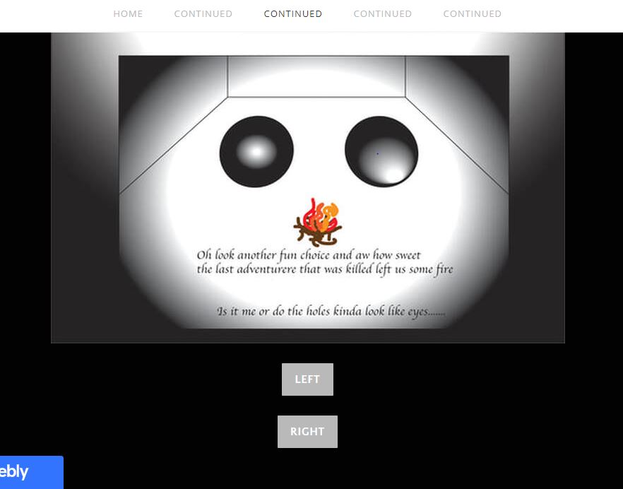
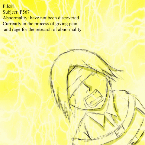
What inspired me is one of the comic I saw on the internet with gif having 2 frames keep switching to each other. The only thing that are different between those 2 is the pattern of the fire camp, this create the effect of fire animation while everything else in the frame is still. After seeing this, I thought that the idea was really cool so I did it with electric. In addition, the other idea of mine is to paint each frame with only one color, but the colors I chose were based on the atmosphere in that frame. For instance, when the main character lost his temper, the whole frame turns red in order to shows his anger.

My comic has a vertical layout. With one single big frame only show up one at a time, the reader can scroll down slowly with the mouse wheel, this kind of layout makes a lot of sense for me so that is why I chose it. Furthermore, I also make sure it will have an interactive element, a thing that can only be done in web comic. For that reason, I added hover boxes in some frame, which means readers can point their mouse to the frame to see a different image. To inform the audience with this feature, I put a note in the beginning of the comic about the icon which I added to show which frame can be interacted later on.

I tried my best to organize the layout in touchscreen device, but it still looks a little bit off. The hover box lost its feature in these kind of device. Instead it only shows the images when the mouse is hover on it. For this reason, my comic will not make a lot of sense on a smartphone so I guess my project is only optimized for computer. I believe my comic fits McCloud definition of comic well since it contains multiple frames and together, they tell a complete story.

For this final project, I used my Wacom tablet to draw in Photoshop. I have a feeling like I did not really utilize the potential feature of Photoshop since most of them are just organic drawing, so that is one flaw that I wish I know how to fix. But there are something that I could not complete without Photoshop. To make the gif, I drew the guy in the electric chair, used the lighting picture put on top of it and then set that layer as overlay. The result came out great as the lightning pattern was drew in that picture. After that, I spun the lightning pattern so that I have the second frame. Finally make a gif out of those 2 then I have my favorite frame of the comic. In addition, I added the bubble text and words to show the character’s speech.

Wix was what I used for this project since I used it before and realized of how easy it is. I only need to export the frames to JPEG and then add it to the website. Since Wix gives you the feature of drag-and drop ability, it was very convenient for me to organize the layout. Wix also let me add hover boxes so I was able to make those interactive frames.

On the whole, I am very proud of the project and happy of how it turns out. One thing I learned is how to make gif so as to getting more experience building website on Wix. The project just helped me more comfortable with building website which is a big help as I believe I need to make a website portfolio on my senior year in order to graduate.

https://ttbaophuc.wixsite.com/dtc201comic

Posted in Fall 2019 Archive (201 Blog) | Leave a comment

Final Web Comic: Dahlia Xie

The main inspiration for my web comic was the gif on Eroyn Franklin’s website. I was intrigued by the use of GIFs as a way to portray a comic. During the brainstorming process, I was mainly determined to create a GIF. I also wanted to incorporate illustrator into my comic and also have more user interaction with my comic. For those reasons, I made my web comic two GIFs that I felt incorporated both what I learned from Project 1 and what I learned from Project 2. The first GIF is kind of like a stop motion of items that I scanned in, and the second GIF I just drew in illustrator. I tried connecting the two GIFs to make it seem as though the pencil from the pencil case in the first GIF was being used to draw in the second GIF. To add more user interaction, I made it so that when the user clicks the first GIF, it changes to the second GIF. Unfortunately, even though I wrote code in JavaScript so that the GIFs should change when the user clicks, it only works the first time. After looking up the issue, I found that it doesn’t work because my files are not online. I really like the idea of an interactive web comic and I think I should have added more clarification on how to interact with the comic so that the user knows that clicking on the GIF causes it to change.

Frame from my web comic GIF

My web comic doesn’t work on anything other than device/laptops that have the HTML and GIF files so it isn’t very user-friendly. I think in the future I will post it online because I want to create portfolio soon and I will make sure to make it a little more clear about how to interact with the comic. I think Scott McCloud would say that my web comic is a comic in the sense that film can be considered comics because they are a lot of individual frames. Also, McCloud would likely mention the way I used time in my web comic because there is a sense of time between each frame in the GIFs but there is also the user-controllable aspect of time with the “click to change GIF” part of the comic.

I made my web comic in Photoshop and Illustrator. I scanned the pictures of my pencil case, pencil, and an eraser at Avery after class and then drew the hand and pencil movement in Illustrator using the pen tool. For the GIFs to show up on the localhost website, I had to make sure that the GIF files were in the same folder as the HTML file. Overall, I learned the strengths of each software. I think I still need to familiarize myself with Illustrator a little better but I’ve become very comfortable working with Photoshop and I plan on continuing to use this software in the future for more projects I do in my free time!

Posted in Fall 2019 Archive (201 Blog) | Leave a comment

Final Web Comic: Tom McLean

For my final web comic, I decided to use the website Wix to display my comic online. Initially, I thought about using some HTML to make my own website but I figured that using Wix would give me more time to work on the actual web comic. I wanted to display my comic on a basic website without any distracting features or backgrounds to them. I chose to have the panels being in a scrolling vertical order so that anyone could view it either on a phone or a desktop. The basic ability of just scrolling makes it accessible to most people that have used a basic website in recent times. In order to ensure that my comic would be able to be viewed correctly on a phone or desktop, I used the build in tool on Wix to ensure that my content could be viewed correctly. I believe that Scott McCloud would say that my comic has a simple story arch and gets a point across.

Image from my web comic

The software that I used for this project was Illustrator. I only used illustrator and not Photoshop because I had no need to use any external images that needed editing in Photoshop, everything that I wanted was accessible in Illustrator. In order to keep a good resolution for my website, I kept each art board at the resolution of 1920 x 1080 and inserted each image below one another on my website. This would make loading the images much easier and more fluid due to everything not just being one large image. Something that I learned from this project is that displaying your content online can be a tricky thing to try and do for the first time. The first two projects were straightforwards when presenting them. All I had to do was print them out. This project helped me learn how to present my work online in a professional way. I hope to used this skill in my future work when I need to use an online outlet to display something to people.

Posted in Fall 2019 Archive (201 Blog) | Leave a comment

Final Web Comic: Peter Dowell

First part of Peter Dowell’s Web Comic

Here is the link to the comic: http://pdowell.com/web-comic/

For my web comic I wanted to make a choose your own adventure type of comic for the project. I wanted to do this because it would add some interactivity to the comic and gives a different way of navigating the comic. I wanted to create an alien exploring an alien planet and different events that happen when it explores the planet. The first part of the story is three panels showing a spaceship flying to a new planet. I made the planet out of multiple different gradients to give a layered effect like how Jupiter looks. I made the spaceship out of multiple shapes and the alien was mostly made with the pen tool and then adding some more detail with shapes. I wanted to make the comic atmospheric with showing different locations where the alien is at and I did this with having the reader choose if they want to go in a cave or go over the cave. Going in the cave there are a lot of crystals and a light shining as you walk towards it. You then find the source of the light and are given another option to take it or leave it, which then leads to the final panel. When you go over the cave you go on the icy mountain tops and meet something frozen in the ice until you go and hear a loud “CRACK!”, what you do from there is life or death.

I wanted to add more interactivity with my comic compared to books because you can do that on the web with making buttons do different things. In my case I made it so the buttons progress through the story with different options for different events that happen and then once it is finished gives the option to restart. I made the HTML code so that it would scroll through horizontally and then once you are fully scrolled through you get on option so you always choose after you read the first part. When the comic is viewed on different devices it just shrinks the window and makes the user scroll more horizontally to read the comic. I think Scott McCloud would talk about the closure of the comic because there is interesting things that happen with closure for each option that is picked because it is different based on what is chosen, also there are multiple ways of reading the comic based on what options are chosen as well.

I used Illustrator to make my comic because I liked using the pen tool to draw characters and using the shapes to build different things as well. I also took advantage of clipping masks for each of the panels which was very helpful to keep it all in one place and not overflowing. I put my comic on my WordPress site where I just uploaded the media in the media library and then reference to it in custom HTML. I like WordPress, it made it fairly easy for me to set up the stuff on the site and had multiple options to change things on there as well. The one issue I had in the beginning was how large the images were because they would not fit in the block in WordPress. I couldn’t just insert the image because the block would interfere with the dimensions and it would not look good. Adding in the scrolling for the HTML helped it fit all in the block. I just uploaded the files using the media library that WordPress has and then referenced them when I had to insert them on the page. I used gradients a lot in this project to highlight specific things or make things look more interesting. The spaceship has gradient for its boosting and the planet is one whole gradient which gives it layers. I made a radial gradient for the shining of the gem and I made the shining of the entrance of the cave gradient as well. I also made the sky a gradient.

Posted in Fall 2019 Archive (201 Blog), Sample Posts by Students | Leave a comment