
This is the fourth page/ image of my comic. Here I took advantage of having a webcomic by using
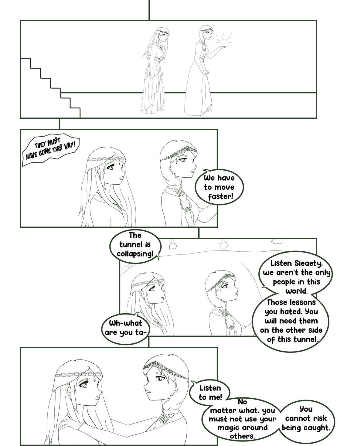
“trails” and a zigzag pattern with the panels.
I’ve have read a lot of webcomics on my phone and found that I always enjoyed scrolling vertically through the comic, especially when the comic and webpage were designed to have no gaps in between images. I knew right from the beginning that I wanted to have a vertically scrolling comic where the images seamlessly led from one to the other. I liked that I was still able to organize my comic in pages when I was drawing it but I didn’t have to stick to the usual rules with pages in a book. For example, while some of my comic has images designed like a page in a printed comic book where the frames fill the pages, I was also able to have images where the frames didn’t fill the page and perhaps moved back and forth in a vertical zigzag.
I expect that the reader will scroll vertically through the comic as that is how it was designed and it cannot be scrolled through in any other way unless the viewer zoomed-in quite a bit. I used the concept of “trails” from Scott McCloud to guide the reader. I included trails for any of the images that designed less like a traditional page and also in between some page transitions.
When writing the code for my website I made sure that my comic would scale when changing the window size or device. There was a bit difficult as I was changing around the images and how they were laid out. At first, I wrote the code so that there was space in between the images but when I rewrote it so there was no space my comic lost the functionality of being able to scale. I had to try a few different things before I was able to get the comic to scale again. It does scale now so if I make my window size smaller only computer the images get smaller without moving out of their place in the column. The same things happen on a phone as well.
I think Scott McCloud would mention how I used motion lines to show that a bell was ringing and also to show rocks falling. In “Understanding Comics”, Scott McCloud talks about how motion lines were primarily used in Japan. I think it makes sense then that I used them considering most of the comics I have read were manga and I even drew my comic in the Japanese manga/anime style of art. I think he might also comment on how I mixed the use of typical pages design and trails with panels positioned less like on a printed page.
I used Photoshop for my comic. I like using Illustrator for simple graphics like logos but for more complex artwork I like to use Photoshop. I find it easier to get the type of lines I want and I just prefer working with pixels instead of vectors.
I chose to make my own website by writing the HTML and CSS. I learned a bit of HTML a few years ago so even though I had forgotten a lot of it, it didn’t take to for me to refresh my memory. It, however, was my first time using external CSS. When I was learning web design a few years ago, I only used internal and inline CSS and I didn’t get very far in learning how it worked either. Luckily my dad was able to help me with the code and watched some tutorials with me so he could help me if I ran into any problems. Writing the code went simply enough. The only problem was making sure the scalability of my comic based on window size stayed intact when I removed my images from their div containers so they they didn’t have space in between each other. I can’t remember what I did exactly to fix it but after messing around with the CSS for a bit I got it working again.
Although I changed some of my canvas sizes slightly while working on my comic every image started out at 8.5 by 11 inches at 300 ppi. When I prepared the images for my website I first exported my PSD files jps at 72 ppi without resampling. Then I took those images and 72 ppi and saved them in a separate folder while resizing them down. When I was watching different videos and tutorials about web design they suggested using an image bigger than what I wanted it to display at. So I resize my images to about 15 inches wide but wrote my code so that they displayed at 10 inches wide.
In terms of making websites, even though I had learned code before I did learn how to use the flex-column tag to make sure my images stayed in place vertically while still remaining scalable. In Photoshop I learning more about how to use clipping masks to help in illustration. For example, when color skin on a character I first lay down the base color. Then I add a layer on top as a clipping mask and use that layer for shading and highlights. This way the shading and highlights stay within the boundaries of the skin without permanently changing the base layer. I also learned more about brush settings such as smoothing and changing the hardness and opacity to get the desired effects I wanted.
