Northwest Alternative Comics: Blaine Casil

Abruption: Taylor Dow

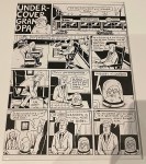
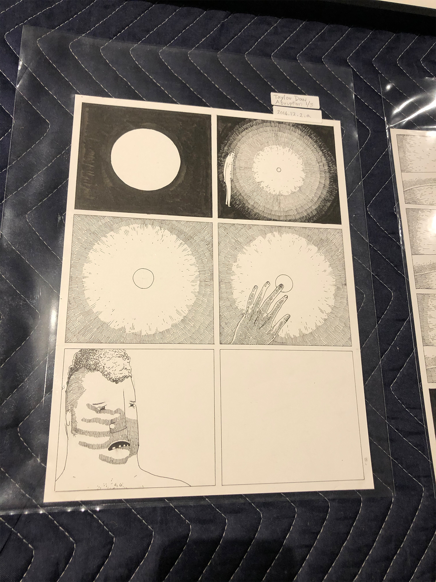
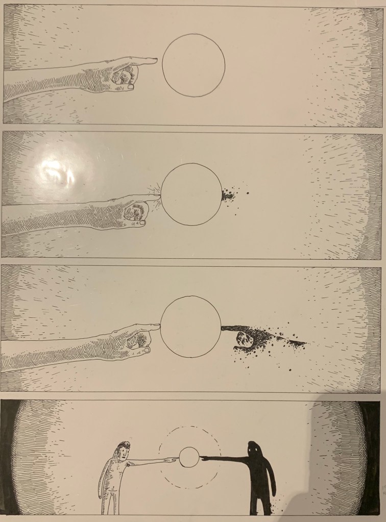
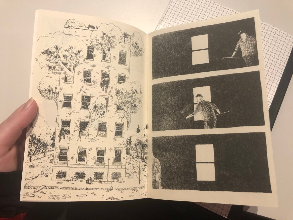
When we visited the WSU Art Museum Collection to see some of the work that was present ate the Northwest Alternative Comics, Abruption by Taylor Dow is one of the comics that caught my attention. As I read through the comic book, a lot of it were series of images without text which let the reader create their own dialog in their heads. The reason I picked this comic is because of the story I was able to form with the images. What I saw was someone who was constantly running away, trying to find the light, yet he struggled because there were things holding him back and trying to keep him in the dark. When he finally found the light, it was taken again yet he finally faced the darkness and tried to get the light that was taken. In other words, he faced the darkness in order to see the light.

I quickly noticed that Taylor Dow used a few of the elements of design in this comic. He used color and value in unity. Although the comic was only in black and white, he used different shading techniques to give attention and detail to certain objects. He also used a lot of lines to create details or to show things radiating such as the ball of light.

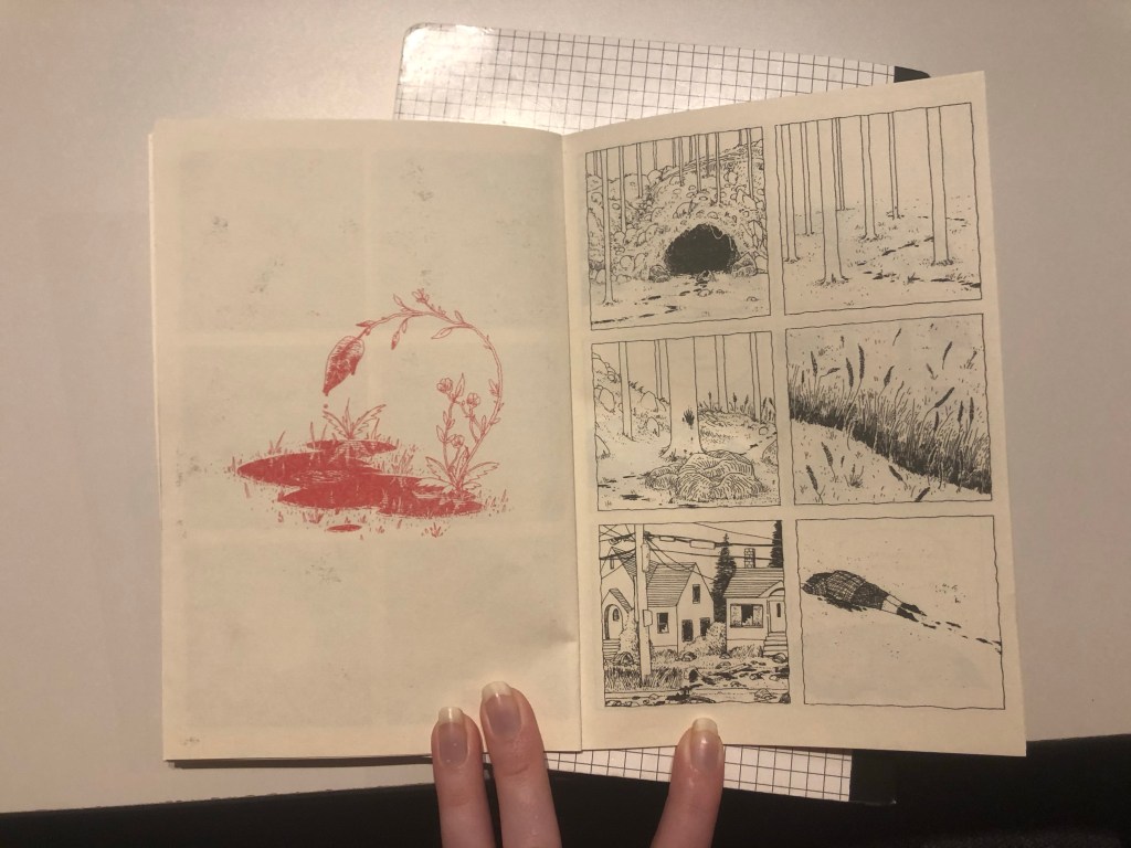
As for closure, Taylor Dow used moment-to-moment which can be seen in the image above. As the reader transitions downward through the different scenes, the main character is shown slowly moving closer to touch the light. When he does, a shadow can be seen forming on the opposite end. Once the reader gets to the last scene on the page, the main character is touching the light and another character is introduced.

Overall Taylor Dow uses a number of different techniques to portray the story “Abruption”.

Posted in 201 Blog, Northwest Alternative Comics | Leave a comment

Northwest Alternative Comics: Jon Preng

The artwork that I chose to write about is, “Undercover Grandpa” by Tom Van Deusen. The idea of a grandpa saving his head as a way to remember him was odd to me, but it made for a interesting and funny story.

In Deusen’s work, I was able to point out elements and principles from John Lovett’s reading. Elements included line, size, texture and value. Whereas fo principles, I saw balance, gradation, repetition and contrast. There is no color in the comic, just black and white. For example, gradation and contrast stood out to me the most since Lovett didn’t use color. The tone of his ink varied since he didn’t have much color to play with while also being detailed as possible. Deusen also made a good use of texture, which can be found in multiple items (e.g. teddy bear, hair, the grandpa’s skin and much more).

Deusen’s use of elements and principles didn’t really affect my interpretation of the story. However, it did cause me to focus more on the story and details since there was no color to pay attention to. I think it engaged me more to whats going on, instead of paying more attention to the design.

I believe the use of time frames in this comic is moment-to-moment. In the scenes, the action happened in a short amount of time. For example, detailed conversations that lasted more than five panels. There was a-lot of context given and Deusen didn’t skip out on it.

Posted in 201 Blog, Northwest Alternative Comics | Leave a comment

Northwest Alternative Comics: Malvin Malai-Harrison

During my time at the WSU Museum Collection Study Center, I took the time to observe and read many of the comics that the artists contributed to the collection. They were all very impressive and unique in their own ways and it was easy to tell that they all had their own inspirations for the pieces that they created. One comic artist that stood out to be was Taylor Dow. This artists work was truly impressive because they illustrated their comics with an ultra-fine radio graph pen. I was able to look very closely and see how intentional the artist was with every stroke of the pen, admire all of the small details that went into their illustration and ponder about the time that it must of took them to draw out a single panel. I was quite impressed to say the least. Furthermore, the subject matter was super interesting as well. I read both Abruption and Apocalypse Dad while I was there and both of these stories were really well done. I loved how the artist used very little dialogue to tell the story and allowed the illustrations to do most of the work in communicating what was going on.

Abruption by Taylor Dow. 2016.

For Abruption, there were many design principles that went into this creation. For instance, this scene of the mysterious glowing light, they used repetition of the circle along with different sizes to illustrate the distance. Moreover, contrast between black and white shading, and the contrast of the lines surrounding the circle gives off an impression that this circle is rather bright and emits a lot of light. In the top right panel, we can see the use of gradation between frequency of lines used slowly fading as they near the center of the circle.

For closure, I’d say that this scene illustrates Aspect-to-Aspect because it shows different perspectives of the same scene to give the reader different viewpoints that they inherently put together to get a holistic understanding of what is happening.

Posted in 201 Blog, Northwest Alternative Comics | Leave a comment

Northwest Alternative Comics: Trent Madison

cmicpic

Pete Bagge’s comic saved by the WSU art Museum from the 2016 art exhibition 

One Example I saw at the show on museum on Tuesday was the piece by Pete Bagge. This comic used boxes that were all the same size. There was no color used on this comic. He balanced the elements in the comic by dispersing the use of the shading. He showed a dominance in some of the frames by making one person bigger than the rest so we know to focus on what they have to say. Those elements make me intemperate the comic as a guy who doesn’t want to go to an art museum or show is dragged to one by his girlfriend. She then runs into a friend and hes alone looking at art, when he ran into someone as well and insulted the work. It turns out the artist of the work he insulted was that of the other guys girlfriend.

Posted in 201 Blog, Northwest Alternative Comics | Leave a comment

Northwest Alternative Comics: Mitchell Delmage

Taylor Dow uses various design elements and principles to convey a feeling of distance, curiosity, and separation in his comic Abruption. 

Dow uses a contrast between the darkroom and the glowing orb to make the character feel curious. The character reaches his hand out toward the orb and Dow drew a contrasting shadow over the character’s face to show the light emitting from the orb. 

Dow uses contrast to show separation between the two characters in his comic and the white orb. Another character appeared when the comic character touched the orb. The characters are the same person, but one looks like a realistic character and the other is merely a shadow character. The contrast between the two characters shows the separation between them, even though they are the same person, at least shape wise. 

The color in the comic is only black and white. The color is also, for the most part, solid fill or gradient. It gives the setting of this comic a very abstract feeling. This could be just a dark room or it could be a metaphor to show that the setting takes place inside the character’s mind. 

The balance in the comic is really good. Some of the frames are almost entirely black, and some of the frames are entirely white. The artist did this in a way to make the comic look very visual aesthetic to the eye.

Dow uses repetition to minimize viewer misinterpretation. There are several frame sequences that have almost the same frame several times with something slowly changing. The artist does this to bring the viewer along with him on what he is trying to communicate. 

Dow also uses size to make the viewer feel closer to the comic and more invested. Most of the frames are close-ups of the character’s face or hand. This brings the viewer closer to the page and more interested in the comic because the close-ups show more detail.

Posted in 201 Blog, Northwest Alternative Comics | Leave a comment

Northwest Alternative Comics: Bryce Ames

The alternative comic book that I have chosen to evaluate from the WSU Art Museum is called “Urban Hipster 2” by Greg Stump and David Lasky. the design stood out to me in terms of the particular layout of each of the panels the authors used objects as the borders of some of the panels to allow for transitions to be more interesting

“Urban Hipster 2” by Greg Stump and David Lasky p.5

This comic provided me with a visual that there were 6 panels on the page instead of 3 by using the roof of the building to split the page. The overall scene seamed to use a good balance of cluttered trash in the street to provide the reader with the aspect that this part of the town is in shambles. Another example used was dominance the laundromat store was the dominant figure in the frame and allowed of the smaller objects to be proportioned so that the store added more interest to the reader.

The splitting of the scene into several panels of repetition of the same scene with slight adjustments allowed the reader to truly focus in on the scene had in terms of used the similar variant that Scott McCloud used where he walked across the kitchen panel in several differing frames all seemingly attached as one whole scene. This method is the moment to moment where the scene stays the same but the subject continues actions in each frame.

Posted in 201 Blog, Closure & Time Frames | Leave a comment

Northwest Alternative Comics: Erin Rockwood

The ending of “Apocalypse Dad” by Taylor Dow.

The comics that most interested me in the ones we saw were the ones by Taylor Dow. My favorite of the 3 that I read of his was the one titled “Apocalypse Dad” where a father searches a barren city and forest for his lost daughter. The ending of all of Dow’s books were at least semi-existential, and a little creepy. Taylor Dow had a lot of repetition in his comics, he would close up on things by using the same panel over and over with only a slight change. Dow’s panels were also cool because the spaces between each panel were so thin that he could bleed things together easier when needed. He also works in black and white, with highly contrasted areas. He uses the black and white to emphasize difference and change in his panels. Dow mostly worked with smaller panels set in a 6*6 grid, like in the picture provided, so when he used full page spread it was very effective for the reader to understand the weight of those pages.

There was some cool ways that Dow used time frames in his comics. In Apocalypse Dad he shows a crowd that slowly disperses from panel to panel, but he has not lines in between his panels so it bleeds together.

Posted in 201 Blog, Northwest Alternative Comics | Leave a comment

Northwest Alternative Comics: Alexandria Bachmann

This is a set of panels from Apocalypse Dad by Taylor Dow. Dow uses multiple elements within his work.

Comic Panel from Apocalypse Dad by Taylor Dow

In terms of elements Dow uses a very consistent line shape. All of the drawn elements are made of of these lines. With more or less lines to emphasize movement/visual contrast instead of the point size of the line being used to create contrast as well.

Comic Panel from Apocalypse Dad by Taylor Dow

In terms of color Dow only used black and red. Red drawings fill up and entire page of their own a give foreshadowing of a kind to the following pages. Similar to chapter titles but instead drawn and red. This massive color difference I think is to leave the audience knowing what events are important/tease the reader with the foreshadowing.

Dow uses multiple design principles in his work. Graduation is one of the most visible principles. Dow uses strokes of the same size to emphasize direction/movement within a shape, such as a rock having different irregularities in shape, and uses it to create contrast visually by moving lines closer together to create a darker appearance in some areas vs. others.

Comic Panel from Apocalypse Dad by Taylor Dow

Dow uses the principle of dominance in the section of panels. Using color and size contrast to draw the audience into looking at the dripping plant. Emphasizing its impact and relationship with all the panels on the next page.

Dow uses the principle of unity on every single page and panel set. Drawn elements in a previous panels can almost always be found in the following panel. Creating a constant sense of continuity within the piece. Additionally it forces the reader to follow the comic and keeps the reader from getting lost or confused during transitions as everything readily connects to be organized chronologically. If you took apart the entire book you could easily place it back together just by following the continuity drawn into the comic.

Dow uses a lot of repetition. Through line strokes, shapes, textures, and the physically drawn elements. This idea of repetition connects to the last principle in it is one of the ways Dow so effectively uses unity. The constant repetition of drawn figures, shapes, and created textures creates a constant continuity for the reader to follow.

Comic Panel from Apocalypse Dad by Taylor Dow

Lastly this is one of the most interesting examples of time within the book. In the panel on the right you have the dad sitting in front of the building. Immediately following on the next page the dad appears to be in a building. However you have no way of knowing if its the building shown previously or even directly after his fit of tears, as its just a black room, the dad, and a window of light.
Leaving the audience unsure of what is going on or even any true visual context of what is occurring.

Posted in 201 Blog, Northwest Alternative Comics, Uncategorized | Leave a comment

Northwest Alternative Comics: Diana Alonso

Dune? #44 by Marissa

The alternative comic book that I have chosen to evaluate from the WSU Art Museum is called Sorry Sheets by Eroyn Franklin. This book is made of off several comic artists and the image I have selected is called “Dune? $44” which is by Marissa. I found this image to my liking because it is simple, yet powerful. From the elements of design, I would say this image includes mostly lines. Although I would consider this image to mostly have lines, this image also includes shapes, direction, size, and value. By including all these elements, it created a sense of inclusion, which if it didn’t, I don’t think it would have the same meaning or I would have definitely not interpreted it the same. I would say that if this image was made more realistic, it would not have as much meaning behind it, or at least not as powerful. An example would be that if it was a realistic image of a white female, it would not be as inclusive as this image already is, since its just black and white, which could make make women feel like they are not being left out. If there was also color added to the it, I would make the image feel more happy, which I think part of the meaning of this picture is that it is not content, assuming from the words chosen.

In regards to the principles of design, I don’t think it shows that many principles, besides maybe balance, a little bit of repetition, and dominance. The darkness of the hair, and the emptiness of the picture on the opposite sides show a balance between dark and light. I would also say that there is repetition in the side of thee image where the flowers are drawn, the only difference would just be the size. The waves used in the female’s body inside seem to fit mostly in the dominance principle because of the length of the waves, the size of the waves, the direction and the space in between them.

Posted in 201 Blog, Northwest Alternative Comics | Leave a comment

Northwest Alternative Comics: Chloe Brusseau

In class on Tuesday, I had a great time browsing through the Northwest Alternative Comics collection in the fine arts building here at WSU. Many pieces caught my eye and were very interesting to read and look at. One piece that stood out to me when visiting the Northwest Alternative Comics Collection was one by Paul Chadwick. The comic display was just one panel filled with an illustration. I interpret a monster-type being in the middle of some sort of office, surrounded by 2 humans who are watching the news. Using closure, I might assume that they are watching a newscast relating to a disaster the monster may have caused, due to the manner in which he is sitting (shoulders shrugged, head down). The element of size plays a big part in this illustration, the monster takes up a lot of size which draws the eye to him. The texture of the “monster” as I keep calling it also draws my attention in, as it is very rough, rocky and inhumane. The people stand out as the clear subject of the illustration due to the contrast from the black walls to their mainly white/light colored figures.

Photo by Chloe Brusseau, March 10 2020. Northwest Alternative Comic by Paul Chadwick

It is hard to think about time frame as this particular piece from the collection only displays one panel of the comic, however there is a sense of a long moment in time taking place in this illustration. There isn’t much action or movement. It gives off a lethargic feeling that can be viewed as melancholy or ever eerie.

Overall I felt drawn to this piece because of the intricate and realistic looking illustration which I found impressive, and the intriguing subject of the illustration pertaining to the strange monster-being. I would love to look further into some of Paul Chadwick’s work in the future.

Posted in 201 Blog, Northwest Alternative Comics | Leave a comment