
The alternative comic book that I have chosen to evaluate from the WSU Art Museum is called “Urban Hipster 2” by Greg Stump and David Lasky. the design stood out to me in terms of the particular layout of each of the panels the authors used objects as the borders of some of the panels to allow for transitions to be more interesting
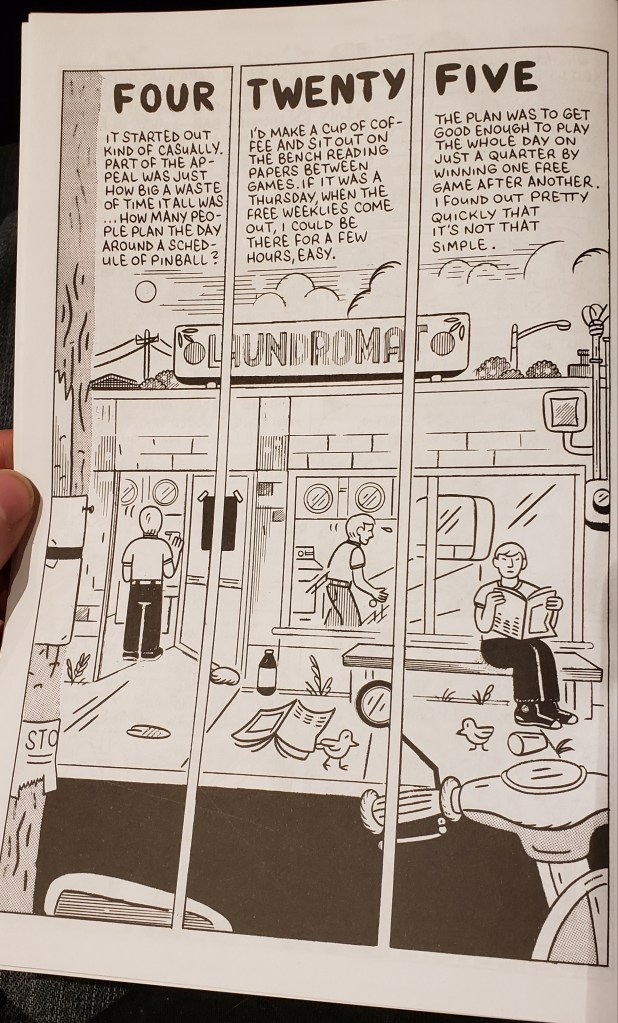
This comic provided me with a visual that there were 6 panels on the page instead of 3 by using the roof of the building to split the page. The overall scene seamed to use a good balance of cluttered trash in the street to provide the reader with the aspect that this part of the town is in shambles. Another example used was dominance the laundromat store was the dominant figure in the frame and allowed of the smaller objects to be proportioned so that the store added more interest to the reader.
The splitting of the scene into several panels of repetition of the same scene with slight adjustments allowed the reader to truly focus in on the scene had in terms of used the similar variant that Scott McCloud used where he walked across the kitchen panel in several differing frames all seemingly attached as one whole scene. This method is the moment to moment where the scene stays the same but the subject continues actions in each frame.
