
Taylor Dow uses various design elements and principles to convey a feeling of distance, curiosity, and separation in his comic Abruption.
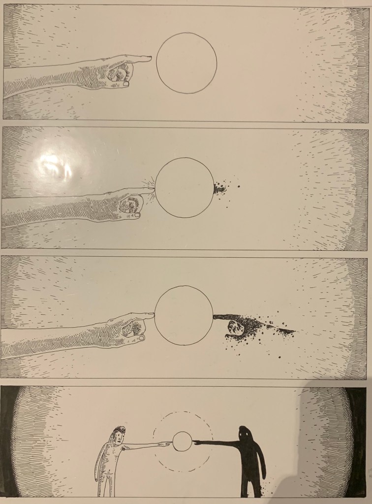
Dow uses a contrast between the darkroom and the glowing orb to make the character feel curious. The character reaches his hand out toward the orb and Dow drew a contrasting shadow over the character’s face to show the light emitting from the orb.
Dow uses contrast to show separation between the two characters in his comic and the white orb. Another character appeared when the comic character touched the orb. The characters are the same person, but one looks like a realistic character and the other is merely a shadow character. The contrast between the two characters shows the separation between them, even though they are the same person, at least shape wise.
The color in the comic is only black and white. The color is also, for the most part, solid fill or gradient. It gives the setting of this comic a very abstract feeling. This could be just a dark room or it could be a metaphor to show that the setting takes place inside the character’s mind.
The balance in the comic is really good. Some of the frames are almost entirely black, and some of the frames are entirely white. The artist did this in a way to make the comic look very visual aesthetic to the eye.
Dow uses repetition to minimize viewer misinterpretation. There are several frame sequences that have almost the same frame several times with something slowly changing. The artist does this to bring the viewer along with him on what he is trying to communicate.
Dow also uses size to make the viewer feel closer to the comic and more invested. Most of the frames are close-ups of the character’s face or hand. This brings the viewer closer to the page and more interested in the comic because the close-ups show more detail.
