
The artwork that I chose to write about is, “Undercover Grandpa” by Tom Van Deusen. The idea of a grandpa saving his head as a way to remember him was odd to me, but it made for a interesting and funny story.
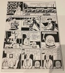
In Deusen’s work, I was able to point out elements and principles from John Lovett’s reading. Elements included line, size, texture and value. Whereas fo principles, I saw balance, gradation, repetition and contrast. There is no color in the comic, just black and white. For example, gradation and contrast stood out to me the most since Lovett didn’t use color. The tone of his ink varied since he didn’t have much color to play with while also being detailed as possible. Deusen also made a good use of texture, which can be found in multiple items (e.g. teddy bear, hair, the grandpa’s skin and much more).
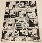
Deusen’s use of elements and principles didn’t really affect my interpretation of the story. However, it did cause me to focus more on the story and details since there was no color to pay attention to. I think it engaged me more to whats going on, instead of paying more attention to the design.
I believe the use of time frames in this comic is moment-to-moment. In the scenes, the action happened in a short amount of time. For example, detailed conversations that lasted more than five panels. There was a-lot of context given and Deusen didn’t skip out on it.
