
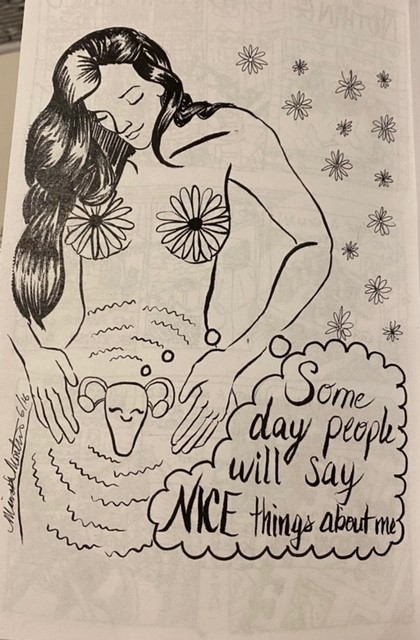
The alternative comic book that I have chosen to evaluate from the WSU Art Museum is called Sorry Sheets by Eroyn Franklin. This book is made of off several comic artists and the image I have selected is called “Dune? $44” which is by Marissa. I found this image to my liking because it is simple, yet powerful. From the elements of design, I would say this image includes mostly lines. Although I would consider this image to mostly have lines, this image also includes shapes, direction, size, and value. By including all these elements, it created a sense of inclusion, which if it didn’t, I don’t think it would have the same meaning or I would have definitely not interpreted it the same. I would say that if this image was made more realistic, it would not have as much meaning behind it, or at least not as powerful. An example would be that if it was a realistic image of a white female, it would not be as inclusive as this image already is, since its just black and white, which could make make women feel like they are not being left out. If there was also color added to the it, I would make the image feel more happy, which I think part of the meaning of this picture is that it is not content, assuming from the words chosen.
In regards to the principles of design, I don’t think it shows that many principles, besides maybe balance, a little bit of repetition, and dominance. The darkness of the hair, and the emptiness of the picture on the opposite sides show a balance between dark and light. I would also say that there is repetition in the side of thee image where the flowers are drawn, the only difference would just be the size. The waves used in the female’s body inside seem to fit mostly in the dominance principle because of the length of the waves, the size of the waves, the direction and the space in between them.
