
This is a set of panels from Apocalypse Dad by Taylor Dow. Dow uses multiple elements within his work.
In terms of elements Dow uses a very consistent line shape. All of the drawn elements are made of of these lines. With more or less lines to emphasize movement/visual contrast instead of the point size of the line being used to create contrast as well.
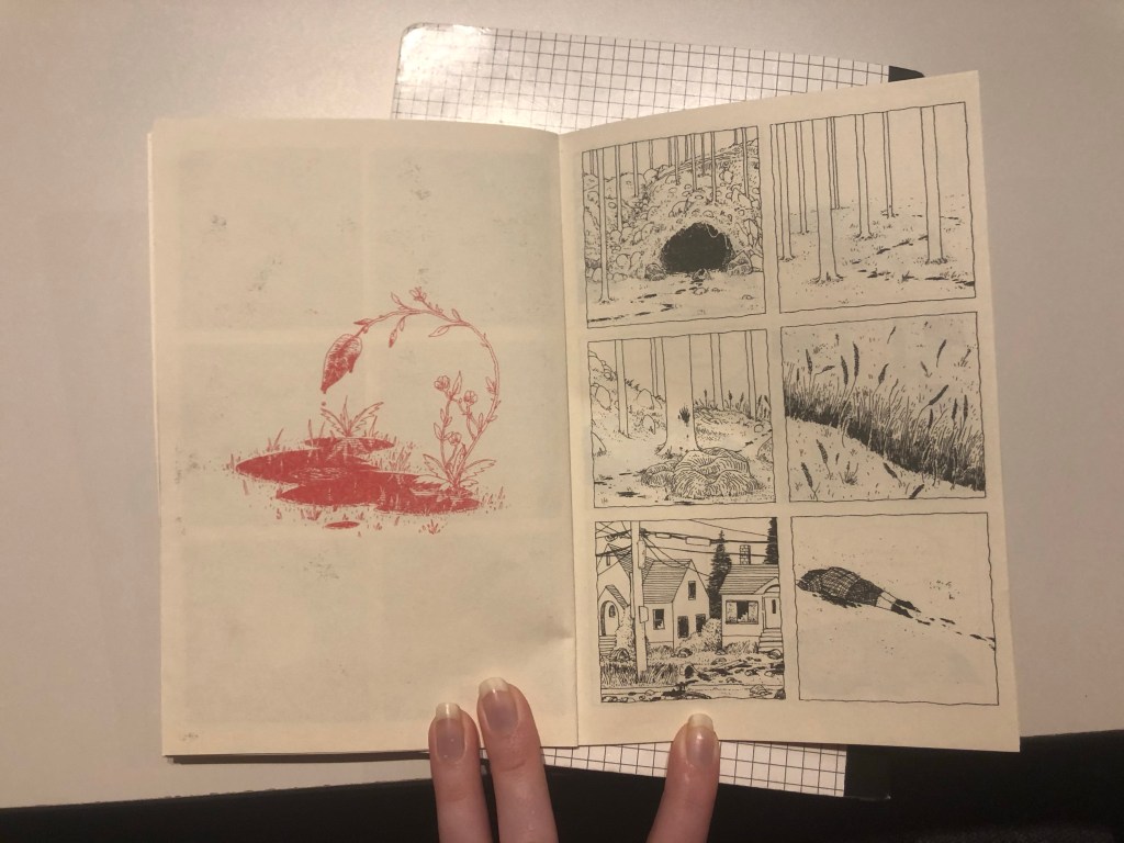
In terms of color Dow only used black and red. Red drawings fill up and entire page of their own a give foreshadowing of a kind to the following pages. Similar to chapter titles but instead drawn and red. This massive color difference I think is to leave the audience knowing what events are important/tease the reader with the foreshadowing.
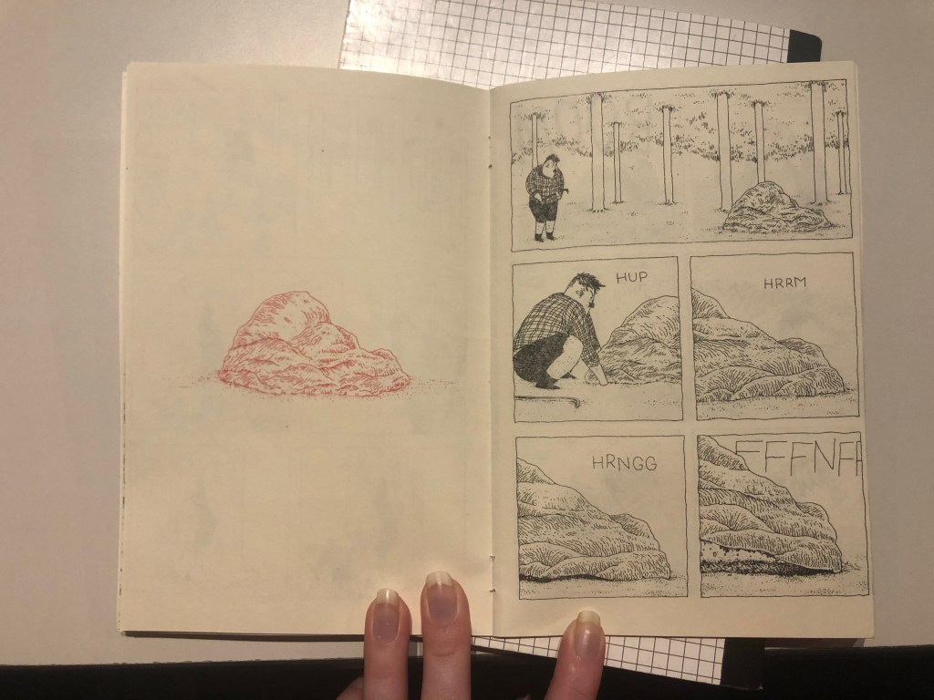
Dow uses multiple design principles in his work. Graduation is one of the most visible principles. Dow uses strokes of the same size to emphasize direction/movement within a shape, such as a rock having different irregularities in shape, and uses it to create contrast visually by moving lines closer together to create a darker appearance in some areas vs. others.

Dow uses the principle of dominance in the section of panels. Using color and size contrast to draw the audience into looking at the dripping plant. Emphasizing its impact and relationship with all the panels on the next page.
Dow uses the principle of unity on every single page and panel set. Drawn elements in a previous panels can almost always be found in the following panel. Creating a constant sense of continuity within the piece. Additionally it forces the reader to follow the comic and keeps the reader from getting lost or confused during transitions as everything readily connects to be organized chronologically. If you took apart the entire book you could easily place it back together just by following the continuity drawn into the comic.
Dow uses a lot of repetition. Through line strokes, shapes, textures, and the physically drawn elements. This idea of repetition connects to the last principle in it is one of the ways Dow so effectively uses unity. The constant repetition of drawn figures, shapes, and created textures creates a constant continuity for the reader to follow.
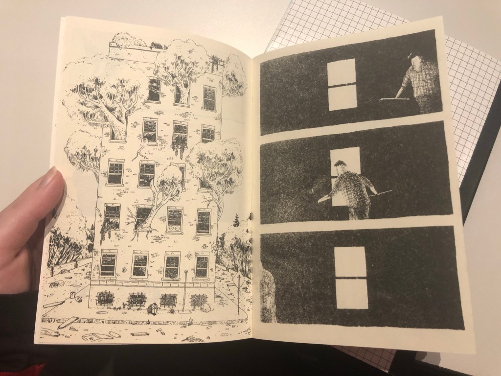
Lastly this is one of the most interesting examples of time within the book. In the panel on the right you have the dad sitting in front of the building. Immediately following on the next page the dad appears to be in a building. However you have no way of knowing if its the building shown previously or even directly after his fit of tears, as its just a black room, the dad, and a window of light.
Leaving the audience unsure of what is going on or even any true visual context of what is occurring.
