Living in Line: Sophie Dimry

Hand drawn comic by Sophie Dimry

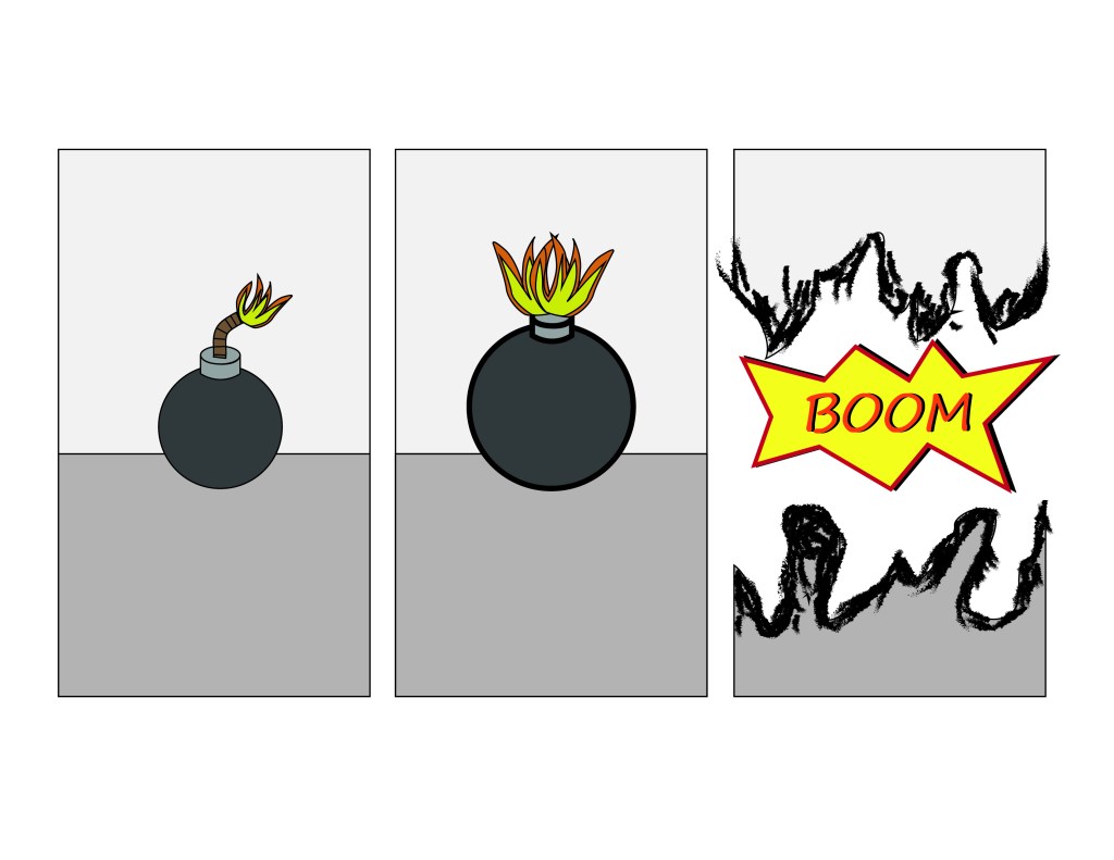
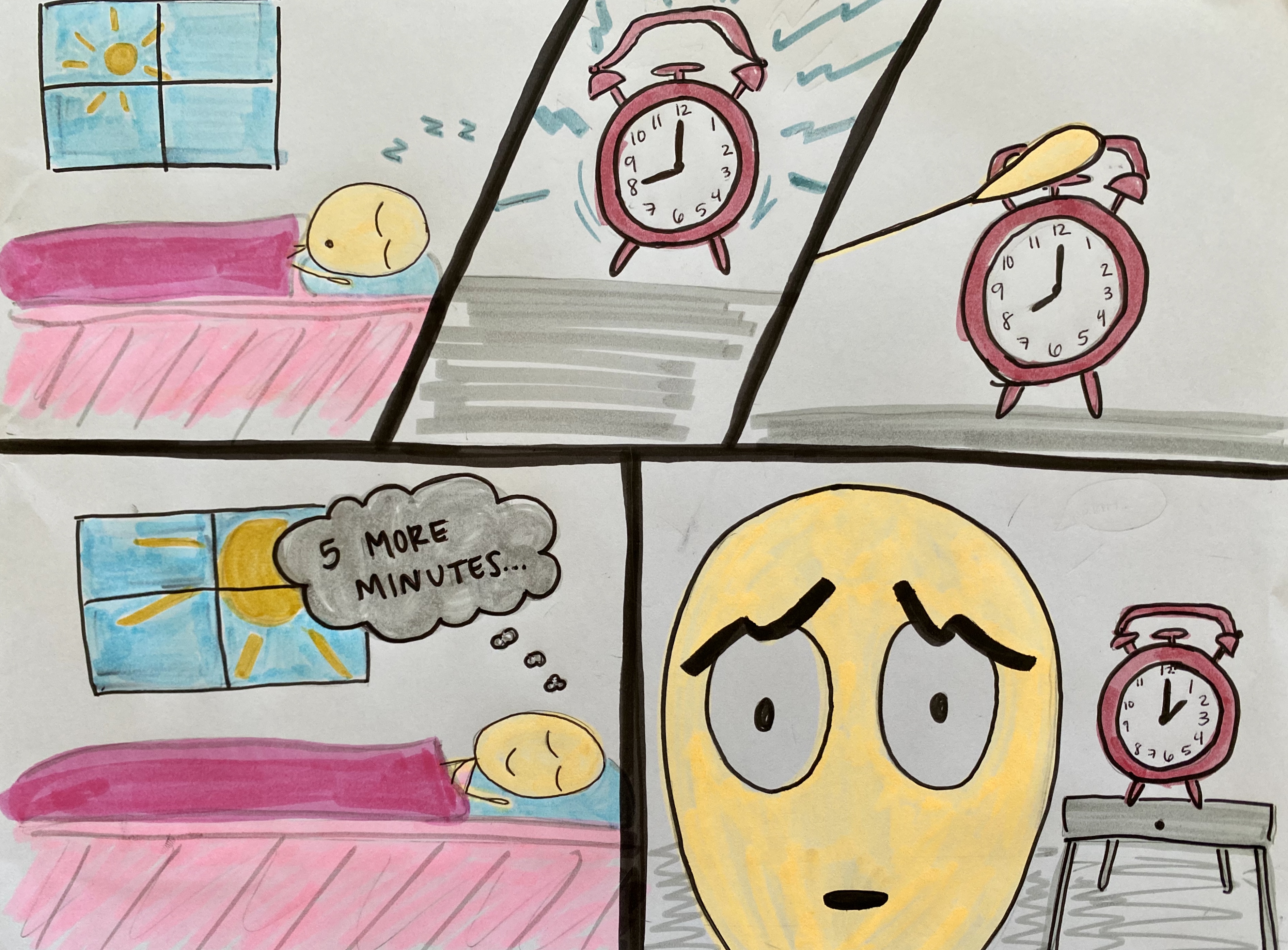
In “Chapter 5: Living in Line” from “Understanding Comics”, Scott McCloud explains the different ways that artists can convey “the invisible realm of senses and emotions” (135).  In my comic, I did this by manipulating the expressions of my main character and used different line techniques to convey noise. At the beginning of the comic, the stick figure man is peacefully sleeping when his alarm clock abruptly wakes him up in a loud, obnoxious manner. The man turns off his alarm clock and thinks to himself that he will sleep another five minutes before waking up. Suddenly he wakes up 4 hours later discovering he slept in too late and is overwhelmed with stress and panic. To show the man’s different emotions I first drew him as peacefully sleeping with Z’s above his head. The alarm clock is presented as loud because it has many chaotic lines drawn coming off of it in all directions. The alarm clock can also be perceived as moving because there are lines along the sides of it to suggest movement. The windows in the background also indicate the idea of time passing by as the sun starts off small and not as high in the sky then when it is in the afternoon once he finally wakes up. Finally, in the last panel I conveyed the sense of anxiety and panic through the expression of the man’s face an dry showing the time on the alarm clock in the background. The man’s eyebrows are contorted, his pupils are small, and his mouth is small. These all suggest that the man knows he messed up and over slept because he seems to be in a state of distress.

I chose to draw this series of events because I feel as though everyone can relate to it. I chose the medium of drawing and used markers as my tools. I like using markers because I feel like I have more control and I like using lots of color. I tried to use a couple of techniques to play with time in this comic. I used the idea of the sun through the window in the background as a subtle hint that time has been passing. I also explicitly gave the time on the alarm clock each time to see that 4 hours had passed.

Posted in 201 Blog, Living in Line | Leave a comment

Living in the line: Mitchell Delmage

In my comic, I wanted to convey a lot of craziness. I used a lot of crazy shapes overlapping each other to give the emotion of adrenaline. I used a lot of straight lines to show the character going full speed down a hill. I used text bubbles so the character could talk. I used a light bulb to show the sense of the character having an idea. I also used exclamation points and little lines to show the characters emotion right before the jump. I also put my panels all over the place because that is what it feels like to be flipping through the air. The panels, even though they seem like they are in a random order, your eye is supposed to follow him flipping through the air. For my comic I used some old action figure with a skateboard I found in an old box. I used paper and my drawing ability for the background. The hard part was getting the lighting right because I did not want shadows all over the paper. I used three different light sources to fix this problem. I made one of the panels really big and that panel was when my character was racing down the hill. I wanted to show that it took more time than the rest of the story. I wanted to show he was going down a really big hill and picking up lots of speed. The closure that takes place is when my character goes up in the air. The viewer never sees him land the trick. So there is no closure for the viewer. They have to assume what happens. I really enjoyed making the comic. It was cool using real figures with paper and pen. It makes for a very interesting visual.

Posted in 201 Blog, Living in Line, Sample Posts by Students | Leave a comment

Weekly Blog: “Living in Line” Diana Alonso

Hand drawn comic by Diana Alonso

For this weeks blog, we had to come up with a comic that used some of the ideas provided in Chapter 5 form “Understanding Comics” and/or from previous chapters read. Although I used some ideas from previous chapters, most of the ideas that I used were from chapter 5.

The background story behind my comic is about a mother and a daughter having a conversation about the daughter being able to go out or not. I was inspired to make my comic about this topic due to the current issues happening right now with the Corona Virus. For me, this comic is supposed to be funny, although the emotions shown on the comic show emotions pointing towards excitement, but mostly drawn into sadness, stress, disappointment and/or angry.

In the top image, I would say that the daughter looks very excited at first when she is asking the question ” Can I finally go out”, maybe expecting her mother’s answer to be yes, but then after the response she received from her mother, which was “No”, you can tell in her face on the image below that she immediately changes her mood from happy or excited, to sad and disappointment.

The tools that I used in my comic were a blue piece of paper and a pencil. The reason I chose to use a blue piece of paper was to show the overall feeling in this comic which was sadness. The pencil helped me show the importance of the emotions in the face expressions from the mother and daughter. I used a darker shade in the areas from the face where you are able to see the emotions the most, like the eyebrows and eyes. Something that also helped show emotion was the use of words. When the mother replies with “No”, I added an exclamation mark to show kind of the type of response that she was giving, which I would saw was annoyed or upset.

Posted in 201 Blog, Living in Line | Leave a comment

Living in Line: Daniel Blanchard

For the week 13 comic strip I decided to use a little bit of my imagination. for the story of the comic, I wanted to have something that showed emotions in other ways than words. So for this strip, I added curved lines around the body of the lady corn dog in order to show her shaking with fear. I also changed the expressions on the face from smiles to frowns, this shows some discomfort with the situation at hand. for the characters I used adobe Illustrator to make them, and the rest was put together in Photoshop. Using the Illustrator program I was able to make characters like the “demon dog which looks scary, while also being able to create figures that represent living corn dogs.

For the Closures that are taking place between the panels, there is a curiosity of what happens next as the demon dog approaches closer in each frame. As for time within the comic I believe i displayed it fairly well, hoping that the viewer basses the time off the travel of the demon dog inching closer to the couple.

Posted in 201 Blog, Living in Line, Uncategorized | Leave a comment

Weekly Blog: Living In Line: Anh Ngo

In Chapter 5: Living in Line, from Steve McCloud’s Understanding Coming, McCloud discussed the idea of how visibility/invisibility of lines helps portray emotions and effects within art. After learning that, I wanted to play with emotions within my comic using lines but also using the zooming in the effect of a panel to create a more dramatic feel to the story. The emotion that I wanted to portray is concentration, disappointment, shock, and confidence.


With Illustrator, I created a story of four friends playing an online game of Goldfish. I used the pen tool to create the outlines and detailing of each character and object. I then used the gradient tool to add some 3-D effect to the character’s hair as well as the blue background of the second to the last panel, indicating shocked. To create that tinted effect differentiate a computer screen with the “real-world”, I used the image transparency tool. For the screen, I used the line tool to add some “screen-glare” effect onto the screen. Using the basic shape tool, I was able to create some square and rectangular panels where I used the clipping mask to crop out the unwanted part of my character without having to crop out the image.

May the Best Win by Anh Ngo


In this comic, you start with the four eyes panels. By making the color of the background vibrant along with the thick line borders, the viewer’s eyes would see that as the focal point, thus cueing a signal saying that this is the first panel. Rather than making the panels all 90 degrees rectangles, I wanted to angel the lines that separate the eyes to create an invisible effect that tells the readers that this is a serious and “uneasy” game. I also used the 3-D effect on the card table and mouse pad to angle them to create a somewhat realistic 3-D effect.


Moving along to the next panels, the text bubble can be seen going through the back of the female’s character’s head. This indicates that the person that green headphones are talking to is this female character and that although he is out of frame in the next panel, the readers can tell that he is still talking. Because the text bubbles are all touching the panels next to it, it juxtaposes on how all of these five panels are happening right after the other.


To create a different expression, I angled the eyebrows and mouth while adding extra lines in between the eyebrows to show when the character is either disappointed, confident, or in total concentration.


Because this is a game, rather than creating a real ending to the story, I wanted to make it feel like the comic is continuing by placing the panels in a way that surrounds the title. This creates circular motion, implying the continuum of the game.

Posted in Living in Line, Sample Posts by Students | Leave a comment

Weekly Blog: Living in Line: Ivan Franco

Weekly Comic 1 Living in Line, Ivan Franco, Illustrator.

With this comic I wanted to do a simple story that had a satisfying twist at the end. For this comic nothing much happens except the bomb exploding. But in the third panel I wanted to subvert expectations and have the bomb explode the panel. exploding the panel adds a new layer to the comic and explores the line work that the comic focuses on.

First, the bomb is a simple cartoon and the spark is already lit. But as the bomb anticipates the explosion, the stroke and line of the bomb becomes thicker and larger, showing the exaggeration of the build up.

Secondly, the final panel is destroyed and shows that the bomb does even more damage than anticipated. I used this have more room to experiment with the concept of line. I used a rough looking brush to show the burn damage on the panel and not just a broken panel.

For this comic I used Adobe Illustrator, I used the letter print for web and online format. All of the layers are done digitally, but a pre-visual was drawn to give me an idea of where to draw and reference.

Posted in 201 Blog, Living in Line | Leave a comment

Weekly Comic: Living in Line: Henry Igwala

For blog I have decided to create some type of abstract comic to display emotions using lines and contrast. The emotions that I wanted to convey invisibly were happiness and sadness. I wanted to tell a story of how people may seem happy at first but you never really know what’s going on inside.

The technique I used was to create two opposite faces with one line. This created the illusion that there is only one face until you turn the comic upside down, then you will see the opposite emotion. The nature of my tools helped greatly with my image quality. I used Illustrator which is a great tool to use when you want to create anything with lines. What I noticed using digital is that it is harder to draw something you want very specifically compared to free hand drawing, but with digital you can create a lot more detail.

Closure is taken place in my image when you see the dots and lines and create a face out of those few shapes and lines. I don’t really work inventively with time in this comic because there is not really a motion of time in my comic.

Weekly comic created on Illustrator by Henry Igwala
Posted in 201 Blog, Living in Line | Leave a comment

Weekly Blog: Show and Tell: Luis Trejo

Week 14 Comic By Luis Trejo

For this week’s comic, I wanted to create something that I have never attempted before and wanted to use words to help paint the picture of each panel. I did this by using the type tool, changed the fill color, and made many copies of the words until it filled the object. The one word-picture combination that I was shooting for that was in McCloud’s book is the montage combination. Therefore, I wanted to use words and color to help describe what the reader is looking at instead of the usual coloring that we are used to seeing. I found that after adding all the words to the background, the whole panel became crammed and maybe a bit too crowded, it has a unique look compared to other comics that I have made before.

I used Adobe Illustrator to create the comic this week. I wanted to create a story line that was not too complex because I found that all the words can be distracting, and I did not want to add a complex story line that just adds to the confusion. I enjoy the final product and find that the lines and words work well together in the way that I combined them. Because I was working with Adobe Illustrator, one thing that I observed is that creating the montage combination with the words and the picture was easy to create because of the copy and paste tools, they are all the same size. I do not think the visual wood look as good on paper because there is no way of copying and pasting with paper and pencil so the words would all look different from one another. The words are also behind the lines throughout the comic, something that would be hard to do when working with paper and pencil.

Posted in 201 Blog, Show and Tell | Leave a comment

Living in Line: Daylon Hicks

My strategy for my Week 13 comic is to correlate my ideas for the comic and Scott McCloud idea of “the invisible realm of senses and emotions.” The emotions that I want to convey in this comic will be about anger and confused because of the coronavirus. My idea for this comic is feature me but dealing with the coronavirus. In the end, I want the message to display on how to stay inside and how I am confused and frustrated on how to stay inside.  Due to struggles with accessing Photoshop, I would like to use the hands-on method. I believe I can just use crayons and outside resources like leaves. It would be easier that way and I can also convey to the audience what the comic means.  The word “INSIDE” shows how there is confusedness and anger because of the crazy shapes and colors that show how confused life is right now for everyone. The crazy red, blue, and purple lines represent the chaotic energy from being inside and how the mind can possibly lose sanity because of being inside for so long. The circle at the bottom represent the actual disease for COVID-19 and how it represents the devil because it is taking people lives. The anger face at the bottom left represents people’s reaction to stay inside and their plans being ruined. People staying inside for a long people of time is not normal.

Posted in 201 Blog, Living in Line | Leave a comment

Weekly Blog: Living in Line: Ben Apostol

My comic that is representative of the lessons learned in “Living in Line” was inspired by some of the descriptions given within the chapter. Since I needed to incorporate emotion into my comic, I wanted to give a whole spectrum as you continue through the panels. My comic is oriented in ta way that going from left to right you start to see the changes in the tone of the scene subtly at first, but at the end reaching the other side of the spectrum from the happy scene that you first start off in. I like to let the meaning of the comic be derived from the reader, and let them interpret the emotions of the shapes and colors themselves, looking closely at the differences in each slide. Although there are a lot of things that I could not figure out how to add to the scene, I think that the basic format of steady changing that I put into the slides does the same job in showing the change in mood as you continue. One thing that I did to effect mood is to add and take away different elements from the scene. This helps give a physical difference to each of the panels, and by taking away certain elements you get a change in not only the image itself, but the value in what was taken away and what that means. Coming to end of the panels, you see that nearly all the points of interest have been altered in one form or another, and sometimes even completely reshaped. Perhaps the biggest changes between each of the slides is the color scheme. I went for a more vibrant scene in the beginning with bright blues and vibrant greens to a more pastel and dulled look towards the middle two slides. And finally at the end the color scheme went to a sporadic and edgy style to complete the final changes in the theme. Combining the idea of the shapes and colors that were implemented in panels, you first start off with a very calming and bright set of colors and shapes. I wanted to put a little extra emphasis in the very beginning so the changes would be recognizable and meaningful even in the very next slide, but also the grand scheme of the comic. Along with the lines that were changed throughout the comic, I used texturing to really drive home the unsettling and more anxious look of the final slide. It leaves a lot to question and interpretation at the very end making the scene look unnatural, as opposed to the other three slides, and I did this on purpose. It does not cleanly represent the nature filled scene of the very first slide and I did this to completely change the dynamic of emotions at the end, switching the mood entirely. While trying to give my comic closure, it becomes more apparent in the end slides as there is less individual elements to focus on, and instead becomes a grouping of shapes and colors that you must take in as a whole to understand the theme change. The best ways that my comic shows closure is the elements of the color pallet changes. Because there are multiple changes in shapes and orientation, overall looking at each individual panel as opposed to the last, the most recognizable use of closure is that each scene gets darker. Overall, the comic is supposed to leave you with your own interpretation of the imagery and scene changes, and takes you through a spectrum of emotions showing the progression of inevitable change.

Posted in 201 Blog, Living in Line | Leave a comment