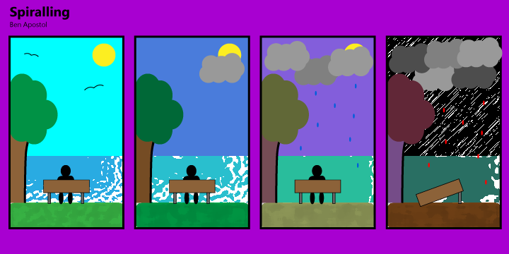
My comic that is representative of the lessons learned in “Living in Line” was inspired by some of the descriptions given within the chapter. Since I needed to incorporate emotion into my comic, I wanted to give a whole spectrum as you continue through the panels. My comic is oriented in ta way that going from left to right you start to see the changes in the tone of the scene subtly at first, but at the end reaching the other side of the spectrum from the happy scene that you first start off in. I like to let the meaning of the comic be derived from the reader, and let them interpret the emotions of the shapes and colors themselves, looking closely at the differences in each slide. Although there are a lot of things that I could not figure out how to add to the scene, I think that the basic format of steady changing that I put into the slides does the same job in showing the change in mood as you continue. One thing that I did to effect mood is to add and take away different elements from the scene. This helps give a physical difference to each of the panels, and by taking away certain elements you get a change in not only the image itself, but the value in what was taken away and what that means. Coming to end of the panels, you see that nearly all the points of interest have been altered in one form or another, and sometimes even completely reshaped. Perhaps the biggest changes between each of the slides is the color scheme. I went for a more vibrant scene in the beginning with bright blues and vibrant greens to a more pastel and dulled look towards the middle two slides. And finally at the end the color scheme went to a sporadic and edgy style to complete the final changes in the theme. Combining the idea of the shapes and colors that were implemented in panels, you first start off with a very calming and bright set of colors and shapes. I wanted to put a little extra emphasis in the very beginning so the changes would be recognizable and meaningful even in the very next slide, but also the grand scheme of the comic. Along with the lines that were changed throughout the comic, I used texturing to really drive home the unsettling and more anxious look of the final slide. It leaves a lot to question and interpretation at the very end making the scene look unnatural, as opposed to the other three slides, and I did this on purpose. It does not cleanly represent the nature filled scene of the very first slide and I did this to completely change the dynamic of emotions at the end, switching the mood entirely. While trying to give my comic closure, it becomes more apparent in the end slides as there is less individual elements to focus on, and instead becomes a grouping of shapes and colors that you must take in as a whole to understand the theme change. The best ways that my comic shows closure is the elements of the color pallet changes. Because there are multiple changes in shapes and orientation, overall looking at each individual panel as opposed to the last, the most recognizable use of closure is that each scene gets darker. Overall, the comic is supposed to leave you with your own interpretation of the imagery and scene changes, and takes you through a spectrum of emotions showing the progression of inevitable change.