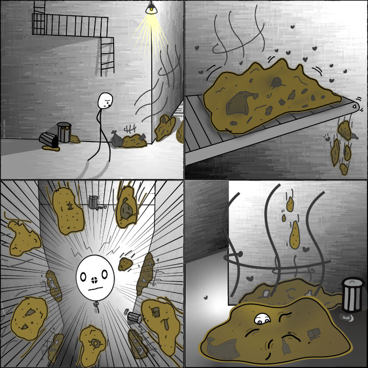
What I was hoping to convey in my comic for the normally invisible senses is that of the “rank” lines to convey the smell of the trash. The invisible emotion that I was hoping to convey was that of surprise and shock with the zigzag above the figure’s head and straight spike lines that radiate inward. The tools that I used were called ibisPaint X this allowed for my art to be made with sharper lines, use precision curves and symmetry when needed. This method allowed me to use the software to create the invisible emotion of shock and surprise, as well as using the stabilizer to allow for smoother curves to better display the stink lines over the garbage and trash. The other observations about the tools and techniques that I used this week for the comic were a mix of both experimental as well as ones that I have used before previously. The technique that most intrigued me that I used in the comic was the except that I achieved for the Shadows mixed with the texture I used to make the wall. I use the combination of gradient tools such as parallel gradation and conical gradation. I was also able to contain a grasp of where my light source should have appeared from which I have not really been able to do in Pryor works but I believe that it came out quite well and this particular one my thoughts are that it was probably due to the fact that it was a light fixture rather than the Sun. The sheering crosshatch and sheering lines were able to allow for a very good brickwork rendition and I will definitely use this in the future for aesthetics. Another technique that I used was the implication of speed lines indicating the motion of an object for the trash that was falling down from the conveyor belt on to the figure. as well as the motion of moving objects in a mechanical way such as “ shaking” or “vibrating” with curved lines around the object to indicate this. Another new technique that I used was that of the radiating spikes to convey the figures shocked expression that displays and it was caught off guard. The types of closure that are taking place between the panels of my comic are the aspect-to-aspect and subject-to-subject.
The graphic novel that I read was “Wings of Fire: The Dragonet Prophecy” by Tui T. Sutherland. Wings of Fire: The Dragonet Prophecy is about the life of Clay a mudwing dragon and his other dragon friends who have grown up under a mountain, being secretly raised by the Talons of Peace an organization that hoped to have them fulfill a prophecy. The five young dragons go on to travel all over their continent. The group of dragons is also destined to end the war that’s been raging between the tribes of Pyrrhia. This ends up to be quite the danger bringer as they were constantly being hunted by those who want to see the war last forever. I enjoyed the novel as it was very interesting and suspenseful as well.
Subjective motion of pearl (yellow) indicating a fast approach to clay(red). (Tui T. Sutherland, Wings of Fire: The Dragonet Prophecy, 2018, pg 160)
The artwork in Wings of Fire: The Dragonet Prophecy is cartoonish and colorful. I think the purpose for this is to make it more relatable for the audience’s original take on the original series. For example, in Scott McCloud’s “Understanding Comics,” he mentions that people can relate more to the story when the artwork is simple and not too complex. Along with this, however, there were times of higher detail that the artist included to draw in the reader’s attention to take in the landscape in its entirety and appreciate it. This was a good example of how McCloud talked about the speed at which a story can be told.
In Scott McCloud’s “Living in Line” chapter, The Wings of Fire: The Dragonet Prophecy used lines to depict the emotion and tone of the “frames.” For example, there was a scene where the author conveyed anger/savage for an assassin attacking the group of dragons with dirty quick strokes to outline them. I also noticed that In the novel the characters that were the smarter ones had more pronounced and sharper line features. Another thing I noticed was that they had used subjective motion lines to portray the speed at which the character was moving.
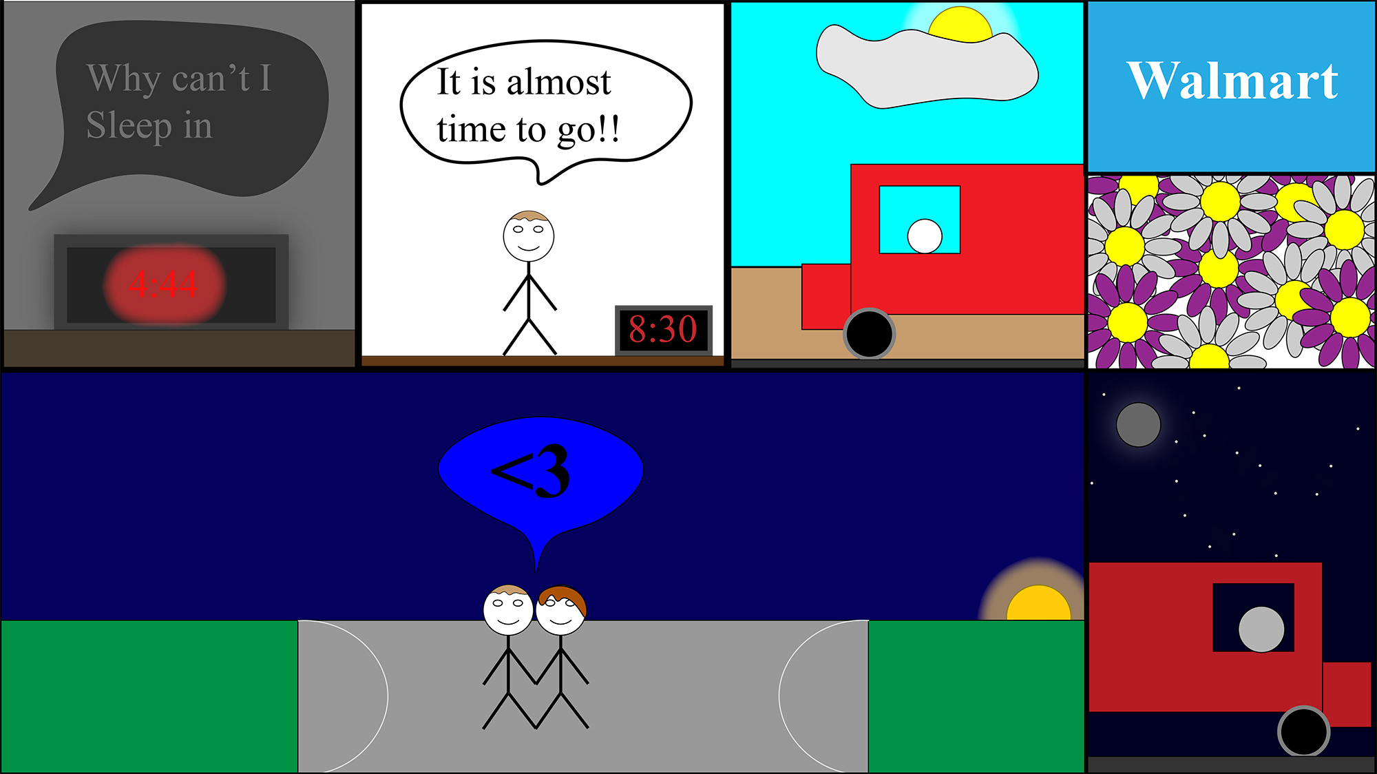
For my last comic I decided to make something more personal to myself. The purpose of my comic this week is to show about the day I met my girlfriend in real life. The reason why it is more personal to me than my other comics is because the other weekly comics I made I would do every single day but for this weekly comic I have only done once before. This was also an important day because I met her family at the same time, so it was important to make a good first impression.
The structure of my comic starts in the morning where I woke up at 4:44. The reason why this is important to know is because before this day for the past week I could not sleep much and was hopping I could sleep that night. The second frame is just me waiting to leave to go to her house to meet her. The third and fourth frame is to show that I bought her flowers. This was important because I wanted to make a good first impression with her and her family and apparently it was a good idea because I was the first person to buy her flowers. The fifth frame I decided to make longer to show that more time has passed, and I also made the sun move to show that it has been almost all day. The reason why this is important is because it showed that I spent all day hanging out with her. The last frame is me going home. I also changed it to nighttime in the last frame because I got drove home at nighttime by my cousin.
The form of my comic this week is pretty simple like my last ones in previous weeks. Something that I did differently this week is by adding more frames than before and even making two frames within the same which I have not done before. I also used illustrator to craft my comic this semester like the last comics I made for the weekly comics. The surface of my comic is smooth.
The reason why this comic was more ambitious than the other weeks is because I used more frame and worked on using all the things I have learned to use in illustrator. I worked on making the sun and moon look like they are glowing to make it seem a little realistic even though I only worked with basic shapes. I also worked on making the clock glow to show light. I also worked on changed the shapes by using the curvature tool to add more points. You can see where I used this tool in the hair of my two characters, the cloud I made, and the text boxes. I also worked on changing the lighting throughout the comic unlike the other comics I made. You can see that it starts out in the dark and goes to light and then goes back to being dark.
This comic was my favorite of all of the ones we have created so far! I was a little bit nervous trying to tackle something that was so large, but I ended up learning a lot about illustrator and I feel like it turned out really well.
I was really inspired by the comic prompt and Scott McCloud when he said “no other human being can ever know what it’s like to be you from the inside,” (McCloud, 194). I think this is a sentiment that we all struggle with constantly because it is incredibly lonely to think that you are alone in your head. I think that people are all incredibly different but also the same. That’s why when we are able to relate to characters in books and fall in love with movie characters. Getting to know someone is opening your heart to them and loving them. This is why I made my comic the way that I did. I thought it would be interesting to showcase the things that are most important to me. These are the things that have truly shaped who I am as a person.
The four aspects of myself that I think are essential to who I am are traveling, reading/books, my faith, and baking (which usually happens with my best friend). This is what makes up the first of McCloud’s steps, which is the idea. I wanted to create a comic that showcased how I became who I am, hopefully giving the viewer something to relate to in some way.
The second step that McCloud lists is form. Obviously for this assignment, I had to create a comic, but I took a little bit more liberty with the way that my comic was structured. First, I had the title in the middle, with cursive writing, stating “My Core Self.” I tried to pick a font as close to my own handwriting as possible. I think that this writing makes the comic understandable. I then had four different panels that are not related to each other (which is why the title is necessary). I tried to size the panels so that the things that have changed me the most are bigger. The plane is the biggest because I have found so much of myself in seeing other places and experiencing other people. The church is the next biggest because it is the most steady aspect of my personality. I have always been strong in my faith because it has always been there for me to lean into. The books on the table are the next largest because books have provided an escape throughout my whole life. Whenever I wasn’t able to travel, I turned to books to teach me about other places and things. Finally, baking is the last panel. My best friend and I started baking together in seventh grade, and it has become a core part of our friendship. Whenever one of us is going through something, the other will show up with a treat. This has helped baking become an important part of me and makes me feel calmer.
The next step was idiom. This was a little harder for me to categorize but since McCloud says that this step contains the “genre” of the comic, I would say that this is nonfiction. This is a comic about myself and my experiences, which have all happened.
The next step is structure. I kind of covered some of this information while talking about the form of the comic. The biggest aspect of this was the size of the panels, which helps indicate their importance. This step also talks about what got left out. I was purposeful in deciding that I didn’t want to include captions with each of the panels. I think that if I had explained each individual panel, it would take away some of the ability for the comic reader to just relate to specific parts of my story.
The next step that McCloud discusses is craft. This comic definitely pushed my abilities as a creator and forced me to get really creative solving different problems in illustrator. I used a variety of tools that I had not practiced with before (such as the scissor tool, the pen tool, adding points, adding textures, etc) that allowed me to get different looks with the different panels. I made each panel look totally different mostly because I wanted to try out a variety of visual types. The airplane was the most minimalist, so I tried to make the shape really reflect that of a plane. I did this by playing around with all of the anchor points and learning how to create shapes that I didn’t previously know how to create. The cupcake was fun because it allowed me to play with adding a lot of different shapes and colors and shadows together. This helped me get a “logo” like look. The books were fun to create because they forced me to play around with sizing and shading a lot. I struggled to get the exact correct line curve but I still think they turned out pretty well. Finally the church, which definitely took the longest time. It took me forever to build the actually building because I had to play with the size and shape of every single aspect. I built a lot of separate shapes that I then joined together for this one. The windows were also really hard. I had to learn how to add different colors to one shape and then practiced with the gradient tool, to give them the stained glass look. Overall, the different aspects of the comic challenged me in different ways and forced me to utilize a lot of the different skills we have learned over the semester.
The final step is the surface step. I think if someone just glanced at my comic they would be able to understand the basic idea that the content of the four panels makes up who I am. They probably wouldn’t notice the small details but they would still be able to grasp the basic idea.
This comic was definitely more ambitious than my other two comics. First, this comic took me about 15 hours to complete because I worked really hard on getting the small details of every single panel to look good. This detail work forced me to get more comfortable with the illustrator interface and practice a lot of things I had not previously known how to do. I think that this pushed me to also go deeper in my understanding of what a comic is. Instead of telling the story of a single moment, I am telling the whole story of myself. This just makes the comic more true to who I am and how I create. Overall, I am the most proud of this comic because of how it pushed me and the skills it forced me to learn.
Diana Alonso “Putting it all Together” Comic May 2020
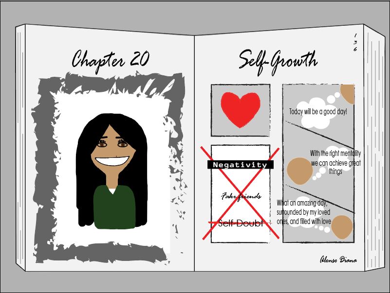
For this weeks final weekly comic, I chose my comic’s topic to be “Self-growth”. The reason why I decided to chose this topic was because throughout my life I felt like I was stuck with being the same person as always, with the same mentality as always and I felt like I was still the same immature girl as always. Recently with the pandemic going on, I have discovered a lot of different changes in how I think and how I view different ideas and changes I’ve made. One example is how I have always found something about myself that I didn’t like, or listened at what other people have told me that they didn’t like about me, and all I did was feel sorry for myself, my during this quarantine I have started to learn how to love myself and how to remove toxic people from my life. I have grown to accept my flaws and how to love myself regardless of what other things. I have also learned that I am not perfect and if there is something that I can change to become the best version of myself I can always change regardless of how long it takes me.
I chose the theme of my comic to be close to like a book. The reason I chose this was because I see my life to be like a story, and I am the writer and main character. The reason behind the “Chapter 20” is to indicate how I am currently in chapter 20 in my life, or in other words, I am currently 20-years-old. The reason I chose my page number to be “136” is because according to Google, I am 20-years-old and 136 days (as of today). I would consider this chapter in my life to be the stage of “self- growth”, and in the bottom right corner I wrote my name because that would be what the book would be called. The reason why I left the face blank on the second page on my comic was to be inclusive in the sense that anyone can be going through this stage as well. I also decided to make it look like there are a lot of pages left, indicating how there is still a long way for me to go.
On the three boxes I added things that are important in my life at the moment, like self-love, getting rid of things that may be toxic, or how I can change many things, like the way I think, in order for me to be happy. The image on the left would be a self-portrait indicating how I am the main focus of this chapter in my life.
On Illustrator, I used a lot of tools that included: Brush tool, lazzo tool, shape tool, pencil, shape builder tool, curvature tool, paintbrush, and the rotation tool. I also used text, color, and facial expressions to add feeling of happiness to my comic.
I think this has been the most ambitious comic I’ve created because it shows how much effort I have put compared to the others, and I feel like I added a lot of hidden details that many may not have known if it wouldn’t have this description. I can also say that I have spent more than half the time working on this comic than the last two. Lastly, I hope that my comic showed my viewers an insight of who I am right at the moment and what my aspirations in life are right now.
For my final comic I was inspired by some recent quarantine haircuts I’ve been seeing online. Sometimes people have been absolutely shredding their hair just because they won’t be seeing any other people which is funny to me. One of the best examples of this trend is the family bowl cut, where someone puts a bowl on their head and just ruins the top of their head.
What I was trying to express with my comic was not only the universal bad feeling from getting a bad haircut, but a bowl cut in general has just a nasty reputation that I’m trying to replicate in all my frames of this comic. It started out with my idea based on a youtuber/streamer that I follow who recently gave himself a bowl cut on stream and it was absolutely hilarious.
The second step, form, I decided that I wanted to make my comic focus on the people themselves and obviously the hair. So the hair and the bowl are always the biggest things in the frame and attempt to draw the most focus when looking at it. For the idiom I wanted it to be taken very literal, what the characters say is what happens. On structure I wanted to try some more unique shapes for panels such that I could make some more interesting perspectives for the story of the comic. I like how the middle long skinny strip turned out with all the hair flowing away from the main character of the strip. As for the craft, I was using illustrator of course, and in this comic I played with the line and brush tool a lot. The line tool was great for making the arms curve a little bit more, and the brush was great for making the hair a little messier than just a bunch of rectangles or ovals.
In order to make myself a bigger challenge this week and make my comic more ambitious I decided to add a lot more frames than my usual weekly comics. The process for the last couple weeks was only 3 panels. By adding over twice the amount of panels I really struggled with finding a place for each part of the story. You can see in the final product that I didn’t do as well as I thought I would by making a title and a “the end” panel at the end but I’m still proud that I made something longer than just three panels. That’s mainly what I focused on for making a more advanced or ambitious comic, was challenging myself to make a longer comic. I also worked more with the pen tool than I usually do because I’m scared of it. The tools in illustrator really do take a lot of getting used too but I can really see the power of things as simple as the pen tool when I could actually add decent elbows on the stick figures. I was also proud of my title card, making the O a bowl was pretty clever right? Anyway, that’s probably all I have to say about this comic, good challenge and growth for my illustrator skills.
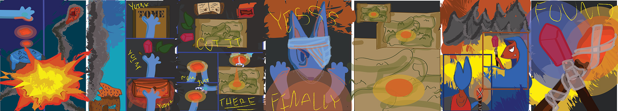
This comic was actually supposed to be a semester-long saga about this character i made at the beginning. I wanted to involve little pieces of the story throughout, but I didn’t end up doing it. I story boarded and wrote the story a while ago, about a cat character in a DnD like world that is trying to find the body of a dead spouse, left with only a finger. The cat becomes a necromancer and has trials to get to their goal. when they finally do find the spouse, it is found that they were the villain of the story the whole time, and had been trying to get the cat off of their trail. The last panel is meant to be ambiguous, a question of whether they made up or are fighting.
To get this together I took all of what I wrote for the story this semester and condensed it down to something I could plausibly do with my coronavirus-addled mind. I took at least 2 panels from each part I wanted to include and drafted it. I then took to Illustrator to put it on the page. I had some issue with my structure, although I had this all planned on paper and in my head the platform held me back a little. I looked up the tutorials and worked to make it look nicer, but it was still hard for me.
Another issue I had with structure was that I originally planned to include flash animation with the comic, especially in any glowing or explosion part. I grabbed inspiration from many different sources, including Home stuck, Night in the Woods, Sally Face, and Hollow Knight. These had cool animation/ color schemes that I wanted to include. All of my inspirations made this what it was, and brought the concept together.
The actual drawing in Illustrator, however, took about 8 hours alone because I am not the most well-versed in the platform. After that I was too burnt out to look into it, but I might work on it further to get my image in.
I tried to think about my comic compositions and panel choices, I like the look of panels that bleed together, like in the second to last page. The background is a part of all the panels. This comic is undeniably me because it involves many of my interests over the years brought together, it has my unique story and thoughts, and my coloring and composition as well.
This was definitely more ambitious then my last comics, I found some inspiration to do something and latched onto it. It was a good reprieve to do this.
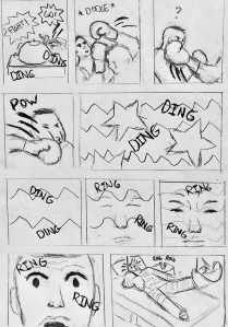
For my final comic, I chose to show how life has been feeling lately through a comic around boxing. In the comic the main character is boxing their opponent. As soon as the bell is rung, the opponent goes in for the first swing. The main character is quick enough to dodge the first hit but to their surprise they didn’t notice the second one coming right after. He get hit right in the face knocking him out cold into a coma. The bell is rung again to signal that a winner was decided. Throughout the coma the ringing starts to shift into an alarm. When he becomes conscious again, to his surprise, he finds himself in an emergency room.
The reason why I feel that this is my most ambitious comic out of the others is because I have never done a fight scene before and I wanted to attempt to have more action in this one. It is a challenge for me to draw in such dynamic perspectives so I thought I should switch it up a little for my final comic. I also made this one slightly longer than my other ones because I also attempted to include almost everything I learned from Scott McClouds “Understanding Comics”. I tried to include different types of closure such as action-to-action with the fight scenes as well as scene-to-scene as it switches to the hospital room in order to show time has gone by. From the living in line section I brought in some inspiration from that by giving the movement of the fists some speed through the use of thick to thin lines. Also throughout the coma the jagged line shift to more smoother ones to indicate that he is coming back. And from the show and tell section I tried to utilize the sound of ringing and dinging throughout the scenes to indicate a shift in time.
Throughout the creation of this comic, I was able to follow through the 6 steps that Scott McCloud discussed in chapter seven. For the idea/purpose, I wanted to express myself and how life has been feeling throughout these tough times. I felt as though I’m the boxer and I am able to “dodge” some of the problems but not everything which would usually hit me hard when they land. Waking up everyday doing the same routine stuck in my house just feels like I have been stuck in a coma which is what I tried to represent. For the form, I just created a common comic look as I feel they are the best ways to create storytelling. For idiom, it would most likely fall under the action or drama genre. For structure, I did it with the simple pen, pencil, and paper mainly because I feel as I am able to express my messages more artistically and clearly with those materials. I would use Illustrator if I had a drawing tablet which I will in the future but for now I don’t want to hold myself back with a trackpad. I also already know the basics of Illustrator through other classes as I create logos and designs for websites, but again for this class I felt it was better to express my scenes through the sketchy and natural look of traditional comics. For craft, I kept it as a traditional black and white comic as I believe it gives it a more real and dynamic feeling as I feel digital may be more static in my option. Finally for surface, I wanted this comic from first glance to look all over the place and full of action. I did this by changing up the values in some places and thickening some lines.
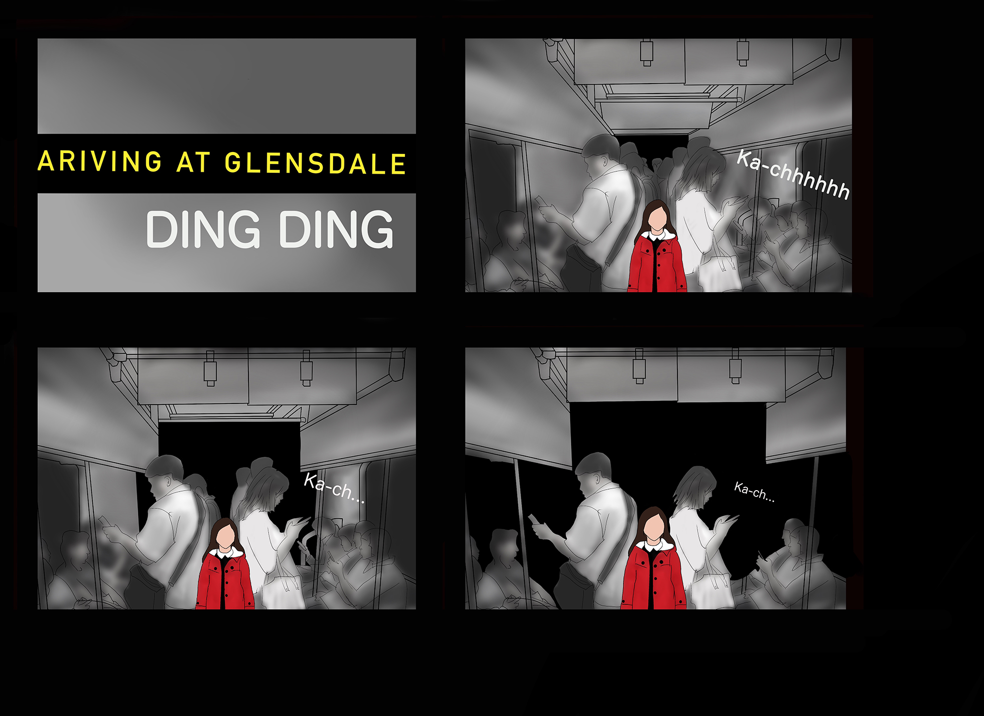
So I went a little bit off topic in terms of I focused more on the idea of individuality in the terms of technology and social media and how people who choose not to interact on the platforms such as Facebook, Instagram, Snapchat, etc which are platforms increasingly used to interact with other people, they essentially become ignored, unrecognized, or even forgotten due to their lack of digital or online presents.
While I’m not saying that people need to be on these platforms to be valid or to even be recognized by society those who choose not to interact in this way are not included in a massive amount of contemporary communication. So while I don’t think this has anything to do with me I wanted to play around with the idea of individualism in the context of rejecting a societal norm that many would see as a necessity in today’s contemporary western society. To actively reject the main modes of expression and communication is a very individual decision and could be multi factored in the reasoning behind such a decision.
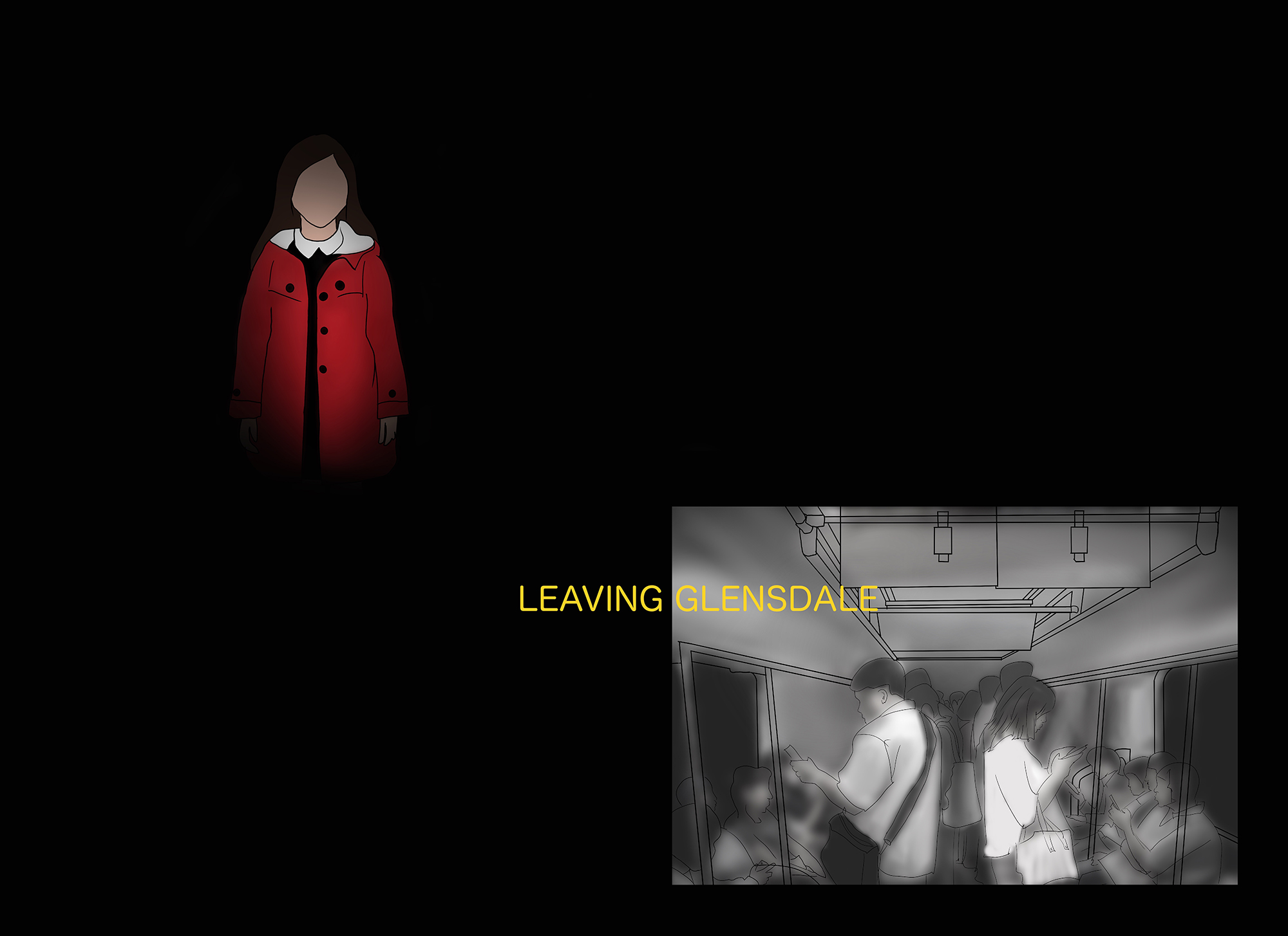
So I suppose with my idea and purpose was to portray this rejection and consequentially the lack of interaction and perceived intentional lack of acknowledgment. Obviously the form was an online comic that was to be viewed in a vertical display. In terms of idiom I think that my comic is neither fiction or nonfiction but representational of something that happens in society through a non-fictitious visual display. In terms of my vocabulary I think it’s pretty basic I use some sound effects and a very simple language structure as I didn’t want that to be the focus of the comic. In terms of structure I am mostly focused on the changes within each scene. As my entire comic is set with in A singular tram car there isn’t much overall movement so what becomes of importance is what is changing within each graphic. Additionally in the last slide I left a lot of open black space to just try and show an idea of the magnitude that is existing in the worldWhere you can’t interact and people might not even know of acknowledge your existence due to your lack of presence in their social reality.
A Social Divide pt1. A Social Divide pt2.A Social Divide pt3. By Alexandria Bachmann
In terms of surface that immediately perceivable trait is it’s digitally created and drawn in a pixel format due to being exported from illustrator into procreate and then being uploaded.
Lastly just the craft of my work originally I began in adobe illustrator and produced my line work that included the tram cars basic outline and all of the people seen within the tram cart. Once I had my basic line work done and I uploaded the file into procreate which is essentially Photoshop where I colored, re-organized, designed the layouts, and inserted text. In terms of pure quality I don’t think this was my most ambitious work however it was my longest and probably my most interpretive piece of work I’ve done in the class as it’s not essentially obvious what the message I am trying to portray is without either seen the prompts or a basic explanation of what the characters in the comic represent as they are not just characters but our representational of societal facets. So in that case I do think it has been my most ambitious work just trying to portray this more abstract idea visually without representing it directly.
So I guess just going back to my idea of representing this digital divide created by a digital social landscape was to not only show the divide between those who are interconnected and those who aren’t but to also argue more in line with the prompt that the way we express ourselves on media isn’t always truthful or accurate which is why I showed the people as being dark and not clearly defined as what we represent ourselves as on social media is as perfect as we can be and yet no one is truly perfect due to the human condition. In contrast I showed the little girl who was not connected has been defined because her existence is only in who she is and not split between real life in a digital social presence.
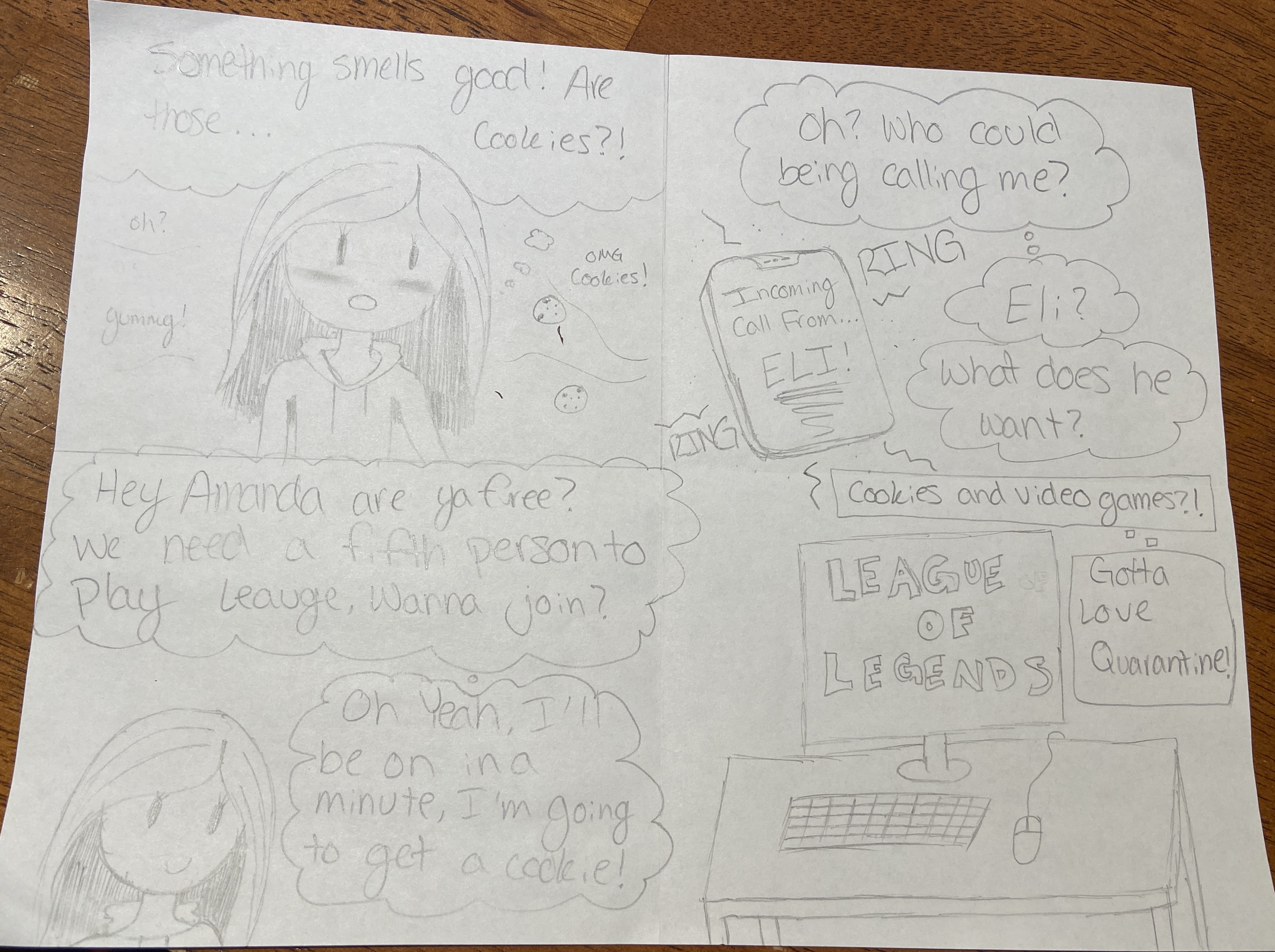
This week I was trying to show a part of myself in my comic. A side that not a lot of people really know about me. That thing is that I love video games. I love it even more when my friends ask me to play or want to play with me because I am not very good at them, but I still love to play them. I started to play video games when I was younger, about six years old. I mostly use video games as an escape and to get rid of pent up stress or to just get away from the real world and have some fun and do something that I normally couldn’t do in real life. Another thing that I love is sweets and baking. I guess that is why I have a sweet tooth. Ever since I was younger, baking was something that my mom and I would do together and it was just us. I am the oldest of four kids, so it was hard to get time to spend with my mom one on one. So naturally, I started to enjoy it because it was something that I associated with good memories. Now I do it all the time and when my mom doesn’t have time to do it, I teach my other sisters how to bake. In this comic I stuck with drawing by hand, this is mostly because I have technical issues using adobe products on my computer. For this week I had multiple frames and I was telling a story. Compared to my last two weeks’ comics, which only had one frame with maybe a few words, I think that this week’s new comic has more life to it and was able to have the reader follow along better and get more out of the story that is being told. I also think that it was a lot more fun and enjoyable to make more than one comic frame compared to the one comic frame. The idea and purpose of this comic is to show who I am and to show something that I usually keep to myself. In this case that is the joy of playing video games with my friends and my love for sweets, but I guess in this case it’s cookies. The form of this comic is me. I tried to draw me in a way that I see myself, but also in a cartoon-like way because I like to picture myself as not too serious, but more cheerful and happy. For my idiom, I had it in a more cartoon style. It’s more cheery and it’s very simple and not complex. For my structure, I made it so it was as if a third party member was watching, or like an audience was watching. My craft for this comic was a handmade comic. I used a dull pencil, not a mechanical pencil like I did the previous comics, and I think it was a lot easier to make light sketches and then darken the lines that I wanted more permanent. Lastly, my surface was a piece of paper folded into four even squares. I then drew four different images in each of the four squares.