Formstorming and Modularity: Rumnik Cheema

For my blog the piece that I chose by Marian Bantjes was “Valentines 2011”. I chose this because it really does a good job connecting the ideas of the book and her Ted talk. In the talk she really explains her reasoning behind the creativity,  design, and her style. Personally I really enjoyed her talk because I like to work in a similar style where I attempt to tie in projects in with personal notes and this is why I chose “Valentines 2011”. In her talk, she explained how before valentines she goes about creating a modular design that can be recreated countless times and represent a different emotion and feeling. This blew my mind, that she essentially forces her self to create and recreate time after time a concept that is usually as simple as a heart design. In addition, just the level of modular styles that smoothly fit together on every style she has done. The components are devised of smaller pieces like wings sections, and different vectors. She really capture everything that is discussed in the book in terms of interpretationbantjes_2011_valentines-1 
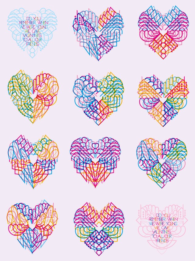
of character and recreate an idea .

Posted in Fall 2018 Archive (336), Uncategorized | Leave a comment

Formstorming & Modularity: Clara Mui

I chose this work of Marian Bantjes’ because of how odd and colorful it was, as well as the words on the piece “Lost Child”, since one of my favorite song is titled Lost Boy.

In this piece, Bantjes used My Little Pony hair to needle-point the words onto a cross-stitch patch with ready-made alphabet. I am really amazed how she could turn something so ordinary and not relevant into something that has a purpose and meaning. Bantjes introduced contrast, randomness and physicality on such a simple piece and idea: Empathy.

My favorite part of this art piece is the randomness of how the hair pieces were placed. This art piece would be way less interesting to look at if the hair pieces just lines behind the stitch patch tidily with coordinated color. Bantjes knows how to keep it interesting by leaving a few pieces of MLP hair on the front of the patch to give it a new dimension and a sense of randomness, a sense of wonder. Which as she mentioned in her TED talk, is a major component that you need when designing something. And that’s what I felt when I was scrolling through her artworks! I looked at it and wondered, stopped scrolling and click in.

I also like how the words “Lost Child” are all in orange despite all the different colors of hair that’s stitched on this patch, it gives a good contrast with the light blue hair and white background. The lines formed by the hair pieces are all pointed towards the words, which also helps draws the attention to the words.

Posted in Fall 2018 Archive (336) | Leave a comment

Formstorming & Modularity: Sanna Wright

Marian Bantjes’ Saks Want It!” typography design creates accessories and fashion apparel using lettering. It was created for window displays and other promotional items such as shopping bags. It was posted in her online portfolio. (Marian Bantjes, Saks Want It!, http://bantjes.com/work/saks-want-it/, 2007).

“Saks Want It!” is a commissioned piece created by Marian Bantjes for Saks Fifth Avenue. The collection uses intricate typography to create the silhouette of fashion items. The collection is for Saks Fifth Avenue but also is aimed at potential customers of Saks Fifth Avenue. The objective is to grab peoples attention while also drawing consumers into the store. Through the unique design, it tells customers not only what to expect inside the store but encourages them to use their imagination to interpret Bantjes “personal” designs.

Formstorming is an act of visual thinking, and Bantjes’ work is an excellent example of that. Formstorming breaks down problems into ingredients or puzzle pieces. When thought about critically they can be put together to solve complex problems. This design concept can be practiced by repeating a concept with several different designs, practicing something new each day, or taking a step back and breaking down a visual design into several unique pieces. “Saks Want it!” is a perfect example of formstorming as each tile of her designs builds on the same concept of text creating silhouettes. Each design is very different, showing a wide variety of approaches to the idea.

Modularity is creating constraints for a project and using only those rules to piece together a design. This method creates specific pieces that must be used purposefully to create a cohesive design. In the “Saks Want it!” example the constraints are the use of only lines and text to create the objects. The lines must be thin to match the font, and the text must mirror the shape being created. For example, the word “cape” has been transformed into the shape of a cape using thin lines that match the font. There is no color in this piece (there are colors in the independent advertisements), increasing the constraints. Lastly, in this photograph, each block of white or black is a module making up the entire image. Each tile has constraints (it must be black or white in a specific pattern) and is used to make a larger image.

Posted in Fall 2018 Archive (336) | Leave a comment

Formstorming & Modularity: Callie McCluskey

Marian Bantjes “Saks Heart”, 2008

Marian Bantjes explains in her TED Talk that her ego is what drives her work. Marian only takes on projects that she is genuinely interested in, as well as creates her own pieces on the side. Her yearly valentines are one good example of how she not only makes design pieces out of pure enjoyment of it but how she uses formstorming and modularity in her design practice. Her 2008 valentine “Sak’s Heart” was created as a piece for Sak’s Fifth Avenue. Valentines are something that she finds very special, resulting in her sending out a new, thoughtful design to her mailing list yearly. I think the act of pushing herself creatively to come up with a design better than the last is an excellent example of formstorming. Although this specific Valentine wasn’t created entirely for personal use, it is clearly still a part of the topic she is so fond of. She also mentions in her talk that she is interested in visual structure, surprise, and anything that involves figuring things out. All of which are used in her Valentine design as well as need extensive planning in order to accomplish them. This design must have taken lots of trial and error before it could all blend together, yet stand out the perfect amount to make it a puzzle.

Secondly, Modularity is clearly a big part of this piece considering the narrowed topic of valentines day. Her heart is created entirely out of lines (mostly curly and organic) that blend together to create the form of a traditional Valentine. Hidden amongst the fluid lines are recognizable letters that grabs the viewers attention to try to solve the word puzzle. The words that are written inside the heart all fit into the category of valentines. Without modularity, it would be hard to make certain decisions that were made throughout this piece such as the type of font to use.

Posted in Fall 2018 Archive (336) | Leave a comment

Formstorming & Modularity: Claire Martin

The piece I selected was “Restraint” by Marion Bantjes and Ross Mills, because I thought the letters and their interaction with one another was absolutely beautiful. I have always found Celtic knots and designs to be very interesting and elegant, and this peace reminded me a lot of those designs. I believe this font was likely created using a multi-column grid to guide the organization and “arrange subject matter” as mentioned in our reading on formstorming.

“Restraint” is a fantastic example of modularity because all the curves and lines of the letters interact in different ways depending on the letters they are next to. These letters can be re-positioned to create an infinite number of designs. One thing I find particularly interesting about this font is how differently the letters interact depending on whether they are next to another letter or open space. When you compare the design on the right of the two ‘S’s at the end of the word “careless” they are actually very different. While the first ‘S’ smoothly transitions into the other, the second ‘S’ expands out further and has more of a swirling pattern.

One of the major decisions made by the designers was to make sure that letters as had three lines emanating from each side that ensured they connected to the other letters. I also noticed that symmetrical letters tend to have symmetrical designs, for example ‘O’, ‘E’ with matching designs on top and bottom, and ‘A’ with matching designs on the left and right sides. This likely comes from the fact that the font was created as Bantjes states “an experiment in connected letters”. While never states outright if the font had some specific inspiration, I believe this fond could be used on books covers or movies posters for the title. I believe Bantjes had something similar in mind when she released it as she says the font has an End User License Agreement that prevents them from making “Restraint” “the sole or major design element in identities, major ad campaigns, or [using] it to manufacture products for sale without additional licensing”.

Posted in Fall 2018 Archive (336) | Leave a comment

Formstorming & Modularity: Jane Doe

Party in the Garden

Party in the Garden by Marian Bantjes

I chose Marian Bantjes’ Party in the Garden for this post.  The lettering is an example of type as tool, or Teip (Modularity).  This type of lettering can be remixed into nearly endless combinations.  In other examples, the lines can pass on top of or behind each other to create depth.  In this image, Bantjes kept the lettering all one dark green color that heavily contrasted with the rest of the lighter colors of the image and the white background.  She does not use many lines to create depth, but she attaches these lines to the rest of the image to connect the entire theme together.

Bantjes used a garden as her inspiration and lines as her form to create an image (Formstorming).  She limited herself to lines and the manipulation of lines as well as color to create the scenery of a garden.  This is not a typical image or idea of what a garden looks like and creates a different vision of what a garden could look like and what you could create with lines.  Bantjes took a basic theme and changed it into an image that would not necessarily be associated with a garden.  The entire streamlined theme, colors, and shapes in the image create the garden that she was trying to create.

Posted in Fall 2018 Archive (336) | Leave a comment

Formstorming and Modularity: Julia Midkiff

“Valentines 2017” features an image of two ears facing each other to form the shape of a heart. This is a series of hand-printed linocut design printed on different colored paper, reds and pink, with different colors of ink. Bantjes explains on her website that this image could be interpreted as “listening to your heart”, importance of listening in a relationship, or simply as an image of two ears (her portfolio).

Formstorming is the process of extending the imaginative and creative though beyond typical visual arts and creating something that in a way isn’t “searchable”. Being able to form a visual simply by brainstorming and not relying on already created images, such as those you can search for on the internet, is a huge part of design. Although Bantjes does not clearly explain her creative process in coming up with this idea, the simplicity of the image conveying a complex idea speaks for itself. Everyone thinks of a heart in different ways, but no one in a normal state of mind would think “two ears next to each other totally makes a heart shape”. The unusual image paired with many possible interpretations by the viewer lends a deeper meaning to the artwork and makes it a successful work of art.

When looking at the medium and constraints of the artwork the artist tells us that the image was carved out and printed onto paper. In terms of modularity, Bantjes was constrained to the shape of the paper and the fact that carving out the image has some restrains in terms of details, size, and texture. The ears are clearly made from repeated diagonal lines as opposed to careful shading or some sort of gradient as that would be very difficult to carve into a block. The shape of the paper was not entirely restraining, as it was more the block, but it provided a background and another source of color for the print. This brought on the simplicity in the color as well, where the paper provided the color for the image and the print was monotone in order to feature the background color and overall image.

Posted in Fall 2018 Archive (336) | Leave a comment

Formstorming and Modularity – Abby Martinez

For this post I chose Marian Bantjes The Vivid Word. She “was asked to do the cover for the US design magazine, Print, as well as given [almost] free reign over eight interior pages.” This resulted in some truly beautiful typographic design.

The idea for both came from the content I was given to work with for the interior: predictions of the future of graphic design as made by designers 40 and 50 years ago.

The predictions ranged from the wacky to the remarkably prescient, and as one can imagine they focussed quite a bit on technology. When thinking about technology then and technology now, I decided that one of the few things we’re still using are little wires. Those fine, coloured wires that make a nice, colourful line. But I wanted to add an element of humanity for the fallibility of predictions, and so came the little hands, which then started doing things related to the text. (Source)

Formstorming is an incredibly important part of design, getting out every idea you have to get past the obvious and to get your mind to new creative places.  The brief explanation of her inspiration for the design above definitely shows that there was an extended thought process in how she ended up with the final product.  When thinking about technology 40-50 years ago, what they thought it would be vs. what it became, I doubt the first connection that was made would be Wires.  That took thought, planning, and research.

This piece is also an excellent example of modularity.  On the cover, The headline text/graphic is composed of each of the little colored wires twisting, turning, and overlapping to create a larger more complex image.  The varying colors of the wires allow the reader to distinguish where each line is coming from and follow how each wire was used to create the overall image.

On the subsequent interior pages, the wires serve the same purpose, while they do not weave through each other the same way, they do come together to create text, and create visual flow through out the page. Each wire highlights one part of text on the page and then connects it to similar content and concepts.  This concept began on the Cover Page with the copy in the upper-right corner and was followed though with more intensity on the interior with each line of text.

On the cover modularity was modeled by using the wires to create an image, the constraint was created by only allowing wires to make up the graphic.  On the interior this was repeated with some of the typography, wires running continuously to create cursive.  The challenge created on the interior was in giving the wires the purpose of creating visual flow and reinforcing the ideas presented on the page.

Posted in Fall 2018 Archive (336) | Leave a comment

Color Interaction: Alex Allen

This pattern caught my attention because while looking at the different designs within the pattern my eye starts to wonder and change my perspective of the image. The contrasting of the three primary colors make the image appear more geometric while the baby blue and white help to bring the colors all together by helping separate the colors. I think the artists use of the color blue helps diminish the other colors and bring balance to the pattern. I also think the use of the blue is used to intensify the red and yellow shapes. This photo also appears to have two different pattern designs that look to be combined to make the final pattern. The two separate patterns you would see if they were separated would be the yellow start looking shape with the blue background and the badge looking shape (white, red, baby blue) with the blue background. The value of this image gives off more of a neutral appearance rather than leaning more towards a dark or bright stance. The saturation on the other hard leans more towards a solid color than a bright color. When it comes to analyzing the “hue” of this pattern, the primary colors don’t really intervene with each other; rather they help the eye move between each pattern more smoothly. In this pattern the analogous colors would include the dark blue with the baby blue dot in the middle of the yellow star shape. The use of “White Space” or “Blue Space” is used to help separate the two shapes and give the pattern more balance and direction. Without the use of the blue space, in the bulk of the design this pattern would get over taken by the positive space and change the appearance of the pattern. On the other hand, the use of the negative space (white space) helps define the badge shape and incorporates texture to the blue space and in turn brings the two patterns together more effectively.

Posted in Fall 2018 Archive (336) | Leave a comment

Print Versus Digital: Melody Huerta

Like many different art forms comics are a form of art that can and will exist in many different mediums. Something that I have taken away from “Understanding Comics” by Scott McCloud is that comics are supposed to be very flexible in who and what they can represent. In chapter two of Understand Comics, McCloud talks about the simplification of comic drawings in order to be able to appeal to more people, the more realistic an icon or image is drawn the less mass appeal it could potentially have. Comics are a great tool to be able to tell ones story, under the medium of comics one is able to have that story reach more people.

Scott McCloud, Understanding Comics, 1994, pg. 31

With that established it is easy to apply this flexibility to many different mediums whether those mediums exist in a print or digital format is the fun part about comics. As McCloud states “A new generation will no doubt reject whatever this one finally decides to accept and try once more to re-invent comics”(23) meaning that the future of comics lies within the hands of those who wish to change it. That being said, the ease by which someone can access a digital comic is what draws me to that medium, people all over the world can view a comic. On top being able to view it all around the world, for those people who are differently abled comics in digital formats can be more accessible to people of all different abilities. It is always important to think about to social implications that come with deciding whether to create art or in this case comics to that are only available to people with certain abilities. For me as I am able bodied it is easy for me to access and enjoy comics in hand, it is even an experience sometimes, the feeling of a physical book. But for others the feeling of holding a book may not be as engaging as it could for everyone.

All in all I would have to say the classic feeling of a printed book is one that can attract many to read and enjoy comics. But for me the digital format is something that I think many more people can enjoy. With the digital comics by Eryon Franklin they are given an even bigger platform to create art even in the surrounding areas or “gutter” of the comic panels already on the page. Comics are an art form that has seen much remediation, the revisiting of an older print art form being reformatted, being made more accessible and interactive in a digital format. I believe that there are benefits to both, the classic and the new. In the society that we live in I believe that it is perfectly reasonable that both mediums see advancements in how comics are thought of and created. I believe the key ideology from what we have seen and learned from comics we have so far observed is flexibility. Being able to create in an environment where there are not any real set rules or regulations and everyday some new variation of comics is created, which all in all is very exciting.

Posted in Fall 2018 Archive (201) | Leave a comment