
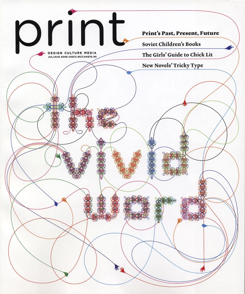
For this post I chose Marian Bantjes The Vivid Word. She “was asked to do the cover for the US design magazine, Print, as well as given [almost] free reign over eight interior pages.” This resulted in some truly beautiful typographic design.
The idea for both came from the content I was given to work with for the interior: predictions of the future of graphic design as made by designers 40 and 50 years ago.
The predictions ranged from the wacky to the remarkably prescient, and as one can imagine they focussed quite a bit on technology. When thinking about technology then and technology now, I decided that one of the few things we’re still using are little wires. Those fine, coloured wires that make a nice, colourful line. But I wanted to add an element of humanity for the fallibility of predictions, and so came the little hands, which then started doing things related to the text. (Source)
Formstorming is an incredibly important part of design, getting out every idea you have to get past the obvious and to get your mind to new creative places. The brief explanation of her inspiration for the design above definitely shows that there was an extended thought process in how she ended up with the final product. When thinking about technology 40-50 years ago, what they thought it would be vs. what it became, I doubt the first connection that was made would be Wires. That took thought, planning, and research.
This piece is also an excellent example of modularity. On the cover, The headline text/graphic is composed of each of the little colored wires twisting, turning, and overlapping to create a larger more complex image. The varying colors of the wires allow the reader to distinguish where each line is coming from and follow how each wire was used to create the overall image.
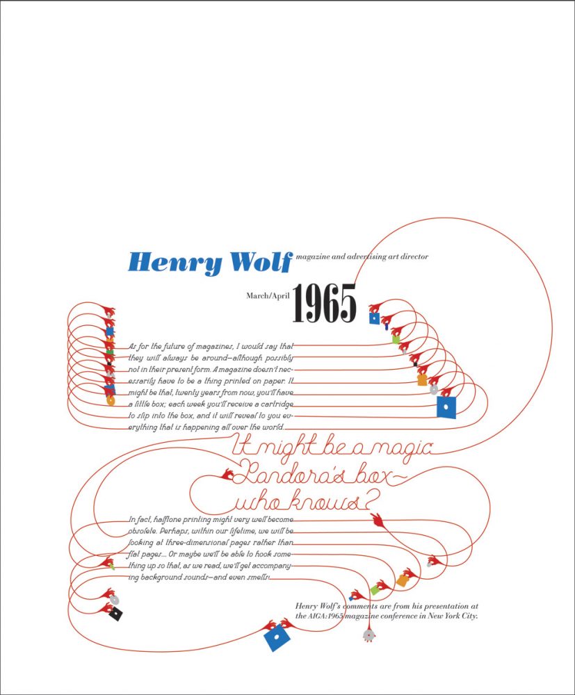
On the subsequent interior pages, the wires serve the same purpose, while they do not weave through each other the same way, they do come together to create text, and create visual flow through out the page. Each wire highlights one part of text on the page and then connects it to similar content and concepts. This concept began on the Cover Page with the copy in the upper-right corner and was followed though with more intensity on the interior with each line of text.
On the cover modularity was modeled by using the wires to create an image, the constraint was created by only allowing wires to make up the graphic. On the interior this was repeated with some of the typography, wires running continuously to create cursive. The challenge created on the interior was in giving the wires the purpose of creating visual flow and reinforcing the ideas presented on the page.
