Comics: Liz Kurtz

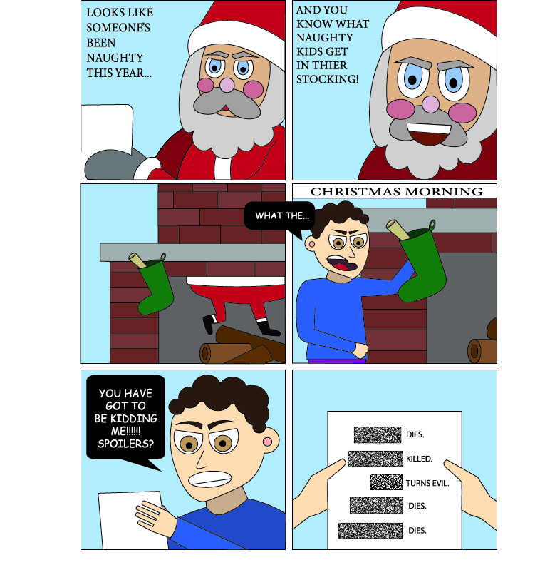
This was my first time using illustrator and I absolutely loved it! The possibilities are endless, this program essentially allows you to create anything you want! At first it was a bit overwhelming, but with time and knowledge I eventually learned how to create exactly what I wanted with my comic. I made a storyline of a child who was naughty, but received spoilers for Christmas instead of coal. This relates to our generation in terms of how much time we spend following television shows, and what would truly disappoint us the most. I am happy with how my comic turned out and the tools I learned throughout this process. The ideal environment for readers to view my comic is that around Christmas time, given my comic is Christmas themed. I hope that viewers responses consist of it being relatable, as well as funny.

When looking at my comic, I would say that it fits Scott McCloud’s definition of a comic perfectly. McCloud argues that a comic should be “juxtaposed pictorial and other images in deliberate sequence”. This is easily relatable to my comic with the aspect that each of my images are in an order so that my story makes sense. I deliberately placed them in an organized and deliberate sequence making them juxtaposed. All of my images are pictorial, had made. When deciding to go with a pint based or electronic based comic, I decided to go with print base. My lines are clean, and my colors are vibrant making it well suited to be print based because viewers are able to hold it in their hand and look at it. I also chose this option because having it in an electronic format would add nothing to the display of my comic.

Scott McCloud discussed many important elements within his book that are important to consider when creating an expressive comic. I focused on displaying my comic more as a cartoon than realistic. I also added text so that the viewer/reader will be able to better understand the context. Facial expressions were another essential element to include when trying to bring an emotion across, this I had fun with and felt that I truly understood and captured.

Posted in Fall 2018 Archive (201) | Leave a comment

Type Anatomy: Alex_Allen

Author of book – Ying huan zhi lüe & Jiyu Xu

The piece I choose from the MASC to talk about for this blog post, comes from a Chinese 19th century geography book printed on what looks like and feels like Xuen paper. My first impression of this book was quickly changed after pretty much getting a history lesson from Clara on the Chinese culture of literature and how Chinese authors structure their writing on a page! I guess what most intrigued me the most on wanting to write about this book was that the reader reads from right to left and from top to bottom. Me, being really fascinated with the Asian culture and especially the Chinese culture was also another reason why I decided to talk about this specific book.

This example (as discussed with Clara in class) has the visual presents that it does because dating back to the original Han Chinese writing style, “authors” would write in this way. But as the new wave of Chinese writing emerged (communists took power), this style of writing took a backseat and eventually became ancient. The Chinese typeface, having a more visual form of language really can’t alter the way they present their form of text to the public. Yes, there is always a way to alter any type; but in this case with each symbol made within the visual symbol (square box each word/visual symbol is structured in) holds its own meaning and combining them to mean a word/phrase/etc.

In this book and in regards to specific characteristics of the symbols, the ways in which I see different symbols relate to one another are firstly by their width and height on the page. Another observation I noticed about this text is that when one writes in this way they use multiple different symbols to make up on symbol. This isn’t in every symbol, but for the most part it is relevant in most symbols as presented in the image to the right.

Posted in Fall 2018 Archive (336) | Leave a comment

Comics: Issaya Saleumsay

My project fits Scott McCloud’s definition of comics, because my comic strip is all condensed and flow with the story line. It also, shows different actions happening during different frames.

In the book, Understanding Comics, I followed a couple of things that Scott McCloud suggested during the reading. He explained how there are different ways to format a comic. You can either have it go from right to left (cover to cover) or left to right (anime style or the way Japanese people write their books). I took that suggestion and decided to write from right to left because I live in the United States and we go from left to right in majority of our comics. So, it only made sense for me to do the same. Also, some comics go from up to down or from left to right on frames. I choose to go from left to right on the frames. I felt like since I was going from left to right (cover to cover), I would go left to right on frames as well. It also reads better for some people. I feel like my comic strip has enough words being said in the story line and there is enough unspoken language in the comic to understand it.

Comic Project

The Struggle Created By: Issaya Saleumsay

I believe that the ideal reading environment for my comic is at home or on the readers free time. I feel like my viewers or readers can relate very well to this. I relate to this comic very well. I’m not positive which readers this comic targets, but if I could take a guess, I would say middle schools. The reason for this target is to show little kids that growing is a lot of work and it isn’t all about homework, but to get enough rest so you aren’t exhausted. This way that kids are understanding that sleep is a necessary for success.

Posted in Fall 2018 Archive (201), Uncategorized | Leave a comment

Comics: Kameryn Skillingstad

Comic by Kameryn Skillingstad 2018

My comic was intended for print on an 8.5 x 11 inch page. After reading Eroyn Franklin’s digital comics and Scott McCloud’s print comic, I realized I enjoyed reading comics in a printed form much better. I don’t know whether it was the satisfaction of turning each page and looking forward to what’s on the next or having the physical copy of a text in my hands that gave me a sensation of liking print more than digital comics. Creating this comic was somewhat challenging for me because I found myself wanting to draw every movement of the main character, Jim. However, in Scott McCloud’s book Understanding Comics, he talks about the idea of closure and how there is a power to leaving the invisible and in-between frames events up for interpretation by the reader. In the third page of my comic, I attempted to have a more unique transition from frames by creating a though bubble that turned into its own frame. In Understand Comics, McCloud talks about the six layers of comics in reference to an apple. In my comic, I made the creators decision to have a strong “seed”, as McCloud referenced, or idea/story of the comic. My comic focuses on Jim reminiscing about the love of his life, Maria, by trying on hats that he’s worn throughout his life that flash him back to important moments in his life. For example, on the first page of my comic, which is depicted above, Jim tries on a striped hat that represents his youth and when he first met the beautiful Maria. Since this was my first time using Illustrator, I steered away from having intricate details and vibrant colors, focusing more on the plot and I hope my viewers understand and enjoy that aspect of the comic. I used many tools in Illustrator such as the brush tool to create all of my characters, pen tool 1 to create the frames and straight lines in my comic, the layers tool to separate artboards and figures I wanted to separate, the text tool to create all the speech, etc. Overall, I believe my comic utilized the conventions from Scott McCloud’s Understanding Comicsin order to create a printed comic.

Posted in Fall 2018 Archive (201) | Leave a comment

Comics: Angela Basinger

basinger-angela-project-02

Comic by Angela Basinger 2018

The comic I created in illustrator is intended for a print medium, as it was designed for an 8.5×11 page and has no elements that are exclusively digital. My comic was based on a drawing I scanned into the computer, so it was made to model my drawing style and handwriting. The comic itself aligns with Scott McCloud’s definition of comics as it has a deliberate sequence made to allude to time changes and story development. The frames in my comic move from left to right and top to bottom, like a print book. I took some stylistic points from Understanding Comics including placement and detail. For my first panel, the circle in the upper left, I layered this circle on top to identify it as primary and to be looked to first for sequence. When constructing my subject, the cat Salem, I steered away from heavy detail. McCloud suggested this in his chapter about form and detail in which he regards minimal detail as a strength of comics to make stories more identifiable to relatable for a wide audience. My intent with this comic was to express the quirks and range of emotions of Salem as a cat to a wide audience of pet owners and cat lovers. In order to establish setting and consistency in background, I used the watercolor paintbrush tool to show a difference between the horizontal floor and the vertical walls. Other tools that were essential in the construction of my comic included the pen tool, the curvature tool, and the layering tool to trace and recreate my pencil drawn comic. For my captions, I used the paintbrush, angled in the same manner of my own handwriting, to create the two captions I used. Without these captions, there readers would not have context for the cat attempting to jump onto the bed in the foreground. This comic follows the conventions of comics as outlined by Scott McCloud in Understanding Comics in order to be interpreted as sequential panels to be read as print.

Posted in Fall 2018 Archive (201), Uncategorized | Leave a comment

Comics: Shengjie.wu

Continue reading

Posted in Fall 2018 Archive (201) | Leave a comment

Type Anatomy – Abby Martinez

Print of Today : An illustrated survey of Post-War Typography in Europe and the United States : Oliver Simon

While a good drop-cap is nice, and this one has a very beautiful detailed design, that has a real presence on the page, I want to focus on the intro paragraph of this text.  I really love a well crafted serif font.  Transitional serif fonts are my favorite, the way that the feet curve into the stem of the letter, the axis that the stress is placed on is centered rather than tilted, the uniformity that still has a lot of character.  While this typeface may not strictly be a transitional serif, and falls more into old-style, many of the aspects that I like from that period are present.

When it comes to identifying the stress axis in type I like to look at the O’s.  The O’s in this text have the axis starting at the middle top, and goes through the middle bottom.  This type of stress signifies a serif more from the traditional period, and these centered stress points are also present in my of the other letters as well, the C and S both have centered axis.

We also know that this is not a strictly modern serif because of the relationship of the feet to the stem.  The serifs have a soft transition from the base of the feet to the stem, if this were a more modern type there would be a hard transition from the foot to the rest of the letter.  This is actually my favorite aspect of serif fonts, I think the soft transition is absolutely beautiful and really is an important part of how I choose a serif font.

All of the letters in this uppercase paragraph have a common waviness to them.  What I mean by that is,  the arms, cross-bars, bars (really any horizontal piece) are not perfectly straight lines.  There is a dip at the top and a bump at the bottom.  This is partially a result of the intensity of the serifs, but is also a stylistic choice by the typographer.  To make the serifs look more pronounced, they raised them slightly above the cap-height thus giving the bars of the letters a more wavy look.

Posted in Fall 2018 Archive (336) | Leave a comment

Type Anatomy: Cassidy Ward

IMG_2633
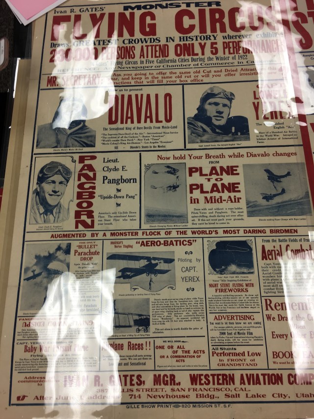
The example I chose to write about from the MASC library was the san serif font displayed in an air circus newspaper article from 1922 because there are a lot of different fonts used within this example. In addition, it stuck out to me the most because it was the one example of text that I felt I related most to: possible because the examples of type used in this newspaper example is still used for newspaper today.

After reading the article titled “Letter” and comparing my new knowledge to this example I immediately thought of the “Monster” fonts that were created during the industrialization era. These fonts include being big and bold by embellishing and engorging the body of the letters. Therefore, it is most commonly used for advertising fonts (or was during the industrialization era). For example, in this article page I distinctly see the “Extra condensed” typeface that is used for narrow spaces in advertising. I think because this article page is so condense, the “extra condensed” typeface stands out. In addition, other titles within this article that use monster fonts would be gothic, and from what I can tell also fat face.

Regarding the layout of the page, I think that the different sizes and styles maximizes the scale of the letters in the space. For example, the text to title in addition to use of images works in a way to show the reader what the page is about, but also giving the information in a conventional way by using the variation in text.

The fonts used for the titles of the page stands out the most. Therefore, the specific font I want to discuss is the extra condensed characteristics. The stem height of the letters  are very short because of the thin nature of the letters. In addition, the ascender height can be slightly above the cap height because of the skinny nature again (for example lower case t or something like that).

Posted in Uncategorized | Leave a comment

Type Anatomy: Miranda Frasier

While I wasn’t present in class the day we went to go look at the manuscripts I made sure I went to the the exhibit that they have set up right now and checked out the other font. The one I found the most interesting and that I felt related to the reading we did on typography was Poems supposed to have been written at Bristol by Thomas Chatterton. I was analyzing the text and I found that the first word you see “P R E F A C E” when looking at the word you can clearly see that it contains stems, bowls, cap height, base height, and x height along with many of the other parts of anatomy used in typography. This font is a serif font. We can see this by the way the ends of the words have a little hangover on each letter. Another thing I noticed that was mentioned in the reading is the size difference. It is common for the firs paragraph of a word to start with a bigger capital letter than the rest of the words. You can see this when the paragraph starts with the word “The”. 

Posted in Fall 2018 Archive (336) | Leave a comment

Type Anatomy – Juan Nolazco


The type I chose to analyze from the MASC is from a book called “The Psychology of Printing Types”. It is a serif font that most people would just assume is Times New Roman. However, after learning more about typefaces I can see that there is a structure to typefaces and there is a lot that makes this type unique. The first thing that caught my eye was the capital ‘Q’ and letter ‘u’ at the start of one of the sentences. The finial of the Q stretches under and over to the end of the ‘u’, which is something unique about this type. Since the letters ‘Q’ and ‘U’ typically go together, I think this was a strategic decision made by the creator if they were working with moveable type, because it would mean only using one letter block to print two letters. Another aspect of this font that differentiates it is that the type contains ligatures between some of its letters. This is not uncommon amongst serif fonts but when discussing fonts in general, these ligatures help differentiate it and make the type unique. I also chose to analyze this type because it included numbers in the text as well. The ‘4’ in the text is unique in that the focal triangle in the number ‘4’ sits on the baseline instead of starting at the cap height, and the descender in the number runs down below the baseline. This contrasts with the other number in the text, an ‘8’, which sits on the baseline as well but never goes below the baseline, instead it stretches up to the type’s cap height. The type itself is very formal and professional and I could see it being used in books and formal documents.

Posted in Uncategorized | Leave a comment