
While I wasn’t present in class the day we went to go look at the manuscripts I made sure I went to the the exhibit that they have set up right now and checked out the other font. The one I found the most interesting and that I felt related to the reading we did on typography was Poems supposed to have been written at Bristol by Thomas Chatterton. I was analyzing the text and I found that the first word you see “P R E F A C E” when looking at the word you can clearly see that it contains stems, bowls, cap height, base height, and x height along with many of the other parts of anatomy used in typography. This font is a serif font. We can see this by the way the ends of the words have a little hangover on each letter. Another thing I noticed that was mentioned in the reading is the size difference. It is common for the firs paragraph of a word to start with a bigger capital letter than the rest of the words. You can see this when the paragraph starts with the word “The”. 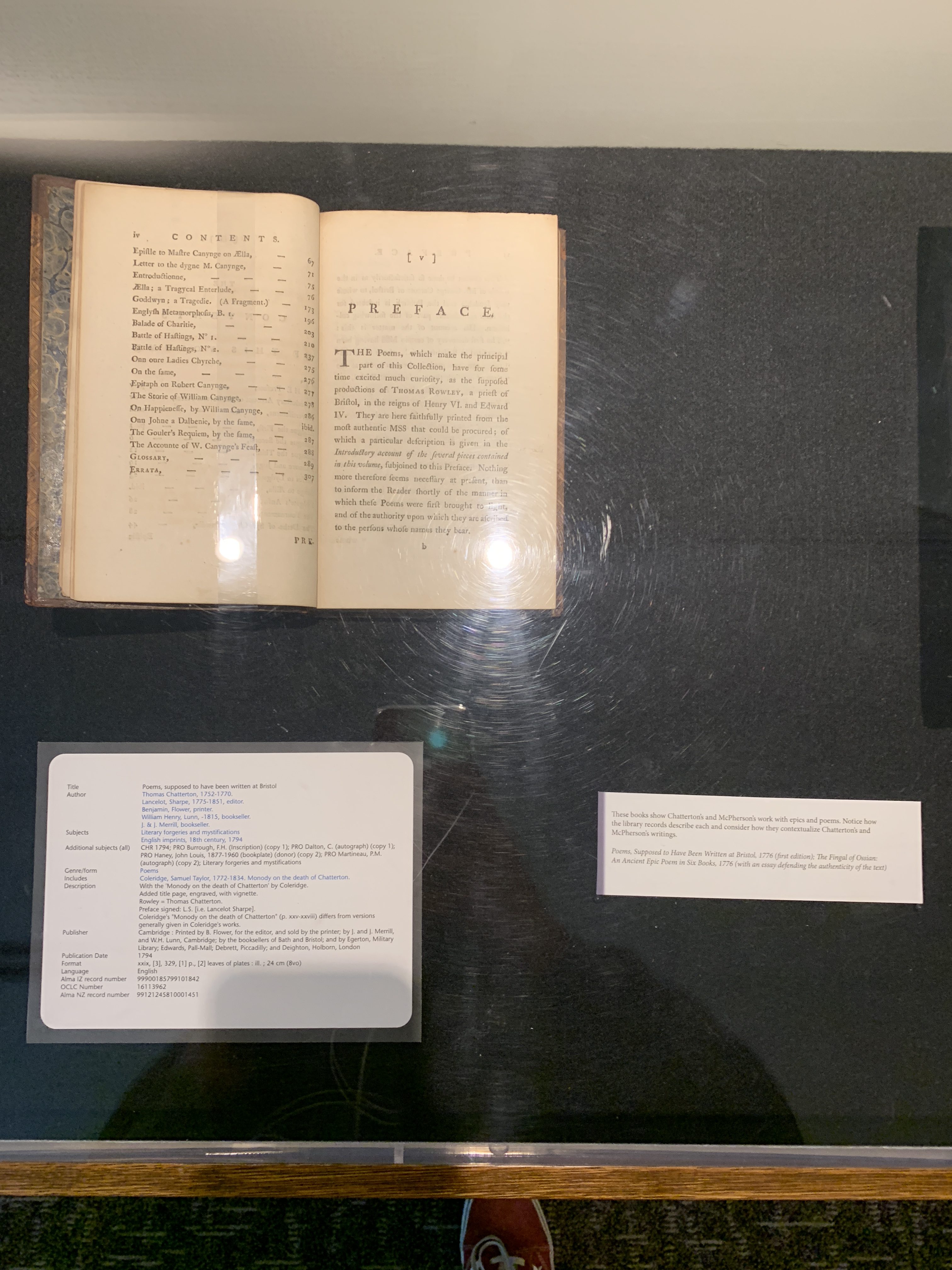
OFFICE HOURS
Tues and Thurs, 4:05-5:00pm, Avery 479 (office) or Avery 105 (lab)
EMAIL: kristin.carlson@wsu.edu for an appointment
Blog Posts
- 201 Blog
- Archives
- Fall 2014 Archive (336)
- Fall 2014 Archive (338)
- Fall 2015 Archive (336)
- Fall 2015 Archive (338)
- Fall 2016 Archive (336)
- Fall 2017 Archive (336)
- Fall 2017 Archive (336)
- Fall 2018 Archive (201)
- Fall 2018 Archive (336)
- Fall 2019 Archive (201 Blog)
- Spring 2016 Archive (336)
- Spring 2017 Archive (336)
- Spring 2018 Archive (336)
- Sample Posts by Students
- Sample Posts by Your Professor
- Uncategorized
