
Print of Today : An illustrated survey of Post-War Typography in Europe and the United States : Oliver Simon
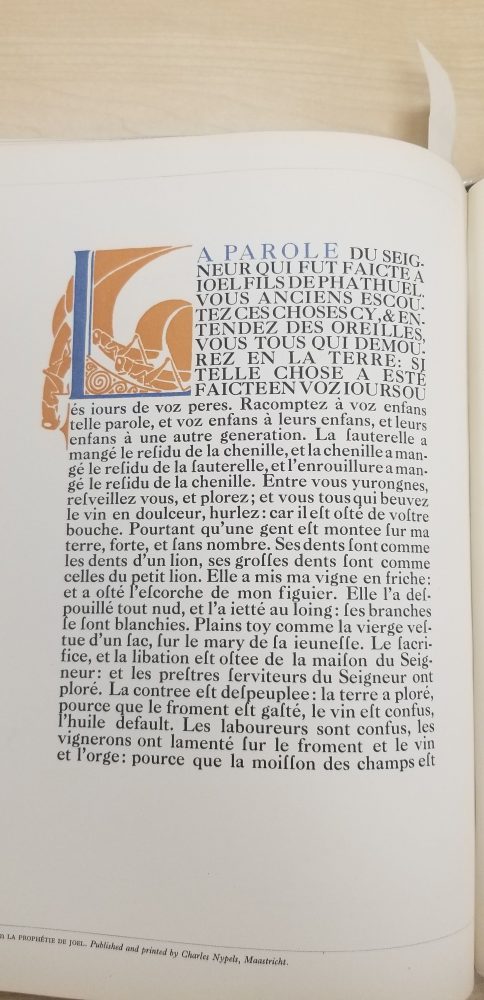
While a good drop-cap is nice, and this one has a very beautiful detailed design, that has a real presence on the page, I want to focus on the intro paragraph of this text. I really love a well crafted serif font. Transitional serif fonts are my favorite, the way that the feet curve into the stem of the letter, the axis that the stress is placed on is centered rather than tilted, the uniformity that still has a lot of character. While this typeface may not strictly be a transitional serif, and falls more into old-style, many of the aspects that I like from that period are present.
When it comes to identifying the stress axis in type I like to look at the O’s. The O’s in this text have the axis starting at the middle top, and goes through the middle bottom. This type of stress signifies a serif more from the traditional period, and these centered stress points are also present in my of the other letters as well, the C and S both have centered axis.
We also know that this is not a strictly modern serif because of the relationship of the feet to the stem. The serifs have a soft transition from the base of the feet to the stem, if this were a more modern type there would be a hard transition from the foot to the rest of the letter. This is actually my favorite aspect of serif fonts, I think the soft transition is absolutely beautiful and really is an important part of how I choose a serif font.
All of the letters in this uppercase paragraph have a common waviness to them. What I mean by that is, the arms, cross-bars, bars (really any horizontal piece) are not perfectly straight lines. There is a dip at the top and a bump at the bottom. This is partially a result of the intensity of the serifs, but is also a stylistic choice by the typographer. To make the serifs look more pronounced, they raised them slightly above the cap-height thus giving the bars of the letters a more wavy look.
