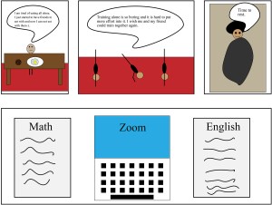
For the week fourteen comic I chose to do my typical afternoon. The reason why I chose to do my afternoon is because last week I did my morning routine. The reason why I used interdependent word-picture combinations is because I had to for the assignment. The way I decided to do this is by having pretty simple shapes for the frames and add text so the reader could see what the character is thinking about and put together what the character is doing. I also used duo-specific word picture combinations on frame three. The way I did this is by you can see the character resting but the character is also thinking that it is time to rest therefore they are conveying the same information. I also kind of used montage combination on the last frame by just adding the words into the frame on the papers and on the laptop I made.
The tools I used were the shape tools. The reason why I wanted to use the shape tools mostly because I wanted the simple effects that I could easily make with them. The shapes also make the words more important to read to see what is happening. I also used the brush tool to create a writing illusion on the papers. I realized that naming the things you use is helpful for if you need to change something in the future.
I used subject-to-subject closure for the second frame. The way I did it for frame two is by having the same character three times to convey motion that the person is doing a handstand pushup. For the fourth frame I used the closure aspect-to-aspect. The way I did this was by having this but not really conveying any real amount of time besides having the frame bigger.
The way I work with time is by changing the sizes of the frames. The first and third frame are the shortest in time and I show this by having them smaller than the others. The last frame that shows schoolwork is supposed to be a longer length of time to show the amount of time I work on schoolwork.
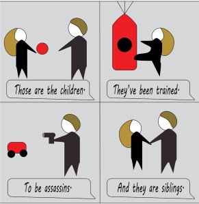
The interdependent comic type I used in the first panel was an additive, as the words amplify the image and add onto the meaning of both. Without the additive of the words, you wouldn’t know the significance of the image. In the second panel I was going for duo-specific, as the image shows the training, and the words mean the same thing. The third is duo-specific again, and the fourth panel was word-specific, as the image doesn’t add as much meaning as the words, and you gain most of your information from them. You wouldn’t be able to decipher that they were siblings from just the image alone.
I used illustrator for this comic, I’m still not the best on the platform, but I tried to use this rather than physical paper this week to learn more and feel better on it. I used some skills I learned in other classes, mostly the copy function, to make the work easier.
Illustrator is easier to work in the longer you spend time with it, the first project I did in it took about 4 hours while this took about 1. I have a hard time getting the functions to go my way in the application.
All of the panels in my comic have scene to scene closure, and the time frames are kind of jumping into different moments of them on a compound together, kind of like flashbacks. It’s as if the person who is showing the other person who they are is looking through records of them while the montage plays on.
My comic uses a combination of words and pictures to tell a story. On its own the pictures don’t mean much but the words add meaning to the seemingly unconnected pictures. This is additive use of words at it adds meaning to what is already there.
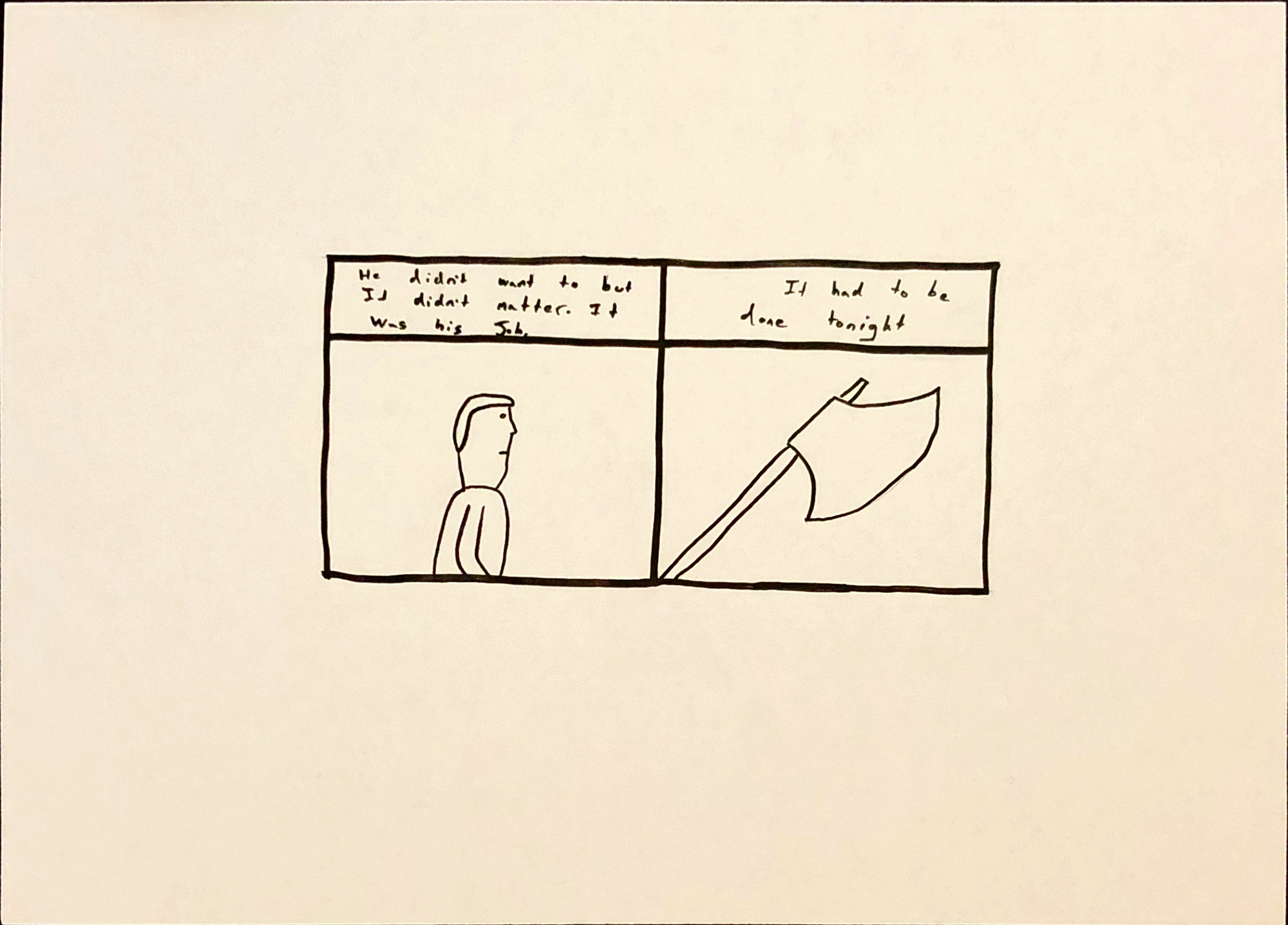
For this comic I used paper and two different black markers to achieve my lines. I traced over a pencil sketch. Because I used paper, I was not limited by digital tools for lines and details
Using physical tools for me is easier because there is no learning curve or things i have to get used to to make my comic. Next time however I will use illustrator
The type of closure I used is subject to subject as it goes from one subject to another in the same scene being the man and the ax that he is holding.
In this comic time almost doesn’t apply as the second picture is just the ax that is held up by the man and as such exists together with the man in the same time.
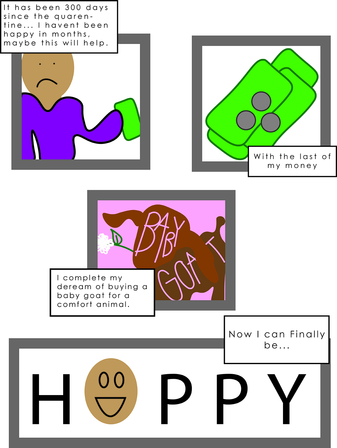
For my weekly blog this week I choose to use the experience we are in now, quarantine, to talk about what I would do if we get to day 300. The way that my comic uses interdependent words and picture combinations is that it uses the words to tell an inner thought type of words. In the McCloud book that we are reading in class, he talks about how by using the thoughts that someone has in their head it can help make your comic be more interdependent. I also thought that since we have quarantine right now I thought that it would be interesting because we are alone and haven’t been talking to people and so the character would be more comfortable in their thoughts. I attempted to use montage in my comic like the book had by using the word happy and replacing the a with the characters face that is happy. I also tried to use montage when I put the words baby goat into the body of the goat. This did not turn out exactly how I wanted it to because I wanted the words to make the words actually form the goat’s body but I could not figure out how to do that. I will continue to try and do this with our next comic. The tools that I used were a mix of Illustrator on my computer and adobe draw on my iPad. I found that drawing what I wanted the character to look like first, copying the image and putting it into illustrator, then tracing over the drawing with the curve tool was a way better process. I tried to use time inventively in this comic by doing a close up of the money and in our book, in chapter 4 McCloud talks about how doing a close up lengthens how long it feels. I wanted someone to really get time to think about what she was thinking.
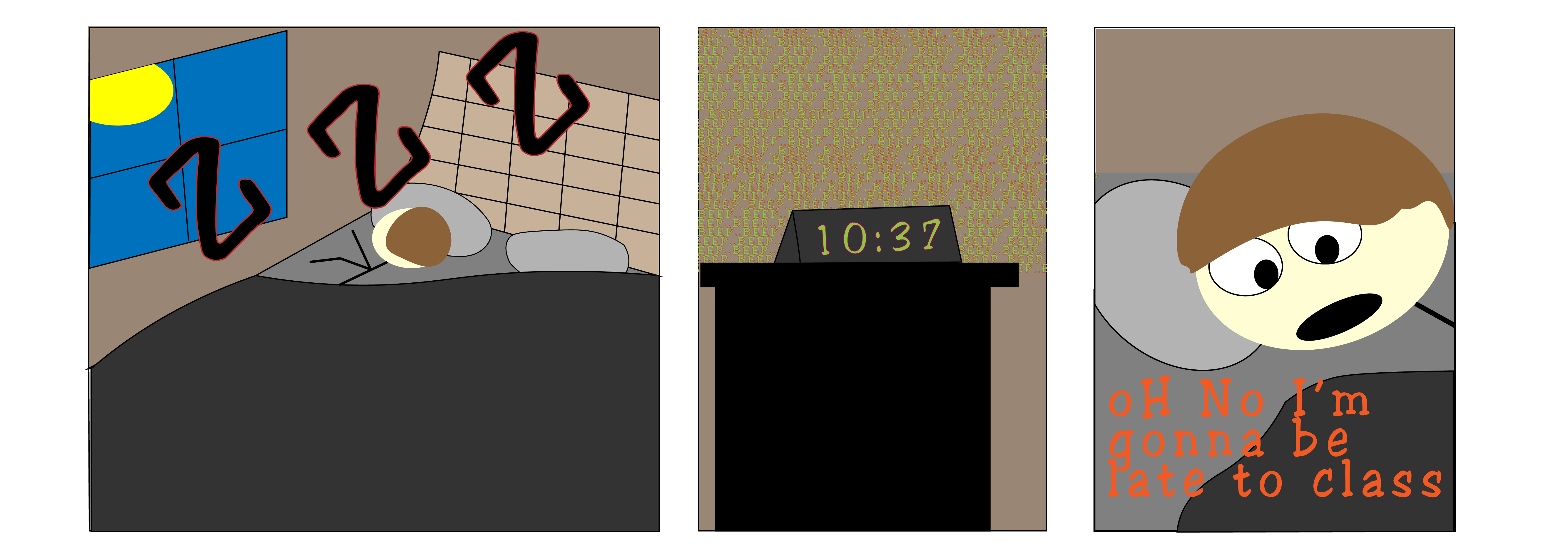
For my weekly comic, I used language to convey what couldn’t be conveyed by only images. For example, in the third panel, the text specifies that the person in the bed has woken up late for class, without the text, the viewer wouldn’t know that the person in bed was alarmed about (pun intended). Likewise, without the image, the viewer wouldn’t know the situation that would make someone late for class, in this case being they overslept. In my creation of this comic though I tried to be a little more creative with how I used text so in the first two panels there was some more less seen modes of verbal communication in the comic. The first panel with the sleeping Z’s seemed to fit the definition of duo specific to me because the words and the image both tell the viewer the same thing, that the person is sleeping in bed. In the second panel I tried to fit the additive definition by making the alarm beep so much. I tried to make the words emulate the feeling someone gets when their alarm just doesn’t stop beeping, so the obvious hyperbole of words adds to the image that would normally just seem like a late time to get up.
Week 14 comic
I made this comic in illustrator, using the various shape and line tools to create the room and person and the text tool to make the text. I spent a while playing with the different colors to make the room seem less cartoony and more realistic. The problem I ran into when I did that was the room looked very bland, so I tried to make the text more fun colors to make the comic pop more and stand out. As for the actual creation, the pen tool was excellent to add some depth or shape to my very basic shapes, such as the sheet or the hair being shaped the way it is is thanks to the pen tool.
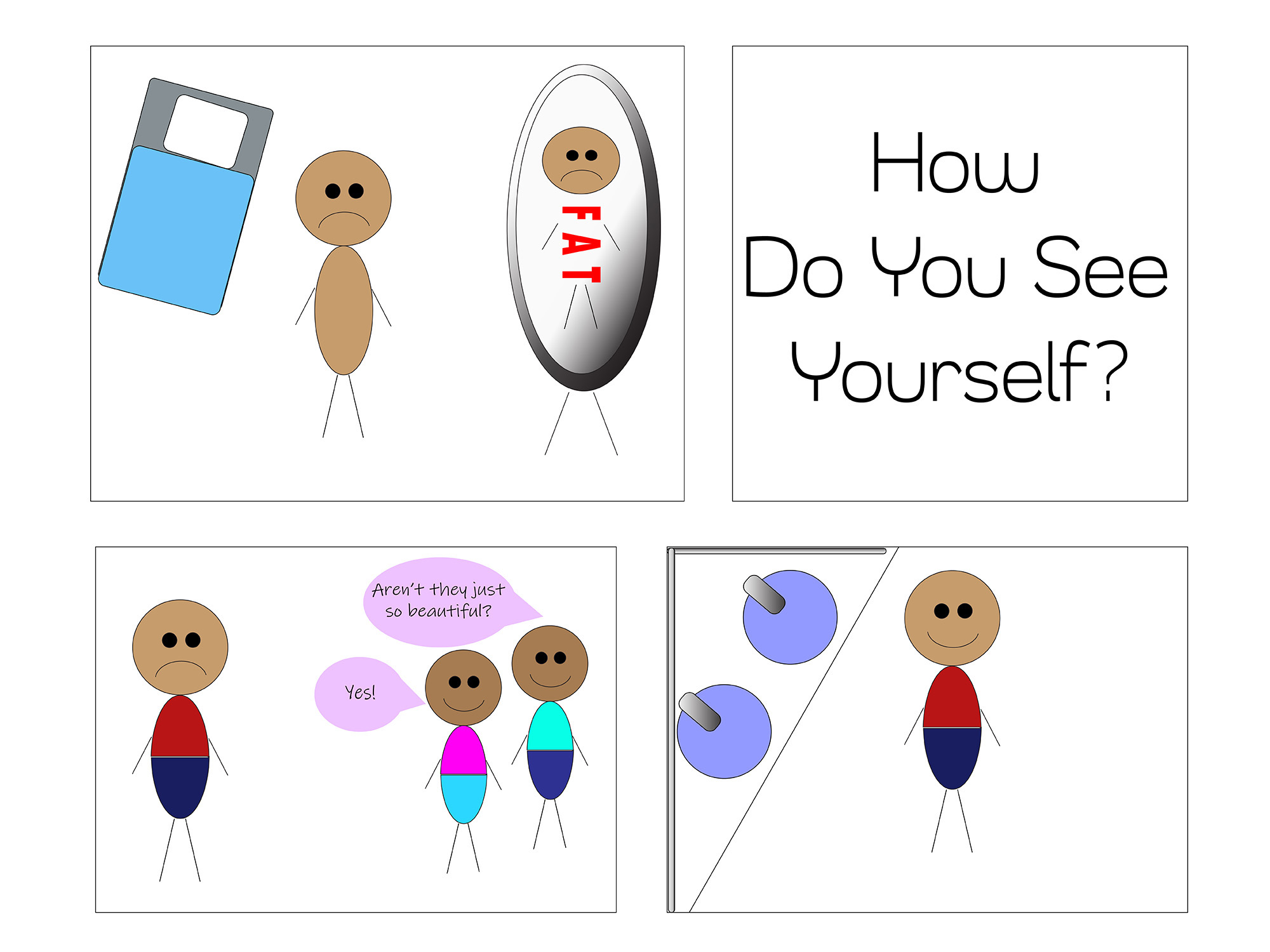
When I was looking at the prompt for this weeks comic, I began to think about how we as people have come to view ourselves, and how the could be represented by words. I think that every person has had an experience where they look in the mirror and see something that they do not like. For this comic, I choose that the main character viewed themselves as fat because I think a lot of people see that as equating to not beautiful in our society. Once I had the idea to portray a person in this light, my concept developed and tied in with the interdependent word-picture combination super well. I think in the three panels of the comic (not the title) all of the words are interdependent. In the first panel, the viewer would not be able to understand that the person is frowning because of their perception of themselves without actually being able to see the reflection in the mirror where the word “fat” is displayed. The words in the panel with the two other people really highlight why the change is happening in the bathroom panel. In the bathroom panel we see the main character looking in the mirror and smiling, which we can infer is because they see something new in the mirror. That change would not have happened without the other characters speaking positively about the main character.
I think that the headlining panel uses the additive word-picture combination. Scott McCloud says that in the additive combination “words amplify or elaborate on an image or vice versa”. I think that the reader would be able to understand the comic without the title, but I think that the title “How Do You See Yourself?” makes the reader actually think about what they are seeing in the mirror, instead of just thinking about what the character is seeing in the mirror.
I used illustrator for my creation of this comic, and I used the different shape tools a lot to create this comic. I also used the shaper tool a lot, allowing me to get more specific shapes. I tried to utilize the gradient tool, especially with the mirror, because I think that it adds depth to the picture. I definitely struggled to make the items I used the gradient tool on to look exactly like I want them, but it helped add to the picture. I also used the type tool for all of the words in the comic, but varied them by font. This allowed me to get the specific look I wanted for each word, since adobe has such a variety of fonts. In changing the fonts, I was able to add different weights to the words. I think that “fat” is a heavy word, often associated with bad things, which is why I made it super thick and red (to stand out). I made the two characters complimenting the main character have a “lighter” font that was closer to handwritten, and thus more human. I know that compliments make me feel light and airy so I wanted that to come across in the compliment. I tried to keep the titles font more neutral, but a little on the lighter side. The question isn’t asking people to critique themselves, so I wanted it to look like something that wasn’t scary or dark to think about. This medium has a lot of options with the presentation of words which I think can really help a comic stand out.
I also utilized color a lot in my comic, showing the main character in darker clothes because they are having a harder time. The two other characters are dressed in light clothes and even have a light colored talking box. This helps the reader associate them with happier things. I tried to utilize color in the background sparingly, mainly just to provide context for where the individuals are, so that it didn’t distract from the message. I think that the hardest part about illustrator for me was the amount of time it took me to get something to look exactly the way I wanted it to. Instead of just putting a pencil to paper and drawing a line, I had to work with specific tools to get that line to curve the right way. This also allows for a lot of freedom that I didn’t have while drawing because my artistic skills while physically drawing are not super strong. Overall, I really enjoyed being able to work on illustrator and learning the interface even more.
For this comic, I tried to fit in a bit of comedy into it. It starts off with someone wanting more shade, he then captures the sun and starts to pull it west so it would create more shade for him. He did not realize it but as he kept pulling it, he turned the sun into the moon and it was no longer day. My comic uses interdependent word-picture combinations in the way that the text adds in character and also gives the scenes a little more meaning to them. The pictures could have given the story without the words, but I feel as if the addition of words can set the mood and tone of the comic itself. The other type of word-picture combination I used was picture specific. Like I previously stated, with the addition of words, I was able to create a funny comic rather than a serious one.
Like my last comic, I used only a pencil and a napkin. The reason that I don’t use colors in the comics I make is because I feel like I can’t get the detail that I want, especially when I am drawing it. I am a big fan of black and white art work. By using no colors, I was able to keep the words defined and clear as much as possible. I did not have to worry about the reader having a hard time seeing the words since the comic itself was in black and white. Something else that I found neat was even if I drew something in the wrong area, if I redrew it near where I erased it, it gave a cool effect to the drawing. For example, if I drew the human figure a little off of where I meant to put it then recreated it where it is supposed to be, it would create a cool “shadow” effect on the drawing.
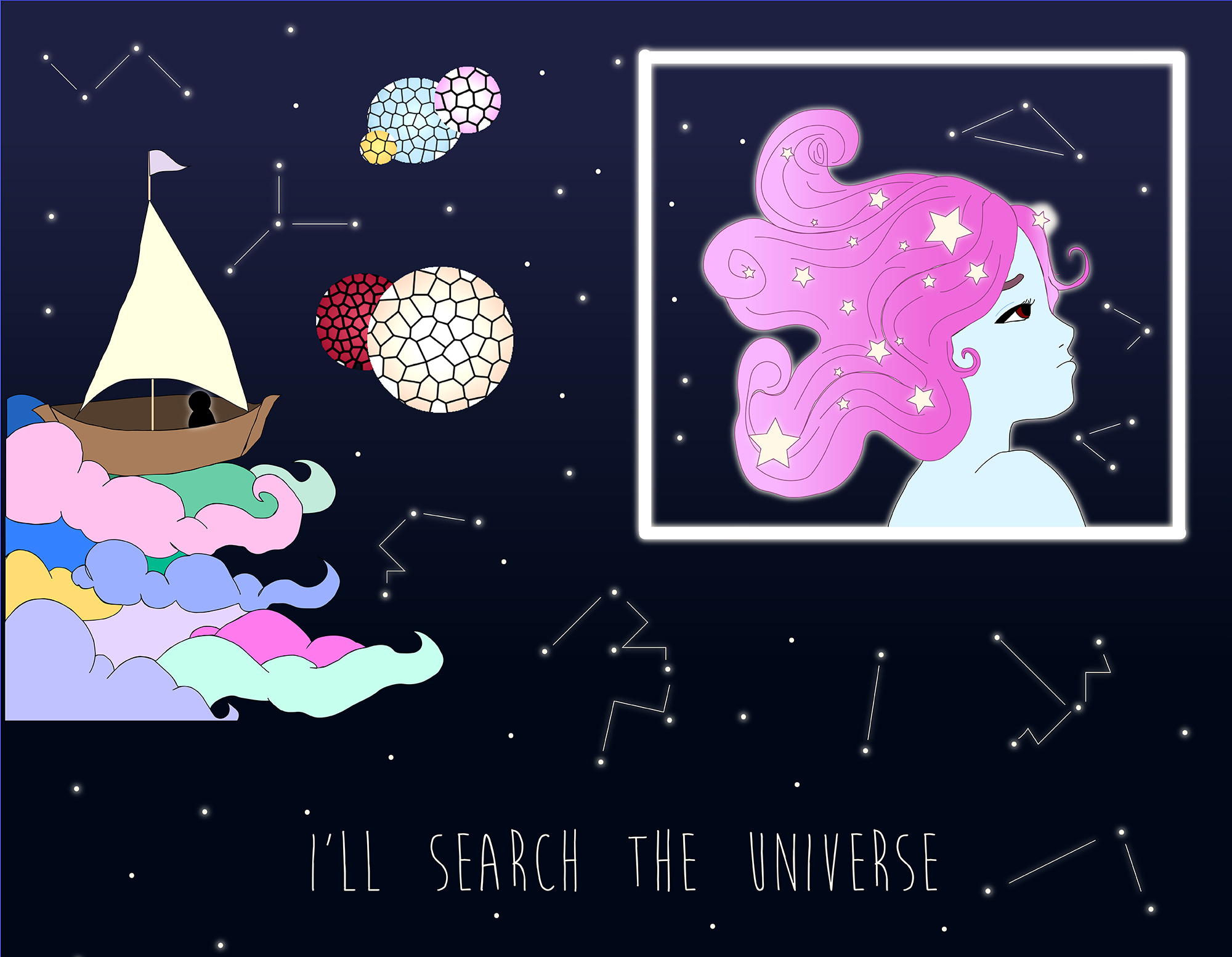
For this weeks comic I decided to tell simple story of a lost love. I think my comic uses interdependent word-picture combinations. I believe that without the phrase “I’ll search the universe”, that the comic would not have the same effect. So by including the phrase, I feel that it ties my comic together smoothly.
I think that I use the duo-specific combination, because in the main “panel” I have the boat “sailing” through outer space. My phrase gives purpose to my panel and the overall storyline. The phrase also conveys the same message as the boat. That the figure in the boat is searching on the “clouds” within the universe.
For tools and techniques, I did use illustrator again. However, unlike last week I challenged myself further and took into consideration the feedback I got from last week’s comic. I wanted to add more color but also keep it simple. I also used the gradient tool in order to create and color my female figure’s hair. Using this tool really helped me get the effect that I wanted for her hair. It also added more dimension to my comic instead just having it all be solid color blocking. I also used the gradient tool for the background of my comic, I originally was going to just have it be all solid black. But then I decided that it made my comic look too boring and plain, especially since I was already using a simple color blocking for the boat and clouds. For my planets I used some of the photoshop effects within illustrator, I did this because I wanted to do something else besides gradients and color blocking. I chose the stained glass effect because I liked the way it made my planets really stand out. I also used the glow effect for several objects within my comic, such as the silhouette and the stars. I feel this adds more to the space aesthetic I was going for. It also helps my figure in the boat to stand out more and not be lost within the background.
What I noticed with this weeks comic using the tools, that I was more confident and comfortable with Illustrator. I used the same technique as last week, sketching first and the digitally rendering the comic. I think doing the comic digitally instead of traditional really made my piece stronger than it would have if I just used paper.
For closures I feel it can be many of the ones mentioned by Scott McCloud. But I feel that it could be both subject to subject and aspect to aspect or even scene to scene. I left my comic this way because I wanted there to be many interpretations.
I decided to shape my story after my biggest stressor currently, being deadlines. I have a lot due this week, so I let the story in my comic for this week help me express the stress. This was engaging with the readings in McCloud’s “Understanding Comics,” as it gave me the opportunity to experiment and practice with the linguistic mode, as well the appearance of my diction. With this, my comic uses interdependent word-picture combinations throughout almost each frame as they refer to the topic of “social distancing.” However, the images themselves did not physically represent or show a person separating themselves from a group of people, but instead showed things such as a table and plate, a Nintendo switch, and a bed. With familiarity of the current situation we are all facing, many can recognize these visuals to be things the speaker might be doing while social distancing. However, as these visuals go hand in hand with the my linguistic decisions, interdependent word-picture combination is visual throughout my comic. A more specific combination I want to point out in my comic is within the very last frame, being montage. The words here take up the space in the frame and appear as though they were surrounding, or flying towards the individual represented. This was my attempt to make the words seem significant to story, and the impact this linguistic mode has on the individual in the frame. I often used the pencil tool and its fill option, and the shaping tools consisting of the rectangle tool, ellipses tool, and straight line tool. Finally, the textbook tool which made me realize that I did not necessarily have to create a square for my linguistic mode. These were extremely beneficial with my experimentation with words as I was able to make it appear as though the words throughout the comic were more of the speaker’s thoughts, rather than an actual conversation. I was also able to choose a font that seemed more similar to thoughts, or journaling as it looks like handwriting. However, within the last frame, the words are bolded, large, red or black, and surrounded by lines to express aggression, giving the linguistic mode a frightening feel. Finally, some other observations I made with the techniques I used this week is that red is a scary color! So I used it to my advantage in my comic. Also, distance between the frames are important as they make it feel more comic like and guide the reader, things I learned as I experimented with different size squares. In terms of closure and time in my comic, I tried to ask for some reader participation, especially as it is in reference to current issues today. With this, the reader can identify all of these frames to either represent one single moment, such as forgotten food due to a video game seen in frames two and three, or a series of things done throughout a day, or even a week or two. With this, it is a lot of either aspect-to-aspect, or subject-to-subject which is more supported by the the linguistic mode used in the comic.
Comic by Korie Cedre, made on Adobe Illustrator. April, 2020.
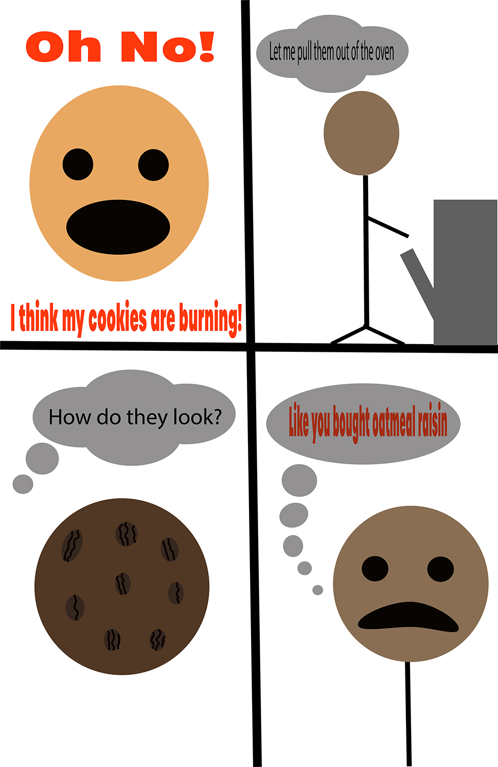
The comic that I created was interdependent on the text and images. It starts by showing a character with a panicked expression on his face but you would not know why he was worried unless i put the bold text stating that he was worried about burning some cookies that he had put in the oven. In the second frame you might not have been able to tell that the second character was opening an oven unless I made him mention that he was doing so. You may not have known the cookie shown in the bottom left was oatmeal raisin, if i hadn’t put any text saying that they were.
The first frame illustrates a Word-Specific combination because the picture does not add meaning to the story but just gives it a visual to an already established dialog. The third frame illustrates a Picture-Specific combination because the picture of the cookie shows that it is oatmeal raisin and the speech bubble of text just adds context to the story and asks about the cookies and doesn’t explain the frame itself. The final frame shows a Duo-Specific combination because Without the second character saying that they are oatmeal raisin it may be unclear which type of cookie they are but it says that they are oatmeal raisin, however without the picture you may not be able to indicate that the character is saddened by the news of them being oatmeal raisin.
I used the oval shape builder tool to create the faces of the characters and used the selector tool to choose points on the shapes and move them to warp the shapes. I used the paint brush tool to paint the squiggly lines on the cookie to create the look of the raisins. I also used the rectangle tool to make the oven that the character is pulling the oven out of. I thought that using the shapes and putting them to together and grouping them created nice looking objects that I could adjust the size of.
The tools I used were easy to use and put together shapes to make objects.