Week Blog: Living in Line: Edgar Martinez

A comic about working at Amazon

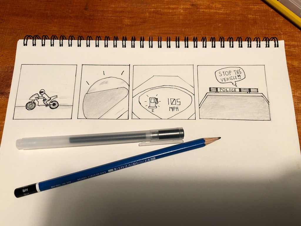
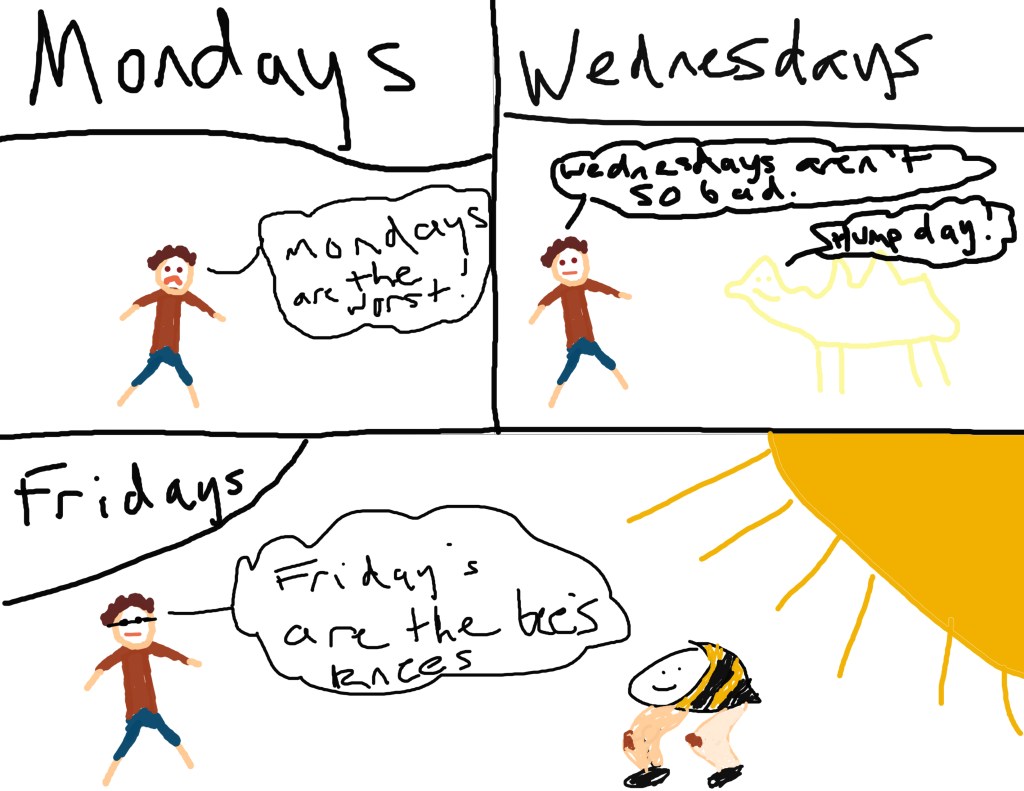
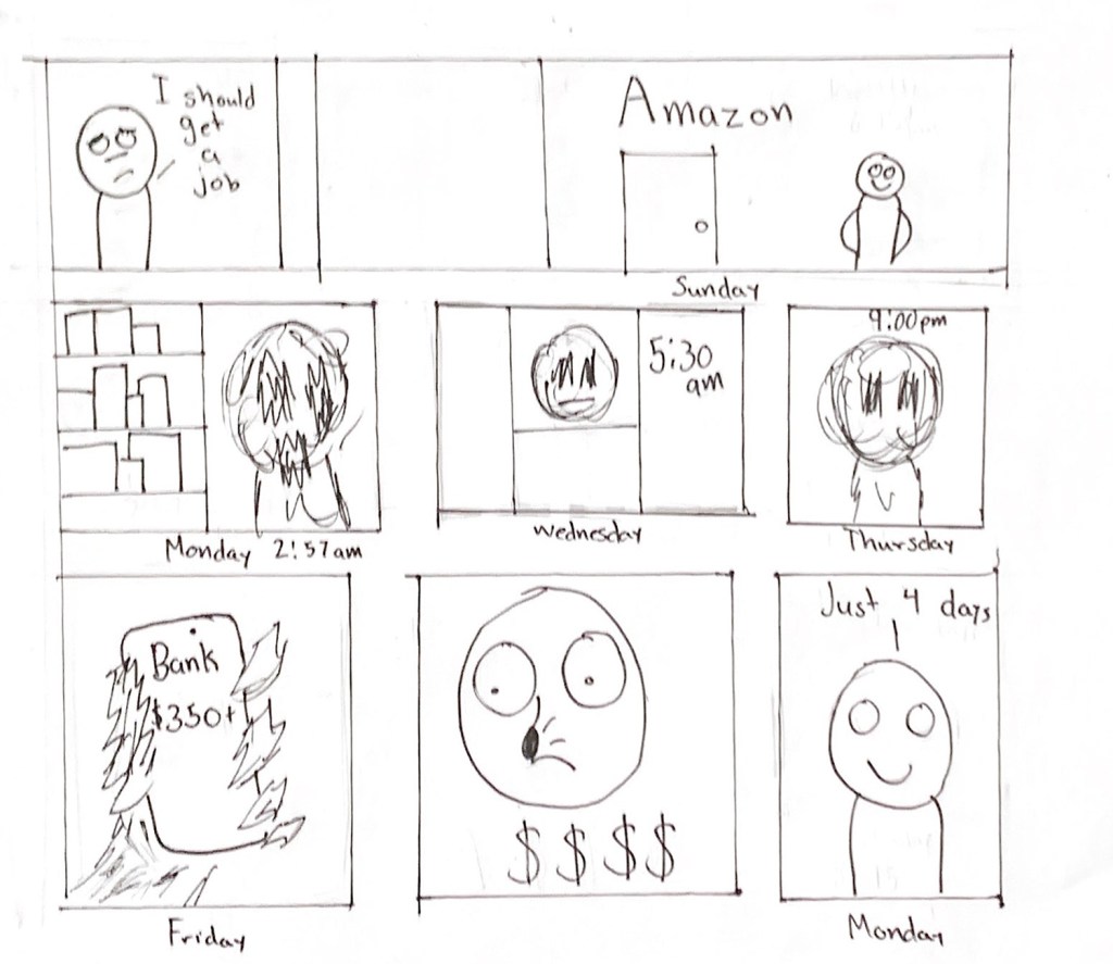
When I was thinking about using lines in this comic I kept coming back to the idea of clean and sharp lines vs rough, messy lines. I am a huge fan of the sketches and despite looking rough that they can convey the same amount of emotion as other drawings. That is how I decided to use rough messy lines to convey emotion in my comic.

I got a job at amazon during spring break and have been working the graveyard shift as a day job would interfere with my online classes and that decision is what inspired my comic. I wanted to contrast the two types of feelings I had when it came to my new job with the two types of lines that I was going to be using. The sharp and clean lines would represent joy and comfort while the rough and messy lines would represent my dread. I found throughout the week I am dreading the days and my work but as it is hopefully shown in the comic once I get payed the dread disappears and the cycle continues with a new week.

I used pen and pencil in order to create my comic and found that the pencil was an amazing tool in order to create the messy, sketchy look that I was looking for. Once I had the outline of the comic done with pencil then I went over it with my pen. I found that using the pen made everything more defined and pop out which was great for the sharp lines that I was looking for but it made the rough sketchy lines look too clean. I had to find a way to make the defined pen look not defined and messy and I think I managed to achieve that in my comic. I used a week as a basis of time for my comic with each panel representing a new day and it is all a part of the week.

Posted in 201 Blog, Living in Line | Leave a comment

Weekly Blog: Show and Tell: Malvin Malai-Harrison

For my comic, I wanted to create one that was very short but to the point, similar to the examples that Scott McCloud included in his book. For each panel, both the pictures and the words both depend on one another to covey the full meaning of the comic.

This comic is an exaggerated illustration of how I feel during the quarantine. Every day, the news media are always filled with bad news regarding coronavirus getting worse. It’s easy to pay attention to that but sometimes we all need a break.

The words at the bottom of the panels are a narrative of what the person is feeling. They’ve obviously grown tired of hearing the news. The “tick tock” around the clock depicts the passage of time and the clock functioning. While the words underneath guide the narrative, the words and the clock help illustrate the overall idea of the panel.

Then, I used a calendar to illustrate the passage of time on an even longer scale. While the months are still just words, it’s used positioned to reference a calendar. Also, the year shows just how long this person has been dealing with Covid-19 and has been in social distancing measures for.

In regard to McCloud’s word-picture combinations, I’d categorize this comic as duo-specific word-picture combination. This is because both the words and the pictures both work in conjunction with one-another without focusing predominantly on one or the other. Both the words and the pictures are inter-dependent on one another and both separately do not convey the entire message/meaning.

I used pen and paper again for this comic. Using these tools helped me depict a bit more of my personal way of drawing, rough around the edges while still communicating the message.

Working with this medium again, I noticed that little-by-little I’m getting slightly faster with my drawings. However, I need more practice to make the illustrations look cleaner.

Posted in 201 Blog, Show and Tell | Leave a comment

Weekly Blog: Living in Line: Malvin Malai-Harrison

Through this comic, I was wanting to convey a feeling of tension and panic in an intense situation. The motorcycle driver is seen here driving away from something when they look at their fuel gauge and notice that they need to refill soon. This is a problem especially after revealing that what they’re running from is actually a police car. Even though the reader can’t see the facial expressions of the driver, they can infer from the context that they are most likely very panicked about their situation and maybe trying to find some way out of it. However, we don’t know.

The tools I used for this comic was a piece of paper, pencil, eraser, pen, and a ruler. Since I’m not that skilled at drawing by hand, this definitely affected my overall image quality. I had to erase and redo many parts just to get them to where I wanted them to be.

Working with this medium is pretty nice because you can erase and start over as many times as you like. Once you get it to where you want it to be then you can go over your work with a pen and makes it look much cleaner and defined. However this is a very tedious process. From our visit to the museum, I noticed that most of the comic artists work with a pen and paper first before moving to a digital medium. I wanted to give this method a try, and I can definitely see the benefit from this method.

Posted in 201 Blog, Living in Line | Leave a comment

Weekly Blog: Show and tell: Mitchell Delmage

For my comic this week, I created a scene where a car drives from Wyoming to Colorado. I used techniques from Scott McCloud’s, Understanding Comics. I used the additive combination of words and pictures and the interdependent technique in the first panel. The first panel is additive because the words add information to the image and the story. It is also interdependent because the words and pictures go hand in hand. The second panel uses the interdependent combination as well because the picture and the words go together to set the location. The second panel also could be considered a montage because the word is integrated into the image. The third panel uses the additive combination method because the words do not do anything except add information to the image. The fourth panel uses additive, montage, and interdependent. It is montage because the words in the sign are a part of the image. It is interdependent because both sentences go hand in hand with the image. It is additive because the words add information to the image to set the scene and describe the story. I used an app called sketchbook to create my comic. I assume it is very similar to illustrator but much more simple. I like using apps like sketchbook because it can make it really easy to create perfect shapes. It is especially easy to create the panels using a software, versus hand drawing the whole thing. I used a really long panel of the landscape to show that the car is driving for a long time. The only closure in the story is at the end when the car arrives at the destination. The viewer has no closure and has to assume what the reason is for the trip and who is in the car. I never put a person in my comic to make it more universal.

Posted in 201 Blog, Show and Tell | Leave a comment

Show and Tell: Sophie Dimry

Hand Drawn Comic by Sophie Dimry

In this comic I decided to portray my idea of what I think everyone will be doing during the summer while we are quarantined. The comic shows a person with a long list of nothing to do for his day in quarantine. The man decides to lounge in the pool for the remainder of his day to relax.

This comic is more picture specific, as it shows words that go with the sequence of events displayed by the images. Scott McCloud explains the picture specific combination as a way to “ass a soundtrack to a visually told sequence” (McCloud, 153). To showcase this idea I drew a sequence of events and added some sound components as well as speech. Throughout this comic the use of words do a couple different things to add to the visual storyline. In the beginning the To-Do list gives the reader a glimpse into the storyline as well as the speech bubble above it, narrating the events. The use of time is also shown through time stamps at the top of each panel to indicate time passing as well as a following of the aforementioned schedule. The words also indicate sound when the phrases “aaaahhh” and “sluuurp” are used. These words alone can mean different things but when put into the context of these visual images, it creates a sense of relaxation. The use of these sound phrases with the images is an example of duo-specific. When alone, these words do not necessarily fit into the story or can be interpreted in different ways, but when paired with the images, the story makes better sense. This idea also relates to McCloud’s definition of interdependent word combinations because the words and images go together to convey the story, and neither of them could effectively do that alone.

For this comic I chose to work with pens, markers, and paper. I prefer this medium more than Illustrator because I feel I am able to control how I want the images to look better. When I am drawing I feel as though I have more control over my strokes, placement of images and words, and layout. I found it more difficult to control the way I drew in Illustrator and preferred this method more.

Posted in 201 Blog, Show and Tell | Leave a comment

Show and Tell: Ruby Hopkins

For this week I decided to make a comic or collage type of deal that depicts several different types of flowers and the point of it because I drew it in black and white was to imagine the colors each flower would have. While there is a title added to my drawing, “Find the Red Flower”, I still know that when someone where to look at the image and know the rose was the red flower. Why? Because roses are red, violets are blue and so on. While the wording itself works independently as instructions or a title, the images themselves act independently simply as what they are. Flowers, displayed across a page drawn by a simple graphite pencil. I feel that I used the word picture combination duo specific because without my instructions those looking at my writing may not understand what the point of the drawings are or what you are exactly supposed to do with it.  The tools and techniques that I used to create this comic was just a simple graphite pencil and my sketchbook. It had simplicity and detail to it all at once. My placement was very specific of each flower as well. I made sure the rose was the one to be full center of the page so that was hopefully the first thing many drew their eyes to. I know that this class is based on photoshop, but whenever I am given the chance to pick up my sketchbook and draw, I make sure to fully take on that opportunity. I love how I can draw lines on a page with no specific ending point and just see what my outcome will be. When making cartoons, especially ones accompanied by words, I try and keep them as simple as possible. Sure I could spend two hours drawing a beautiful realistic flower, but I love how simple some sketches can be but anyone who looks at the image will know exactly what the drawing is supposed to be. 

Flowers: By Ruby Hopkins
Posted in 201 Blog, Show and Tell | Leave a comment

Weekly Blog: Show and Tell: Maria Alvarez

Comic done in Illustrator by Maria Alvarez

I wasn’t sure what to create in the beginning, but then I thought to keep it simple. I saw many people on social media say their sleep schedule was way out of line and that made me think of mine. I like to think my sleep schedule is pretty normal. So I decided to do a comic that I think many people can relate to. While being stuck at home all day with nothing to do, I realized to make my comic about that. I am usually always in my room and on my phone because I don’t have a TV in my room. I usually go to bed around midnight and wake up around 10 am. That’s actually pretty early for me because I like to wake up really late, but I have to take care of my nephews. I wanted to make the comic a little more funny so I exaggerated on the times. Even though I’m sure there are some people who actually have their sleep schedule like that. I was going to start the first frame with the sun out but then I thought it would be better to have the night sky because I wanted to show that is when the day is starting. In the first frame, the stick figure is using a phone, it might be a little hard to see that because of the color. I was going to choose black, but I didn’t want a lot of dark colors since the bed was already a dark blue. But I wanted the bed to be dark because it stands out, to show that the figure hasn’t moved all day.

I had used Illustrator before, but I’m still learning how to use it. I divided the page into three sections so it could be in a three frame layout. I used the shapes to make the bed and the window because I couldn’t draw it all. I also used the pen and the paint brush to make the Zs and the sunrise on the window. I made my own speech bubble and I liked the font I used; it is very simple just like the whole comic so I thought it would fit better.

Posted in Uncategorized | Leave a comment

Weekly Blog: Show and Tell: Dean Janikowski

So for my comic I used 4 different squares to make a quick an easy flow of how to read my comic. 2 boxes on the top and two below. For my comic the first square is a person at the store asking to see who the owner is. In the next box to the right is a stinky old man who smells and has lots of flies around him. The third box is a guy who looks like a felon and is all chained up and dirty. The last image is a guy in a suit with money floating around him. The last box is intended to make it look like he is for sure the owner of the company based entirely off of his looks and the money floating around. The comic uses interdependent word picture images by detailing the looks and conveying text through image which h helps you answer the original question which is, who is the owner of the company. The other word picture combinations in the image is the text over each image of potential business owners and it says “are you” over every single box. The specific tools I used was shading, details, and a lot of interdependent word picture combinations. I accomplished all of this by using paper and a pencil. The closure between each box was very minimal as all the boxes were placed directly next to each other giving it no room which kind of caused you to move to the next three boxes a lot quicker. I would say with this comic I used all of the tools I have learned over this year and combined them all to create this comic. With the comic I thoroughly enjoyed making this comic and being able to test out the characteristics of interdependent word picture combinations.

Comic by Dean Janikowski
Posted in 201 Blog, Show and Tell | Leave a comment

Blog 8 Weekly Comic: Show and Tell: Brady Davis

For my weekly comic, I decided to pick a topic everyone can relate to. I chose to depict the work / school week in the three phases that I and most people use to judge the status of their work / school week. For me it comes in the form of Mondays, which are always the slowest day of the week as it comes off the heels of the weekend where everyone was having fun without priorities. It also marks the longest point of the week from being care free again. Wednesdays are always that halfway point which aren’t the worst and are signs of things to come. On Wednesdays I usually start making plans for the upcoming weekend and the end is in sight. Fridays are usually a vacation day in that the whole day doesn’t seem like any other day of the week. Everyone is usually more laid back and care free and is looking forward to getting out of class. It’s hard to be in a bad mood on a Friday.

I used my typical 3 frame layout to draw this one where each frame is representative of one of the aforementioned days. Mondays are the worst. Wednesdays (hump days) aren’t so bad, and Fridays are the bee’s knees! I found this to be a good example of interdependent word picture combinations as without the text to label the days and talk about them, the comic would have an entirely different meaning and probably wouldn’t even make sense. I found the two to be very intertwined needing one another to give the full effect. Similarly, the text bubbles make the relationships and juxtapositions between each frame blatantly obvious as they were meant to. Once again, I used Photoshop as my primary tool to draw as illustrator was still being glitchy on my MacBook.

Posted in 201 Blog, Show and Tell | Leave a comment

Show and Tell: Diana Alonso

Comic created by Diana Alonso April 2020

For this weekly blog, I decided to come up with a story related to today’s recent quarantine. Basically, my story is describing how the sun feels since everyone is in quarantine, and the outside is to be avoided. In my image I used various techniques to put together my story. Some include the brush tool, lasso, shape, shape builder, and a few other more. Without being able to use these tools I would not have been able to complete my comic as I wanted. In one comic panel you can see how there is a brown square/rectangle that you may not know what it is, but in another panel I added the same shape, but that one indicated what it was, with the use of words, such as “dock”.

One of the tools that I used the most was that gradient tool, which allowed me to make my lake seem more livelier, rather than if I used a plain blue color. Another way I used the gradient tool was for my sunset. This also allowed me to show how the sun was about to set, after being alone all day since there was no humans around. This allowed me to have a more defined sunset, instead of just using a plain blue color, which may have been confusing.

Something that I had noticed when using these digital tools was that in order for some tools to work, or to make a more drastic change to your images, you must use other tools combined in order for it to work. A few combined tools that I used often were the selection tool, the lasso tool, and the shape builder tool. I used this combination of tool so I can recreate different shapes that may have been more difficult for me to create. One example that I used these tools on was to create my crescent moon, I created two circles first, and deleted sections as I went.

Posted in Show and Tell | Leave a comment