Northwest Alternative Comics: Sabrina Hoenes

Sorry Sheets, Eroyn Franklin

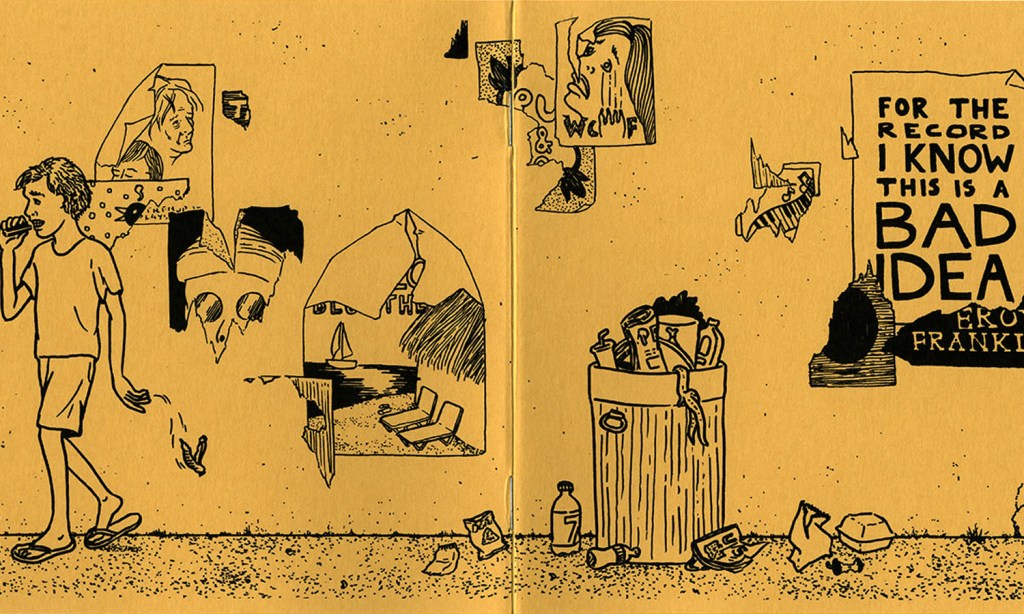
The alternative comic that I looked at during our time at the Collection Study Center is the mini comic called Sorry Sheets by Eroyn Franklin. For elements and design, Franklin uses repetition and different forms of lines. The lines that are used are mostly used for shape and texture. The shapes that can be seen are the shape of the main figure seen throughout the comic and of the figures hands. Lines are also used to create hair for the figure as well as the texture for the rug. The lines that are used for the hair vary in length and direction. Franklin also uses a form of implied lines for the rippling water effect. There is also a great contrast between the clean water, represented by the white color, and the water that gets mixed with blood, the black color. The contrast creates a pattern within the rippling water as well, which is a form of repetition.

Sorry Sheets, Eroyn Franklin

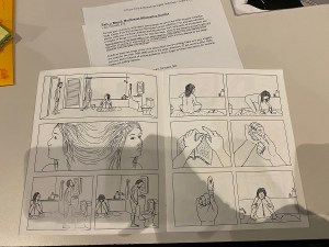
The most interesting aspect in the comic however is the use of a different form of repetition; repetition of scenes. Even though it is different from the principle of repetition discussed by John Lovett, I do want to mention his words of “When the variation is missing, repetition becomes monotonous.” When I realized that the scene was being repeated and that the panels were the exact same, it made me want to go back and reread the mini comic again to get a better understanding of what was happening. After many rereads I still haven’t quite grasped exactly what message or experience Franklin was trying to convey, which in my opinion makes for a great example of asking for active participation from the readers. When it comes to closures for this mini comic. There were a lot of uses of action to action and subject to subject. which an example can be seen on the right page.

Posted in 201 Blog, Northwest Alternative Comics | Leave a comment

Northwest Alternative Comic: Amanda Retchless

When we went to the Museum on Tuesday, we looked at a few different works of comics. I found one that was really interesting and caught my eye. That comic being “Unidentified Feeling Object”, by Mita Mahato. The comic was very short, but I think that it was really sweet and cute. The comic was about this UFO that had found a heart. In the short comic the heart is being dragged behind the UFO. In each frame the line connecting the UFO and the heart got thinner and eventually broke. The heart then went off falling. In the image, the heart is shown falling down from frame to frame. This is done using motion lines and it does a really cool effect where the images are not being limited to the panels and the frames. This comic shows shape and direction. I say this because of the way the heart was falling. The heart wasn’t only falling in the story, but it was also falling through the panels. I thought this was super cute and creative. Some principles that I think were used was contrast, balance and harmony. Contrast because the heart stands out compared to the dark sky or background that was being used for the duration of the comic. Balance because of this particular page. The sky and the forest seem to share the page. What I mean by this is that the forest seems to take up about half of the page whereas the sky seems to take up the other half. I also think that contrast can be in play here because of the light colored trees compared to the dark sky. As well as the white stars in the sky. Lastly, I think harmony. Harmony because it seems that the color palette that was chosen doesn’t seem to harsh from each other. The color tones all soft and purple. This was meant to be a soft comic that is deep, and that was able to tell a story without words.

Posted in 201 Blog | Leave a comment

Northwest Alternative Comic: Ruby Hopkins

I chose to write about the comic “How 2B King” by Taylor Dow because this specific work of art really caught my eye. While all the other artists had amazing pieces to offer, I enjoyed her simple, linear trajectory of her story while giving it an interesting twist through her drawing style and coloring choices. Simply looking at the comic without looking into the elements and principles of design, the comic looks pretty straight forward. But once taking a closer look, the work produced a lot more emotion from me and attention to the small details that really made it stand out.  First, and most obvious, the color style. Dow decided to draw the entire comic alternating panels in a red or blue panel, the comic in its entirety was drawn using these two colors alone. It gives the comic a fun side to it, catches the readers attention, and draws it away from many other comics that are simply black and white, it immediately stood out to me. I began to question if these color patterns perhaps had meaning behind them, that they were placed in specific areas for a reason, to create a mood. The element of line in this comic also draws attention to me because of the curvature of some aspects, and then the stark angle of others. Bringing in strange abstract shapes into symmetrical panels was a fantastic way Dow used lines to give the comic more uniqueness to it. These elements of design have changed my interpretation of this comic because I looked much deeper into the artists technique and really tried to connect color and line to the work itself and dissect the reasoning behind the specific style. Rather than just looking at a comic book, I was looking at a form of art, that took time, consideration, and. Method. 

How 2B King by: Taylor Dow
Posted in 201 Blog | Leave a comment

Northwest Alternative Comics: Ethan Miller

This image was the most interesting of the entire collection to me. The way the artist used color just drew me in and made me not stop looking. The deep blues contrasted with the orange of the family and the fire. The image obviously tells a story of a family seeing their house destroyed, their life destroyed. It’s a very simple idea that uses color to make one of the greatest losses of all possessions feel so much greater. The use of blue and orange and white space all together make the story feel so much stronger. As for closure and time frames, their isn’t really multiple images juxtaposed so it’s hard to find examples that would exploit that type of movement or style. In terms of design principals although this watercolor exceeds multiple categories. The direction of the smoke, the line in the windows, the contrast of the family and the house, the color of the tone of blues, the shape of the smoke using whitespace, the texture of the fire. I could go on an on about how this artist uses the elements to draw the viewer in and make them feel the devastation that this poor family is feeling. The interpretation of the comic changes as you see more and more details, looking at a stand point of these design elements and principals. Once you notice how many different pieces she used to cohesively tell this story of pain accurately and knowledgeably becomes all the more obvious when you can appreciate the thought that went into this work.

Posted in 201 Blog, Northwest Alternative Comics | Leave a comment

Northwest Alternative Comic: Dean Janikowski

Unfortunately, I was not able to make it to the museum due to sickness, so I was stuck with having to search through WSU website. I made through to go through the whole website and take a deep look at each of the artworks. Then I finally came across one specific artwork that I really liked. For blog 5 I decided to look at Eroyn Franklin. More specifically I wanted to examine his work called, “for the record, I know this is a bad idea.” I really liked this piece for many reasons. One for just being straight to the point. You can easily tell the message he is trying to persuade. In the image it says “for the record I know this is a bad idea” on a poster. This is directly related to all the things the kid is doing in the image. The kid is smoking and littering and behind him is a trashcan and a bunch of other trash on the floor and not in the trashcan. You can also see the tattered posters on the wall giving it a real beat down area type of vibe. I also love the simplicity of the colors. He uses black and yellow only. This gives it a very cool vibe. The element of design that he used was incredible. I want to focus on the two main things he used and that was line and texture. The lines he used were very fluid and easy to understand. Everything was made simple and had a purpose. The character specifically only used a few lines to make. The texture used in this was also very interesting. In the image you can see texture on the walls and floor mainly. The walls were ripped and torn and the floors looked like they had a rough surface kind of like sand or cracked concrete. Overall, I really enjoyed this artwork and was easily one of my favorites because of the way he used elements of design.

For the record I know this is a bad idea By: Eroyn Franklin
Posted in 201 Blog | Leave a comment

Northwest Alternative Comics: Zackary Reynolds

Max Clotfelter “Pube Smoke 2”
Found in
WSU Museum Collection Study Center
from the Northwest Alternative comics collection

The example I decided to use from the WSU Museum Collection Study Center from the Northwest Alternative comics collection was one from Max Clotfelter. I chose this page because it the ending was unexpecting. A design element it used was lines. Some of the lines used is linear marks, alignment, and to create other elements. An example of the linear marks is on the last frame where the person moves their arms and Max Clotfelter uses linear marks to create motion. An example of Alignment lines in the comic is the frames itself to keep all the frames aligned. An example of line used to create other elements in the comic is on the edges of the frames to create a shadow effect. Another design element Max Clotfelter used in this comic the value(tone) of the comic. The way he does this is by making the room and other objects feel darker using shadows. 

Some principles of design used in the comic is gradation and dominance. Max Clotfelter uses 2 types of gradation, static and dynamic. An example of static gradation used in the comic is on frames one and two on the chairs the people in the comic sit in. An example of dynamic gradation he used in the comic is one the edges of the corners of the walls in the comic. 

A type of closure used in the comic is action-to-action closure. The way Max Clotfelter uses this is when in frame three when the person asked what the other person will decide to do. Then in the next frame the person jumps up and says both loudly. He also used an interesting time frame for the last frame. He made the last frame bigger than the other frames which makes it feel like that moment lasts longer than the other frames. 

Posted in 201 Blog, Northwest Alternative Comics | Leave a comment

Northwest Alternative Comics: Daniel Blanchard

For this blog post, I used examples from Paul Chadwick’s work, “Fanzines.” This piece of work done by Paul is nothing short of extraordinary, The number of elements that are used in his work, you would need more than 10 fingers to count. Paul has many different drawings in his fanzines series but the one I am focusing on for this blog is “APA-5 80″ and ” This example I feel has the most elements and did a very good job of capturing my eye. The first element I want to discuss is “lines,” The lines used in this art are everywhere. From the blueprint in the background to the lines used to depict muscles on the robot’s arms, there is no shortage of them in this graphic. Another design element that is used very well in this graphic is “texture,” the texture can be found in the darker shades of the piece. The lines and criss-cross patterns throughout the robot adds a sort of muscle texture to the graphic. The last element I will mention, even though there are so many in this graphic, is color. A lot of the other pieces of work in Paul’s “Fanzines” portfolio are black and white but there is a select few with color and I think the ones that do have color are exceptionally pleasing to look at. It adds a mood to the graphic and helps the viewer have a feeling towards the piece of work.

After looking at Paul Chadwick’s “fanzines” series, it gives me a good idea that comics don’t have to only be animated characters with a bunch of text bubbles. They can be amazing and detailed pieces of work sequenced just right to tell a story and keep the viewer intrigued. In this series, there are not very many examples of time and closure, but a lot of the pieces of art don’t have much explanation to them and leave the reader intrigued and puzzled in a sense. This makes the viewer make their own scene and play out what happens by using their imagination. This, I believe is something very special and hard to do successfully.

Posted in 201 Blog, Northwest Alternative Comics, Uncategorized | Leave a comment

Northwest Alternative Comics: Edison Soliman

Dirtbag” panel by Eroyn Franklin

At the WSU Art Museum Collection Study Center I was exposed to a multitude of different comics in a varied amount of art styles. The one that stood out the most to me was this single panel by Eroyn Franklin. Just from this single panel it really drew my attention away from the others around it. Mainly due to the fact it is really impactful in the way it is composed with a single family watching over a roaring fair engulfing their house. Another reason why this caught my eye was because of the interesting color scheme. She chose to go with a blue color overall but an orange on top to give great contrast to the fire and the family sitting below. Overall, I found this piece really interesting to look at visually as well as amusing to interpret.

At first glance I attempted to guess what the comic could possible be about. From the single panel I assumed that it was a family that just went through a horrible misfortune of having an accidental fire take away their home. And later that they would have to work their way back up by finding a new home to live in. When I found Eroyn Franklin’s website full of her archived comics I was able to finally read the full comic. To my surprise, the comic was a little to the way I interpreted it. There was just more depth in the beginning of the comic. It was a memoir to her early 20’s and it illustrated her life as a “dirtbag”. As she was hanging out with a friend she sadly had to come home to a fire at her house.

Page from “Making Tide” by Eroyn Franklin

Looking through Eroyn Franklin’s website I was also able to see more of her work. Shockingly I found out that almost all of her work was done in a lot of different styles and mediums. She seems like a very versatile illustrator who is able to create many interesting works which is incredibly impressive. One example is this comic called “Making Tide” which is in a completely different style compared to the previous “Dirtbag“. This also includes a time frame example where it shows a montage of this couple having a “magical summer”. Each panel is a different time during their summer together and the reader would have to interpret it as a montage.

Posted in Northwest Alternative Comics | Leave a comment

Northwest Alternative Comics: Maddy West

There were a lot of unique comics that we viewed at the WSU Muesum Collection Study Center that were featured in the Northwest Alternative Comics collection. One of the pieces that resonated with me was the piece by Mita Mahato. I was drawn to the fact that the art wasn’t created with the traditional pen to paper, but cut paper, that was pasted together.

These panels are from a comic by Mita Mahato that is now stored in the WSU Museum Study Collection Center. This panels uses cut out paper to create the picture that is shown, utilising texture to add to the readers experience. (Mahato)

There were many aspects of design that stood out about this particular comic. The main one that I noticed was the texture. Since we viewed the original art, I could actually see the depth of the work. I liked how the different types of paper had texture and how they all came together to create a physical “bump” that created the scene. I also noticed, and thought it was interesting how the panels, which are normally what someone would draw inside, seemed to be set on top of some of the cut paper. To me, this seemed to give more of a feeling of a world being created that we were being given a window view to. Another thing that I thought added interesting texture was the use of newspaper/book paper. This paper already has writing on it which just adds another layer to the picture that people see.

This is a set of panels from a comic by Mita Mahato, created utilizing cut paper. The comic this is from is stored in the WSU Museum Study Collection Center and was showcased in the WSU Alternative Comics show. This is considered and alternative comic because of the medium that she uses to create her art. (Mahato)

I also think that Mahato used the size element in an interesting way. Most of the panels were pretty similarly sized, but what she put in each panel was interesting. To convey distance, she utilized the panels to convince the reader that something was closer or further away. When she wanted a planet to look far, she would make it smaller and fit into a smaller corner of one panel. When she wanted it to look bigger, she would actually cut it in half and frame it so that it looked like the picture had just got cut in half and separated, which was similar to a scene-to-scene cut. This was a really good example of closure in my opinion because it allowed the reader to view the picture and put them together. The fact that nothing happened between the two panels was the whole point that Mahato wanted the reader to understand.

Posted in 201 Blog, Northwest Alternative Comics | Leave a comment

Northwest Alternative Comics: Yanir Govrin

A panel from the comic Concrete by Paul Chadwick

I really liked the art and the idea behind the idea concrete. I personally really like super hero stories and this unique one seemed really interesting to. Because it is only one panel you can’t look at closure but you can still look at use of time frames. This is a large panel so you can assume it takes up an entire page causing you to spend a lot of time focusing on the panel and makes it seem like a long moment instead of just a short panel you quickly read. I think this gives the panel much more weight and strength as a standalone panel.

Posted in 201 Blog, Northwest Alternative Comics | Leave a comment