
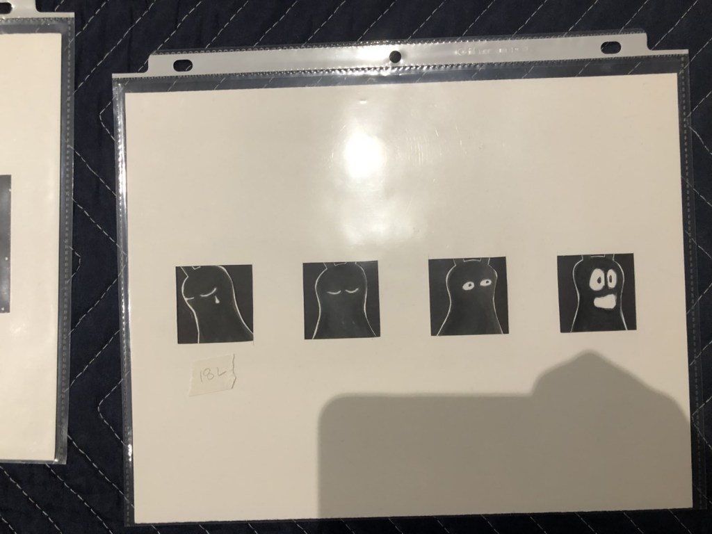
There were a lot of unique comics that we viewed at the WSU Muesum Collection Study Center that were featured in the Northwest Alternative Comics collection. One of the pieces that resonated with me was the piece by Mita Mahato. I was drawn to the fact that the art wasn’t created with the traditional pen to paper, but cut paper, that was pasted together.
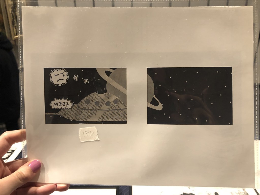
There were many aspects of design that stood out about this particular comic. The main one that I noticed was the texture. Since we viewed the original art, I could actually see the depth of the work. I liked how the different types of paper had texture and how they all came together to create a physical “bump” that created the scene. I also noticed, and thought it was interesting how the panels, which are normally what someone would draw inside, seemed to be set on top of some of the cut paper. To me, this seemed to give more of a feeling of a world being created that we were being given a window view to. Another thing that I thought added interesting texture was the use of newspaper/book paper. This paper already has writing on it which just adds another layer to the picture that people see.
I also think that Mahato used the size element in an interesting way. Most of the panels were pretty similarly sized, but what she put in each panel was interesting. To convey distance, she utilized the panels to convince the reader that something was closer or further away. When she wanted a planet to look far, she would make it smaller and fit into a smaller corner of one panel. When she wanted it to look bigger, she would actually cut it in half and frame it so that it looked like the picture had just got cut in half and separated, which was similar to a scene-to-scene cut. This was a really good example of closure in my opinion because it allowed the reader to view the picture and put them together. The fact that nothing happened between the two panels was the whole point that Mahato wanted the reader to understand.
