
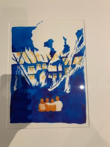
This image was the most interesting of the entire collection to me. The way the artist used color just drew me in and made me not stop looking. The deep blues contrasted with the orange of the family and the fire. The image obviously tells a story of a family seeing their house destroyed, their life destroyed. It’s a very simple idea that uses color to make one of the greatest losses of all possessions feel so much greater. The use of blue and orange and white space all together make the story feel so much stronger. As for closure and time frames, their isn’t really multiple images juxtaposed so it’s hard to find examples that would exploit that type of movement or style. In terms of design principals although this watercolor exceeds multiple categories. The direction of the smoke, the line in the windows, the contrast of the family and the house, the color of the tone of blues, the shape of the smoke using whitespace, the texture of the fire. I could go on an on about how this artist uses the elements to draw the viewer in and make them feel the devastation that this poor family is feeling. The interpretation of the comic changes as you see more and more details, looking at a stand point of these design elements and principals. Once you notice how many different pieces she used to cohesively tell this story of pain accurately and knowledgeably becomes all the more obvious when you can appreciate the thought that went into this work.
