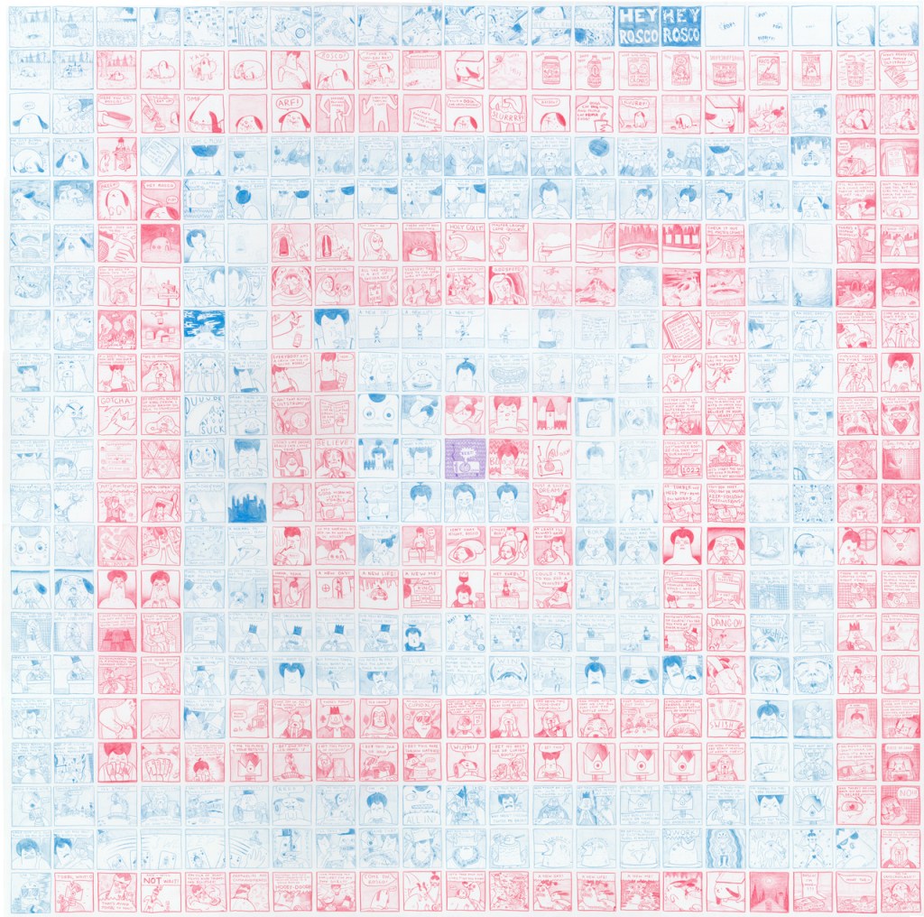
I chose to write about the comic “How 2B King” by Taylor Dow because this specific work of art really caught my eye. While all the other artists had amazing pieces to offer, I enjoyed her simple, linear trajectory of her story while giving it an interesting twist through her drawing style and coloring choices. Simply looking at the comic without looking into the elements and principles of design, the comic looks pretty straight forward. But once taking a closer look, the work produced a lot more emotion from me and attention to the small details that really made it stand out. First, and most obvious, the color style. Dow decided to draw the entire comic alternating panels in a red or blue panel, the comic in its entirety was drawn using these two colors alone. It gives the comic a fun side to it, catches the readers attention, and draws it away from many other comics that are simply black and white, it immediately stood out to me. I began to question if these color patterns perhaps had meaning behind them, that they were placed in specific areas for a reason, to create a mood. The element of line in this comic also draws attention to me because of the curvature of some aspects, and then the stark angle of others. Bringing in strange abstract shapes into symmetrical panels was a fantastic way Dow used lines to give the comic more uniqueness to it. These elements of design have changed my interpretation of this comic because I looked much deeper into the artists technique and really tried to connect color and line to the work itself and dissect the reasoning behind the specific style. Rather than just looking at a comic book, I was looking at a form of art, that took time, consideration, and. Method.