Found in
WSU Museum Collection Study Center
from the Northwest Alternative comics collection
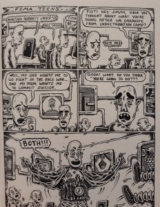
The example I decided to use from the WSU Museum Collection Study Center from the Northwest Alternative comics collection was one from Max Clotfelter. I chose this page because it the ending was unexpecting. A design element it used was lines. Some of the lines used is linear marks, alignment, and to create other elements. An example of the linear marks is on the last frame where the person moves their arms and Max Clotfelter uses linear marks to create motion. An example of Alignment lines in the comic is the frames itself to keep all the frames aligned. An example of line used to create other elements in the comic is on the edges of the frames to create a shadow effect. Another design element Max Clotfelter used in this comic the value(tone) of the comic. The way he does this is by making the room and other objects feel darker using shadows.
Some principles of design used in the comic is gradation and dominance. Max Clotfelter uses 2 types of gradation, static and dynamic. An example of static gradation used in the comic is on frames one and two on the chairs the people in the comic sit in. An example of dynamic gradation he used in the comic is one the edges of the corners of the walls in the comic.
A type of closure used in the comic is action-to-action closure. The way Max Clotfelter uses this is when in frame three when the person asked what the other person will decide to do. Then in the next frame the person jumps up and says both loudly. He also used an interesting time frame for the last frame. He made the last frame bigger than the other frames which makes it feel like that moment lasts longer than the other frames.
