Putting It All Together: Anh Ngo

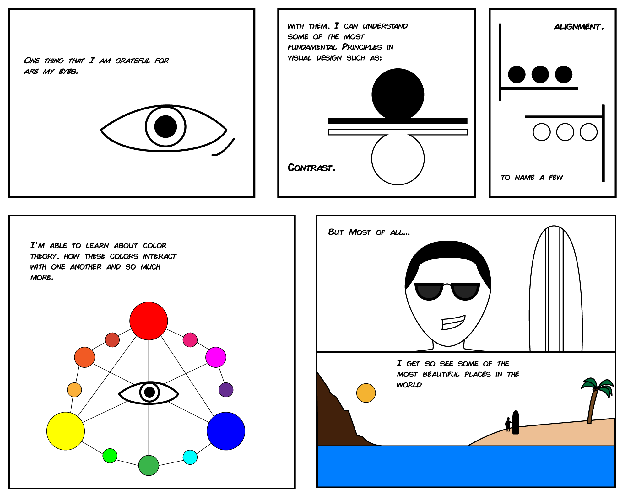
In chapter 6 of McCloud’s text, he illustrated the idea of the importance of having a balance of words and image to describe the story that the author is intending to convey while chapter 7 discusses the idea of applying six different steps from the text to really form that balance; idea/purpose, form, idiom, structure, craft, surface, craft, and surface. By having all these factors together, the comic will not only look more appealing, but also interesting to read.

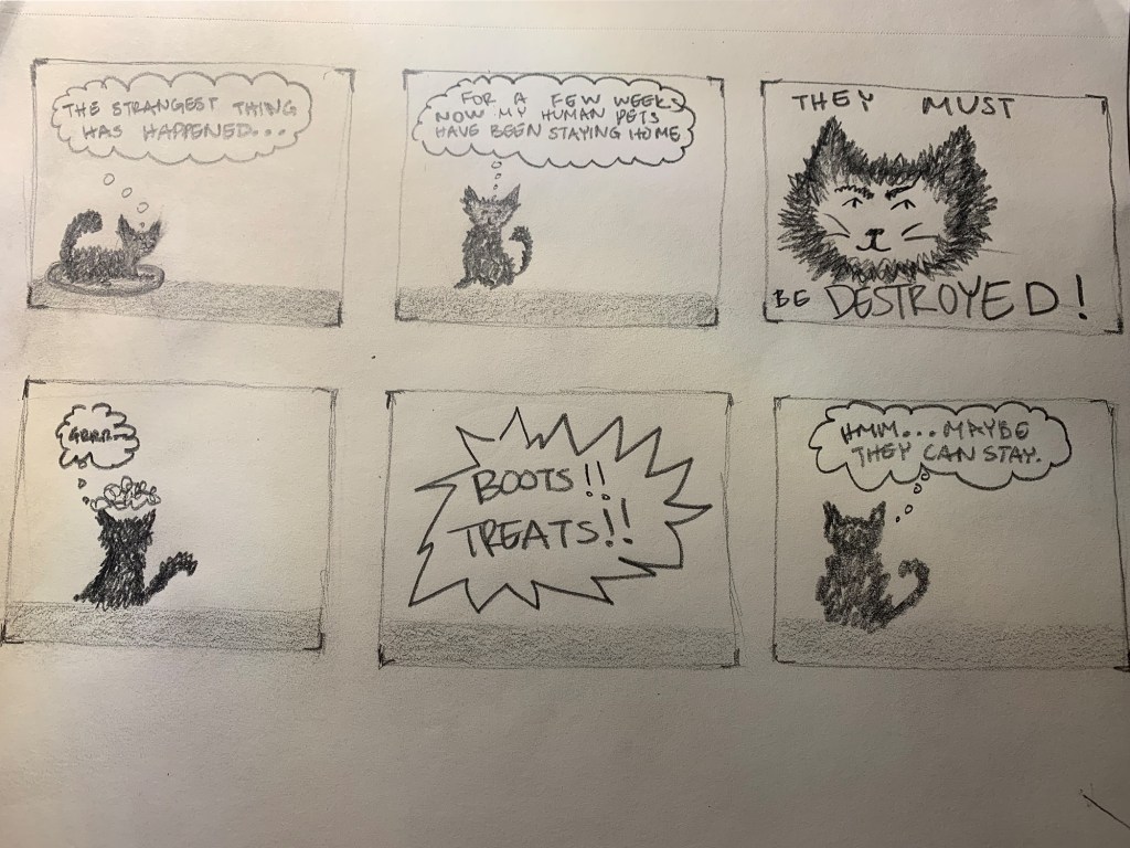
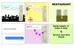
Since the topic for this week is expressing our individuality through the style of comic, I was unsure as to what part of me I wanted to convey. Due to the pandemic, we have all been staying at home to keep both ourselves and others safe, I was reflecting back as to what my life was before the quarantine started and truth be told, it hasn’t really changed too much. Except instead of taking online classes, I physically went to class. Because of that, I figured, why not create a comic based on my daily life? This type of story could be placed in the Slice-of-Life genre. My daily life is not that all interesting. I live a simple life where I perform the same routine. To convey that simplicity, I did not add too many details into my characters or the environment that takes place except for when I zoom in on the character/object itself.  

Anh in ONE Nutshell: Quarantine Life 2020 by Anh Ngo

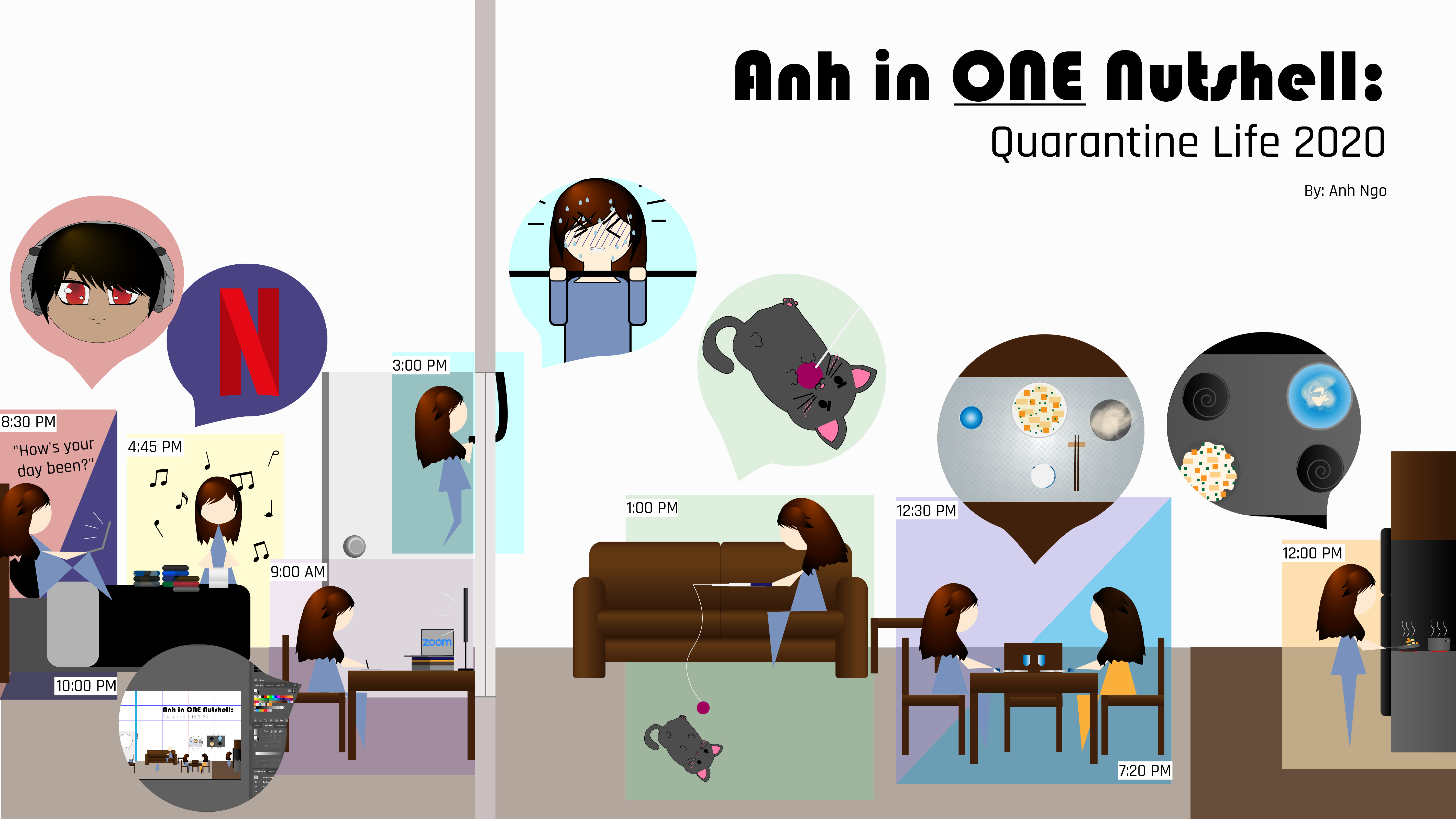
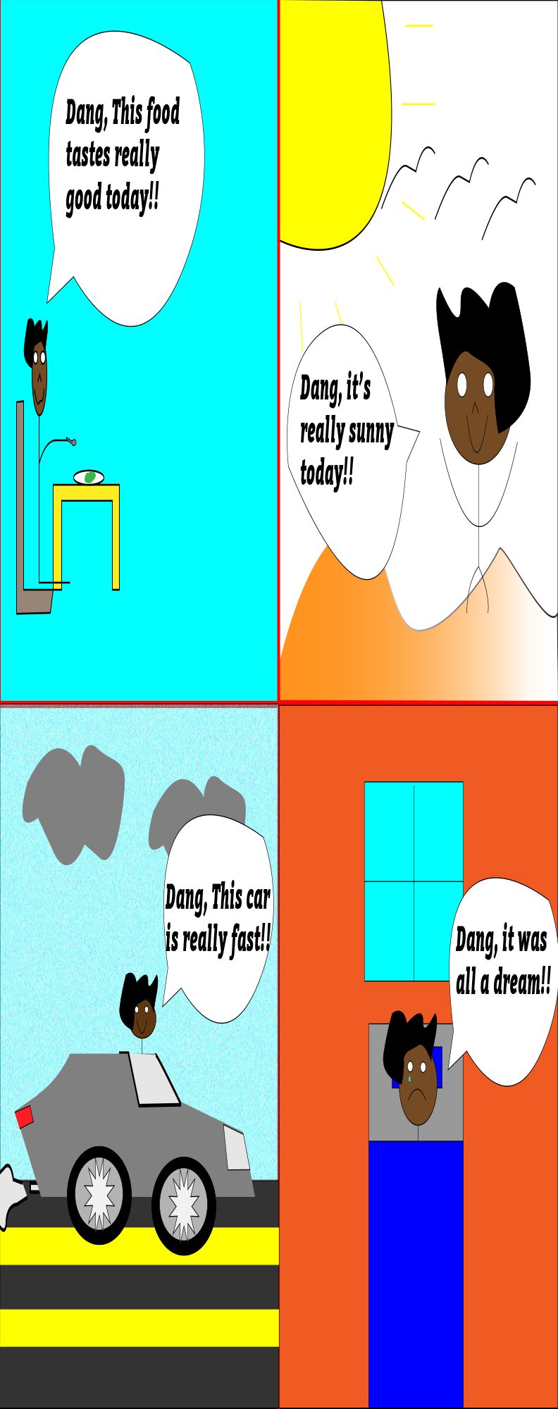
Inspired by the comic Here by Richard McGuire, I wanted to illustrate a simple looking comic that depicted my everyday life using Adobe Illustrator as my instrument. In McGuire’s comic, he used little to no words in his comic. The only text he uses were of the dates for the event that was occurring in each of the panels. As for the environment and panels, the panels tell the different events occurring at different time but within the same environment. Wanting to use the same idea, I put time in the corners of my panels to inform my readers the timeline in which the event took place. The environment is within my apartment: Bedroom, living room, and kitchen. The gray line that is placed on the right of the comic illustrates a wall that separates my room and the other two rooms within my apartment. There is no wall separating the kitchen and my living room, so I did not add the same thick line as I did for my bedroom, however, the lining in the floor gives off the same sense of separation. Since all of the events that are occurring takes place in my apartment, the different colored panels help the readers differentiate between panels; each color expresses the mood that I was feeling when performing the tasks. An example of this is in the panel of 9:00 AM, it shows me sitting at a study table studying/doing my online classes. The time does not change until 12:00 PM, indicates that I was working between 9:00 AM to 12:00 PM before cooking brunch. There are two square panels that has two different timelines. This is meant to demonstrate two different events occurring within the same space of the apartment. An example of this is in the light purple and blue panel (12:30 PM and 7:20 PM) it depicts me eating brunch at 12:30 PM with my roommate, and then later that night, we at dinner together at 7:20 PM).

For my comic, the tools that I used to illustrate my story includes: the pen tool to draw out non-geometrical shapes such as the body or the cat and the character’s hair. The curvature tool to draw out the “heat” radiating out of the food and the white string on the cat’s toy. Text tool to add text into the comic such as the time for the individual panels and title of the comic. The line tool to draw a straight line. The brush tool where I changed the texture of the brush to be more “stringy” looking to make it seem like they were noodles. The shape tool (rectangle tool to create the panels, flooring, tables and chairs, my bed, and refrigerator and cabinet. Spiral tool for the burner on the stove top. Ellipse tool for the character’s heads, kitchen and dining equipment. Polygon tool for the character’s body. And rounded rectangle toll for the couches table mat, the fridge’s doors, books, computer, and beddings). And lastly, gradient and 3D effect tool to create some 3-dimentional effect on some of the objects within the comic.

This week’s comic, although the style of it is not as wordy and detailed as my week 13 comic, but it is not as simple as my week 14 comic, the biggest challenge that I had to face was creating a comic that portray all of the information that I wanted to express without the use of too much words. For all my comics, it tells a story about my life. However, the difference between this week’s comic versus my previous two is that this week’s comic plays a compilation of my every day’s life whereas the previous two only captured one specific event in my life that is now part of my memory rather than truly expresses my everyday personality.

Posted in 201 Blog, Putting It All Together, Sample Posts by Students | Leave a comment

Putting it All Together: Ruby Hopkins

In my final blog post my goal was to create a story based off the perspective of my cat that I have. I figured that while the world around us has changed so much, our animals must be wondering why we have been home so much more often. Are they happy? Or perhaps, like from the perspective of my comic, they wish to be alone again and go back to their daily schedule. I can only imagine my cat’s earlier days consisted of many naps and peace and quiet. Now, it is very far from that. The form that my comic took was all about my fluffy gray cat I have at home, I made sure to give it more detail than simply drawing a stick figure looking cat and do my best to show facial expression or little clouds above her head when angry. For the idiom, my style takes on that of a fairly normal comic style, I relied on thought bubbles and added the jagged lines around the words that were being yelled so it would have more emphasis to it. The comic is all in black and white. In my structure I made it all to the cats perspective so I did not want to add any more members of my family or I into the comic itself as to put more focus onto my cat and the story she was supposed to be telling on her own. During the drawing process my craft came from simply a graphite pencil and paper, I was able to shade darker or lighter to add depth to what I was creating. My surface was lastly added by cleaning up my edges to each box, adding shading to the ground area and adding in my wording that fit with each frame. I wanted my six -stage story to have closure at the end and even make it a bit comical to bring some light into what is happing in the world right now. This comic was more ambitious than my last few comics I think because of the storyline I created. I definitely wanted it to be more in depth and comic like than any past comic I had done. Maybe even be a little witty. I thought of what I wanted to tell in my comic then drew the images around that idea. I added emotion and drawing style to show what my cat was feeling within each frame. I intended to do the thought bubbles because for some reason I have always thought that cats have this inner monologue that they are always saying. I thought it would be funny to flip the roles and have the humans as the pets in this situation and the cat as the leader of the house. Imagining herself as the queen of the household. The story ended with my cat getting some treats, and realizing that if she did destroy us, she would no longer get treats like this handed to her and she would rather have to work for them on her own. 

A Cat in Quarantine: By Ruby Hopkins
Posted in 201 Blog, Putting It All Together | Leave a comment

Putting It All Together: Dean Janikowski

In my comic I made sure to include all 6 steps as stated by Scott McCloud. In my comic I talked about Covid-19. The comic began with two Covid-19 cells that are named “co” and “vid” and they start off with just introducing themselves as cell looking shapes. Then in the next box Vid talks to Co and says “Ya know Co, China is cool and all but I want to travel…” Then Co says in the next box, “Where would you want to go!?” Next the box shows the world and lists the letters “The World.” After that is the plane taking off showing that they were off and traveling. The second to last box was Co and Void at a tropical island just laying and relaxing. Then the last box is just letters stating “The End.” My inspiration for this comic was based off of todays time. 2020 has been one crazy year so far and Covid-19 has been the craziest thing to have happen. This pandemic was caused in China which would later spread to the U.S and many other countries. My comic was fairly accurate to what is going on today and I wanted to be able to show that in my comic while using everything I learned in this class.  In my comic I made sure to use all 6 steps that was given to us in page 170-171 by Scott McCloud. For Idea and purpose I thought my idea was fairly clear that I wanted to replicate what is going on right now and put it to paper. For the second step form, I made sure to make the comic look very kid friendly or PG rated so any one could read it and I made sure to use pencil to make the comic look soft. For the third step idiom the genre of the comic would stand under its own genre since there are very few comics on this pandemic and its been a sensitive subject at the time. For the fourth step structure I made sure to keep in the simple facts and to leave out the politic parts of it all. This way its informative and doesn’t bother those who are reading it. For the fifth step the craft part of it all was me using a pencil and paper to create the comic and to make sure all details possible were added to the comic. The last step of it all was the surface. The surface was a calm and flat surface that was done on paper and sketched lightly on the paper in order to give it the surface to the comic. Overall, I really enjoyed this class and being able to grow in my comic making was a lot of fun.

Covid-19 by Dean Janikowski
Posted in 201 Blog, Putting It All Together | Leave a comment

Putting it all together: Henry Igwala

“All a dream” by Henry Igwala

For my week 15 comic I chose to illustrate what I go through almost every single day. Scott Mcloud says, “no other human being can ever know what it’s like to be you from the inside,” (McCloud, 194). So I felt that this is a great example of something I go through without the knowledge of anybody else.

The first step to expressing myself is purpose, according to Scott Mcloud. A little backstory is that I sleep A LOT. I sleep at least 15 hours a day in a 24 hour period. I don’t sleep 15 hours straight, more like every two to three hours. I often get really detailed dreams that seem so realistic. My dreams sometimes feel more real then when I am awake. I can taste food in my dreams, hear sounds, in my dreams, and worst of it all, I can feel pain in my dreams. Ever since the pandemic I’ve had nothing to do so sleeping was my getaway drug. It takes me to places I can only imagine, taste the finest foods, and enjoy my imaginary paradise. Although I may be addicted to slumber like a crackhead on crack, it keeps me sane. The last panel panel represents how I feel when I wake up and realize what I just experienced was all a dream. All my achievements, my endeavors, friends, enemies and memories were all a figment of my imagination. My wife and kids are gone, the brand new Benz I bought, gone, the years that passed by in my dreams end up just me being asleep for a couple hours. I realize that I now have to live in the dark, unforgivable, world until I sleep again. All in all, the purpose is to illustrate my everyday life; conscious and unconscious.

The second step to expressing myself, according to Scott Mcloud is form. The form that I chose to use was illustrator. I would have handrawn the comic but illustrator allows me to create different effects and distortions. Also I am pretty bad at hand drawn so I feel like my comic would be easier to understand using Illustrator. I feel like I am comfortable using illustrator now, compared to the beginning of the semester. More specifically I used the pen tool to draw objects and characters, while I use the shape tools for the backgrounds and other small miscellaneous items.

The third step is Idiom. The genre of my content would be comedy. All though the true meaning is real and serious I wanted to create some sort of comedic aspect to it. I tried to do this by giving my character the catch phrase “Dang”. The character repeats this phrase throughout the comic.

The fourth step is structure. I didn’t structure my comic in any specific way, instead I just put three examples in the first three panels. The fourth panel, however, was structured at the end to show the end of my adventures.

The fifth step is about craft. I tried to perfect my craft by making things a little easier for me. I did this by copy and pasting some of my objects instead of recreating them. Some examples of this are my character’s hair, and the wheels on the car.

The sixth and final step is surface. It is the most appreciated step by the audience because it is the most visible step. I tried to adhere to this step by adding gradients and different textures and bright colors to make the surface of my comic seem beautiful. 

This comic is more ambitious than my previous two because this one is an illustration of my life. It is hard to explain in words what I go through, and I think this comic does that for me.

Posted in 201 Blog, Putting It All Together | Leave a comment

Putting It All Together: Sabrina Hoenes

Me by Sabrina Hoenes

For my final comic I decided to use a different program. Instead of using Illustrator like I had in the previous weeks. I decided to use an application called Procreate. The reason why I decided to change programs is because I felt that I could make the comic more ambitious. I also used this program in order to convey my personal drawing style, because I was not able to achieve this using Illustrator. The prompt for this final comic was challenging for me because of how open ended it was. So I decided to take it quite literally and base it of my personal experience with struggling with my identity.

The idea / purpose of this comic was inspired by this reading that I had in my Chicano/a studies class. The reading was about how some young latinos struggle with their identity. This really resonated with me because, growing up I was always judged by my looks and race, making me feel forced to confirm to Western / European beauty standards.

For form, I just chose to stay with the traditional box panels, because I felt using other panels wouldn’t achieve the look I was going for. for this step as well, me using digital, and more of a comic page instead of a comic strip form, helped me accomplish and fulfill this step.

For idiom, I’m not entirely too sure or if I even achieved accomplishing this step. But Scott McCloud stated in our assigned reading, that the comic could be a genre of its own. I feel that my comic could fall under that, or it could even fall under a “real life” genre, because it is based off my personal experience.

For the structure step, as stated before, I stuck to a more traditional sense and structure of a comic. Very simple panels and very easy to follow story flow and flow of time.

For the craft, I used digital tools and programs. I used a variety of brushes to create textures that I wanted and to create more diverse backgrounds. I also used a limited variety of colors. I felt that using less is more, and the pallet I used for this comic set the mood I was going for in each panel. I also downloaded other brushes because some of the pre-installed brushes didn’t have the effect or texture I was looking for. I also used layer masks to erase portions of my background, so I don’t accidentally compromise my line work.

For the last step, surface, I am not quite sure this step was really fulfilled. In some panels I used a “glitter” brush just to further convey the main protagonist’s happiness. I feel that I didn’t really using anything that gives my final composition a “finish”.

The reason why this comic is more ambitious to the previous two is because I used more techniques. Unlike the first comic, I used more variety in brushes and I used more color. In comparison to the second comic, I used more shading and highlighting techniques. I also used more brushes with different texture and effects. I feel that this comic embodies my previous comics and in a sense combined those two comics and used what I learned to successfully create this one.

Posted in 201 Blog, Putting It All Together, Sample Posts by Students | Leave a comment

Putting it all together: Mitchell Delmage

The idea behind my comic was to draw the first thing that came into my head. So I created a fuzzy monster. I just wanted to create something that was totally different and completely unusual. Whatever would come to my mind first is what I would create. The story is about a fuzzy monster, and for whatever reason his species can reproduce at an extremely rapid rate. So, the fuzzy monster reproduces himself 15 times every week. He takes his offspring and blows them up every week for his TV show. I had to include a lot of background information in my comic for all my ideas to be understood. And, it can be implied that in his society there is no morally wrong reason to kill your children. 

The form of my comic is a digital poster comic. The whole comic is on one piece of paper, and I chose not to use panels because I wanted all the drawings to be seen together in one atmosphere. I used a computer software called sketchbook to create my comic.  

The genre of my comic depends on how it is perceived. The comic could be perceived as funny and, therefore, it would be comedy. The comic features a fuzzy monster, and it is unclear if he is an alien too. So this comic could also be science fiction. 

I chose to include a lot of background information to add context to the story. I wanted to make the comic flow together so I had the artwork flow chronologically through time. Some of the comic visually flows well together and some of the other artwork is in a random order. 

I chose to do this comic on a computer because it made it easier to incorporate my ideas. For example, I was able to duplicate the monster several times. This would have been hard to do with paper and a pencil. I also wanted to use my mouse to create the artwork. That way it is more authentic to my style. 

The first thing you see when you look at the comic is a bunch of fuzzy monsters, a plane and an explosion. All together it might be hard to understand, and that is why it makes it a comic. Because it takes viewer participation and careful analysis of each drawing. 

Posted in 201 Blog, Putting It All Together | Leave a comment

Putting It All Together: Chloe Brusseau

In chapter 7 of McCloud’s Understanding Comics, he discusses the 6 steps to humans motivation for making art, and bringing a comic together. First is the idea. My idea for this comic was to show my individuality. I used a female subject and showed her in her life, at different events where she doesn’t seem happy. She is surrounded by people and fun activities but at the end of the day, she feels happier in a more introverted setting. I wanted to show in this comic that it is okay to spend time alone, and there is value and beauty in time spent with just you and your thoughts. The second step is form; I knew that this would obviously be a comic, and I wanted it to be a chronological story. I wanted it to be digital but have a mixture of physical art as well. I also knew I wanted it to include dialogue and multiple characters. Third is idiom, or genre. I knew this was going to be a realistic fiction type of story. It would somewhat embody my opinions on life. Fourth we have structure. Like I said, I wanted this comic to be chronological and tell a story from left to right, top to bottom. I do enjoy making comics where the order and structure can be up to the viewer’s interpretation, however I felt that in order to get my message across this comic should stay consistently chronological. Step 5 is craft or skill that is used to produce your work. I wanted to try to use my digital skills which worked for some aspects, but I also needed to combine drawings as well. I also feel that this adds to my comic by giving it multiple textures and colors which is unique. The sixth and final step is surface. This is what the initial feel and finish the comic has. I wanted it to be light and easy to read but still have an underlying message and lesson.

Comic created in Adobe Illustrator by Chloe Brusseau, 5/4/2020

For this week’s comic, I decided to use adobe illustrator and used a combination of different art forms. This comic was more ambitious than my previous weeks because I utilized digital platforms which I haven’t used for our last few comics while being a remote class. Adobe illustrator has many options for creating images and words that can be tweaked and played with to make your idea come to life. I manipulated the system a bit and combined physical art with digital by drawing my characters and uploading them to illustrator to become a part of my comic. I did this because I knew it would be more difficult for me to create life-like looking characters digitally.

In his book, McCloud says “Art is the way we assert our identities as individuals and break out of the narrow roles nature cast us in” (166). I asserted my identity in this piece by showing a side of myself that some people may not recognize. I am a very social person and love people, but at times I feel that certain settings can be overwhelming. I wanted to take this opportunity to showcase this part of my personality, especially because I have a newfound appreciation for this trait of mine due to the circumstances of our world right now as we navigate through life in a global pandemic.

Posted in 201 Blog, Putting It All Together | Leave a comment

Putting It All Together: Malvin Malai-Harrison

For this blog, I wanted to create my comic using Adobe Illustrator to see what I could create as opposed to using pen and paper like the comics I made in previous weeks. For this week, we were asked to express something about our individuality in reference to Scott McCloud’s quote “no other human being can ever know what it’s like to be you from the inside.” This prompt was a bit challenging for me because it was so broad, and I had to think of an aspect of my self that could be communicated briefly in only a few panels. I began to think of different things about myself and some strengths and weaknesses. Even though I’m pretty terrible at making comics on Illustrator, ironically, I chose to make a comic about a part of me that I like, my visual senses. More specifically, my eyes, and how grateful I am for them allowing me to see and design things accordingly. My work for this class is pretty different from the work I do for my major, Strategic Communication. In my major, I use the Adobe software to design things such as layouts, advertisements, wireframes, magazine ads, social media ads, all sorts of things. One strength of mine is my visual sense when it comes to designing things, seeing if something out of alignment, and attention to detail. I wanted to try to create a comic that would showcase that side of myself that tends to be pretty hard to communicate.

Therefore, in reference to the first step of Scott McCloud’s 6 steps to creating art, “Idea/Purpose”, I utilized this step by creating a comic about my appreciation for my visual senses. The second step, “Form”, was met by me choosing to create a comic in Adobe Illustrator. His third step, Idiom, which is essentially the genre that my work would fit in to, it’s hard to say. I wouldn’t classify it as comedy or anything like that. It’s basically a comic that showcases something about me at the end of the day, so maybe it could be classified as fitting in some sort of self-reflection genre. For Structure, I chose to compile it in a typical way that comics are made, side-by-side panels. For craft, I used a variety of tools in Illustrator. Some tools that I used heavily were the rectangular marquee tool, the elliptical marquee tool, and the pen tool. The pen tool was used heavily to create all of the complex shapes in my comic. I hope that for Surface, people that view it will be able to get just a little bit of a glimpse about how I view things and my appreciation for the visual senses when I make designs, but in a more general sense, my appreciation for all of the beauty that can be seen in the world.

The last panel is inspired by the Summer I spent in Maui, Hawaii with my best friend. I got to see and experience some amazing things that naturally occurs in nature. When I get to see more of the world, the more inspired I become and the more I appreciate the blessing of being able to see it with my own eyes.

Putting It All Together: Final Comic by Malvin Malai-Harrison


Posted in 201 Blog, Putting It All Together, Sample Posts by Students | Leave a comment

Putting It All Together: Jon Preng

“Musical Emotions” designed by Jon Preng, 2020.

For my week 15 comic, I decided to use music as a way to express feelings and attitude for an individual. On page 194, Scott McCloud stated, “no other human being can ever know what it’s like to be you from the inside.” Although music can affect people in a similar way, each person is different with how they interpret music.

For my comic, I wanted to focus on the idea of individuality and internal feelings. With that being said, my idea was to have someone like an unpopular song. If someone truly likes something, they should stick with it and not follow the popular opinion. Not only is the person different from the rest, he also has some happy memories from listening to the song. This part ties in to the “internal feelings” section of the prompt. The audience does not know who the woman is in my work, but that is for them to determine. It could be an ex, a loved one or a friend. What truly matters is how they feel in the inside. In an earlier chapter, Scott McCloud mentions how simple artwork can be more relatable to the audience. People may relate to the experience, even if it is not the same song by Drake.

I used McCloud’s “Six Steps” as a way to frame my work. Looking at step 1, which is form, it is about the impulses, ideas and emotions. To show emotion, I used a concept from “Living in Line” to express how my person is feeling. In the first panel, the lines in the background are wavy. However, at the end of the comic, the feelings are different once he thinks about the good times. The lines are changed dramatically.

This comic is more ambitious compared to my other two because I spent more time on it. My last two comics only consisted of black, white and grey. In this comic, I wanted to add color to help spread my message. Another reason why I put in more effort into this comic is that I include more details. For instance, instead of leaving my person bald, I decided to throw on a beanie and give him a nice shirt. I played around with the gradient tool to experiment with the color. I think my comic from this week is more fun to look at and read compared to the previous two.

The techniques were pretty much the same throughout all of my work. I like to use the shape tools, paint brush and text. To create the comic panels, I use rectangles in black and white for the boarder. Something I did not use in this work was the 3D effect, which I use way too often. To help with the process, copy & paste came in handy, so I didn’t have to repeat anything. I like to work diligently so it helps me out greatly. I also think not including “The End” made it better. Overall, I am pretty satisfied with this piece.

Posted in 201 Blog, Putting It All Together, Sample Posts by Students | Leave a comment

Putting It All Together: Nick Caton

Week 15 Comic by Nick Caton 2020

For this week we were asked to express something about our individuality. For my comic I decided to make it about my favorite team, the Seattle Mariners. Something that you should know about the Seattle Mariners first is that they have never won the World Series or have even been to the World Series. For my comic I had the idea of it being a dream. I had this idea in my head for a long time, but I did not know what my dream would be about. I decided to make the dream about the Mariners winning the World Series. I had to pick a team they would be playing so I chose the LA Dodgers of the National League. I chose the year 2023 because we are currently in a rebuild process so I thought that maybe they could be a good team again in the 2023 season. I chose Julio Rodriguez who is one of our best prospects in the minor leagues right now. He is a young player that is very talented so I thought him hitting the walk off home run would be fitting. For the form of this comic is within a dream. I chose this form because I thought it was an interesting concept that you do not see all the time. I thought that it will add more to the representation I am trying to portray because it is something that I want to happen, thus being a dream. I think the way I used the frames as clouds as well as adding words and actions outside of the frames helped a lot to this comic. I like when comics are kind of wild and you have to try hard to follow the path, they want you to follow. It is a normal path you would think you are following in comics but with twists throughout. Some of the styles and gesture I used were in the text. I used normal text for a lot of the comic. I tried to implement logos and things in the ballpark that mattered to the idea. I like when comics have big action words, so I used CRACK and MY OH MY in the comic. The CRACK is the sound of the bat after he hits a home run. I used the famous quote, “MY OH MY,” from the late announcer of the Mariners, Dave Niehaus. Dave Niehaus is not alive anymore, but his most famous quote is when he would say MY OH MY after something amazing. This also adds to the dream aspect because maybe in my dream Dave Niehaus is the commentator. When I was putting it all together, I decided to use the logo for the world series, the scoreboard, the count, and the view of the batter hitting the home run. I think these are the perfect things to show what is going on in the comic. I wanted to show that it was the World series, so I used the logo. I wanted to show that it was a tie ballgame, so I showed the scoreboard. I wanted to give suspense, so I used a full count on Julio Rodriguez and showed that. I think all the parts I used came together perfectly. The tools I used for this comic are sharpies, pencil, and a little bit of red marker. I wanted to use the red marker because I used it in my previous two comics so I thought I would keep the trend going and they worked with he laces on the baseball. This comic is more ambitious than the others to me because there is a lot more going on and it makes it a challenge for the reader. I wanted to make this comic a little chaotic with a lot of things for the reader to think about. I used multiple frames and also text that went outside of the frames to make it look chaotic since the story it was portraying is so exciting. The conclusion of this comic is that it was all just a dream yet there was so much that made it feel real.

Posted in Uncategorized | Leave a comment