Weekly Blog: Living In Line: Maddy West

Comic by Maddy West, April 2020.

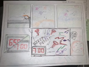
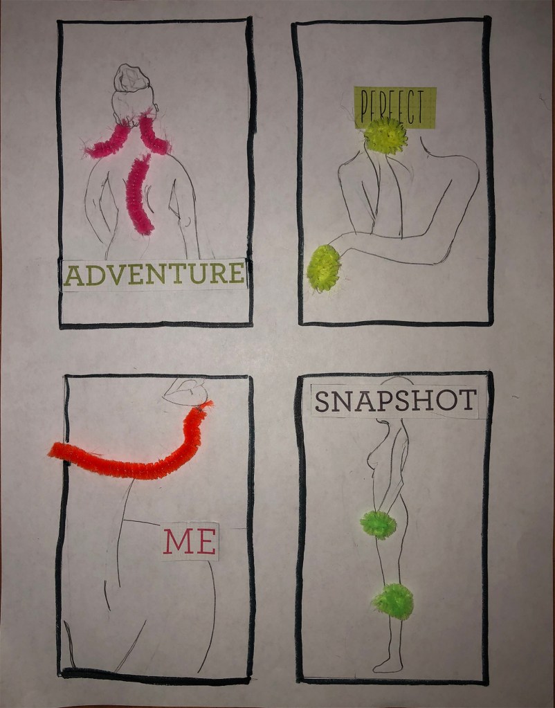
As I read “Living In Line” by Scott McCloud I was really inspired to share my best friend, Maddie’s story. Maddie is a college student who is living with arthritis, which causes her health problems, mainly chronic pain. When I read the blog post, I thought this would be the perfect time to showcase what chronic pain is like and how much of an impact it truly has. I felt that trying to convey the invisible sense of a pain that others cannot see would translate well. When she was first diagnosed about 5 years ago, Maddie said “It feels kind of like fireworks are going off inside me but no one else can feel how badly they are burning me.” I really wanted to share this feeling and showcase how she sometimes feels like she is trapped in her own body.

I utilized material tools to create this comic because my brother needed to use my computer to complete his schooling. Originally I was bummed because my vision had to change, but as I worked, I loved what I was able to create. I knew that I wanted my comic to be minimal in nature, so that what I used to showcase the pain would pop off the page. I created minimal drawings, copying a style that has recently become more popular (line drawing). This is an incredibly difficult skill to master, that took me a long time and several tries to get a look close to what I wanted. For these bodies, I used pencil because I wanted to maintain the simple line look and keep the character light. I didn’t want her to come across as burdened by creating too heavy of a line. Then, I added pipe cleaners to the bodies. Maddie’s pain congregates in specific parts of her body, so I focused on those. I decided to use pipe cleaners because I think that they really showcase the feeling of a firework, by kind of popping of the page and being a bright color. They were also easy for me to manipulate into the shape that I wanted. I added a single word to each panel that I think really represent the story of someone dealing with chronic pain. People have often called Maddie’s arthritis an “adventure” that she gets to go through and some have told her that she looks fine (perfect) so she probably is faking it. Maddie wants people to know that arthritis is a part of her (me) but that it is only a small part of who she is (snapshot). These words came from some old scrapbooking paper that I found. Finally, I outlined all of the panels in the thick black marker. I did this to convey a sense of being blocked in to what other people see and how you feel. This sense of being stuck can be just as exhausting as the chronic pain itself. This also relates to the order of the pictures. I wanted the pictures to feel like a set of mugshots, (at least in how they are framed), to communicate how chronic pain can make one feel trapped. The girl is turning for each picture, to capture a new side of her that people may not be able to see.

I definitely noticed my own inability to communicate my creative message because I am not a super good drawer. I spent a long looking at different minimalist drawings so that I could imitate the same feeling, and it took me a while. I also noticed how the image of the comic does not have the same impact as actually looking at the comic. In person, I can actually see the details of the comic, which are not shown in the picture, simply because they do not translate well (such as things like texture). Despite this, I like how the comic turned out because I think it communicates my point.

Posted in 201 Blog, Living in Line | Leave a comment

Weekly Blog, Living In Line: Amanda Retchless

In this weekly comic, I hope to convey the emotion and invisible sense of creativity. There are two people and those two people are seeing the world differently. One person is all bright and colorful and can see a lot more. The other person is more dull and can only see things as they are, such as a tree as only a tree. I chose creativity because when I feel it it hits me like a wall. When I feel creativity I feel a burst of energy and self confidence. The tools I used were paper, pencil, marker, and color pens. The specific nature of these tools affect my image because I am limited to my own abilities. I can imagine something in my head, but then I can’t really transfer it to paper without it looking like a five year old drew it. I think that I was able to express the invisible sense and emotion better when I drew this comic by hand. I say this because I was able to do what I wanted. I wasn’t limited by some program, I was able to make all the shapes that I wanted and I also think it means more to me when I do something like this by hand rather than on a screen. Some other things that I learned about my tools is that sometimes I get the effect I want and sometimes I don’t. I was trying to make the two people the same, but mirrored, but because I drew this by hand and not on a program it was hard for me to copy what I was doing onto the other side of the paper. So they did not turn out the same, at all. I also learned that depending on the tool I use I will get a different outcome. For example, when I use a dull pencil compared to a sharpened one. The dull pencil had a thicker line and had a more balanced look to it. The sharpened pencil had a thinner line and was more precise, but it smeared a lot easier and I broke the lead a lot. 

Posted in 201 Blog, Living in Line, Sample Posts by Students | Leave a comment

Living in Line: Ruby Hopkins

The images I chose to draw in my comic were simple, I simply did the relationship between two waves, one with lightning and all stormy, and the other just a simple line. This relationship between chaos and calm can be so drastic yet so simple to convey. I hoped, at least, that my two drawings showed this relationship well, and those who look at my work can pick up on this relationship easily. I wanted to make my comic extremely simple because Scott McCloud explained how even just the texture of a line can cause an emotion, so I took this to heart and created two simple images, but with very different drawing techniques and textures. My drawing technique was simple, I used a led pencil to sketch out my two images and placed them side by side, I then added more lines and texture to my chaotic side of the comic to add more to the image, making it appear almost messy, while the other side was a simple line with no other context. Being able to use a pencil and draw my work allowed me to use different strokes, whether it be darker or lighter, I could add depth with it and layer texture on top to create a cleaner or more chaotic look to it. I noticed that creating a more suspenseful and chaotic look to my comic was much easier to do using a pencil as it was a bit messier looking and had a less clean of a finish. While I imagine using a digital tool to create a comic would make for a much more clean appearance. My closure between my panels in my comic is simple, “The calm after the storm”. This simple message can be clearly shown with a few simple stroked of pencil on a piece of paper. 

Calm After the Storm by Ruby Hopkins
Posted in 201 Blog, Living in Line | Leave a comment

Living In Line: Dean Janikowski

“Melting Sun” by Dean Janikowski

In “Chapter 5: Living in Line” from “Understanding Comics”, Scott McCloud I learned a lot about the different feels and vibes you can get just from a line. I made sure to do a comic that presented a very anxious or stressed image versus an image that is very cool calm and relaxing. So for my blog entry I decided to draw the sun and the moon. With this drawing I hoped people to convey the sun as this sad and stressed out person and made the moon look like this calm and relaxed person. The sun is shown sweating viscously and in deep distress. As for the moon they are very calm and relaxed as shown through the simple lines and facial expression. The techniques I used for this drawing was deep lines that showed shading and made things look hectic especially on the sun. The sun has sweat running down its face with lots of heat coming from its surface that has a lot of texture to it as well as the background. The type of closure occurring between the panels is just a simple blank canvas just as the galaxy would be where the sun and moon lies. I would say time is not used in this as there is nothing that shows time besides the fact that the sun is melting and you could perceive the sun is melting just like the polar ice caps due to global warming. With this section I enjoyed being able to take a deeper look at lines and see what they really do in comics. Scott Mcloud does a really good job at showing that through his comics which gave me my inspiration to do such a thing. Never would I have thought that lines can give of a emotion.

Posted in 201 Blog, Living in Line | Leave a comment

Weekly Blog: Living in Line: Sabrina Hoenes

A Ghost! by Sabrina Hoenes

For my comic I just wanted to tell short and somewhat comedic story. In my comic it is about a ghost who wakes up at 3:00 A.M. ( known as the witching hour). The ghost goes to start his night but stubbles across a being unlike him. The ghost and the being startle each other, causing the ghost to flee in fear, while the being is frozen with fear.

In my comic the silent emotions that I wanted to portray are: sleepiness, joy, shock/surprise, and fear. The tools that I used was Adobe Illustrator, this tool allowed me to effectively create thick and thin lines. I think the stringiest example of my use of thing and thick lines is my fifth panel. By using a thick line for the border and using a thin line for the characters, I think I was successfully able to convey their shock of seeing each other. I also think that using thick lines for my characters and foreground and thin lines for my background made my comic look a lot more polished. This tool also allowed me to edit and undo any mistakes I made with ease. I am however still struggling and getting used to the program, so I was having some frustrations and had to keep referring back to the tutorials. The other tool I used was drawing paper to sketch out my storyline. Using drawing materials allowed me to think more creatively and effectively.

I think using these tools together made the whole process easier in the long run, especially when it came to using Adobe Illustrator. I was able to scan in my initial sketch and then use Adobe Illustrator to digitize my work, giving me an easy creative process and I think this eased a little of my initial struggle with the program. I for sure know that I will continue this process for the upcoming comics.

Posted in 201 Blog, Living in Line, Sample Posts by Students | Leave a comment

Weekly Blog: Living in Line: Chloe Brusseau

The comic that I created this week tells a simple and short story of a girl who is sound asleep deep in a peaceful, quiet dream when she is awoken by her loud and unsettling alarm clock.In the beginning frames, I wanted to portray the sense of silence and serenity that is usually invisible. I used soft strokes of a pencil to outline everything. I used lighter colors which I lightly pressed on the paper giving off a softer and quieter feel. The character was in a peaceful and pleasant dream where everything was still and silent besides the buzzing of butterflies and soft chirping of the birds flying in the wind. I wanted to add contrast in the 5th panel where the alarm clock went off, interrupting the quietness. I was trying to portray the invisible sense of irritating loud noise. It’s unpleasant, unsettling and deafening. I portrayed this sense by using sharp symbols that were colored with dark, loud colors. Even the panel itself is outlined sharply with a darker pen than the rest of the panels. I used brighter colors than those in the quiet panels as well.


I thought about using adobe illustrator for this comic, but I had a vision of this story and how I could portray usually invisible senses with the noise. The use of a softer pencil helped me outline the quiet panels along with soft, light colored pencils. I used a thicker black pen for the loud panel as that gives more of a strong feel which is what I was going for. I noticed that a ruler helps with creating the outline for panels and adding color can help make a comic tell a story far better than a black and white one can.

The reader/viewer of this comic must use closure between panels when switching from the character’s dream and real life with the alarm clock. Nothing is explicitly saying that they are two different settings, but when the reader uses aspect-to-aspect, they are understanding that the alarm clock is not actually inside of the dream due to the cues in the background and the separation of panels.

For our next comic, I am going to attempt to create something with adobe illustrator in effort to add a variety of different modes and styles to my comics.

Posted in 201 Blog, Living in Line | Leave a comment

Weekly Blog: Living In Line: Blaine Casil

Comic by Blaine Casil

With the comic I created the senses and/or emotions I hoped to convey was a feeling of calmness yet sadness. The way I wanted to portray sadness is by using the pencil to create a shadow type of background and by having the figure create a flame then put it out soon after. With the background, I tried to keep it somewhat dark until the figure put the flame, that is when I made the background the darkest. When creating this, I only used a pencil and a tissue. For me personally, I do not have much experience with Illustrator so I wanted to create something the best way I knew how. Also the reason I chose to only use a pencil was because I felt as if I was able to put more feeling and emotions behind the comic. I used the tissue to smear some of the lines I made with the pencil that way the figure or idea that I was making was more obvious. 

The type of closure that I used for my comic strip was mostly movement-movement. Usually when I create comics I like to create pictures and let the pictures tell the story instead of using words. The reason for that is because I want to be able to connect with the reader and give them the ability to create their own story with my art. With this comic, I would say I do work with time because by having an open hand, snapping, back to an open hand then a closed fist, takes only a few seconds. The reader is able to tell that there was not much time between each action that the figure was doing. Also I think with a plain background, it was easier to create a sense of time because the focus is only on the hand.

Posted in 201 Blog, Living in Line | Leave a comment

Weekly Blog: Living In Line: Korie Cedre

With my comic, I decided to do a three frame comic so that I could truly focus on emphasizing emotions and situations. With this, my comic below consists of a girl laying in bed and hearing the morning birds before realizing that she had stayed up all night on her phone. Some of the normally invisible senses and emotions I hope to convey in my comic are the serene moments of early morning, including the morning birds, and sudden shock upon realizing something. A lot of the tools I used to create this comic involved the rectangle tool, as well the ellipses tool. The line tool was important as well as I used it a lot during the last frame, connecting the lines to create the feeling of shock or frustration. I think the sharpness of these tools, being its specific nature, allowed me to exaggerate the emotions I was trying to display. The tools also allowed the opportunity to bolden, or thicken, the lines to create a more intense situation. WIth this, I used the thin and less sharp lines to create a calm, simple moment. I followed this with bold, thick, and sharp lines to change the pace of the comic, creating a moment of shock. An observation I made about the tools and techniques I was trying this week, being digital, is that there was a lot of on and off clicking to switch tools. Adobe Illustrator seems to be a bit more sensitive compared to Photoshop, which I didn’t necessarily enjoy when creating this comic. In terms of closure, moment-to-moment and subject-to-subject can be seen in the three panels of my comic. Moment-to-moment is because of how each frame consists of within three minutes, and readers are able to see her hold then put down her phone. This is then met with subject-to-subject as the subject of morning birds and the surprise by this can be connected as how a few hours had passed. Unfortunately, my original idea for this comic was to provide multiple frames to show an even longer passing of time, perhaps even a few days, but my struggle with Adobe Illustrator is a bit of a barrier.

Comic by Korie Cedre made on Adobe Illustrator, April, 2020.
Posted in 201 Blog, Living in Line | Leave a comment

Weekly Blog: Living In Line: Devon Anderson

Ever since moving home with the stay at home order I have been taking my dogs on walks daily. They always run and hide on the couch until I get the harness on them. The emotion I was trying to express was trepidation. The dogs are always nervous until we actually start walking and then they have a blast. I thought that this was a funny topic/action to re-invent in an illustrators platform.

Comic by Devon Anderson, April 2020

I created this comic on the Illustrator platform. I had some frustrations throughout the creative process and re-did different segments a couple times. That said I mainly used the text to express thoughts or conversation. For the images themselves I used a combination of lasso tool, rectangle tool, ellipse tool, line segment tool, and the paint brush. The lasso tool was super helpful in copying and pasting multiple parts of the art to be altered for later use. All of the line and shape tools were nice to make clean cut images. I used the paint brush to bring in more color and create shapes I did not find easy making with other tools. I found that there are still many techniques that are unknown to me that would have been helpful in the comic (I will have to re watch tutorials). Next time I hope to learn how to make my own pattern, I think that could have brought more texture to the blanket that is covering the dog.

In regards to closure you can see/hear in the first panel that the animal is moving and then you see that they had hidden under the blankets placed upon a couch. 

Time is not a huge consideration within this comic, you understand time has passed from the statement made and the thoughts by the dog but I would say that it is not a huge component.

Posted in 201 Blog, Living in Line | Leave a comment

Living in Line: Haydyn Wallender

Hello friends! Welcome back. I’m so happy that I get to share a piece of myself with all of you for this blog post.

For this comic strip, I decided to do scenery here in Oregon that I am surrounded by. That happens to be farmland, mountains and cattle. So, therefore, that is this comic’s content. I’m thinking of making the “nature” theme a series for the remainder of this school year.

The senses that I tried to convey are, quite simply, the five senses: smell, sight, sound, taste and touch. In at least one panel, I attempted to dedicate a sense to one. In the first panel, the cow manure with the lines and the flies; in the second and third panels, the sounds that cows make “moo”, as well as the scenery that surrounds the cattle we have, which are the blue mountains and pasture. In the last few panels, I tried to get the close up of taste, incorporating the cows and their eating of the hay bale, and me petting the cows that I call pets (yes, each cow has a name – don’t think they wouldn’t).

Feeding Cows. Created by Haydyn Wallender, Spring 2020.

The emotions that I was hoping to convey is a sense of joy and serenity, and I suppose humor, as my drawings are pretty hilarious. I was limited in my abilites to draw, however, because I chose to stick to drawing shapes using the “(insert shape) tool”, and the color panels. I didn’t use anything besides circles, rectangles, and lines, and the colors are basic and simple. I would say that it not only made it challenging for me to make my ideas come to life because I was limited to pre-drawn shapes, but it made me feel like I was back in 5th grade drawing things, which to me feels over-simplified and perhaps lacked emotions and the depth I wanted it to. If I showed an image of what our valley really looks like, there is nothing simple about it at all.

For the “Blood in the Gutter” reference, I would argue that my panels are a switch of close-up shots and distance ones, where implied movement takes place between them. For instance, in the two larger panels in the middle of the page, you can see the cows as distant figures, and then they appear closer and louder (which has to be interpreted, though I attempted to apply it with the moving of the words with the cattle). It was a challenge for sure, but I think the meaning is pretty straightforward.

I hope you enjoy “reading” this as much as I did making it!

***Side note: I think the formatting of my original work in Illustrator made it have that extra white on the left side. If anyone knows how to fix it, please send help ASAP lol.

Posted in 201 Blog, Living in Line | Leave a comment