
Hello friends! Welcome back. I’m so happy that I get to share a piece of myself with all of you for this blog post.
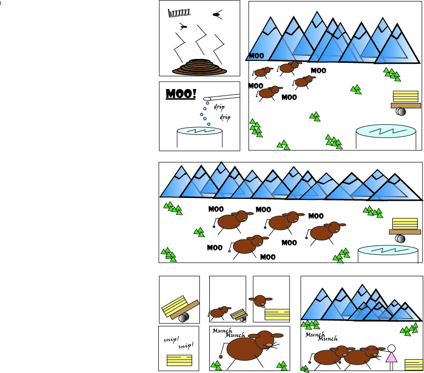
For this comic strip, I decided to do scenery here in Oregon that I am surrounded by. That happens to be farmland, mountains and cattle. So, therefore, that is this comic’s content. I’m thinking of making the “nature” theme a series for the remainder of this school year.
The senses that I tried to convey are, quite simply, the five senses: smell, sight, sound, taste and touch. In at least one panel, I attempted to dedicate a sense to one. In the first panel, the cow manure with the lines and the flies; in the second and third panels, the sounds that cows make “moo”, as well as the scenery that surrounds the cattle we have, which are the blue mountains and pasture. In the last few panels, I tried to get the close up of taste, incorporating the cows and their eating of the hay bale, and me petting the cows that I call pets (yes, each cow has a name – don’t think they wouldn’t).
Feeding Cows. Created by Haydyn Wallender, Spring 2020.
The emotions that I was hoping to convey is a sense of joy and serenity, and I suppose humor, as my drawings are pretty hilarious. I was limited in my abilites to draw, however, because I chose to stick to drawing shapes using the “(insert shape) tool”, and the color panels. I didn’t use anything besides circles, rectangles, and lines, and the colors are basic and simple. I would say that it not only made it challenging for me to make my ideas come to life because I was limited to pre-drawn shapes, but it made me feel like I was back in 5th grade drawing things, which to me feels over-simplified and perhaps lacked emotions and the depth I wanted it to. If I showed an image of what our valley really looks like, there is nothing simple about it at all.
For the “Blood in the Gutter” reference, I would argue that my panels are a switch of close-up shots and distance ones, where implied movement takes place between them. For instance, in the two larger panels in the middle of the page, you can see the cows as distant figures, and then they appear closer and louder (which has to be interpreted, though I attempted to apply it with the moving of the words with the cattle). It was a challenge for sure, but I think the meaning is pretty straightforward.
I hope you enjoy “reading” this as much as I did making it!
***Side note: I think the formatting of my original work in Illustrator made it have that extra white on the left side. If anyone knows how to fix it, please send help ASAP lol.
