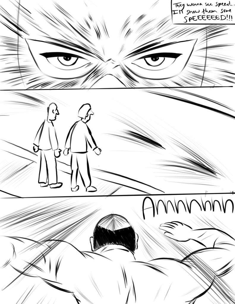
For this week’s comic I wanted to make sure I capture the prompt well with Scott McClouds “Living in Line” chapter. In order to do this, I thought about showing the main characters passion to run by being persuaded by the crowd around. The main character is insisted in showing his speed and in the comic I had drawn up I used lines to main him look aggressive and focused towards winning the race. While doing so i believed I successfully captured the prompt under Scott McClouds chapter.
With tools and techniques, in this part I wanted to make sure I used different stokes ad line sizes to show different aspects of the project. For example, in his face I used different line types to convey different aspects and features. I went with just black and my white with this project. I wanted the focus to be more on the line types to display my message rather than have color take away from the main point of the comic. But having done so I believe it was shown that my understanding was there.
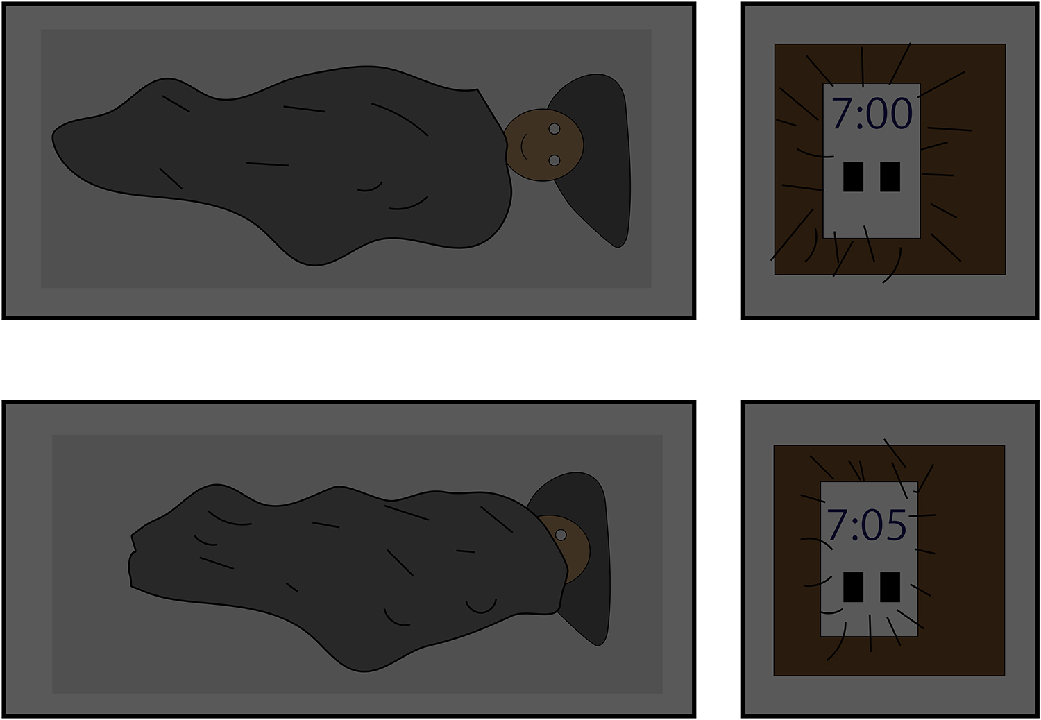
For my first weekly comic I based it off my mornings. I usually have my alarm go off two times in the morning. The first alarm at 7:00 and the second one at 7:05 to remind me to get up. I was hoping to convey the feeling of tiredness, warm, loud, and quiet. The way I tried to convey tiredness is by have the 3rd frame look like the character pulled the blanket of its head. The way I tried to convey warm and quiet senses is by having the first and second frames look like it is dark and without any noise. The way I conveyed loud is by drawing lines on the alarm clocks to show that there is noise coming from it.
The tools I used were the shape tools and the brush tool. I was also making some of my things slightly transparent which helped to convey the warm and quiet feelings in the frames. Some of the observations I made about the tools is that they get easier to use the more you play around with them. At first some of the things I wanted to do like moving layers around was challenging but the more I did it the better I became at it.
The type of closure I was going for was subject to subject closure. The reason why it is this type of closure is because the frames go from the character sleeping to another subject which is the alarm going off. I also tried to work with time in my comic by having the sleeping frames longer to convey the feeling that time is happing in a longer period of time. I also tried to show time moving fast with the alarm clocks being a small frame and you can also see the time that has passes between each alarm going off with is five minutes.
I was attempting to convey the progression of time and expectation. On the left side of the page I wanted to represent youth, beginnings, exploration, and a lack of definition and clarity. In contrast on the right side I wanted to represent maturity, sureness, and the idea of something existing as it’s meant to or at its peak. To do this on the right side are used colors associated with new beginnings such as green which I believe ties in with the idea of spring and the newness of spring. In contrast on the right side are used red and pinks tying in with the idea of summer, progression, and maturity. In terms of technique used stronger and more defined lines were used to emphasize importance or difference based on their size. Lighter details used smaller lines and larger more important details used larger and more defined lines. In addition the left hand side was created with a rougher tool/pen to show its lack of rigidity/definition as because it’s a beginning it isn’t what it truly is yet in direct contrast to the right hand side that is made with defined and sure lines that leave little margin for a line interpretation.
Absolute Certainty by Alexandria Bachmann
In terms of the tools used I don’t think image quality was affected in any massive way as it was done digitally and pixels were considered during the process. So uploading wouldn’t be an issue.
Lastly I don’t think the way I use time within the comic is truly inventive but I think there’s a subtlety to its use even with the large clock in the center. I think it’s obvious a progression happens within the comic however it’s up to the audience to create that story of progression. I like to think of it as a seasonal progression, my mom interpreted it to be Demeter and Persephone, my dad thought it was a daughter and her mother. So I think by leaving the comic open for Interpretation I also leave the concept of time within the comic open for interpretation as well.
For this week we created a comic that showcased inspiration from Scott McCloud’s Living in Line chapter of his book. The senses I was trying to convey with my comic that are otherwise invisible was anxiety on the guy’s face with how I was making his eyebrows and expression. Then I tried to convey motion by adding lines outside the meteor to make it seem like it was moving. I also used the lines to create depth in my comic with the hill and the city. The way the hill cuts across the horizon makes the shot
Week 13 Comic
seem so much larger when you can see it in context of the large city. I also tried to reach the same effect with the explosion that followed.
I made this comic in illustrator, only using the shape tool, shape builder tool, and pen tool. The shape tool was to get all my basic shapes done, and then I used the shape builder tool and pen tool to create more complex art out of the basic shapes. For example, the explosion in the third panel was originally a star. I used the pen tool to create rounded angles and make the fire effect that you see in the final comic. The meteor was originally a 5 stared polygon, but after shaving it’s sides down with the shape builder tool and some circles you can see the final object. I felt that with the use of these tools I could really create anything I wanted, and convey anything I wanted. These tools really lend themselves into creativity since they are so basic they can be transformed into really anything, whether that be an explosion or a meteor or even hair.
The type of closure I was trying to make with my comic was more action to action. From the way the man’s arms move from frame to frame contextualize his emotions when looking at the horrific event in front of him. We can see the meteor moving and can assume it’s moving based on how things play out. It’s a very quick moment because the man barely moves, so it makes it interesting in seeing how fast things are playing in the background. Almost as if the moment of impact is frozen in time, with a lone mans shocked expression to leave him there forever.
This leads me into how the time frames work in this comic. I wasn’t too inventive with how the comic plays out. It is just three frames in a very basic order. One after another playing the same scene.
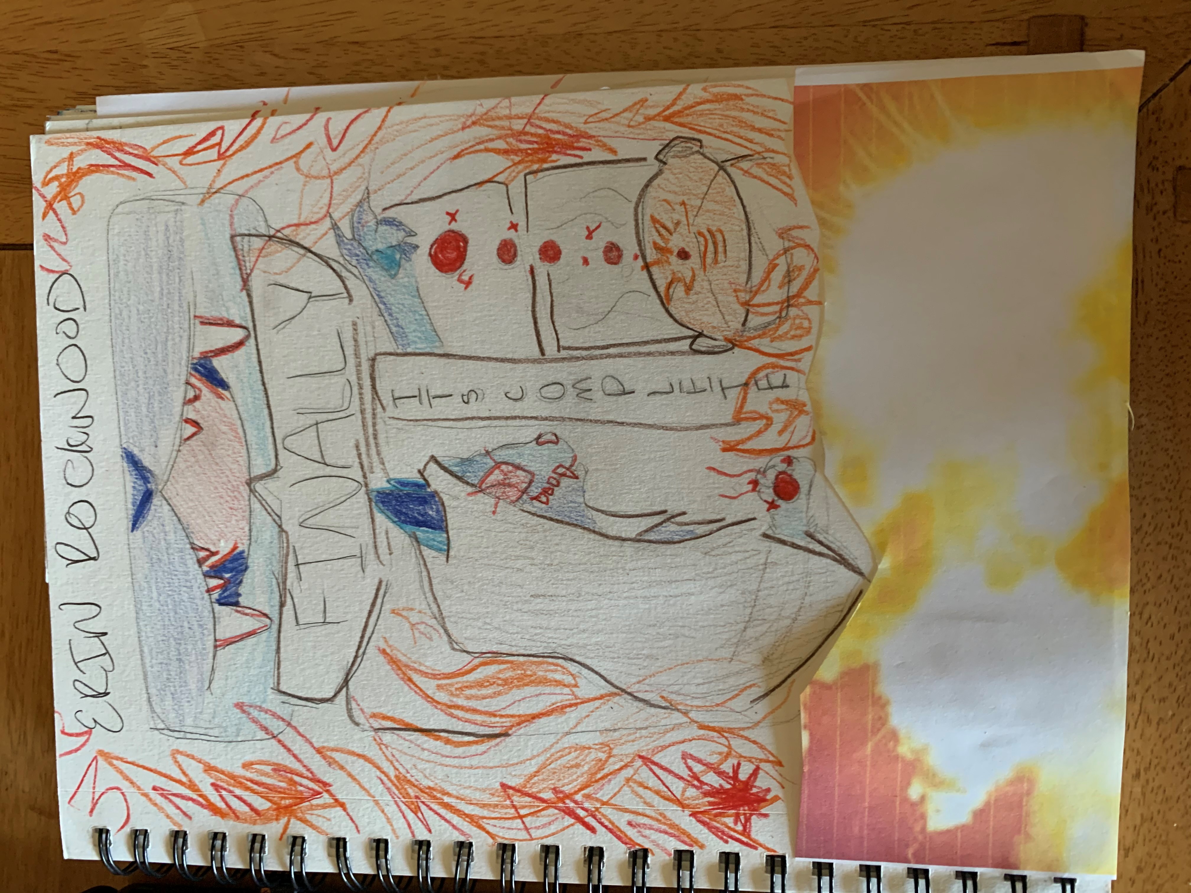
With this comic the invisible emotions I hoed to convey was relief and regret. The character had been working on this for a very long time, but upon emptying the stone into the cauldron the whole thing blew up. I wanted to put the flames on the sides to show the long term result of this mishap that it will have on the characters life. The character is happy that the magic has finally worked their way, after what seems to be a long time coming.
I have limited resources at my house right now in art supplies because my mother had planned to sell the house a month or two ago and packed everything up. I had old color pencils and pens. To help bring it u a little I used a printed out picture of an explosion to show the size of it. I put tape on the back so it pops out a little off of the page. The colored pencils I used are old wooden ones and I observed that they ran out of led pretty quickly before I had to sharpen them. They were a little hard to work with because of this.
I did work inventively with time frames in this comic because the 3rd and 4th panel is a static image that the stone is moving through. The first 2 panels are a close up of the other. I used this because I thought it would build a little more suspense as the stone cascades into the cauldron to have the subsequent explosion.
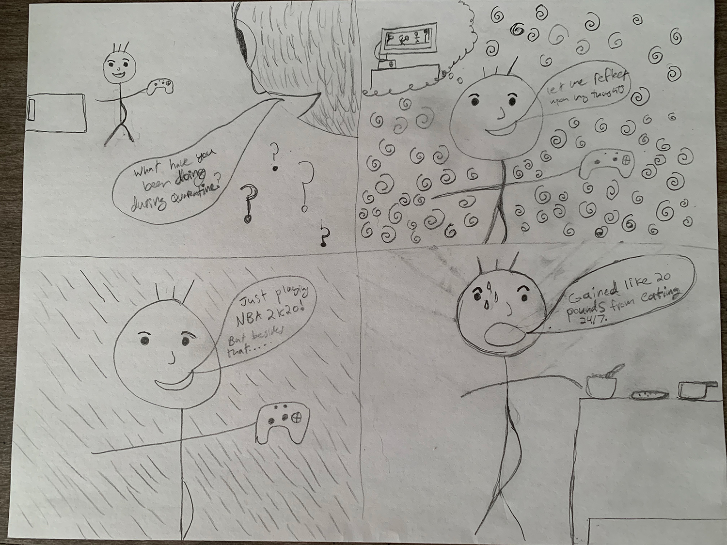
With the lines I used, I hope to convey a sense of confusion or being unsure in the top right panel of my comic and almost a sense of realization in the next panel from that one. In the top left panel, I put question marks under the character to give that sense of curiosity. In the last panel, I used thin lines to create sweat on the characters face which gives a sense of frustration.
I did not have a lot of tools available when i made the comic so i had to use a regular pencil and
paper but I tried to still work with line and give it texture of some sort. I think the pencil actually worked good on the bottom left frame because it gives off the sense of thinking or realizing something.
I used moment to moment closure in the first three panels of my comic. In the last one I used Scene to scene since my character started in his bed room and ended up in the kitchen by the table.
I used time inventively in my comic because I implied that it was only seconds in between each panel except for the last one. There was more than seconds in between my second to last and last panel because my character had to get from his room into the kitchen.
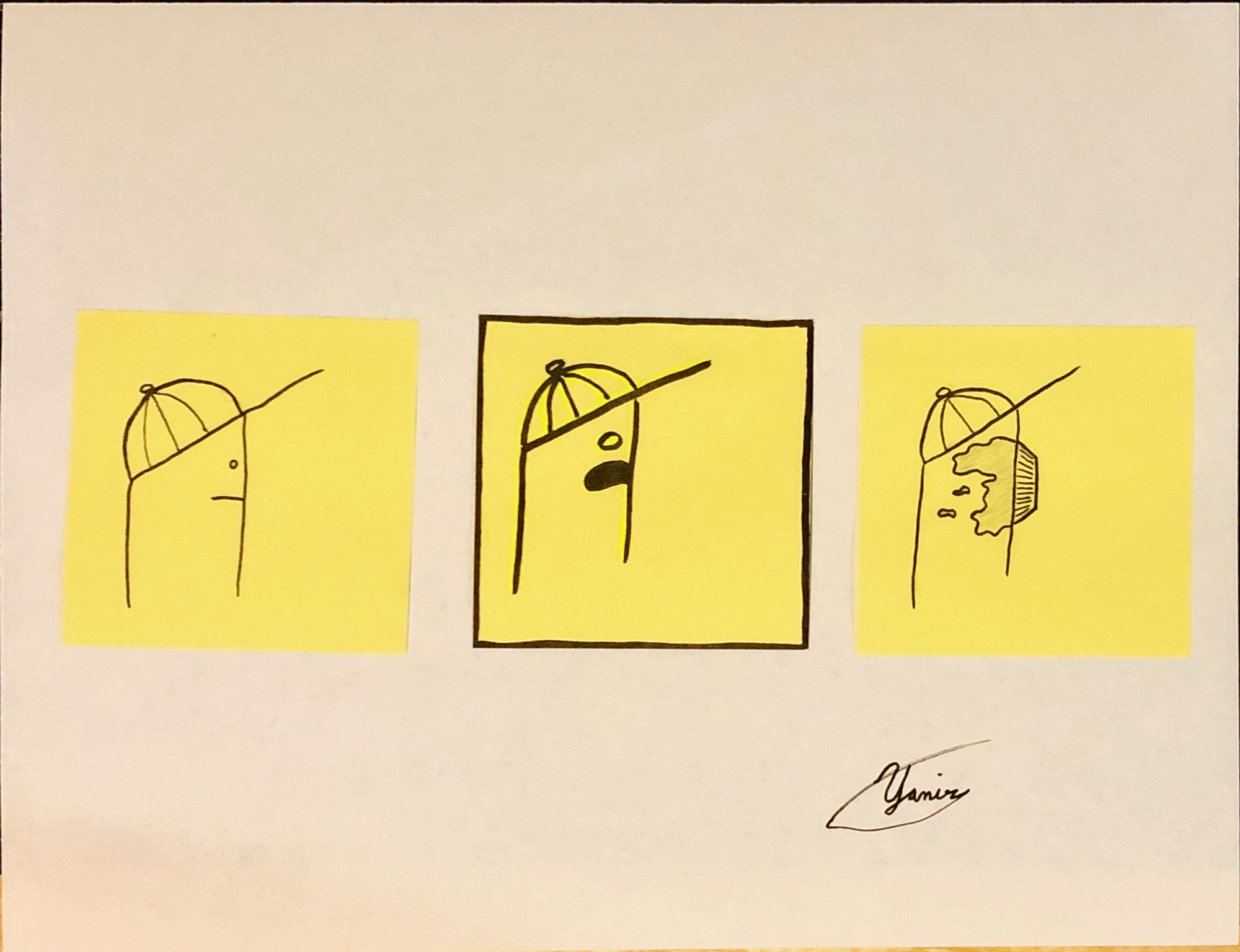
This week we had to make a comic that used concepts from the chapter “Living in line” and had to use these concepts to convey an emotion or feeling. In my comic I used thicker lines and outlining my second panel to make it seem very pronounced and push forward the idea of shock and fear as shown in the characters face as he sees a pie flying towards his face. (Hopefully it was obvious it was a pie) The lines at the end mirror the line thickness in the first panel showing that the character is in the same slightly unhappy un-moving state that you found him in almost an acceptance of what happened after the shock in the second panel.
I made this comic out of a standard sheet of printer paper as the base and sticky notes for the panels. For each panel I created a pencil sketch before inking each panel with variable thickness black markers. I chose sticky notes as panels because they are perfectly square and are distinctly separate from the paper below it.
Because I made everything on paper I felt that I had more freedom as I was not limited to my experience in a piece of software
The closure taking place between my panels is moment to moment as the things that happen in my comic happen rapidly without the character performing any actions. What this comic shows is him standing then realizing that a pie is flying towards his face and finally the pie hitting his face.
Because the character sees the pie then doesn’t avoid it in any way it can be assumed that all of the panels happened in very quick succession. The character is just spacing out when suddenly he notices the pie right before it hits him giving no time to react and resulting on a pie hitting his face. However the time here is very straight forward as the panels are linear snapshots of what is happening almost like frames of a video.
In Scott McCloud’s, Understanding Comics (Chapter 5 Living in Line), I learned that many different emotions and movements could be conveyed through the use of simple lines. As he states, with this technique emotions could be made “visible”. He provides several examples utilizing lines in order to describe a certain emotion. Such as jagged lines to create tension or fear while curvy lines usually give off a joyous vibe.
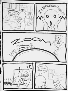
With the comic I created for this week I tried to provide enough examples of how lines could be used in order to show emotion and movements. I also went the pencil and paper route because I feel for right now I am able to convey stronger emotions through this than digital. The storyline is pretty short and simple. This random character I created is going through his normal errands shopping when he suddenly feels like something’s missing. He realizes that he forgot the oven was running before he left! He rushes back home in order to find that he was too late. The oven had literally ran away from home. This was a simple ridiculous story I came up with quickly but I knew it had great potential for line use.
“Forgotten Oven” by Edison Soliman
In the first panel I utilized a tornado-like line above the person’s head in order to show that he’s confused or questioning something. For the next panel I attempted to provide the emotion of shock with a jagged line going across the person’s face. I thought this was appropriate due to it literally looking like electric is going through him causing his shock. The next panel is my favorite and it was where I was able to utilize line to create motion. I did the basic cartoon clouds that follow a person as they run at full speed. I also tried to make it look like he’s running fast with lines that went from thick to thin. For in the second to last panel I added more thick and thin lines to give the effect that the door is slamming open quickly, as well as a subtle foot step. Finally in the last panel, I created a waterfall of tears coming from the person’s eyes in order to show great sadness after they found out their oven had actually ran away.
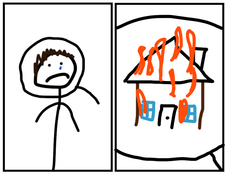
For my comic, I went with the digital route as I’m more comfortable and feel like I can make something much more visually satisfying with a keyboard and mouse than I can by hand. The concept of line is interesting as it is essentially the building block of any shape and furthermore any illustration. The way in which we use lines is everything when it comes to any illustration. Lines can create borders, form shapes, people, details, etc. In Chapter 5, McCloud points out that people often use line to portray emotion and likens line style to being an artists signature.
In my illustration, I tried to portray someone who is visually sad, while containing little information to why he’s sad. I then used a magnifying glass to convey that the next frame will portray a close up look into the head of the individual. It is only then revealed that the characters house burned down, which is why he is sad. I think anyone who saw this would instantly be able to sympathize with the character from this microcosmic view of his thoughts and worries.
I tried to use Illustrator to draw this, but my computer didn’t want to work with it and I kept getting a grey screen. Instead, I opted for the old trusty photoshop and opted for the rectangle shape tool to create frames, then did the rest with the brush tool. I only used 4 different colors, but I think they definitely catch the eye of the viewer as they’re pretty bright vibrant colors. I chose to draw this image because I think a lot of people have been sad or depressed lately with the whole quarantine, but I don’t think we’re being very sympathetic that everyone is going through it. Emotion is something that is often overlooked by people. Many people lack the empathy to put themselves in someones shoes and think about the source of the persons sadness. I think this does a good job of making someone think more about people and their feelings and focus in on why they feel a way and what others can do to help.