Helvetica – Victoria Henry-LeMaster

Image of a computer screen with gridlines and restrictions to create a type font.

1:11:18 Stop point of Film. The section features Manuel Krebs and Dimitri Bruni.

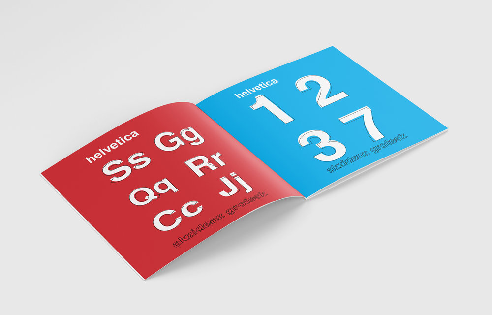
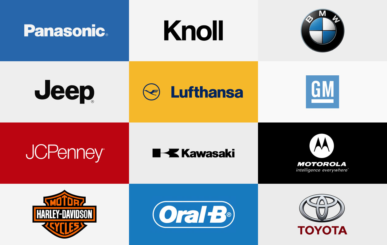
I think the most important thing about Helvetica is that time and time again in the documentary it is mentioned how it can be used for really anything. The versatility of the font creates endless possibilities for design use. No matter what project Helvetica is being used for it is used so universally that with any branding it usually can work. If you look at examples in the documentary-like American Airlines and American Apparel, both companies use the same font, however, they depict two completely different brand franchises. That is the repeated beauty of Helvetica and its ability to shape into anything that a brand really needs. It is acknowledged to be a dependable and consistent font. With contemporary designers, it was easy to understand how the font was able to shape a new form of design into the late 1900s. When it was first created Helvetica really was a font that turned around design. It was modern, clean, and contemporary. Helvetica can be thick, thin, serif or san serif, emphasized or italicized; it in its whole aesthetic is universal. One of the many typographers in the documentary described the font as almost an embodiment of humanity in a type. I think that in itself is beautiful, it now seems to fulfill that description purely. Helvetica is everywhere it is on street signs and billboards, it may really be on more pieces of paper individually more than people on Earth. Mike Parker,  a typographic developer described the design of Helvetia as being more than just a normal font that curves for random reasons but that there is a relationship with the foreground and background of the font.  There were some designers however that mentioned that because it has become so popular that it is overused to the point that it is “sickening” or too much. Though it was different and new when it first came out it was blown out of proportion. In my opinion, Helvetica is honestly really complex in its design even though it looks so simple. Pulling a quote from the documentary there really is little to nothing you could do to make it any better. It is universally concrete for a wide range of uses. I think that the documentary as a whole was actually extremely beneficial for learning more in depth of how other “real life” designers actually work on their projects and different tactics that are used. On that specifically, one artist mentions that the more restrictions you have that the easier the design becomes to create, I think that I will try and implement more of that thinking into me editing of my design so that I can really get each one really cohesive. The thing that I have a challenge with is working to be able to figure out what I want my restrictions to be. I feel like it is limiting my creativity as I have has a difficult time thinking about and working with my design, however, now that I understand it a little better I think that I may be able to understand what I really what the design to embody and describe in a more artistic and descriptive way. It seems as though my font would not be as orthodox and many of the earlier designers would like but I am okay with that, as long as it ends up being cohesive and full I will be successful in my own context.

Posted in Fall 2018 Archive (336) | Leave a comment

Helvetica: Jane Doe

An image of smartwater.

A real-world example of Helvetica in my apartment.

The san-serif typeface Helvetica was designed in 1957 by Max Miedinger and Eduard Hoffmann at the Haas Type Foundry in Switzerland.  It was created in the post-World War II era of modernism in Switzerland.  It was originally named after the typefaces that inspired it and named Neue Haas Grotesk before a name change by a parent companies Stempel and Linotype to Helvetica, which is a slight alteration of Switzerland in Latin.  It was marketed worldwide in 1961 and later adopted by Macintosh on all their computers.

(Side note: Microsoft had Arial designed by another company specifically for them to compete with Helvetica.)

Since its release, Helvetica has changed the typeface landscape.  Helvetica is everywhere.  From signage to businesses to the United States government, Helvetica is used by everyone.  It is a neutral and legible typeface, making it highly sought after and used.  Businesses use it to be neutral and personable.  Signs and the government use it to be easily read and neutral.  It works for nearly all purposes and for everyone.  It is so frequently used that it is familiar and no one notices the frequency at which it is used.

Businesses using Helvetica include Jeep, Knoll, BMW, JCPenney, Toyota, American Apparel, Nestle, Motorola, Panasonic, Lufthansa, and Target.  These businesses are clothing and electronics retailers, candy and food makers, vehicle companies, and more.  Helvetica is so neutral and universal that it works for a diverse range of companies.

Wim Crouwel and Massimo Vignelli believe that this universality of Helvetica is its strength.  Crouwel believes that type should be neutral and any meaning should be in the text, not the typeface.  Vignelli similarly believes that type should not be expressive.  Both designers contributed to the widespread use of Helvetica in logos and signs.

Helvetica’s popularity is also its downside.  Since Helvetica is seen everywhere on everything from businesses to signs to government offices and forms, it becomes invisible.  It stops standing out.  Companies or sign makers that decide to use Helvetica run the risk of the typeface disappearing into the background since it is so ubiquitous and familiar.

Helvetica has many detractors such as Paula Scher, Stefan Sagmeister, and David Carson.  Scher describes Helvetica as fascistic, clean, and corporate.  Sagmeister describes the typeface as boring.  Carson describes the typeface as simple, clean, and boring.  All these designers are concerned with creating designs with meaningful type.  Unlike those who like and use Helvetica, they believe that type can communicate meaning.


Watching the documentary Helvetica was fascinating.  It is incredible just how ubiquitous the typeface really is without even knowing it.  I found that the most interesting part of the documentary.

Typefaces and design are all around us, but we tend to not notice any of it.  This documentary interviewed a variety of different designers and showcased a ton of Helvetica type in our everyday world.  It was really helpful to see and hear from each opinion and see exactly the extent of the problem (yes, problem).

I was glad to hear that I am not the only individual who believes that Helvetica is overrated.  I also believe that it fades into the background and that type can communicate meaning.  I would say that Helvetica still has a place since it is so ubiquitous and so legible, but to use it creatively would not be something that I would consider.

Type communicates just as much as design.  If your typeface is neutral, then that communicates something about your text.  Those are connected.  I understand the beliefs of Crouwel and Vignelli and believe that sometimes type needs to be neutral to communicate certain things, but in creative spaces, type must not be neutral.

The documentary did not have an impact on the design of my project.  If I make any creative changes later, then I might reference it, but I am currently finished with my draft and it is turned in.

Posted in Fall 2018 Archive (336) | Leave a comment

Helvetica-Emily Deichmann

From billboards to taxi cabs to subway stations and store windows Helvetica is everywhere. Most people use this font because it is just there like how a lot of people go to McDonalds because its just there you don’t have to think about it. After watching this documentary, I have learned just what makes Helvetica so special and powerful.

Maximo Vismil says it is the space between the letters that makes the type good. Although to a person’s eye type looks black and white; in reality type is mostly white and a little black. The reason why Helvetica is so popular and successful is because it is very modern, clear, and works for just about everything. Helvetica was created in 1957 when a need for a rational and international typeface was desperate. The world was becoming more modern and there needed to be a typeface to express the changes and advancements going on. Helvetica was more machines and doing away with the manual work of creating a typeface. It was a symbol of the new modern world. Eduard Hoffman, the mastermind behind Helvetica, suggested that his German printing press should make a modernized form of Akidenz Grotesk. Akidenz Grotesk had serifs and san serifs and Hoffman wanted a typeface without them. Helvetica is all about the figure ground relationship. The shapes within the shapes match perfectly and create a powerful letter. Where is Helvetica now? A company named Linotype now has ownership of the typeface. Linotype owned the Haas and Stempel companies, which created Helvetica.

Helvetica cleaned up the advertising world. Instead of all the extra stuff being added in the 50’s advertisements like exclamation marks and cursive font for example, it transformed into bold statements with Helvetica like “Drink Coke Now” period. Another big client of Helvetica are governments and incorporations. They love using Helvetica because it seems neutral. Also, the smoothness of the letters make them seem human and can come off as seeming more accessible.

Helvetica invites a certain form of interpretation. It can match any brand it is representing. By using a certain typeface, a product or company can reach a different audience. For example, if a sign says “buy these jeans” in a grunge font, you would think the jeans would be ripped or grungy. If something were typed in Helvetica, you would think it is a simple product that could relate to most people.

Helvetica is a club, and by using it you’re saying, “we are a part of modern society”.

David Carson made many people in the typography world upset. When they were all trying to put things in order and make a system he continued to experiment and make crazy typography. He believes that the type font you use should represent the word. He thinks that Helvetica is simple clean and boring rather than simple clean and powerful. Grunge typography took the world by storm for about four to five years but by the end of the grunge period type fonts were broken because of how much they were manipulated. When creating a strong powerful typeface I have learned that the more restrictions and rules the better. Many people have tried to improve Helvetica but are never successful.

Posted in Fall 2018 Archive (336) | Leave a comment

Comics Continued: Melissa Urueta

American Splendor movie poster 2003

The film American Splendor combines two worlds together, it combines the world of comics into a world of film all while telling the story of Harvey Pekar the author to the “American Splendor” comic book series. This film starts by telling the story of Pekar’s life needless to say his story does not start off interesting. Pekar is portrayed as a sad, irritated man who is stuck in the same low level job as a file clerk in a hospital. He has had two wives and meets the third in the film, Joyce. In the film he fill his life with jazz music and Garage sales finds, this is his integration of art in the beginning  of the film and how it unravels into his comic books becoming his own work of art.

This film combines two realities into one, the real life and the fiction/ hollywood side of pekar’s story. This is made clear in the film where both the real Pekar is commenting and narrating the movie and having an actor play him in the movie. The same goes with his wife. Both worlds collide in this film. This is something that Scott McCloud does in his book. He tells a story and then has himself as both the main character and the narrator. he mentions this in his book as comic can be a way to collide with reality. It is a form of expression and Pekar needed to express his reality. This is why after his long days of his same job he created comics from it as a way to make his life into an art form like his garage sales finds and jazz music he admired.

In the film there are scenes that are that have some illustrations and these went back and forth from reality to illustrations. The film was based on a comic book about the author’s life and they integrated both worlds. Scott McCloud says that you can also make a comic out of anything and it is an art form, all it has to be is a “juxtaposed pictorial and other images in deliberate sequence” (9). This is how the film is film, the film is basically Pekar’s comics come to life . He created art out of his daily life and it became a popular comic books series. This was his form of storytelling.

Pekar’s comics were a hit because it is exactly what Scott McClouds book talked about. Pekar’s comics were familiar and minimally detailed and this made the readers fit right into the shoes of Pekar. This is almost exactly what McCloud says in his book that makes a character when he discusses masking. This is what makes Pekar’s comics so popular because he does not put up a mask, he tells his story in his comics and which makes it relatable for the readers. This is the idea that Pekar was going for. The same goes for the film, it is relatable and familiar and shows true character development all while telling his story on how he rose to fame.

Posted in Fall 2018 Archive (201) | Leave a comment

Comics Continued: Jaclyn Erickson

The film American Splendor is about a famous comic book series and the author, Harvey Pekar, the film goes into detail how Harvey started at the very bottom an worked his way into creating a very popular comic series. Harvey’s wife doesn’t come into action for sometime but one she, she is a absolutely crucial for their relationship and in other words plays a major role in the film. There is a multitude of different concepts from Scott McClouds novel Understanding Comics scattered throughout the film.

The main character of the movie is named Harvey and is a very gloomy, irritated, depressed man. He is struggling to stay up on his feet through various jobs and the fact that he could never figure out how to write a solid comic. One of the first concepts that stood out to me relating back to McClouds novel was that any story can become a comic. Harvey started out struggling to come up with a story for his comics but eventually learned that just by writing about stories that happens in his everyday life. Harvey later brought his stories to his friend who was making a living from creating and drawing comics and he thought Harvey’s stories weren’t so bad. Leading me into my next concept that related to the movie, a quote from the novel by Scott McCloud says that “No schools of art are banished by our definition, no philosophies, no movement, no way of seeing are out of bounds”. Though this concept ties with my first it made me believe that the film was created the way it was because Harvey and his character is a very non tradition guy, meaning he doesn’t follow the guidelines of creating your average comic. Yes, any story can become a comic but the way the comic is presented can be a turning for its audience.

Another detailed concept that stood out to me was how in the film there would be scenes including time stamps in the corners of the screen. This on the other hand was a bit more of a traditional idea presented in comics to help the audience have a better understanding of whats happening at that moment in time. I personally did not use this idea in my own comic but have read several other comic that do include this concept. This is also not the first time I have seen films do this sort of time stamp, it’s actually used quite commonly in all sorts of movies, novels, and or even presentations.

In chapter 3 of Scotts McClouds novel it talks about all different kinds of scenes that can be done in order to draw out dramatic affect. The film actually does this quite a bit with all sorts of different angles to create affect as do comics. What was also unique was that this film added speech bubbles and other comic-like drawings into the film giving the audience a bit more of detail on what the story may really be about. To me when I began noticing that the movie had been adding these extra features making it seem as if the story really was about a superhero named Harvey and how hard it was for him but eventually he is recognized. In the beginning of the film there is a Halloween scene that truly helped my theory. In the scene there is a group of boys all dressed as super hero’s except one who was Harvey Pekar.

In this image we can see the Halloween scene of the film. Young boys dressed as super hero’s and then there is Harvey Pekar.


Posted in Fall 2018 Archive (201) | Leave a comment

Helvetica: Hunter Kozol


Helvetica is one of the most used fonts in the world. It is used to represent companies, give instructions, label street signs, and much more. The popularity of the font comes from its design. In the documentary Helvetica, typists from around the world share their authority on type and break down the history, the design and the popularity of Helvetica.

The font originated in Switzerland and is known as Neue Haas Grotesk or Helvetica. Early in the film, one typist describes “Helvetica was a real step from the 19th-century typeface. It was doing away with the manual details in it. It was neutral.  The meaning is in the context of the text, not the type itself.” This allowed the font to be a simple, clean, vehicle for communication. It is extremely versatile. One typist explains that “Governments and companies love Helvetica because, on one hand, it makes them seem efficient, but it’s also the smoothness of the letter that makes them seem human.” These two factors create this amazing font. It is easy to read and has only the necessary structure. In addition to being simple, the smoothness gives the type a natural look which is welcoming, but it also has utility. Neville Brody said that “in a way, Helvetica is a club. It’s a membership. It’s a badge. It says we’re part of modern society. We share the same ideals. It’s well-rounded. It’s not going to be damaging or dangerous.” His comments really describe the qualities that companies and other organizations find attractive in the typeface.


One typist, from Switzerland, describes how the Swiss view the design differently than most. He says “When you talk about Helvetica it’s about the negative space the figure-ground relationship.” This concept blew my mind. I had never thought that other countries focused on different elements of design. When I think of a font I think of the stroke and weight of the letter. I have more elements which I can describe and understand after this assignment, but hearing that the Swiss focus on the negative ground more in the font Helvetica was something that changed my own typeface design. The shift in focus allowed me to expand my thinking about how I could represent my body of text through my font.  A major shape that I wanted to incorporate in my text was the silhouette of half dome in Yosemite National Park. I found that I could use this shape in the counter form of my font. In many letters, like P, O, Q, D, and B, the specific shape worked wonderfully as the counter form. As I shifted my focus back to the positive space of the typeface I noticed that I liked the balance of the subtle details in the negative space and the form in the positive space in my letters. The trouble I found was in the letters that I couldn’t fit the half dome shape in the counter form or the form of the letter. This is a balance I am still trying to find to create unity in my typeface design.


Posted in Fall 2018 Archive (336) | Leave a comment

Comics Continued: Aidan Aumell

The movie American Splendor is about a comic book writer by the name of Harvey Pekar who write a comic book series called American Splendor. The film follows his rise to fame as an underground comic book artist living in Cleveland. His wife plays a major role throughout the film as the movie really focuses on their relationship. The movie displays elements of traditional comic book design often, Scott McCloud discussed these types of elements in his book “Understanding Comics”. Throughout the film we can directly relate certain concepts from “Understanding Comics” to “American Splendor”

I actually really like the movie “American Splendor” not really because of the storyline but because of how it was produced. I feel like the way Harvey Pekar decided to tell his story was not a very tradition way of putting together a movie. There was almost like two main narrators throughout the film because of how he added cut scenes of him and his wife talking about their life in a separate setting from the film. Not only was it a different setting from the main storyline but it was set in the future and they were looking at themselves from a third person point of view perspective. I thought this was a cool way of producing a film and it made me care more about the characters in general. I actually have never even seen a movie like this one before and I was kind amazed that it worked so well being so far off from a traditional movie. This type of producing was really unique for telling a story. In Scott McCloud book, he talks about how comic book writer envision what they want to produce before the they even star. “Ask any writer or filmmaker or painter just how much of a given project truly represents what he/she envisioned it to be.” I feel like this quote in the book really summarizes how the movie American Splendor was produced because to me the entire film seems to be Harvey vison of how he wants his story to be told. Even though it not a very traditional way of producing a movie I thought I worked out well!

Which leads me to my next connection between Scott McCloud book and Harvey Pekar movie. When Scott McCloud is describing the rules of comic books I could help but thoses rules to anything that has to do with your creative imagination. In the book he says “ No schools of art are banished by our definition, no philosophies, no movement, no ways of seeing are out of bounds!” I feel like this was the attitude towards Harvey creating the film mostly because of how none traditional it was. Ultimately there are countless ways to produce a comic or movie you just have to use your imagination.

IMG_0125

Some specific concepts I noticed in the film that we cold relate to the book was he included time stamps of the top left of certain scene to help give the audience more information about the setting through the film. Scott McCloud used this throughout the book and I (myself) actually included this in my comic project! This was interesting because he merged the comic book world with reality which gave off a cool effect. Scott McCloud not only talks about this in the book but I also have seen examples of this, in his Web comics!


Posted in Fall 2018 Archive (201), Uncategorized | Leave a comment

Comics Continued: Kameryn Skillingstad

American Splendor is a movie that follows Harvey Pekar throughout his journey of life and how he came to be a famous comic artist. American Splendor is also the name of Pekar’s comic that he wrote as an underground comic artist. As I watched American Splendor the movie, I noticed many similarities between certain elements of comics talked about in Scott McCloud’s book Understanding Comics.

First, I found that the general idea of the movie American Splendor relates to Understanding Comics because one of McCloud’s arguments he discusses in his book is that comics is an art form that should be taken more seriously and seen as something that is acceptable for all ages. In the movie American Splendor, Pekar is inspired by Theodore Dreiser who shows that comics can be an acceptable art form for adults. Pekar’s comics appealed to people because they were real life situations that he experienced that everyone can relate to in some way which brings me to the nest similarity I found between the movie and the book Understanding Comics.

McCloud’s talks about how he believes a simpler comic drawing may be the best option when it comes to trying to make the characters relatable, universal, and spark imagination in the audience. In a scene in American Splendor, Pekar is shown attempting to draw a comic in a library with the quote “I got a job”, with frames and stick figures. Even though he didn’t use those drawings, because he never actually drew for his published comic, in McCloud’s eyes Pekar’s stick figure drawings may not have been the worst idea to use. McCloud believes a simple drawing allows the audience to imagine that character is us and feel more invested in the story itself.

Pekar’s comics also focus on black and white drawings and let the story be the leading force within the comic which is similar to McCloud’s opinions. McCloud makes the case that focusing on the content within the comic and the power of the story should take priority over how intricate the drawings are within the comic.

Lastly, McCloud writes about the powerfulness of using varying transitions, panel shapes and sizes, and line styles to create an impactful story. I researched one of the American Splendor comics and found an image of a man on the phone. Pekar uses Scott McCloud’s technique and separates the two frames of the boys on the phone with a jagged diagonal line that splits the frame into two. In comics, this jagged line is frequently related to a phone and creates a very intriguing and in my opinion satisfying aspect to the comic because if the two men on the phone were separated by a straight line and a different frame it would have taken me longer to identify they were in different places chatting on the phone.

I thoroughly enjoyed watching American Splendor not only because of the humor but also because after reading Understanding Comics I was able to identify elements of comics and better understand the art form. Although there were massive amounts of similarities between Understanding Comics and the movie American Splendor, these were just a few that stood out to me.


Posted in Fall 2018 Archive (201) | Leave a comment

Extra Credit Helvetica Film Blog Post Jan Conrad Rac

mockups-design.com / http://www.graficzny.com.pl

Before Helvetica it was such a different font  and the graphic design and typography was uses In a cartoonish way. Since the birth of Helvetica it has been the leading and dominant typeface which is a good marketing assets in assisting helping companies. I think also since the birth of digital technology since we are going into that realm of the technology side and you can do graphic design work on the computer where you can make different types of typography. I think that understanding of how contemporary design uses the typeface is very interesting. A lot of designers uses Helvetica in many different ways. there are many forms of how design is laid out and put everywhere. you see Helvetica everywhere in the IRS Form, in Magazine, and all over the cities, etc. There are some graphic designs with different colors it always involves warm and cool colors and also black colors typeface using Helvetica.

Die Neue Haas Grotesk its the original name of Helvetica Edward Hoffman wanted to created a modern day Sand Serif but in order to retool the typeface. Going off of the documentary they showed various amount of different letters sequences throughout the film and the letters that i will touch upon is how they used lowercase being created.   letters A, C & E have a horizontal structure. Haas was the founder of the type foundry and was living in Switzerland. Linotype Headquarters owned the Haas and the Stempel foundries and now owns Helvetica.  Haas had everything written and plan out for what was being created.  All these information about how it started to all the facts of what Helvetica and what it is uses for. Helvetia it is on every street corner. Graphic design is a communicate framework and its message. The designers have an important job. Helvetica is a typeface that has a clear typeface. Helvetica typeface is all around. In 1957 Helvetica immerges as the typeface corporate identify and signs systems present them to the public and uses it in a legible way. It’s basically saying making sure the font it’s the right size and legible for the signs so that the consumers.

Corporate identities was the shift and changes because Helvetica paves the way for what graphic designers uses and what these companies and corporate companies as well. In the 1950s the designs and ads they uses were very plain and had pictures but when the an example is in the time magazine they showed a picture of coke they used a Helvetica typeface and font which was so bold. American appears uses Helvetica  because it is eye grabbing and eye popping. Helvetica is the most commonly uses typeface because it’s mostly generic compared to all the typefaces. I think working on this project it will be give me a wide variety of ideas for my project. There are a lot of opportunities of typeface. I think if I wanted to used graphic design work in the future I would now uses Helvetica because of the way the font looks.

Posted in Fall 2018 Archive (336) | Leave a comment

Helvetica – Juan Nolazco

After watching the documentary Helvetica, I have come to understand the controversy behind the typeface and why it is both revered as well as hated. To understand why this type has such a strong effect on people and designers, the documentary first dissects the anatomy of this type. Helvetica is clear, modern, and neutral, which in turn makes it extremely versatile. The documentary describes how the type is all about the figure ground relationship. The negative space tightly surrounds each character securely which creates a strong statement in the words formed by the letters.

From the film ‘Helvetica’ directed by Gary Hustwit

From the film ‘Helvetica’ directed by Gary Hustwit

Helvetica was the answer to the issue of 1950’s advertising being too flashy, cluttered, colorful, with zany hand lettering and too many different typefaces being used that didn’t need to be there. Companies transitioned to Helvetica to clean up their brand. The type transformed their image into something professional that makes a clear statement. A great example of this in the documentary was Coca-Cola going from cursive wedding typography and an extensive description accompanied by an image of a family, to a clear image of the product and the company’s name and slogan in Helvetica. This was also one of the most impactful parts of the documentary for me because I am an advertising major and the logic behind that decision struck me as brilliant. I also currently hold a graphic design position on campus so this technique and mentality can be applied to my work. Governments and corporations love Helvetica because it makes them seem neutral and efficient, while the smoothness of the letters make them seem human. These are qualities they want because they come off as more accessible, transparent and accountable despite an image of seeming oppressive and authoritarian. It was used so widely that it became part of every-day life in America. It became basic and lost its visual potency. People began using more expressive typefaces as a form of pushback and tried using other sans serif fonts that could be a substitute for Helvetica. Nowadays people consider Helvetica to be a basic font and is often seen as boring. The type has become such a large part of every-day life that people need something different in order to be eye catching. However, many campaigns continue to use the type because when used correctly, it can be just as effective as when it was introduced.

This documentary provided valuable insight into the world of typography and graphic design and I have learned a lot that I can apply to my type and poster design. One of the biggest takeaways I had was that just because something is legible doesn’t mean it communicates, and more importantly it doesn’t mean it communicates the right thing. Remembering to be intentional with every decision made throughout the design process is the best way to create something meaningful. If an artist does not have a reason or significance behind the creative decisions they make, then viewers won’t receive a message from the piece.

Posted in Fall 2018 Archive (336) | Leave a comment