Helvetica is one of the most used fonts in the world. It is used to represent companies, give instructions, label street signs, and much more. The popularity of the font comes from its design. In the documentary Helvetica, typists from around the world share their authority on type and break down the history, the design and the popularity of Helvetica.
The font originated in Switzerland and is known as Neue Haas Grotesk or Helvetica. Early in the film, one typist describes “Helvetica was a real step from the 19th-century typeface. It was doing away with the manual details in it. It was neutral. The meaning is in the context of the text, not the type itself.” This allowed the font to be a simple, clean, vehicle for communication. It is extremely versatile. One typist explains that “Governments and companies love Helvetica because, on one hand, it makes them seem efficient, but it’s also the smoothness of the letter that makes them seem human.” These two factors create this amazing font. It is easy to read and has only the necessary structure. In addition to being simple, the smoothness gives the type a natural look which is welcoming, but it also has utility. Neville Brody said that “in a way, Helvetica is a club. It’s a membership. It’s a badge. It says we’re part of modern society. We share the same ideals. It’s well-rounded. It’s not going to be damaging or dangerous.” His comments really describe the qualities that companies and other organizations find attractive in the typeface.
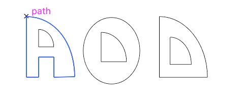
One typist, from Switzerland, describes how the Swiss view the design differently than most. He says “When you talk about Helvetica it’s about the negative space the figure-ground relationship.” This concept blew my mind. I had never thought that other countries focused on different elements of design. When I think of a font I think of the stroke and weight of the letter. I have more elements which I can describe and understand after this assignment, but hearing that the Swiss focus on the negative ground more in the font Helvetica was something that changed my own typeface design. The shift in focus allowed me to expand my thinking about how I could represent my body of text through my font. A major shape that I wanted to incorporate in my text was the silhouette of half dome in Yosemite National Park. I found that I could use this shape in the counter form of my font. In many letters, like P, O, Q, D, and B, the specific shape worked wonderfully as the counter form. As I shifted my focus back to the positive space of the typeface I noticed that I liked the balance of the subtle details in the negative space and the form in the positive space in my letters. The trouble I found was in the letters that I couldn’t fit the half dome shape in the counter form or the form of the letter. This is a balance I am still trying to find to create unity in my typeface design.