Page 31 from Scott McCloud’s book, “Understanding Comics: The Invisible Art.”
On page 31 of Scott McCloud’s “Understanding Comics: The Invisible Art,” there are tons of examples that demonstrate the uses of the elements and principles of design. To begin with perhaps the most basic element, line, I noticed that McCloud uses boundary lines most commonly, however, he does use implied lines as well. On page 31, in the second panel (depicting the Wizard of Oz), McCloud uses boundary lines heavily in his self-portrait, but in the yellow brick road, boundary lines are present. Lovett also talks about how lines are used to create other elements. In the first panel of the second row, I noticed the lines across the face in the second portrait. I think this is a good example of visual texture because, through the use of the of a few lines, the reader can easily tell where the highlights and shadows of the man’s face are.
I was also intrigued by the idea of size within Scott McCloud’s spread and comics in general. Personally, my eye was immediately drawn to the two larger panels. I believe this is partially because of their size and partially because of the empty space within said panels. Like Lovett described, size differences create tension within an art piece. This is definitely true in this case. McCloud’s choice to make the bottom left panel so large and lack so much detail feels somewhat out of place in regards to some of the detailed artwork surrounding in on page 31 as well as the rest of the book.
The first principle that jumped out at me was unity. I think that in the case of comics, unity is especially important. On page 31 and throughout the entire book there’s a universal art style that the artist uses. This helps the reader piece together the story and it also places emphasis on artwork that doesn’t necessarily match the rest of the panels. Scott McCloud very clearly uses all elements and principles of design which is why his comic book is so effective and efficient.


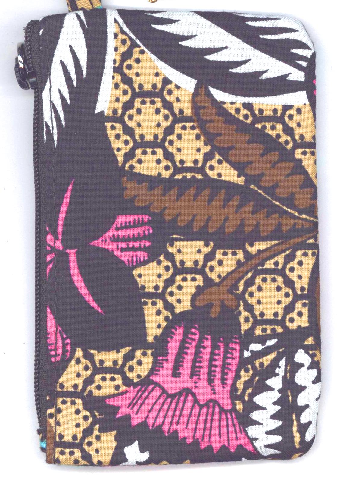


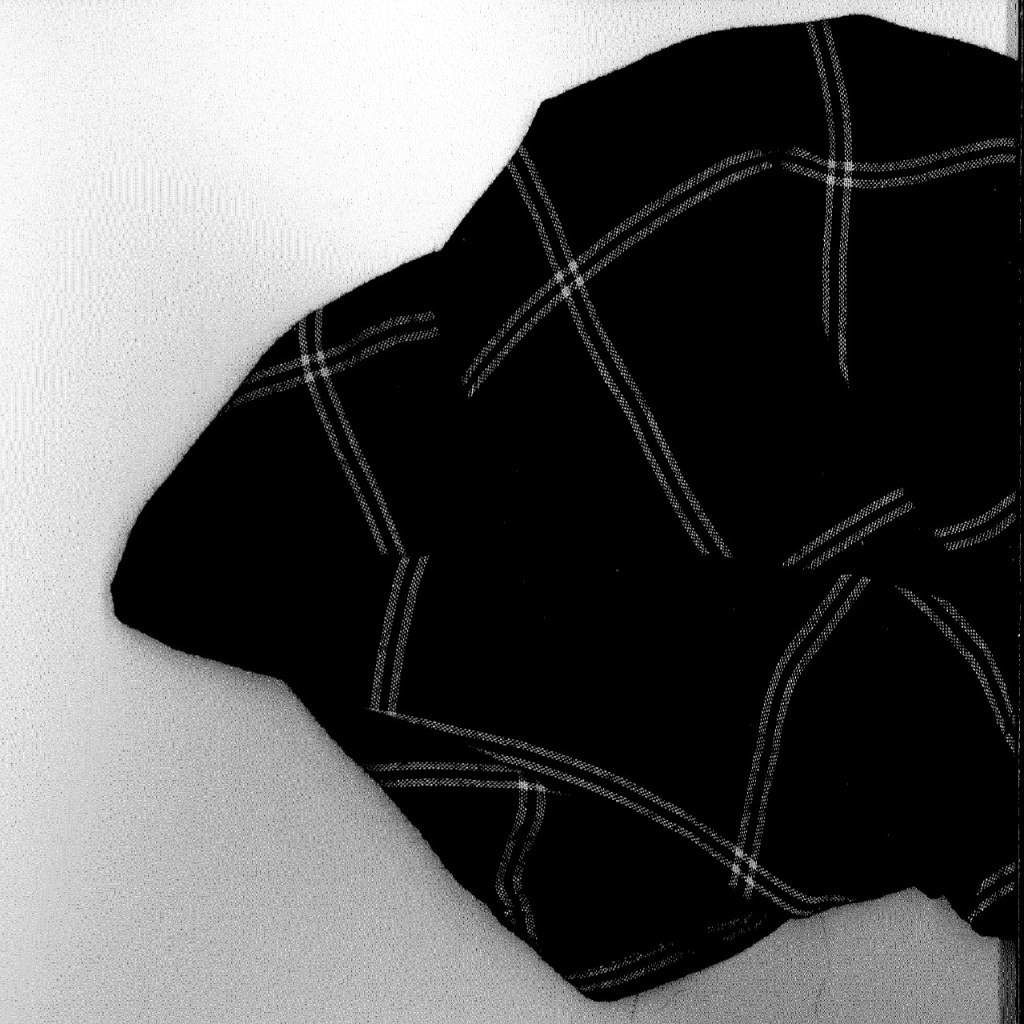
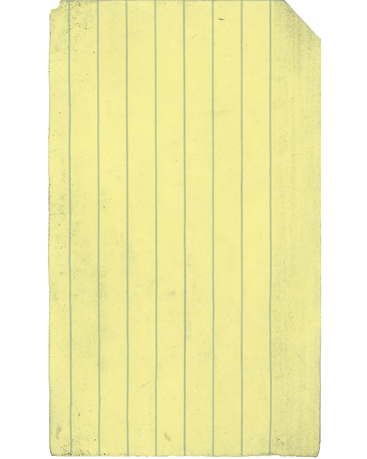
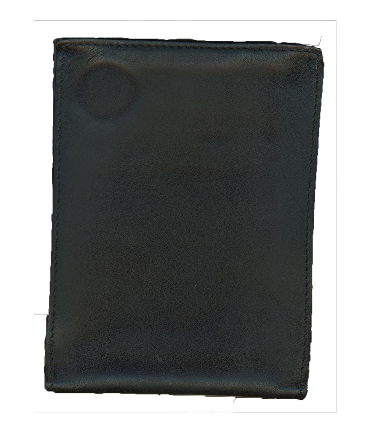 such as some different colored dish rags and a plaid designed washcloth. I also brought along some larger objects two of which I discovered weren’t suitable for scanning. When I finally scanned some objects I chose two relatively flatter objects this time around with some texture I hoped would be very noticeable after the scan. The first was my wallet that has stitches around the rim, a leathery appearance, and a coin imprinted into it. The second was a piece of yellow note card paper. It had dirty rough edges and a large amount of dirty coloration and texture from sitting at the bottom of my bag. I had different difficulties from both of these objects. The first object I scanned between the two was the piece of yellow paper. It had a lot of folds and wrinkles before it was scanned. I had crumpled it before to give it some extra texture, but all the wrinkles didn’t show up in the scan. They were most likely squashed