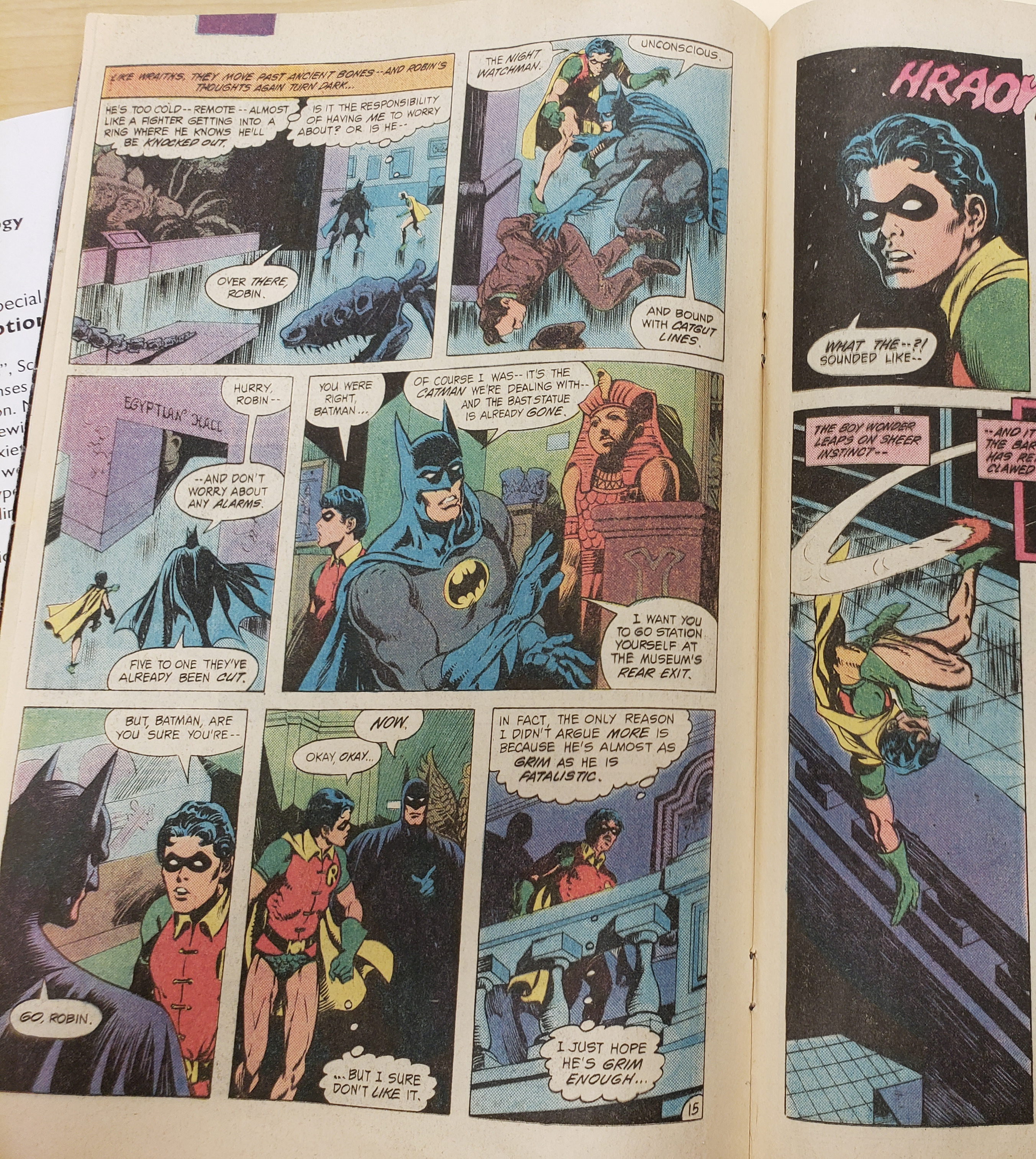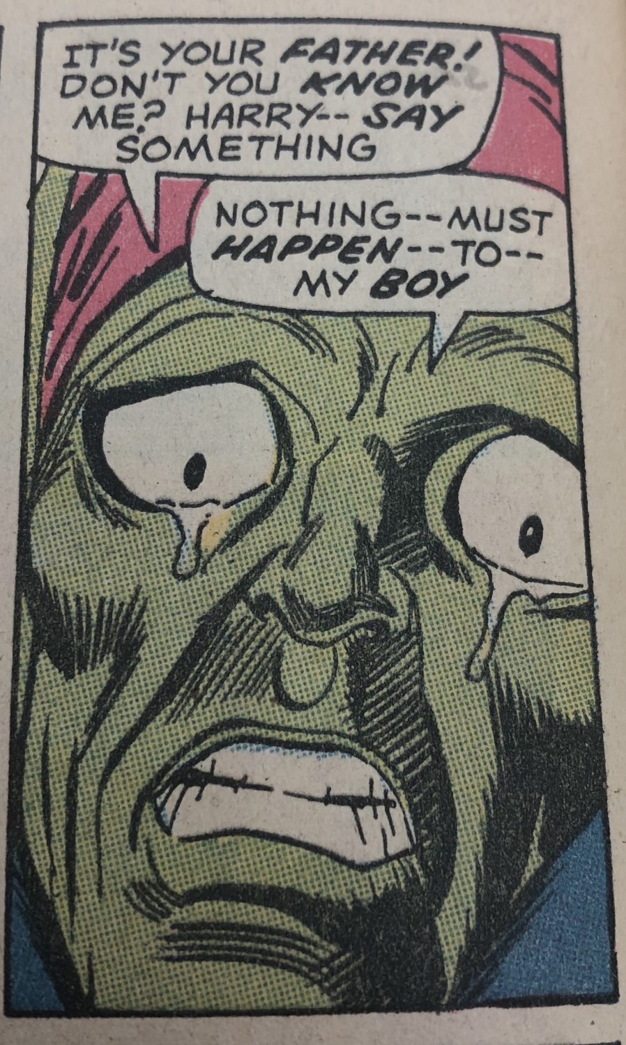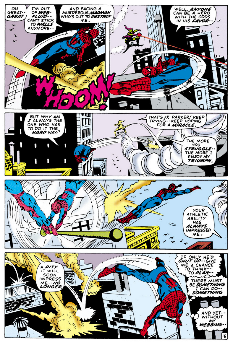
“The Amazing Spider-Man” Issue 98, Marvel Comics 1973.
Included in the MASC was one particular comic that I know my father has read, “The Amazing Spider-Man” issue 98 (1973) from Marvel comics. In this particular issue, one use of lines in order to convey senses and emotions occurs on page 16 of the comic; this particular page has a lot of action, for instance, Spider-Man swinging from building to building. The artist uses lines to create tension and suspense in the reader, for instance, in the last panel, the protagonist barely escapes an attack from the antagonist. The artist uses a variety of line thicknesses, for example, Spider-Man swinging around a pole. The artist uses much thinner lines to convey that there is not, in fact, two Spider-Men, but that Spider-Man is mid-action, the thinner lines and outlines of the character showing us, the reader, that he is spinning around the pole. Another instance of line conveying emotion or “sense” is the artist’s employment of a colored line. In the second panel of the comic, the antagonist shoots a red line from his hand, implying some sort of lazer or danger.
“The Amazing Spider-Man” Issue 98, Marvel Comics 1973.
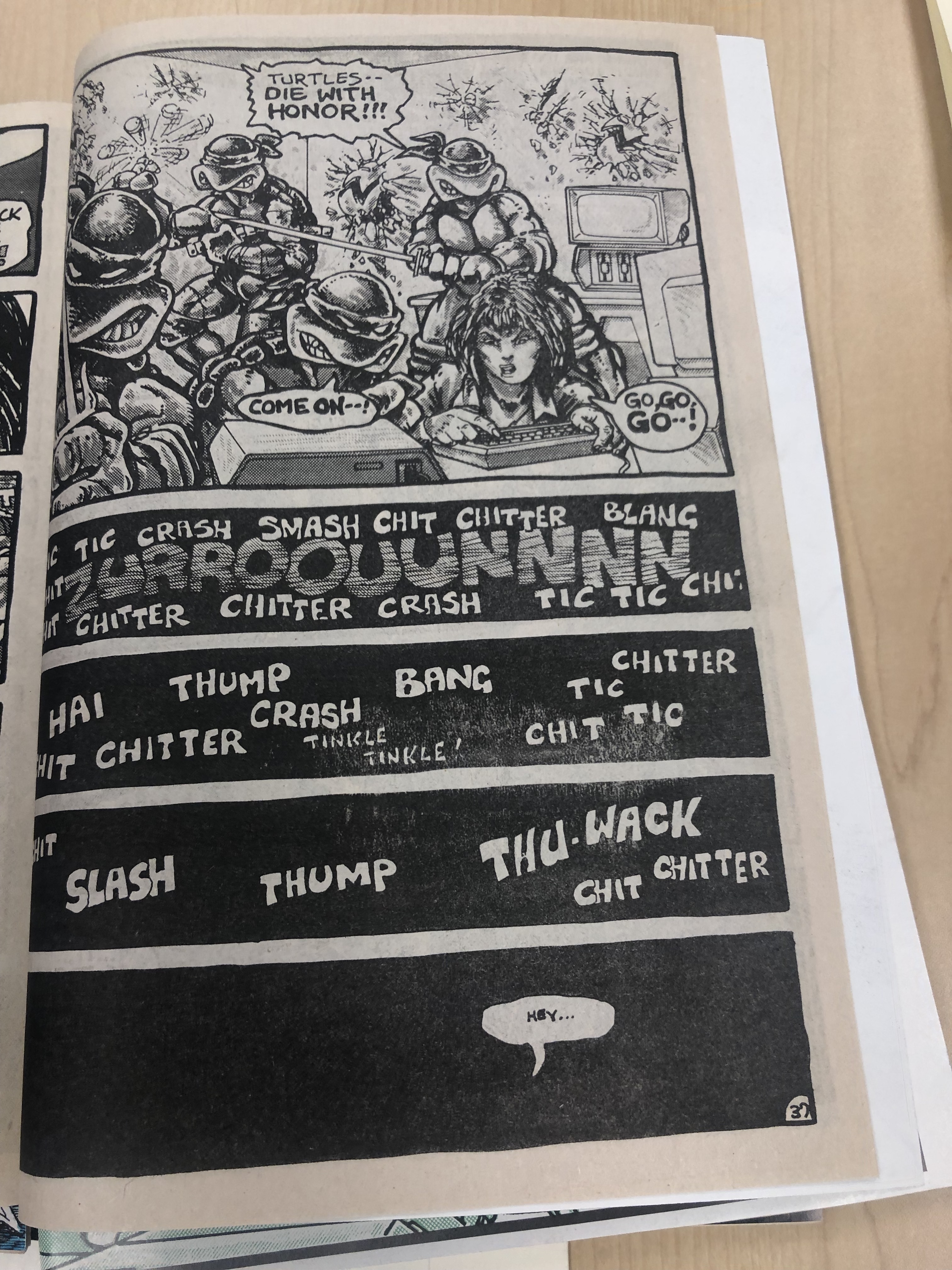
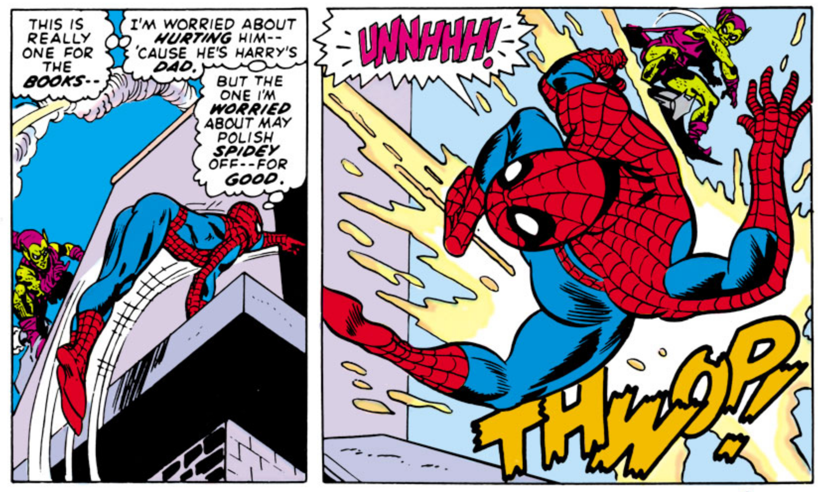
Alongside line, there is also the idea of words and pictures working together to tell a story. One instance of this in this comic is a particular section of page 14. In the second panel, there is an instance of a picture-specific combination, as the wording (“THWOP” and “UNNHHH!”) simply add a sound track to the image displayed. In this instance, the image could stand alone and make sense to the reader, however, the wording adds a “soundtrack” that better allows the reader to understand the peril and pain that the protagonist is going through. The words themselves, though, could not stand alone without the image, as there would be too much left up for interpretation.