

A frame from the comic “Crazy Men go Wild!” depicting line quality
I picked out several frames from one of the “Crazy Men” comics. There are actually a lot of different types of line quality in this comic. However, the example of line quality that stood out to me most was all of the squiggly or wavy lines that were used. I found that the main way the wavy lines were used was for drawing the characters in the comic but there are some cases where they were used in the background or for inanimate objects.

A page from the comic “Crazy Men Deluxe” depicting line quality
As the title of the comic implies many of the characters are extremely crazy looking. I think the squiggly lines help to achieve such an impression. The waves in the lines feel unstable compared to straight vertical or horizontal lines. The lines also almost seem like they are in motion. They have this feeling like they wobbling due to the waves.
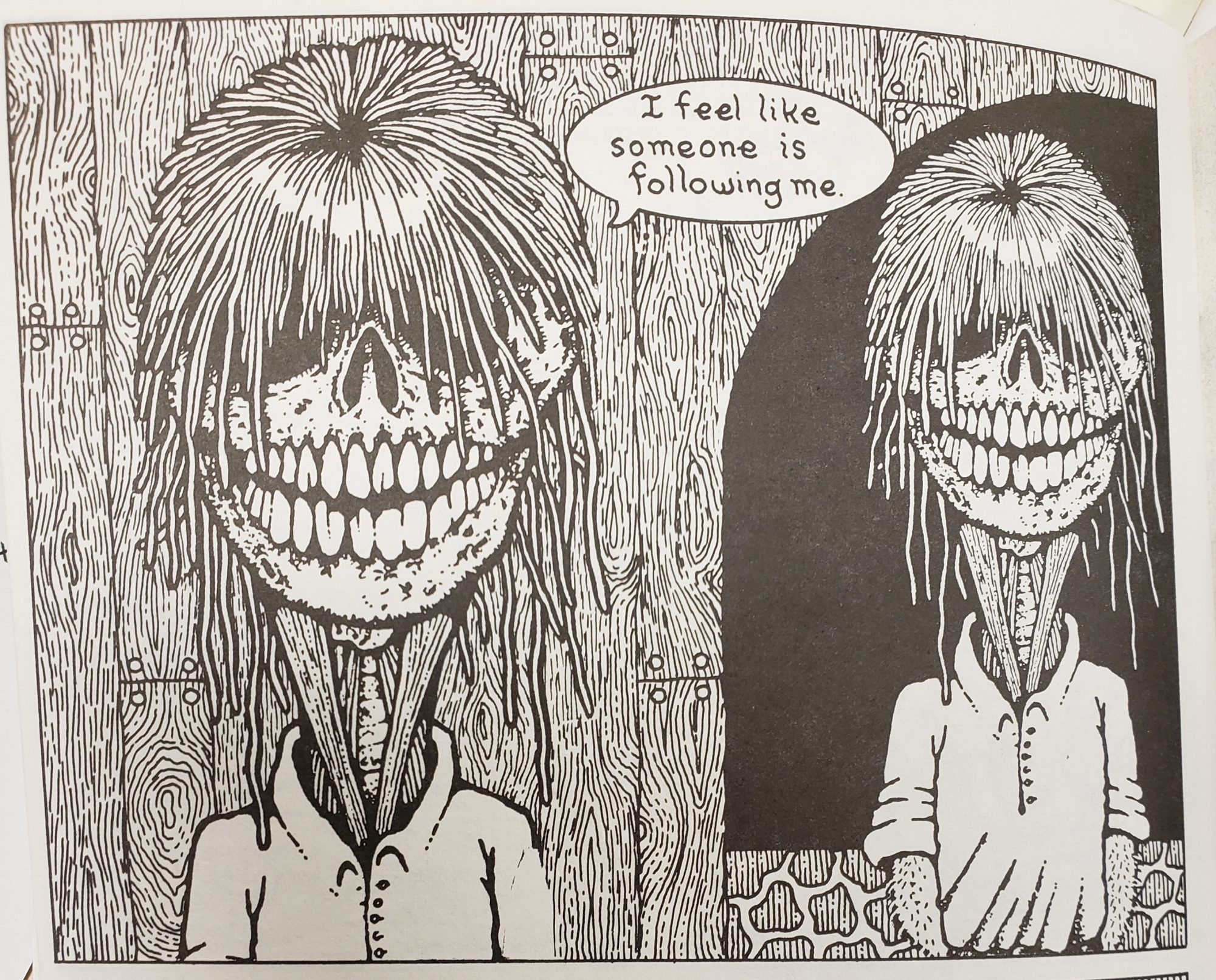
A frame from “Crazy Men go Wild!” showing an interdependent relationship between text and picture.
I also found several examples of interdependent frames. I pulled the first example from another “Crazy Men” comic. In the picture, you see a character drawn twice where one version of the character is slightly behind the other. The picture on its own doesn’t convey as much as when it is paired with the text. The text says “I feel like someone is following me.” The text on its own isn’t as impactful either. While the text clearly tells you the character is being followed, the text and the picture have to be combined to understand that the character is actually being followed by himself.
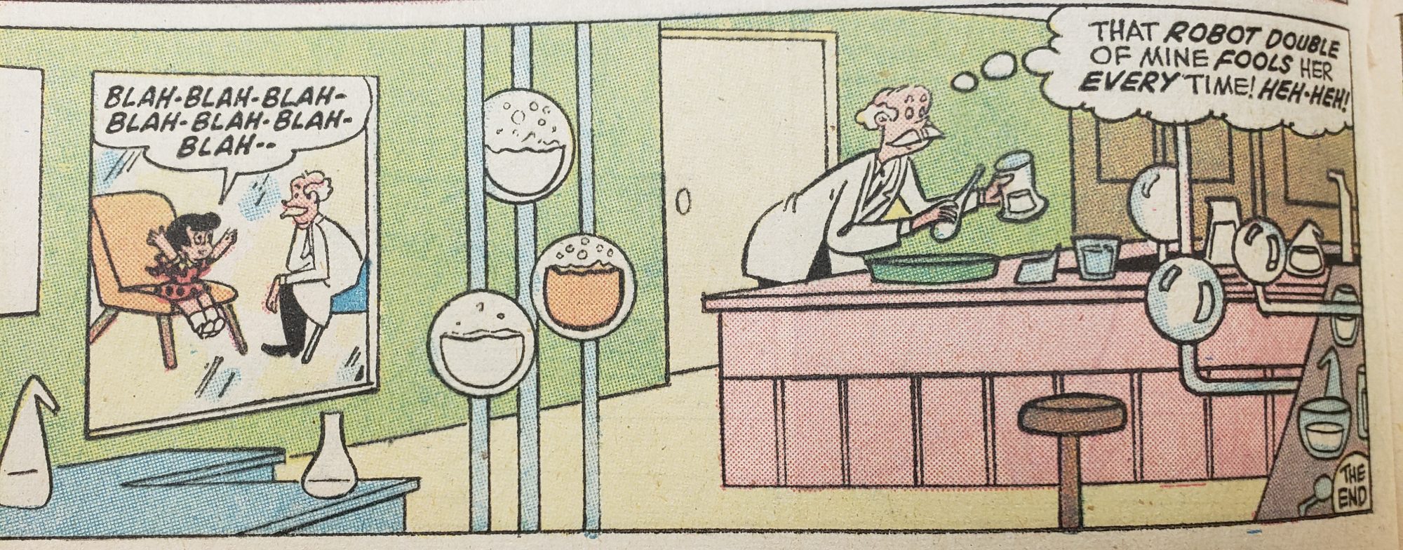
An example of interdependence from the comic “Richie Rich Millions”
I got another example of interdependence from “Richie Rich Millions”. In this frame you see a little girl talking to a scientist in a separate room but then the scientist is seen again in the lab. The only explanation for this comes from the text where the scientist mentions that he has a robot double that is fooling the little girl. Without the picture, the reader wouldn’t be able to know how the robot is fooling her or who she even is.
