Putting It All Together: Blaine Casil

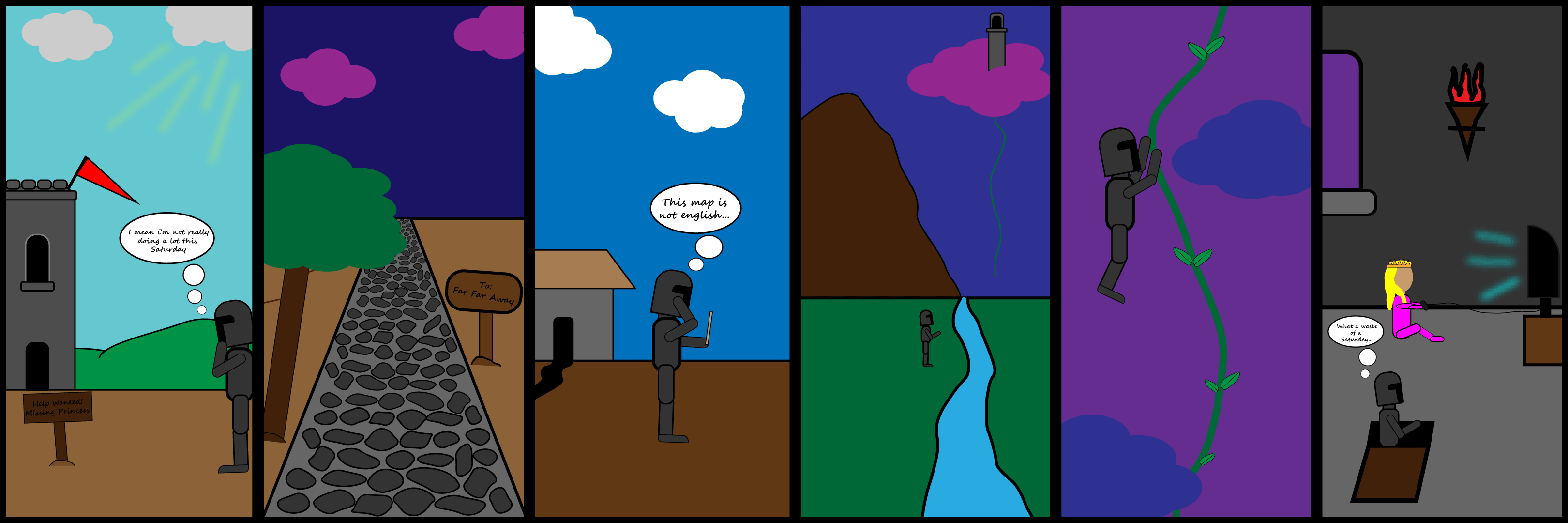
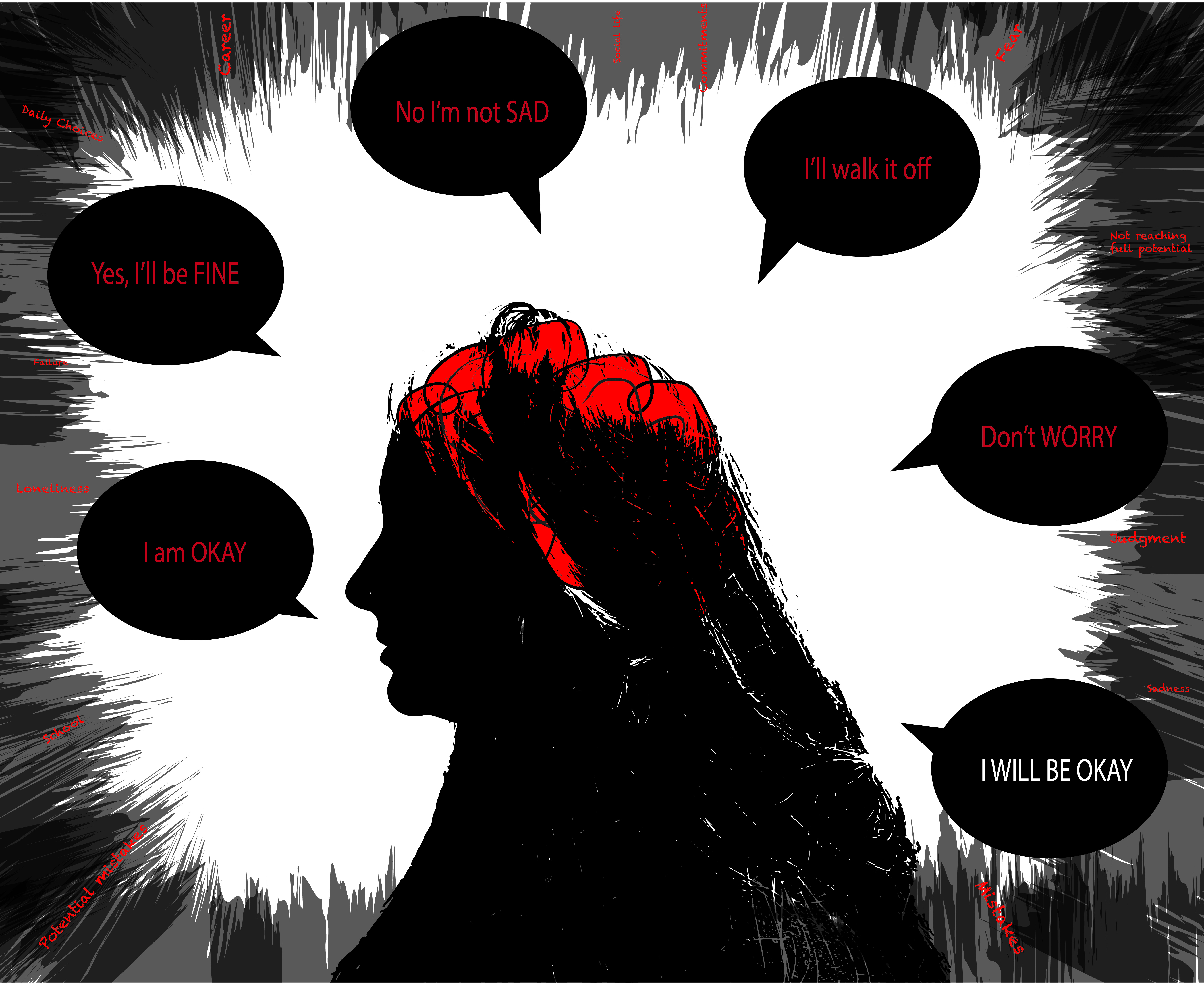
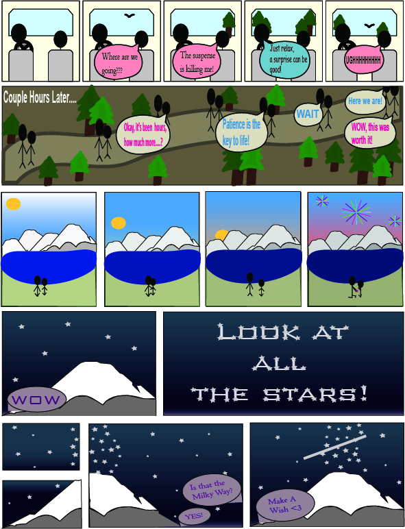
For this weeks comic I chose to look back at my past a little bit. This comic means a lot to me because it represents my relationship with my dad. Growing up, my dad has always given me advice to help guide me on a good path. Even till this day he always gives me advice, yet the ones I used within the comic are the ones that stuck with me and are always making me reflect on what I do. For the first scene, my dad always used to tell me that I can be what I want to be as long as I worked hard. The way I portrayed how this piece of advice has affected me, I split the figure up into four parts. The upper portion is graduation, the second portion is the achievements I have gotten while playing sports, the second portion is me realizing my passions and the bottom portion is my bags packed and ready to travel. The second piece of advice that I alway keep with me is that my dad would always make friends wherever I go because one day, I would be able to look back and count on them. I portrayed that by putting comments from people I have met and have formed bonds with. On the last few panels I drew me talking to my dad and thanking him for all the advice he has given me that has helped me to grow. 

I used Scott McCloud’s six steps to create my comic. His six steps are, Ideas, form, idiom, structure, craft, and surface. The idea of my comic was to portray how advice that is given to us can help guide us if we choose to listen to it. The form that I chose to put it into was a comic strip because I feel that it was able to show the audience what I want to in the simplest way. The idiom that I used was to think about a family friendly comic that is able to appeal to all audiences. The structure of my comic was set up differently than the comics I have previously made, with the left panels being the main focus while the right panels were flashbacks until it got to the last three frames. The way I crafted it was by drawing it with pencil first in order to create what I wanted to, while being able to go back and change it. Once I was content with what it looked like I traced it over with a pen to give it more definition and also make it easier for the audience to look at and read. For the surface, I hope that the audience is able to connect with it on a different level. I wanted to be able to get the audience to think about the advice that they were ever given and how it has shaped them and help to make them who they are today.

Piece of Advice
Created by Blaine Casil
Spring 2020

Posted in 201 Blog, Putting It All Together | Leave a comment

Putting It All Together: Trent Madison

Madison-Trent-Week15-comicThough it could be argued that my comic is not something particularly about myself, it can be personalized when i give it context. My comic illustrates life prior to Covid-19  as  being somewhat peaceful and  not much happening in my life. The second frame is about march when things really started to change. The last section of the comic is showing something that keeps me up at night, which is if everything will eventually return to normal or if well all be driven crazy and not ever be able to overcome this crisis.

I used thin lines in the first sector to give a relaxed  or happy type of feel to it. especially illustrated by the smile drawn on my face. In the last section however I drew thick lines that aren’t perfectly straight and don’t end at the same point so that it would give a sense of chaos and panic. I also used words to describe what I’m trying to illustrate that I am thinking.

The structure of the overall comic was inspired by what is in my head the three phases of Covid that I feel like I have Experienced because life as we knew it was going somewhat normal day to day in January as my first box is labeled. Once we got to March things started getting a little strange and would eventually turn into a crazy month that we end of having a stay at home order put into place and sports got canceled and all of these different markets are effected by this virus. So I would consider that  when it really hit us hard so that is the section I dedicated to Corona itself showing that it hit us in March 2020. The third section is in May because that is the current month that we are in and I wanted to give that contextual clue that it’s still a thought that I am having because we just had the stay at home order extended when it was supposed to be lifted today, just recently stores here started restricting the number of people that can go inside at one time and the world just feels like its in a chaotic, dark place currently so that is why I made that last section May.

I made the comic in Illustrator using the shape builder tools to make things such as my characters faces, and the actual Covid-19 virus. For other elements such as the body of my first character i used the paint tool and drew the body with the stylus for my Surface Pro. I also used the paintbrush tool to create the lines in the background of the final section. I used gradient fill on the first face because i wanted to give the effect as if the sun was shining down on the characters face.

This comic was more ambitious than my last two because I thought the concept was more relevant to the real world and I used not only lines or only text, but combined them both with other elements. I used not only solid colors, I used gradients and tried to go one step further on this project than on the past two that felt like my ideas were not the best.

Posted in 201 Blog, Putting It All Together, Uncategorized | Leave a comment

Putting It All Together: Kirk Brown

Today I am posting my final blog post for this class. This week I decided to challenge myself by using Illustrator for the final comic. I once again realized why I never use this program. I absolutely hate it, and have never been able to utilize the tools of the software to create the icons, symbols and other characteristics I want. Believe it or not I spent 10 hours creating this comic. 10 hours… This is no where near what I can consider my best work, however, it was the best I was able to come up with today. I have never been more frustrated about using a program on an assignment in my life.

A public service announcement by Kirk Brown, 2020

I expressed my reality in this comic. I am Tom. I work as a cashier at a grocery store and I am tired. Not all, but a select group of individuals come through my lines and complain about how bad everything is all day. I am tired of hearing it. I think we as society need to check our privilege. This was my idea and purpose coming into this assignment. My form was lacking as I am not artistic at all and cannot use the brush tool in Adobe Illustrator. The pen tool did not help much either. Every time I was editing my lines everything would collapse and force me to restart. My idiom was the message I chose to display, which was please be more self-aware of those around you. We are all struggling right now, help one another. I made a very easy structure to follow and read. My craft came mostly from the use of the pen tool and the brush tool. I was not able to create much detail because I really can’t draw, and I especially can’t with a track pad on my laptop. On the surface my finished product is stick figures explaining a public service announcement.

While this isn’t the product I wanted to come out with for my last comic I will say this week challenged me beyond belief. I think the problem was I am not nearly experienced enough with the program to be able to utilize all the tools to their fullest capacities. In the end, I learned creating digital media is much harder and I have a great deal more respect for graphic designers. Taking a step out of my comfort zone for this comic may not have worked but it has given me essential knowledge on Adobe Illustrator moving forward.

Stay safe and healthy Cougs, see you next Fall in Pullman.

Posted in 201 Blog, Putting It All Together | Leave a comment

Northwest Alternative Comics: Kylie Michael

Going to the museum was new for me. I hadn’t been to the art museum on campus. I don’t think I have really ever been to an art museum ever before. I didn’t really know what to expect. On this visit there was all the artwork pulled out and placed on the table. Then on the side table there were comic books for us to look at. I started by looking at all the comics they had pulled out. They all were different and told many stories. None of them really stuck with me. Then when looking at the books I came across one that was different then any of the other that I have seen. After getting some more information on the book I found out that the original was made of all paper cut out. So that is why I really liked it. Usually you see comics hand drawn or digitally done. It was also cool to see that something made of paper had so much detail but also was simple. The one picture that I took was one with waves. The paper was cut to look like the ocean and the different layers of paper added the texture. I had a new appreciation of the comic after I found out that it was made out of all paper.

In this book there weren’t the normal time frames that you would think of. Each page was a different frame. They each had a story in it. To me they all had an ocean plot to it. The closure of each page made you feel like each page had its own story but that all the pages flowed together. I was really surprised by the museum. It was really neat to see all different comics in one place. I had a good chance to look and get ideas of comics that I would want to read and learn more about.

Posted in 201 Blog, Northwest Alternative Comics | Leave a comment

Weekly Blog- “Show and Tell”: Kylie Michael

What Day is it? by Kylie Michael

Made May of 2020

This is a simple comic that uses words and pictures to tell the full story. It is a comic of a girl looking at a calendar because she doesn’t know what day it is. There are question marks all around showing that there is some confusion. I knew that I needed to draw a comic that used both and I instantly thought of quarantine. In my family we always joke that we don’t know what day it is because everyday feels the same. We don’t have a schedule like normal so we start to get confused. With this comic if the words weren’t there you might not be able to get the full meaning. You would have to intercept it yourself. Many people might think it has a different meaning, which is great, but I wanted to tell one story with mine. As for if the words were just there and no picture you might be lost. You might think there needs to be more to it to fully understand what it means. The sentence tells a story but you might be able to think of many different pictures that could go with it. These two things go together. You would be able to tell a story without one another but it would be the story that I wanted to tell. The comic isn’t complete without both parts. This is hand drawn because I do not have Adobe yet. I used my lines to help tell the story. I wanted the whole picture to tell the story and not have many other things going on. I used a simple line for the mouth to tell that it was a sad confused look. I also put the text in a bubble to tell that she was thinking it, not just it being there. With this there aren’t any panels. However, the comic itself pans from one thing to the next.When I first look at it I go to the face and then try to see what is going on. Then the hand points to look at the calendar and I still am a bit confused, so then I jump to the words to read what is going on. As for time in this comic, it doesn’t span over a length of time but the words tell you that she has felt this way for a long time. I used word-picture combinations to tell the full story that I wanted to tell.

Posted in 201 Blog, Show and Tell | Leave a comment

Weekly Blog: Living In Line: Kylie Michael

The Evolution of Sleeping by Kylie Michael

Made May of 2020

This is a hand drawn comic of the Evolution of sleeping. There are many different emotions in my comic. In the first picture you see a baby sleeping. The emotion with this is happiness and peace. With the soft lines and cloud under the baby you can feel that the baby is sleeping peacefully. I drew with light simple lines to create a sense of peace. In the second picture I drew with the emotion of tiredness. You can tell that the teen is in a deep sleep. You can’t tell if it is a happy or crazy dream. I drew a simple sketch with a small amount of detail. The teen is stretched out and you can tell that the teen really needed the sleep. In the third picture I wanted to portray that it is a loud sleep. I used harsh lines and made them darker. There are zig zag lines around the head, showing that the man is in a deep sleep. You can also get a sense that the snoring is loud. This is given through the dark lines. The last picture is of an old man sleeping in his chair. This picture also shows a peaceful sleep. With the light lines you can tell that he is just asleep. I have personally seen my grandpa fall asleep in his chair while watching tv. When drawing this is what I was picturing. I used the simple lines because I wanted to tell him that he just fell asleep.

As for my overall techniques I focused on the lines. I hand drew it because I felt the simple detail really helped tell the story. I wanted someone to be able to tell that it is a simple drawing and not something that every detail matters. I drew softly when I wanted it to be a peaceful picture. I would draw more harsh and darker if I wanted to add a louder deeper feeling to it. You can tell that I did try to tell a story, but you can also tell that it didn’t take me a long time to do. I quickly drew panels around them to separate them. It helped tell them apart and tell there was some time in between each one. I focused on four main phases rather than telling a story with every detail. I wanted to use lines to create a better understanding of the emotion in my comic.

Posted in 201 Blog, Living in Line | Leave a comment

Putting it all Together: Benjamin Apostol

In my final comic, I wanted to incorporate all of the different skills and techniques I used in my former comics, as well as the same style of art. My comic follows a knight character through a short journey to far far away to find a missing princess. The comic idea was going to be something much different, showing off the art style in a few different mid evil themed settings. How ever, the scope of the project changed because I wanted to make something of the same style, yet comical. The point of the comic is that the knight travels a long distance to find a princess that is in no peril at all, and comes to find that she is in need of no help. The idea of the project is a little joke to the popular theme of damsel in distress. Perhaps the most detailed of the slides is the small tiles that make up the road in one of the slides. I tried to pay attention to detail and at the same time make the comic and the scenes seem very simplistic in structure. The character building is extremely basic and all are made out of small similar shapes. Even though I tried to keep the art style simplistic, the methods of story telling happens by the change of scenery in each of the slides. In the last couple of slides there is a clear telling of how the knight is traveling, while in the first couple of slides, the scenery changes have much more impact because of the larger changes to the background, showing the passing of time. The final message of the comic in the last slide is supposed to show how the entire journey that the main character undergoes is a waste of time, or not needed.

Keeping the art style simple was not the hardest part of the comic, but the aspect of storytelling in such a small space in a way that makes sense. The way that I chose to tell the story is using the changes in each of the environments to show the passage of time. This is a difficult way to represent time in a comic because if you make the changes too drastic, then the comic becomes a jumble of different slides that appear to have nothing to do with one another. The way that I tried to create a link between each of the different scenes is add familiar objects or representations of objects throughout to show the not so subtle changes between each of the environments that the main character must overcome in order to reach the goal. The goal of the comic was to show the work and the time passing of an individual all for a cause that was not necessary. The comic does not feature very much dialog throughout because I wanted the viewer to get the idea of the scope through the different changes that the main character goes though in each of the slides. The dialog is mostly there to enhance the story telling and to give a little character to the knight. It is light hearted and supposed to make you question the journey that the main character undergoes, while still appreciating the different milestones in the journey and the simplistic art style that still delivers enough information to let you know what is happening in an easy and fun way. To make the changes in time seem more relevant, there is a lot of changes in color pallets that give you the idea of the areas and time of day. Overall the comic is simple and the message is short and comical, but creating a fun comic with a simple message relies a lot on the surrounding details that clue you to the point of the comic.

Posted in 201 Blog, Putting It All Together | Leave a comment

Putting It All Together: Devon Anderson

This comic was the most exciting for me to create because I was able to express myself in a different manner than I am used to. Growing up I have always struggled with anxiety. It emerges due to a number of triggers however it always seems to make my mind go in circles and down rabbit holes. I am taking steps to eradicate this hurdle but it will take time. 

Comic By Devon Anderson, April 2020.

This was the purpose of my comic. I wanted to express my anxiety through a graphic design and found it was actually cathartic to visually integrate the words and feelings that swirl within me into a design of which I am quite proud. I wanted to express my triggers trying to penetrate my thoughts and integrate words or phrases I say to others when someone is concerned. That said, these consoling words were created in darkness to show that you can utter positive phrases while not feeling as if those words are true in the moment. The purpose of this comic was to also show the other individuals in the class a side of me that not many are allowed to see. I also wanted to show the class that it is okay to struggle with anxiety and if anyone else in class struggles as well… you are not alone. 

The form of this design was one I contemplated back and forth. I love the look of comics that are one panel and have an obvious reading flow to them, I feel these are more iconic and something I would be comfortable with using. I tried to use the word bubbles as their own panels so that the reader can interpret the flow of the conversations/texts easier. 

The Idea of idiom in the comic was hard for me to grasp because I did not fully understand the definition of an idiom nor how I could incorporate it in my comic. HOwever, diving deeper into the challenge, I realized an idiom in this comic could include “I’ll walk it off”, which is another way of saying that I will be okay. This is the message my comic is trying to express.

The structure of this comic took some thought. I Included the jagged black and grey stripes to express darkness creeping in. Inside these jagged points you see words, the words are triggers that spike my anxiety. The silhouette is my own, this choice made the comic more personal. I added the brain and colored it red with black swirls to express turmoil.  I chose to use a limited number of colors to have the more poignant aspects of the comic to be more impactful compared to the other sections.

The crafting of this comic was interesting. I used many of the basic tools available in illustrator but tried to incorporate them in a manner that gave a deeper emotion to the reader. That said many of the tools were used differently than in the past to create a new type of effect.

The surface exposure is definitely the silhouette of a woman. It is not apparent of the deeper meaning until the reader looks further into the comic.

This comic was more complex because it has many different layers and parts to make the comic work. I am using the same basic tools however I have integrated them in a way that shows depth within my comic. The words in varied fonts and sizes depict different emotions the reader should interpret. The painting tool with a feathered texture was used to express a sinister darkness while in the past it was just a paint swipe. I started out having a very basic comic and then the layers were added and the emotion became deeper. I really wanted this comic to resonate with the reader.

Posted in 201 Blog, Putting It All Together | Leave a comment

Putting it all together: Jennifer Engelke

Fourth-grade by Jennifer Engelke on Adobe Illustrator May 2020.

When asked to “express my individuality” I automatically knew I had to embrace my unlucky trait. While I have seemingly endless stories of being unlucky I chose to tell the story of how my fourth-grade teacher never made me a popsicle stick and proceeded to pull out the entire classes’ sticks, never realizing he never pulled mine. Although some would see being unlucky as a problem and would allow it to get their spirits down, I do not. Over the years I have learned that it is just something that is common in my life. Since being unlucky is my reality I choose to face it with humor. This was what inspired my step 1 from Scott McCloud’s Six Steps from Chapter 7. I would embrace my popsicle story, but with humor. 

As I was planning my comic out in step 2 I decided to construct my comic vertically, instead of the previous 2 weekly comics in which I designed horizontally. This allowed me to compose my comic in a different way to try something new, and I had to revert from what I had been practicing all along. Step 3’s Idioms are prevalent in my comic as I used a four-leaf clover to represent “luckiness.” In the second panel, a peer has found a four-leaf clover, a symbol of luckiness; however my character is seen holding a two-leaf clover, nothing near as lucky as a four-leafed one would have been. A clear structure for step 4 also is shown. I created these sequences of panels to be easy to read since it was a story about my time in fourth-grade. 

The craft of step 5 was something I knew I wanted to work a lot on in this comic. The past two comics I had done featured characters that looked quite simple and similar. This comic I wanted to create characters that looked completely different. Truthfully, this is where I spent most of my time on this project. Before I had only ever done one human character, this time I was getting ambitious and doing three. I took my time and fully designed my character at first, and hated it. It looked way too similar to everything I had previously done and I was not happy with it. So after watching a couple of videos and completing some google searches of “people made with Illustrator” I was finally able to come up with a style of character I truly loved. I then applied this same style to finishing the two final characters. In addition to a new style of characters, I wanted to try shading for my final comic. While I knew I wanted to keep with my flat style I wanted more depth to the images. I was able to achieve this look by using the shape builder tool, which has quickly become my newest favorite tool on Illustrator. 

Step 6: Surface, I believe I cover a lot of the learning objectives in this course with my piece in terms of concepts, line usage in my illustration, and coverage of time in between the gutters. Overall, this final weekly comic is the one I am by far the proudest of this semester. 

Posted in 201 Blog, Putting It All Together, Sample Posts by Students | Leave a comment

Putting It All Together: Shira Feinberg

For my final project, I decided to make something that truly represents who I am through the eyes of most of my friends, who would say that “I live in a romantic comedy.” Therefore, the purpose of this comic is to make something cheesy yet romantic and fun, while combining some of my experiences with a lot of cheesy romantic stuff, such as the proposal and holding hands on a hike to a lake with a Mountain view. I also wanted to try an express the people’s emotion throughout the comic, through the use of the fireworks, the uppercase words and exclamation point, and more.

Week 15 Comic made by Shira Feinberg

I tried to make this comic into a poster comic, like we were supposed to do in the original Project 2, thereby challenging my creative skills. Furthermore, I chose to make this comic on Illustrator, as I haven’t really used it, until these weekly comics. I also tried to use tools that were more difficult to use such as the pen tool. Also, if we ended up making comics on other platforms, I think that a website that scrolls down would’ve been a cool place to put this comic, I am unsure how I will split it to look nice, but I may have added more cells such that every comic is about two to four cells tall.

As I mentioned earlier and as you can clearly see in my comic, this is a romantic, somewhat of a comedy, comic. This is clearly seen when the two people are walking and holding hands, along with when they are sitting on the beach and one of them proposes to the other.

When putting all the pieces together, I tried to add in some good transitions between each part of the comic. This can be seen with, in the second row, I added in “couple hours later,” to lead me from the car to the middle of the hike, and then from their conversation of seeing a gorgeous view, on the same row, which helps transition to the two people sitting on the beach, then the sun begins to set which brings out the stars, and since I wanted to emphasize the stars, I included one mountain instead of all four.

This comic took me several days to think of an idea and numerous hours to complete. I had a fairly hard time coming up with a comic that was lengthier, especially one that had all the components that I wanted. However, after a while, I came up with a few quick comics which I noticed that I was able to combine into a larger one. Which is the comic you see above. I had to change a few minor things in order to allow for a smoother transition, but I think that overall, it is a pretty cool start to a comic. Also, since I don’t have that much practice, if any, with Illustrator, I decided to use simpler shapes, including stick figures, instead of a more detailed person.

At first glance, this comic looks simple and colorful, with more emphasis on the stars. This was my choice because I love looking up at the stars and imagining what there is beyond them. As per the rest of the comic, it is simple but says a lot, since it is a full day trip with lots of scenery changes. I also tried to change up the framing, rather than making it symmetrical to add a further challenge. This is seen with the 5 small cells followed by one cell with a story throughout the image, and then back to the generic 4 cells and 2 cells (which are also different sizes), followed by that are cells, where one of them is three cells put together to convey one message. Overall, I really tried to learn new tools and push creative boundaries.

Overall, this comic is more ambitious than the other two weeks as for one, I embedded them into this comic, but also because I tried to create a comic that pushes the boundaries of my original thought of comics, where they need to be symmetrical. Thus, I added in the one cell that has several smaller pieces in the same scene. Unlike the first row which has different cells for each piece.

Posted in 201 Blog, Putting It All Together | Leave a comment