Print Versus Digital Comic: Kirk Brown

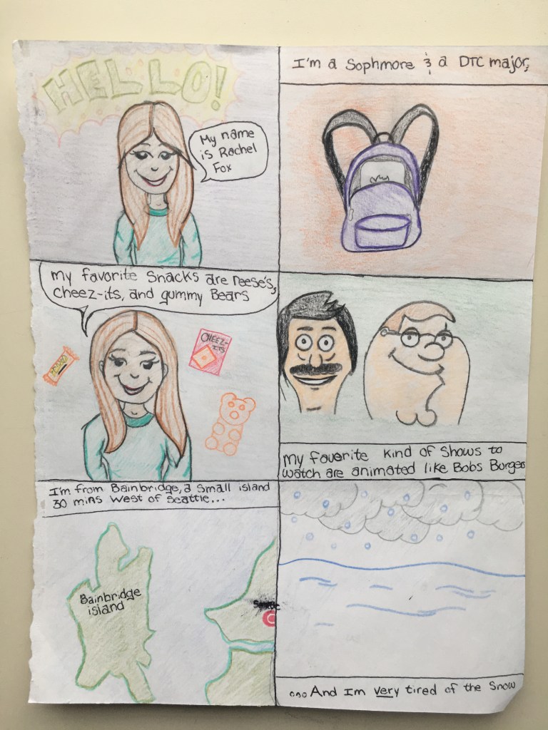
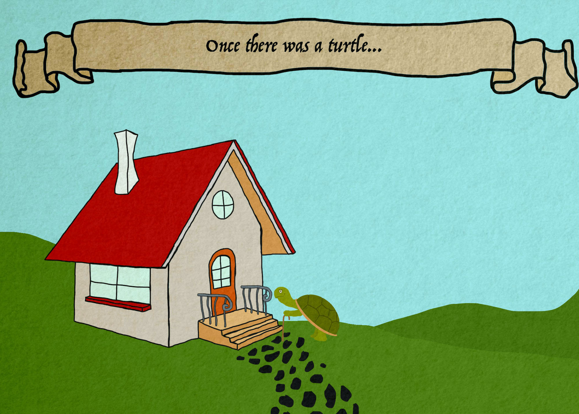
When asked to create a comic by hand I was naturally worried my lack of art skills would not be proficient enough for the assignment. What I learned from this project so far is that my drawing skills are much more advanced than my work with Adobe Illustrator. I found I was most successful with drawing my comic because I could add the little details I wasn’t aware were hard to re-create with illustrator. More specifically, even the speech bubbles weren’t an easy battle with illustrator. The benefit of drawing versus using online softwares to create a comic is that you can add little details such as shading and little objects. However, I believe that illustrator is superior because, if you know what you’re doing, you can create very professional looking comics that have a better opportunity to be printed and distributed.

I couldn’t figure out how to flip the image, sorry viewers of this.

After completing this initial first part of the project, I also noticed that there is a difference from reading comics on paper versus digitally. I personally believe it feels different because when you’re reading print comics that has your undivided attention; whereas when you are reading a comic digitally you aren’t as engaged. This can be due to the way our eyes perceive the pixels we are viewing or maybe because of the possibility that you’ll receive an e-mail, text or new notification that diverts one’s attention. I am no scientist so I’m not sure if what I claimed has any hard evidence to it, however, that is just from my personal observations.

This is my digital comic. I’m not proud that I portrayed myself as a potato, but hopefully I can improve these skills.

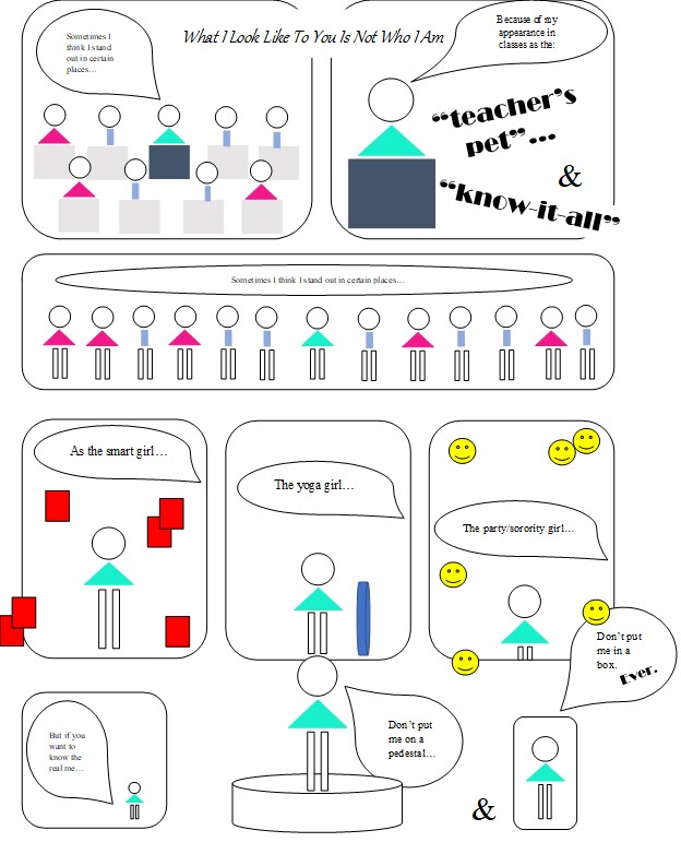
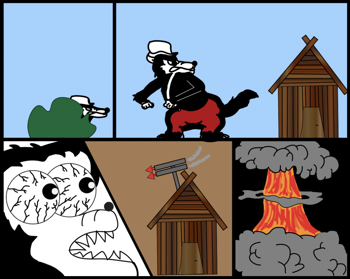
As you can see, my craftsmanship has drastically changed. I found Scott McClouds style to be very interesting and creative in chapter 1. I was unable to takeaway of his ideas and include them in my digital comic. I thought I knew more about illustrator, but I look forward to sharpening those skills in this class.

Posted in 201 Blog, Print Versus Digital, Uncategorized | Leave a comment

Print Versus Digital Comic: Luis Trejo

While creating a hand drawn comic and a digital comic, I noticed that each way had its positives as well as negatives.

Hand drawn comic by Luis Trejo

My hand drawn comic consists of information about myself including where I was born and my hobbies. I divided some of my favorite hobbies into panels with some text making it easy for the reader to understand the comic as well as get to know a little bit about me. When drawing on paper with a pencil I feel as if I have total control of what I am drawing, and it is easy to add details to an image. I found myself having to erase quite a bit when drawing giving the finished comic a not so clean look.

Digital comic by Luis Trejo

For my digital comic I recreated my hand drawn comic in Adobe Photoshop. I used a mouse to draw instead of my hand, and it resulted in me feeling as if I had less control of what I was drawing. Creating the digital comic was easy and less time consuming than drawing the comic with the assistance of tools in Photoshop that helped me create straight lines, shapes, resize elements and duplicate layers. After creating the comic digitally, the comic had a clean look and very simplistic compared to the hand drawn version.

My first draft of the hand drawn comic did not have any words, leaving the comic up for interpretation of the reader. I could understand the comic, but I felt as if the comic wasn’t complete and needed another element. After reading the first chapter on Scott McCloud I noticed that comics that do not use words can have many different interpretations between the readers. I wanted to make my comic easier to understand so I added a few words in each panel that explains the reason for each drawing. I felt that adding myself in addition with the words in each panel gave the comic a complete look.

Posted in 201 Blog, Print Versus Digital | Leave a comment

Print Versus Digital Comic: Brady Davis

Hand Drawn Comic by Brady Davis

I found the hand drawn comic the most challenging as I’m not a great artist when it comes to drawing things by hand. Keeping lines straight and drawing things that are going to be identifiable to other people poses difficulty but I think I conveyed what I was trying to say as it was pretty straightforward and simple especially with the text.

Digital Comic by Brady Davis

The digital comic was definitely easier for me as I just find it easier to work on a digital interface. I used Microsoft paint which is somewhat limiting in what you can do. I was able to easily add colors to it which made it pop more than the hand drawn comic. I’m still not the best at drawing even digitally so it didn’t come out the best but I think I prefer it to the hand drawn one still.

I think between the two the digital one added much more room for creativity as there are so many tools that can be used on the computer to create images that you can’t easily reproduce with pencil and paper. It just feels more efficient and easy to work on a digital workspace where you aren’t wasting paper and if you make a mistake you can easily undo it. They both essentially tell the same simple story but in different ways. The hand drawn relies on the text more and the digital relies more on the art.

Posted in 201 Blog, Print Versus Digital | Leave a comment

Print Versus Digital Comic: Trent Madison

IMG_4920

Hand Drawn Comic by Trent Madison.

Drawing the comic by hand for the first assignment was a bit challenging for me because i was unsure what to even draw that would tell something about myself, so i drew a comic that was about my major and a little bit about what i like. Now knowing the definition of what a comic is, i realized that my hand drawn comic was a comic strip and that i could have given the information without the boxes around every scene. The benefits of drawing a comic is that it can be done fairly quick. Drawbacks would be that the quality of my hand drawn work is not very good.

comic 1

The struggle of everyday life of a student is illustrated through a comic made by Trent Madison.

The digital comic that i made shows what life can be like some days. I focused on something i can relate to versus who i literally am. The process of creating the digital comic took way longer to do because I used Illustrator to create a person using tons of smaller parts. The Benefits of using the program are that I was able to create a person that actually looks somewhat like a human. The Drawbacks would be how much more time and effort it takes to make just one thing if its detailed.

Reading a comic on paper can be dull if there is no color used to bring out the visual element of what a comic is, as opposed to reading a comic on a screen that is full of color and has cleaner lines.

Reading Scott McCloud’s first chapter inspired me to think about simplistic sequential art. By reading my comic left to right, you can assume that its starting on the left side, and as it goes to the right time passes, creating an order to the three events. I also used space in between each different occurrence so that it would get treated like time would for a movie or show.


Posted in 201 Blog, Print Versus Digital | Leave a comment

Print Versus Digital Comics: Haydyn Wallender’s Thoughts

Hey y’all. I am so happy to be a part of this little community. Let’s dive into it.

Starting off with a hand-drawn comic was an excellent way to ease me into this course. I am not an artist – I prefer to doodle and make small stick figures, so I stuck with what I knew, and did that for this first assignment. It was an enjoyable experience; I am one of those oldie English majors who love print books, and pens with paper. I enjoyed the feel of creating my comic through the artistic strokes of each small box, and I love the way the stark black ink looks on paper in general, so that was an added bonus for aesthetic pleasure. I think the only drawback that I can think of for a hand-drawn comic is that when I would mess up – because it was in pen – I would have to start all over, and I was not a fan of that. I am also a perfectionist at heart, so drawing and messing up is not an option for me. I tried to just roll with it, but once I saw the imperfection, I had to start over, therefore costing me a lot of time. I would say time was also a major drawback on not only this one, but on the computer generated comic as well.

When I created my second comic, I again chose to stick with what I knew, and use simple shapes to create stick figures. This time, however, I got to experiment with color and repetitiveness in the comic with other figures, as well as myself. When you hand draw things, most of the time it is a challenge to duplicate the same item in the same way or fashion. Having the ability to copy and paste was a huge time savor, but I still had to focus on the small details, such as proportions of figures, stacking shapes, and using a consistent two or three fonts throughout the comic, to add some aesthetics to the comic. I would say that I struggled on the computer more than with a pen, however, because I am not used to any form of generating images on technology, so that was a challenge. I also wasn’t a fan of reading the comic online – again, I prefer pen and paper, so I got a different feel when I read the comic on the screen versus when I printed it off and read it. Sometimes doodles and paper can outweigh gorgeous pieces of artwork crafted on the computer, simply because of the feeling and the personalization that each piece of paper can bring to someone. I would describe it as the difference between a written note saying thank you, and an email.

As for the reading, I actually decided to do it after, just to see what I could come up with on my own, with no influence. Though McCloud made some excellent points that I definitely bookmarked, I don’t think he would have made too much of an influence on my comic, even if I read it before creating it. Just my personal opinion, however.

My comics – both hand-drawn and computer generated – are below. Feel free to look at them, and I apologize in advance if you can’t read them. My handwriting, and therefore my font, is extra tiny.

Designed by Haydyn Wallender, Spring 2020
Posted in 201 Blog, Print Versus Digital | Leave a comment

Print vs. Digital comic: Rachel Fox

Writing a print comic followed by a digital one was an interesting experience, I didn’t find making the print comic at all difficult despite repetitively drawing the same character multiple times and keeping my hand writing at a steady font. The digital comic was still much easier to design and create, having tools where I could produce straight lines instantly, drop color into shapes rather than manually coloring, and being able to type my speech bubbles were all massive bonuses. My favorite part of moving to digital was definitely the ability to copy a character and just manipulate the expression rather than having to manually redraw like I would need to if I was hand drawing the comic. I used the drawing app Procreate to draw my digital comic and had used it a moderate amount before so I had some ideas on how to use the tools and layers. 

I find reading paper comics to be my preferred way of enjoying them. I find that digital comics don’t have the same feel as paper ones do. If I were to be purely creating comics I would want it all to be digital but if I were to only read them I would want the paper formats over the digital ones. 

The Scott McCloud reading did not have to major of an effect on the concept of my digital comic.I did the reading before I had a concept for my comic and hoped the McCloud comic would inspire something but still had nothing at the end of the chapter. I returned to finish my comic a few hours later once I had an idea and the McCloud comic was still not impactful. 

Drawn by Rachel Fox, January 2020 

Drawn by Rachel Fox, January 2020 

Posted in 201 Blog, Print Versus Digital | Leave a comment

Final Web Comic: Dawson Bolen

Website Link: https://dawson120.wixsite.com/finalwebcomic


For this project, I decided to only use illustrator to create my web comic. I really enjoyed creating the poster comic, plus I felt like I was able to execute a much better project than the first one. I chose to use wix as a platform to display my work because it’s a well reliable and easy to use interface. Although wix did limit my ability to format images, it was a great way to make a good looking website for a beginner like me. The story like my last project is fictional, however I chose to make it old western and cowboy themed. Unlike my last two projects, I didn’t use any words in this one; however, I think there is a very clear plot involving a bandit and a protagonist who wants to do the right thing. 

This is a desert sunset I made in Illustrator. It’s one of the first panels in my comic.

Overall, I was able to embrace the possibilities of web viewing by designing my web comic to be read by scrolling down with a mouse or by hand on smartphone platforms. The design and layout of my comic was very social media/ blog inspired. Most of the panels are squares and are placed very symmetrically almost like Instagram. I think my story does a good job of guiding the viewer through the story. It’s very simple and easy to follow from left to right then downwards by scrolling through the page. After I published the site, I viewed it on my phone. I was doubtful about it at first but I was very surprised about how smoothly it ran on my I phone. The setup is a lot different because of the smaller screen. It’s formatted so that the reader can only see one panel at a time which I thought was really cool. I think Scott McCloud would approve of my project as a comic because it is a juxtaposed series of images intended to produce an aesthetic response in the viewer. I also tried my best to create closure and time frames.

these are the two main characters in the story. I made it to show the tension between them.

Like I said earlier, I only used Illustrator for the entirety of the project. Each panel is its own file that I created individually, because I found that the easiest way to do it. I used Wix because I don’t have any experience with coding which made the whole process a lot easier on me. All I had to do was drag and drop my jpg files into wix and from there on it was pretty straight forward. One drawback to using a website creating service vs making your own I would have to say is the freedom that you have. Although there are a lot of options, you can’t fully customize your page to the fullest. Also, I definitely feel like the formatting in Wix reduced the quality of some of my images. A few of them look a lot grainier than they are supposed to.

Overall, I learned a lot during this project. I’d say I learned a lot more about illustrator which has enabled me to not be as limited in terms of what I can create now. I learned a lot from just making a website. I didn’t realize how much work it can take to create a website using html. I definitely had a lot of fun making this project and there’s a lot I can take away from it.

Posted in Fall 2019 Archive (201 Blog) | Leave a comment

Final Web Comic: Ivy Padayao

One of the panels where I used both Illustrator and Photoshop to create the image.

What inspired me to design the comic how I did on the website, was to set it up in a way for the viewer to physically interact with it. The use of vertical scrolling was mainly how I envisioned the viewer being able to interact with the comic, while also aligning the frames differently around the page. I think having the frames in different places and sizes really helps the reader engage with what is going on in the comic and makes it “different” than other comics on the web. When the comic is viewed on a mobile device rather than a computer, the frames don’t appear to be in different places, but there is still a scrolling action the viewer has to do in able to read through the comic in its entirety. This is something I couldn’t control on the Wix website itself, but it appears to align in different ways on the computer screen.  I think that Scott McCloud would say that my comic accurately represents the definition of what a comic is. The different sizes create a sense of time, the closure seems to be action-to-action, and it is organized in a sequential way for the viewer to read through.

While making this comic I mainly used Illustrator to create the images, but I used photoshop in various parts (the panels where “The Rock” appears). I used both of these platforms in order to create the comic because I am not experienced with merging above programs and being able to manipulate different aspects of them. This was a great learning experience for me being that I am new to using these programs as well! To post my comic I used the Wii site and built my own website. I wanted to do it on Wix rather than WordPress because I would have more control on where and how I placed the images on the screen. To post them on the website I exported each artboard from Illustrator and changed the sizing and placement on the website. I think the biggest thing I’ve learned throughout this project is how to two different Adobe platforms, how to merge them together to work on them, and how to export each dartboard individually for use on a website!


Posted in Fall 2019 Archive (201 Blog) | Leave a comment

Final Web Comic: Ruby Pitts-Cranston

Comic: https://dtc201webcomic.000webhostapp.com/

For my final web comic I decided to base mine off of a story/joke that my mom told me a lot when I was younger. When I started to think about what type of visuals I wanted to use, I kept coming back to the idea of a children’s book, so I tried to make it have those type of illustrations. I think that this project fits within McClouds definition, since there is a specific sequence to it, and since I use both imagery and words to tell the story. To make the comic I essentially drew everything myself using photoshop. I wanted the color palette to fit with the children’s book theme, so I found an illustration with colors that I liked, and used adobe color to get a color pallet from it.

First panel of web comic by Ruby Pitts-Cranston

I like photoshop over illustrator because I feel that it’s simpler to use. I have less experience using illustrator so I would have liked to challenge myself a bit more with it, but I also knew that I wanted to create my website from scratch, so I tried focus more on the html and ccs side of this project. I really like the freedom that it gave me to customize the website. Through the tutorials that were available to us I figured out how to create a slideshow, so that I could have one panel on each slide and embrace the fact that this was a web comic. I think that with the slideshow approach I was able to guide viewers through the comic fairly easily, since you can just click on the arrow key to move to the next panel. In order to get my comic onto the site, I just saved each panel as a jpg, and put them in the same folder that I had my html and ccs files in. This made it so that when I linked them to my html file, they would actually show up. I also had to adjust the size a bit since when I first put them in they ended up taking up most of the screen, and I didn’t want them to be that big. Instead of changing the size in photoshop though, I was able to change it within the html file, and show them at 75% if their full size. This meant that I didn’t lose any quality, and if you zoom in on the website they are still fairly clear. It was really cool to see it all come together from scratch, so I’m glad that I went this rout. When viewing the website on my phone it does look a bit different, the images are a lot smaller, but everything else stayed fairly large. The other problem I found when viewing the site on my phone is that some things overlap with the comic. The arrow buttons and numbers both moved in a lot and are now too close to the panels. Im not really sure how to fix this, but it looks fine on a desktop computer which is what I was focusing on. I learned a lot through this process, mostly in relation to website building since I had absolutely zero experience with html or ccs. I also found out about adobe color which is really useful for creating color pallets, and if you save them they actually are saved within photoshop too which is going to be extremely useful for future projects. The comic  actually turned out pretty close to what I was envisioning, so I’m really happy with it, and I feel like I definitely pushed myself to learn more on my own.

Posted in Fall 2019 Archive (201 Blog), Sample Posts by Students | Leave a comment

Final Web Comic: Jack Kay

Part 2 of Comic; Made in Adobe Illustrator

When creating my online comic, I first thought about coding it myself with HTML and CSS, but both were rather difficult. I struggled figuring out how codes transferred over to my actual website. It was not until the class sharing day that I realized that wix.com is the better fit for me. I was able to customize the page from a template and that allowed for a much greater ease of access. The button actually took the viewer to new pages, which I could not figure out how to do when I was coding. Wix.com allowed for a very nice website with all features necessary, it was easy to use, and my possibilities were endless. The original view is 3 houses representing the very-known fairytale about the three little pigs, so I expect the reader to view the story from left to right. On top of that, the button above the houses read off: “Enter Story, Part 2, Finale.” These practically force the reader to read the comic how I want them to. The easy, clickable button will allow the reader to interact with my work just fine. With the outstanding knowledge on the three little pigs already, the viewer will have no problem navigating through the houses of my story. I tested the website on mobile and everything seems to work fine, the only problem is that the mobile version does not show all three houses in the beginning but does allow the reader to use the three buttons provided and still see the rest of the comic. I have not tried the website on Tablets, but I would expect them to mimic what the computer is capable of. I believe Scott McCloud would really like what I have done with my comic. The comic has a dark twist to the original 3 little pigs’ story and depicts time very well. The background color seems to shift the time of the overall story until it hits the night. The line quality in the comics force the reader to pay more attention to certain parts and the spatial aspects help as well.

I used Adobe Illustrator for all of my project because I wanted to start everything from scratch and have full control of the outcome. I used Wix to make a website and I simply the added a file of the comic to the background of the page. I learned from this project that coding is very hard when just learning on my own and that Wix is a very useful tool and has everything I need to create a website.

Posted in Fall 2019 Archive (201 Blog) | Leave a comment