
Comic: https://dtc201webcomic.000webhostapp.com/
For my final web comic I decided to base mine off of a story/joke that my mom told me a lot when I was younger. When I started to think about what type of visuals I wanted to use, I kept coming back to the idea of a children’s book, so I tried to make it have those type of illustrations. I think that this project fits within McClouds definition, since there is a specific sequence to it, and since I use both imagery and words to tell the story. To make the comic I essentially drew everything myself using photoshop. I wanted the color palette to fit with the children’s book theme, so I found an illustration with colors that I liked, and used adobe color to get a color pallet from it.
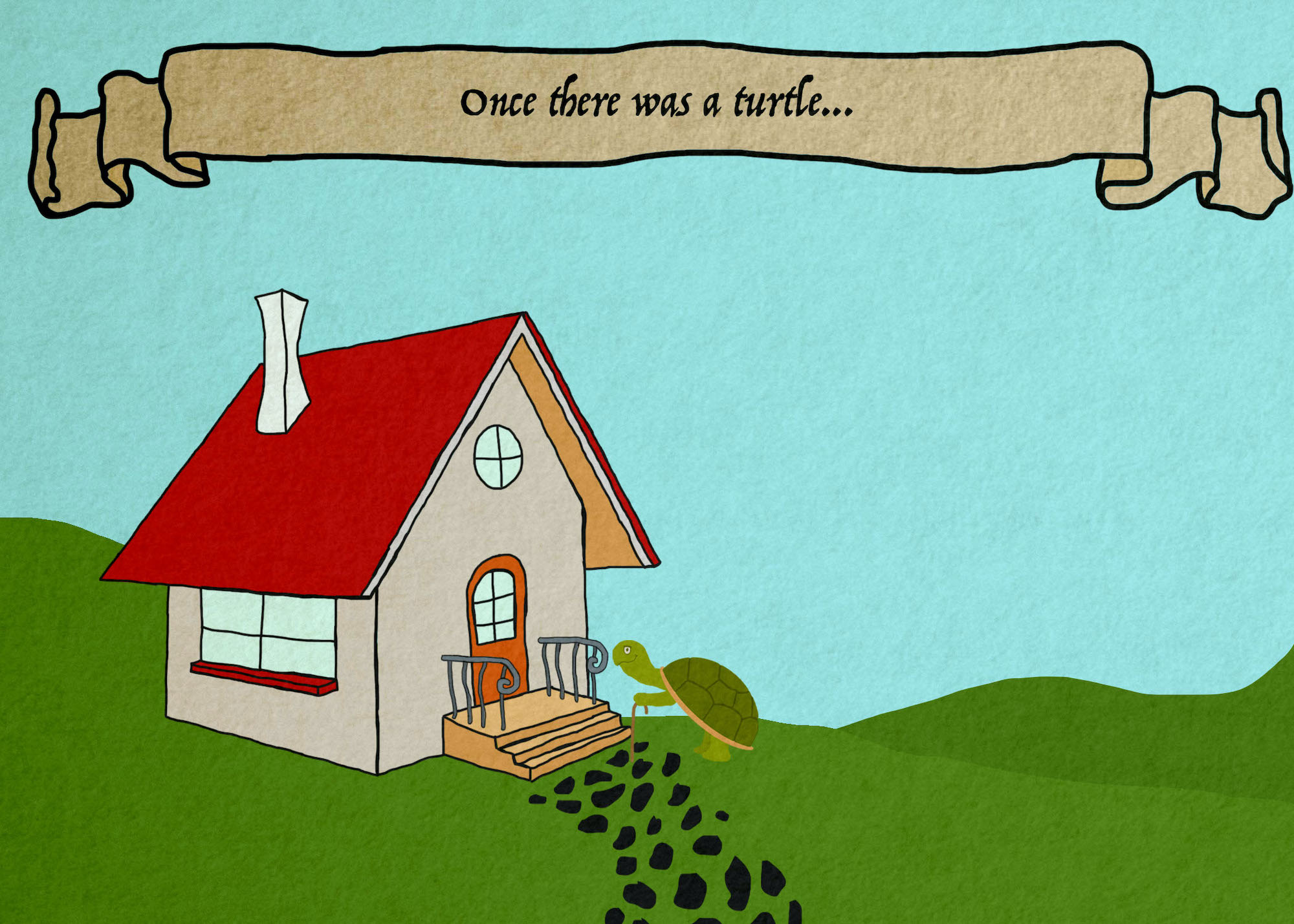
First panel of web comic by Ruby Pitts-Cranston
I like photoshop over illustrator because I feel that it’s simpler to use. I have less experience using illustrator so I would have liked to challenge myself a bit more with it, but I also knew that I wanted to create my website from scratch, so I tried focus more on the html and ccs side of this project. I really like the freedom that it gave me to customize the website. Through the tutorials that were available to us I figured out how to create a slideshow, so that I could have one panel on each slide and embrace the fact that this was a web comic. I think that with the slideshow approach I was able to guide viewers through the comic fairly easily, since you can just click on the arrow key to move to the next panel. In order to get my comic onto the site, I just saved each panel as a jpg, and put them in the same folder that I had my html and ccs files in. This made it so that when I linked them to my html file, they would actually show up. I also had to adjust the size a bit since when I first put them in they ended up taking up most of the screen, and I didn’t want them to be that big. Instead of changing the size in photoshop though, I was able to change it within the html file, and show them at 75% if their full size. This meant that I didn’t lose any quality, and if you zoom in on the website they are still fairly clear. It was really cool to see it all come together from scratch, so I’m glad that I went this rout. When viewing the website on my phone it does look a bit different, the images are a lot smaller, but everything else stayed fairly large. The other problem I found when viewing the site on my phone is that some things overlap with the comic. The arrow buttons and numbers both moved in a lot and are now too close to the panels. Im not really sure how to fix this, but it looks fine on a desktop computer which is what I was focusing on. I learned a lot through this process, mostly in relation to website building since I had absolutely zero experience with html or ccs. I also found out about adobe color which is really useful for creating color pallets, and if you save them they actually are saved within photoshop too which is going to be extremely useful for future projects. The comic actually turned out pretty close to what I was envisioning, so I’m really happy with it, and I feel like I definitely pushed myself to learn more on my own.
