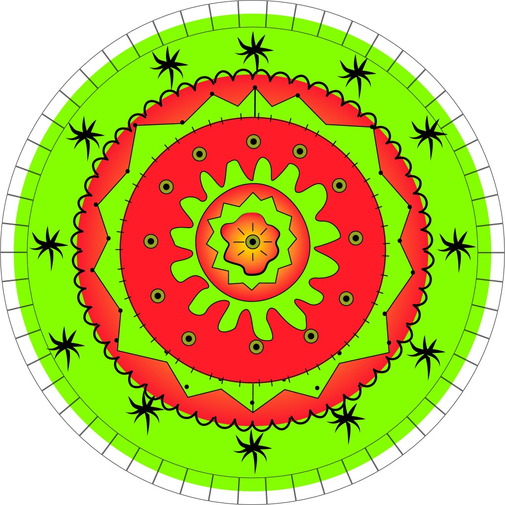
Final Weekly project image, Ivan Franco, Adobe Illustrator
This final project I wanted to do something totally different and yet interesting to me. I did not want to make any panels or deal with characters. I wanted to see what type of obscure design I could make with illustrator and utilize the tools that the Adobe program provides. This project took the longest to complete and even now it is not completely refined.
The tools I used for this image include: pen, brush, swatches, ellipse, and various shapes that I turned into pattern tools. I put in squares, stars, and certain shapes to achieve a look that I wanted. Some of the lines are basic brush strokes and others are custom made strokes. I wanted to make a symmetrical design that would act as a sort of illusion. The eye is drawn to the center and explores out of the spiral. Time is present in the center and moves outward, defying the typical left to right linear reading style. I also made the center more and more distorted to make the center seem as the raw newer part. I like to think the image is a star.
For this final project I wanted to use color like I hadn’t previously. Having so many different shapes and lines allowed me to do that. I stuck to color palette that I liked, a sort of watermelon fruit with a glow. The image took me two days to complete and required a mock up drawing with some concepts that started with having some words orbit the image. I left those out since I personally found it unnecessary and a bit corny.
Overall, I like this image and while it is not a traditional comic panel with a story. It does utilize lines, color, shape perception and time. All aspects that we learned about in Scott McCloud’s book.
As I make my last comic I can’t help but reflect on my whole first year at WSU. I wanted to tell something about me that I hadn’t shared in this class before. I have made comics about how I bake and how I was on the WSU rowing team. I hadn’t yet shared my addiction to coffee. I have always liked coffee, but this year at college it became more of a necessity than ever before. I wanted to tell the story of how I wake up in the morning. I wake up and I can’t function without some coffee. I like to take my time waking up and drinking coffee before getting ready for the day.
My idea behind this was to portray what it is like in my world to wake up in the morning. I can’t fully wake up until I have had my caffeine. On the rowing team we have practice at 6am, so I had to get up and go workout without coffee. I would get back after practice and then have coffee and start getting ready for school. My whole purpose was for others to see how I wake up in the morning.
I chose to challenge myself by creating my comic in Illustrator. I had used it once before last semester, so I wasn’t very good at it. I had to take my time and mess with the tools to see how they work and to get them to create what I wanted them too. I kept the design and color pretty simple. I added boxes to show each frame to give it a bit of the general comic look.
I used pictures and words to create the full meaning of my comic. If the words weren’t there you may not be able to get the emotion I wanted it to tell. The words guide the reader to understand and the pictures give the reader a visual. They work together to give the comic the whole story. As for the structure of my comic, I kept it simple. I was using a new platform so I couldn’t add to much detail. I took my time on the small details to keep it looking clean, but didn’t add too much detail.
I was able to mess with the tools in order to create my final piece. I used the pen tool for most of it. I would add the curves in and then adjust the size. As soon as I like the way it looked I would group it all together. The groups helped keep all the work in the same spot, so if I needed to change things I could get to the right layer and not change everything. I also had trouble with the coloring. I had many different layers going one, so when I wanted to add color it made it a bit more difficult. I ended up using the paint brush to shade most of it.
This was a whole new program for me to use and I had my ups and downs. Overall, I found ways for things to work. I am sure if I watched a couple more videos I could learn a faster, neater way to do it, but overall I am impressed with the way it turned out. If I was drawing by hand I would have added more detail, but it would be as uniform as using Illustrator.
This class has opened my eyes to a new form of art work and I really hope to continue to expand my knowledge on it. My final piece for this class really does show how my first year of college went. It was all a learning process. Not only did I have to learn in my classes, but I also had to learn how to do everything myself. Things may not always go as planned, but we are meant to learn from them. This comic on the surface is a demonstration of how I wake up, but to me it shows way more than that. I have really enjoyed getting to read and create comics this semester.
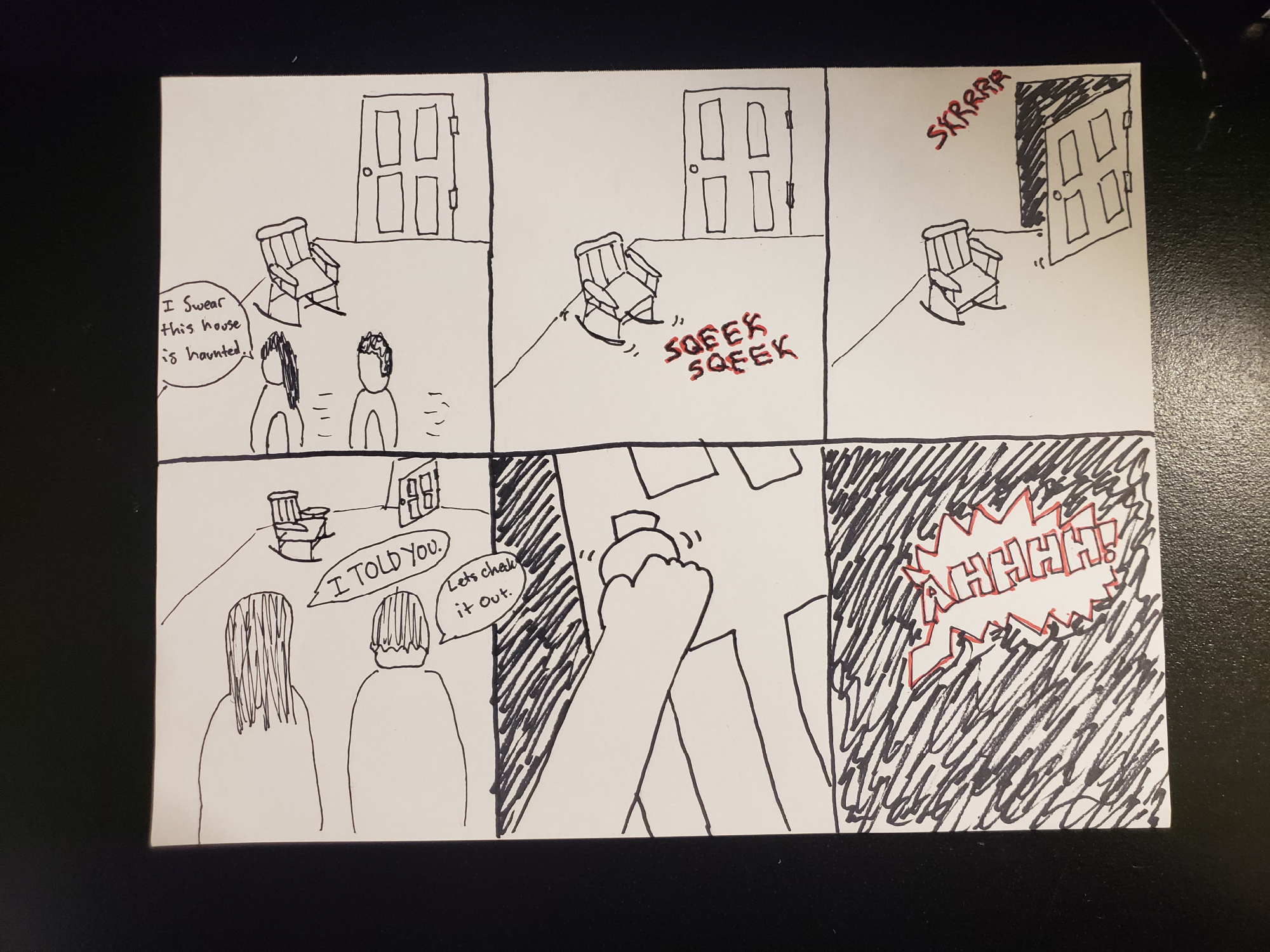
For this week’s comic I had a hard time trying to figure out what to draw. I decided to go with a scary theme and thought of the classic horror movie scenes in movies. I picked a scary basement door and rocking chair as my main subjects because a scary movie isn’t complete without either of these. I used independent word-picture combinations int he first and forth frames. In the first frame these two people are walking into the house and the women says she thinks the house is haunted. This starts the comic because it tells you what the comic will be about. The next frame shows the rocking chair squeaking in a creepy crawly font. The same thing then happens to the door and the couple get freaked out. They then decide to check it out because it is a scary movie theme and that is just what they do in scary movies. When they investigated the open basement door all you hear is a scream. This way I left the ending of the comic up to interpretation for the reader. I like when comics and movies do this but at the same time, I want to know what happens. This all depends on your imagination.
I used other word-picture combinations in the comic. The second and third frames use picture specific word-picture combinations. I used sound effects in these frames to try and show what kind of sounds the chair and door made to get the couples attention. The words used are specific to the picture because they are different when it comes to the sound of the chair and the door. These are the sounds I thought they would make in a scary movie. I like in comics when they use the big POWs and BANGs as sound effects. This is one of the reasons I made the specific font for the sounds because I wanted it to fit the theme and not be plain and boring.
The tools I used for this comic are pencil, thin sharpie, normal sharpie, and a red pen. I used the red pen to outline the sounds in the comic because they are the scariest parts and I wanted to highlight them. Red is a normal color when it comes to scary movies usually because of the blood but I think it fit and made the sound stand out.
This This is a hand drawn comic by me, Nick Caton. For this comic I came up with the idea in my head. I thought about things to draw and this story came to me. I decided to make a comic about a balloon that was let go by a kid. I think this has happened to most people, they let go of their balloon and do not know what happens to it after that. I wanted to show the journey of the balloon in my comic. I think that my drawings in the comic convey a sense of loss and interest. At first you get the sense of loss from the kid that let go of the balloon when they are looking at it float away. Then they get excited because they can still see the balloon and have hope that they can get it back. After the balloon gets released from the tree it floats away again and they forget about it. There is a small piece of paper on the telephone poll that says lost balloon, so this is where the sense of loss comes from. Finally, the balloon gets up so high a kid sees it from an airplane window. This is exciting for him because he would not have thought he’d see a balloon this high up in the air. Maybe it makes him think of when he lost a balloon and wonders how high his got. lastly the balloon makes it to space and pops. This is the end of the balloon’s journey.
The tools I used for this comic were pencil, normal sharpie, thin sharpie, and a red marker. When I was drawing the comic, I wanted the balloons to be the focus so that is why I only added color to the balloon. I think the sharpie makes the drawings stand out and the different thicknesses of the sharpie help show detail throughout the comic.
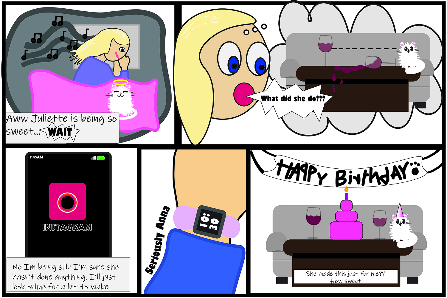
I had a lot of fun with this project! I had started making my comic about a week before we left for quarantine and so I had a pretty good head start. I originally started with the cat on the coffee table looking at the wine. I was not sure where I was going with this idea but I soon figured out that I wanted to incorporate things that had to do with me. Therefore, I used myself and my cat as characters and other things I like, such as wine, Instagram, and my birthday. The way that I expressed my individuality is through my cat throwing me a birthday party. Honestly, she is my best friend that I have at college as well as at home and so we have a close connection. I throw her birthday parties every year and so I thought it would be cute to have her throw me one in my comic. I started with the scene of me waking up and seeing how cute she looked, a daily occurrence, and then I think to myself she only looks this cute when she’s done something. That is normally true and nine times out of ten she has ripped something up or thrown up in the carpet. Everything that I have mentioned before is both my purpose/idea and as well as the form. As for the idiom, I would say that this is most definitely fiction because there is no way for Juliette, my cat, to throw me a birthday party by herself. Next in our reading was, structure, since it was not that important that the reader see me get out of bed that is something that I chose to leave out. I could have added it to add to the frames that I had. However, I felt that it was implied that I got out of bed because there were no thought bubbles around the last frame meaning I was actually looking at, not imagining what I was seeing. for the craft step in McCloud’s book, I spent a ton of time creating the cat because I had to watch hours of youtube videos on how to get that furry effect without drawing individual strokes. this was time-consuming but also really fun to learn so I’m happy I did it. I then took my iPad and drew with my apple pencil the outlines of what I wanted. for example, me waking up in bed I drew on my iPad and then transferred it to adobe illustrator so I could use the curve pen as well as the blob brush to trace over the sketch I had made. I then added way more details than I have been because I really wanted to push myself! Lastly, there is the step of the surface. I think that the biggest thing that people will see when they first get exposed to my work is that this is a fictional story about me. Especially if I were to name the comic “a day in the life of me” or something like that to explain that the comic is about me and my cat. All in all, I am extremely proud of my work for this comic and I am so excited to share what I learned.
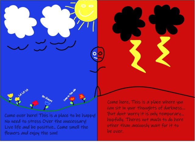
For my final comic we were asked to make something that relates to McCloud’s quote, “no other human being can ever know what it’s like to be you from the inside. For me, something that no one else knows the feeling of is my anxiety, so I wanted to make a comic that expressed how it makes me feel. The idea/purpose behind this comic is to spread anxiety awareness and how it truly feels to have it. I tried to show the tug of war battle that happens during anxiety attacks, by having a bright, happy side and a dark, not so happy side. Using the text tool I gave each side words, these words are what I hear, trying to convince me to crossover. I used a blue color on the happy side with the sun, flowers and some green grass to give the feeling of happiness and a good day. While I made the right side red with dark clouds and thunderbolts, this gives a very scary or dark feeling. The form of this piece is a comic book, it contains all of the factors that put it in this category. As for Idiom, this comic was made to be a drawing of emotions and how they affect humans. While for the structure I wanted to stick to a simple two-panel comic, this allows for more focus on the good and the bad instead of having multiple panels. For my craft of this piece I branched out and used Adobe Illustrator, this was a little of a challenge for me but I plan on using this program later on in my career so I felt it was necessary. I used multiple tools like the brush tool, shape tool, etc. Although I may have been able to draw this comic better, I am happy I expanded my knowledge and used something that may be uncomfortable to me. I feel the overall structure of this work is well, I could have done better if I had more skill in this program I used but with what i know i feel i did my best.
This comic was different from any others I’ve done this year because it was one made based off of all that i have learned this smester. I also felt that this comic did more than just let me express something that effects me as a human. This comic also showed how far I have come as an artist, not just by the art I make but other aspects like how I think about things and the process. This comic is one of what I hope many more to come, I enjoyed making different variations of comic art pieces in class and hope to keep it as a hobby as I go further into my career.
I wanted to have more fun doing this comic so I knew I had to stay away from Illustrator. Illustrator limits the things I imagine because I’m not very good at it and it takes more time to make simple things. It took me awhile to decide if I wanted to draw, color or paint, but since I used to paint and I remember I liked it and I had all the materials in my closet; I chose to paint using acrylics. The only thing is I didn’t have was a canvas, so I got a poster paper which was huge so I cut it in half. The hardest part was to think about something about myself that I wanted to share. For some reason, talking about myself is really hard for me. It was pretty late when I started this comic and I was listening to music and I thought to myself how I wish I was out dancing instead. So I decided to share that side about me.
I was unsure of how to do this comic, so I painted the backgrounds first because in my mind I had an idea. I’ve done 3 and 4 frames comics and for this one I chose 4 frames but in a different way than I’ve done before. The idiom for my comic is don’t judge a book by it’s cover because I may be quite and not talk much, but that doesn’t mean I don’t like to go out and have fun. I painted the top frame first and then the last frame fist because I knew what I wanted to show in the begging and in the end. For the middle frame, I divided that into 2 frames. I was actually stuck on what do do for the middle frame because of the way I started for structure my comic. I did have an idea in my head, but it wasn’t a very detailed plan. I thought of different ideas that would fit the story I was trying to tell and that would make sense in the frames. Finally I came up with an idea and I painted the middle part of the comic last, which now I know it’s not the best idea. But it does force you think of new ideas which I liked because it’s things that I hadn’t thought about before.
I am not afraid to use color and that is why my comic is very bright and colorful. But there is a reason for the colors I chose. The top frame is yellow, few colors and not as bright because I wanted to show calmness. The last frame I chose red because that is a bright dark color and it goes well with what I’m trying to portray. The middle frame doesn’t have much color either because it is not as important as the others.
My comic is about myself and how I am quiet around people, I don’t really talk or try to make conversions with people I don’t know. Many people think I’m mean or rude because I’m quiet, but I just like to mind my own business and I also have social anxiety, so I rather keep to myself. But even though I may be shy and quiet, it doesn’t mean I don’t know how to let loose. Most of the time I have my earphones on listening to music and it’s usually upbeat music because I love to dance. During the night I love to go out to the cubs with my friends and have some drinks and just dance and have fun. I do have my social butterfly moments, but then again it might just be the alcohol talking. This weekly comic was more ambitious because I painted everything by hand and it was a big poster paper.
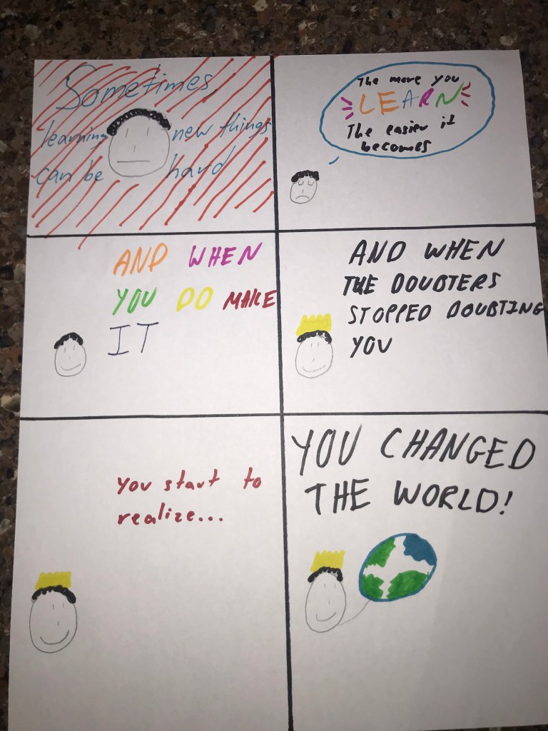
For my final project, I decided make it reputation about the goal I wanted to achieve while correlating it with the class goals related with Scott McCloud. Each slide has a different meaning that I wanted to do within my image. The first slide shows the orange lines with the words showing “Sometimes learning new things can be hard.” I decided to make that creation because the first picture shows confusion because on how new things can be difficult to learn or become good at. The second slide I wanted to show a thought bubble being used because it shows my thought pertaining to the word “LEARN”. The inspiration on making the word “LEARN” multicolored goes back to the “Living In Line” comic that we worked on a couple weeks ago. When I made the third slide with each word being a different color, the reasoning for it was to show my creativity for my goal which shows up in the last slide. I wanted to try and show my creative side with this slide. The fourth slide shows how in big bold black letters when I hit my goals because of the importance the goals are to me. The sixth slide is the one that should hook the audience in my opinion because of the big bold letters and the main purpose of the comic. I wanted to show my goal which is to somehow change the world in a positive way.
Throughout making the comic, I was thinking of Scott McCloud’s quote, “No other human being can ever know what it’s like to be you from the inside” (McCloud, 194). In my opinion that quote made the most impact for me when creating this comic. It also shows how we all human because we will all make mistakes, but as long as we follow with our goals, we will achieve great things. Even with this class, I know it wasn’t going to be easy, but as I mentioned in my second slide, “The more you learn, the easier it becomes.” I chose to do the comic hand written because I feel like it is better to express myself and create an image on how people to view my goals. The comic took me a couple of days to think about because it was the last comic and I wanted think about on the impact I wanted to have for the end of the class. At first glance, the comic can be very confusing but the more you start to read the comic, you will start to understand the ambition to my goals and it shows how unique I want to be for this comic.
Overall, this weekly comic was more ambitious than my previous two because I made it 100% about my goals and it helps because when you create something that describes yourself, you will develop ideas and start to add more details to the comic. I tried to make the stick figure based off of myself because of the hair being curly and adding the crown in the fourth slide to give myself a sense of positivity on how I can look myself as being different like Scott McCloud said.
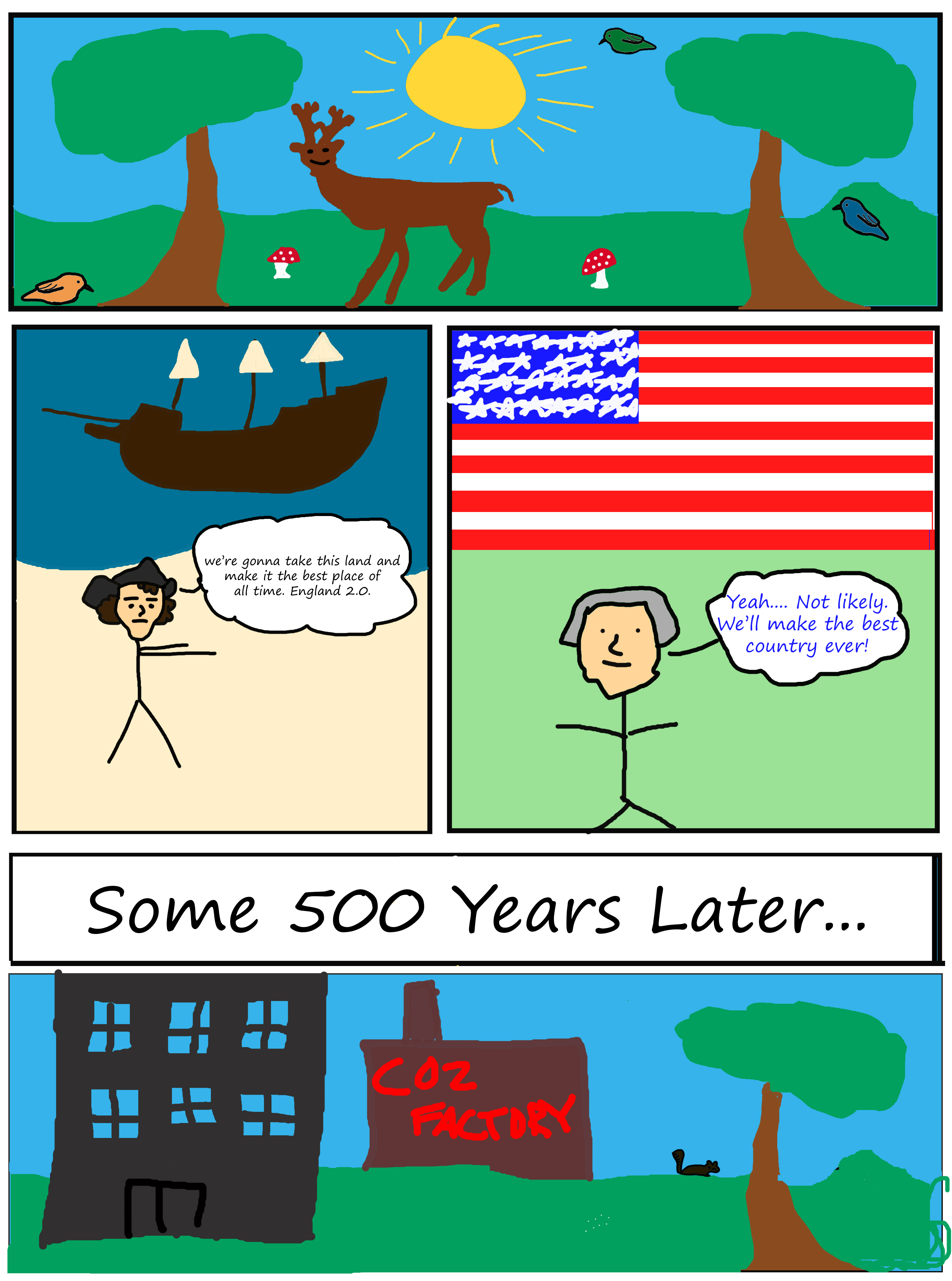
For the final comic, I had a bit of trouble finding inspiration. I found myself just drawing until I found myself with a beautiful nature scene. I started thinking to myself why scenes like this are so rare in real life. It got me thinking about how wonderful the world must have looked before humans moved in and industrialized. Before we deforested tons of land, domesticated animals, over hunted, etc. It must have been so much more peaceful and crawling with natural life. America itself seems to be one of the last places in history to be widely uninhabited before the late 1400s. Once America was independent we were quick to throw up factories and industrialize the continent with little regard for the environment and now we’re starting to pay the price for those actions.
I think this is a strong narrative to push as we are so quick to take advantage of the Earth. I think that this comic is much more ambitious than my others as it’s my largest and most detailed by far. I tried to add more subtle things as well as trying to add more. As far as techniques go once again I used Photoshop as I find it the easiest and most convenient. I used the brush tool for almost all of it besides some of the text. While it was made simply I think some of the techniques are some of my most diverse yet.
Scott Clouds Six Steps
Idea/Purpose: “The impulses, the ideas, the emotions, the philosophies, the purposes of the work… the work’s ‘content’.” – I’d say my drawing is definitely a statement piece about the downsides of industrialization.
Form: “The form it will take… will it be a book? A chalk drawing? A chair? A song? A sculpture? A comic book?” – Comic book
Idiom: “The ‘school’ of art, the vocabulary of styles or gestures or subject matter, the genre that the work belongs to… maybe a genre of its own.” – I’d describe the genre as a narrative environmental drawing
Structure: “Putting it all together… what to include, what to leave out… how to arrange, how to compose the work” – I structured it as a typical comic and built upon the skeleton of the panels.
Craft: “Constructing the work, applying skills, practical knowledge, invention and problem-solving” – This was where I took a bit more creative liberty and just let ideas flow in real time when I was thinking of what to create.
Surface: “Production values, finishing… the aspects most apparent on the first superficial exposure to the work” – This is wear I struggle the most. My quality is limited by my skills in art at the moment which aren’t very strong, however practice makes perfect!
for this comic I had one main idea and that was to showcase how my brain works and something that happens to me often in one and one conversations even while I am the only one talking. While talking to people I often tend to think about things that are largely unrelated but get there through a thought process that to me makes perfect sense. However due to the fact that it is all internal I end up confusing whoever I am having a conversation with resulting in me subsequently explaining my thoughts to hopefully help them make sense of why I suddenly changed the subject.
The form here is simple; I made a comic.
as for the school of art or genre this belongs to I’d like to think it’s funny. This is something that happens tome fairly often and is something I find myself having to explain. I often explain my thought process to the other person for it to actually make at least some sense to them.
As far as the structure I think It is for the most part a simple linear comic with the exception of the middle section. For the section in between the second and third panel there is a flow of its own which follows the red arrows. This represents my thought process and as such can only be seen from the inside so instead of a normal panel showing this I had the reader follow my thoughts.
For craft I used illustrator. This was my first time trying to create something in illustrator so it was honestly kind of rough. I wasn’t confident in using the pen tool but to draw with the brush I only had my mouse. As such the art suffered a little but i was still able to add simple expression in the last panel with the thickening of the brush and more extreme open mouth.
on the surface this is a simple comic. The characters are nothing more than outlines and all of the text is typed. In total there are only 5 colors and what I think is an easy to follow structure
This was more ambitious than my previous comics for one reason, structure. For the most part I like to make linear and easy to follow comics as I have done for almost every comic this semester. With this comic I tried to make it a little more than just a linear comic through adding the free form thought process in the middle. This is a break from the linear storytelling of the panels as it pulls you away from the characters and instead brings you instead to follow my thoughts before returning to the characters. The middle section also breaks the panels in half making time seem to pass differently through the middle section. In all of the panels time seems to be passing at the same speed as it is a conversation however for the thought process or middle part it is faster. I chose to demonstrate my thought process as pinball because it seems really random and travels quickly with an erratic path. This middle section makes the comic a little more complicated as it makes it not just linear but also with the internal workings of one of the characters within the comic. This is more complex than my previous comics which were all linear.