Northwest Alternative Comics: Brady Davis

Unfortunately, I was ill and unable to attend the actual museum. After viewing what’s shown online, it seems like it was quite the exhibit! I’ve walked past the art museum many times and have always been interested to go in, but never have. After seeing the contents I’m especially motivated to see them in person and will make an effort to visit once the whole quarantine business is done with.

This image has an empty alt attribute; its file name is eroyn-franklin-.-dirtbag-.-2016.jpg
Dirtbag by Eroyn Franklin

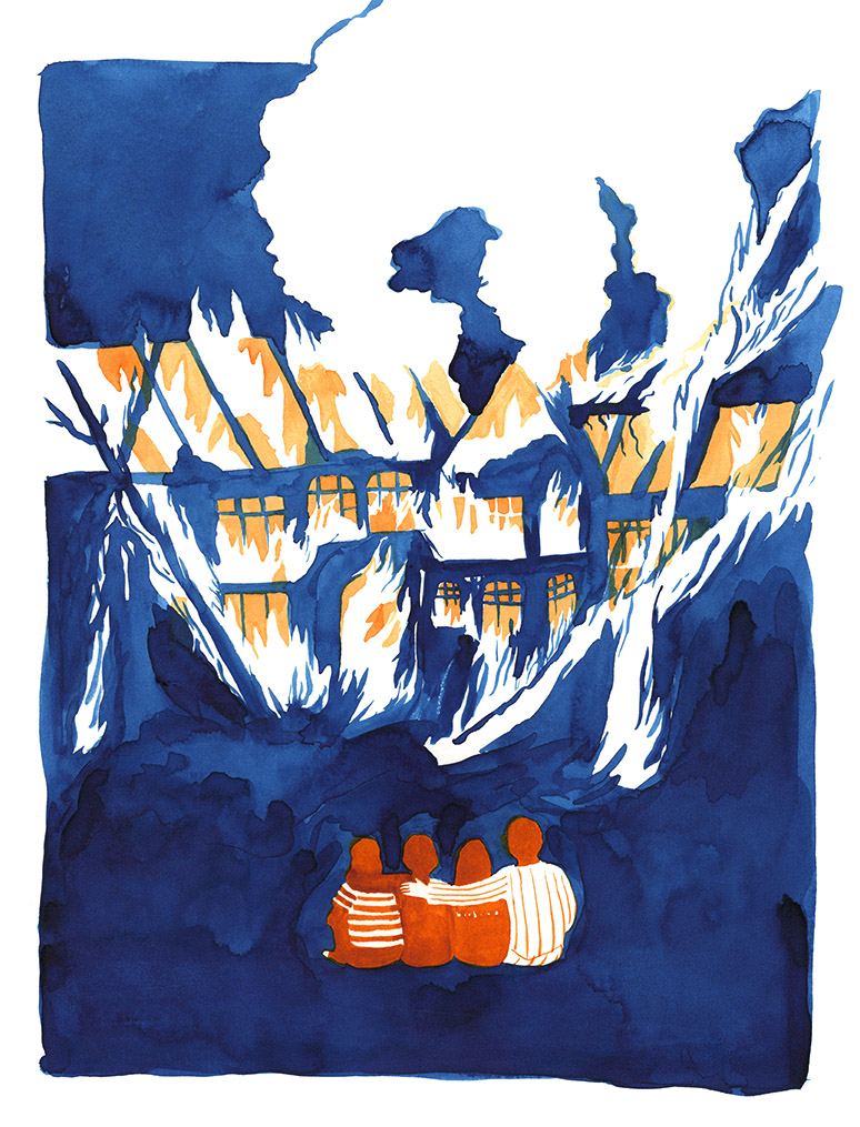
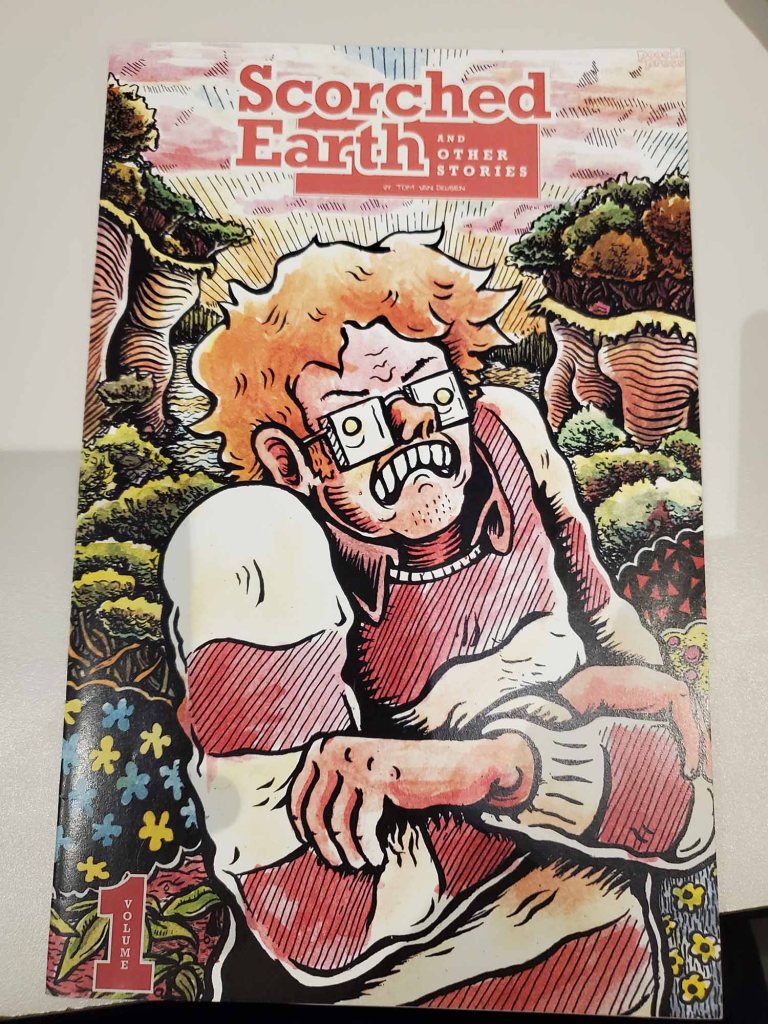
The first exhibit I chose was Dirtbag by Eroyn Franklin. Franklin is a comics artist, illustrator, ceramist, public artist, educator, and occasional shadow puppeteer based in Seattle. On her website, she says that “Dirtbag is an in-progress graphic memoir. In my early 20s I embraced a dirtbag lifestyle fueled by idealism and the search for authenticity in the world of drunks, radicals, and sundry riffraff.” It seems as though Franklin took a bit of a rebel stance in her youth. The illustration seems to be an over dramatized depiction of a family watching their home burn to the ground.

While I’m not sure how accurate this is to the authors intentions or the true meaning of the illustration, but from her description of the work itself, it seems like they come from a very personal place. The coloring is very bright and uses distinct bright colors. It uses lots of shapes and curves to outline the details of the house, family, etc. Color seems to be the primary outlying detail in this comic.

This image has an empty alt attribute; its file name is david-lasky-.-cash-e2809868-.-2016-792x1248-1.jpg
Cash ’68 by David Laskey

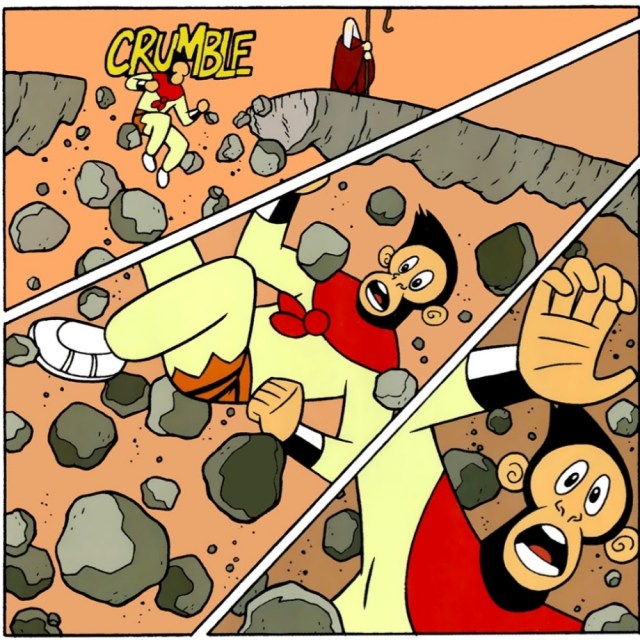
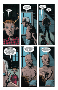
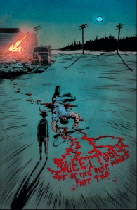
The other comic I chose was Cash ’68 by David Lasky. Upon researching online, I couldn’t find much info on Laskey himself so I can’t really touch upon his background. The comic itself depicts a story of the life of Johnny Cash. It tells the story of how in January of 1968, following a year of debt, addictions, being a poor husband, etc. It says that Cash states he went deep into Nickajack Cave but also says that Nickajack Cave was flooded at the time Cash claims to have entered.

It goes on to tell the story of how in January of ’68 he divorced his first Vivian. Vivian then marries Dick Distin. Cash and his band, The Tennessee Three, then perform two very famous concerts at Folsom Prison with guest appearances from June Carter, The Statler Brothers, and Carl Perkins. The performances recorded by Columbia Records and later released for commercial purchase.

There is a skip to February 22 when Johnny Cash proposed to June in London, Ontario during a performance. It then shows February 29 where June is accepting the Grammy for their duet “Jackson.” It also has a text bubble revealing that June and Johnny are engaged. It then goes to March 1 when Johnny and June are married in Franklin, KY.

This work definitely uses a more classic style than the former. It has more of the boxed, clearly directed reading styles in that its left to right whereas the last one was just one image on its own. This has juxtaposed scene to scene transitions where events take place in between them. The art style itself definitely uses lots of colors to make the pictures pop, as well as lines to box everything in and make it coherent to undertand.

Posted in 201 Blog, Northwest Alternative Comics | Leave a comment

Northwest Alternative Comics: Devon Anderson

Vanessa Davis’s comic is a a promotion for the
Short Run Comix and Arts Festival.
There are many different elements and principles
that can be interpreted from the comic.
(Vanessa Davis, Short Run Comix and Arts Festival, Nov 5)

The illusion of texture within the comic is expressed through a very basic texture in the clothing upon the individuals that flow around the comic. There is also a type of texture the reader can interpret from the text written between the images that promotes different events.

Positive and negative aspects of the shape are created by the people presented by the writer. It helps that the people are a stark black and the backward is a sharp white allowing the reader’s eye to see the strength of the negative space in comparison to the images themselves.

The Direction of the comic has a nice circular flow. Although the point of the comic is to promote the festival and the events that will take place, the images are shown in an interpretive way that the reader can read in whatever direction they wish. That said, the easy flow of the comic starts in the middle with the bolded title and circles around the title loosely flowing to the right.

All of the individuals and images of the book within the comic are of similar size and play a role in repetition. All the individuals are proportional, that said, some words are larger than others creating a sense of dominance the reader cannot ignore.

I cannot find a specific part of the comic that could be fined as closure. I also could not define a specific part of the comic that could be considered time frame unless you consider that the book is being passed from person to person instead of everyone having their own book.

All of these aspects are important while interpreting the comic. Because of the strong positive and negative shapes deliberately placed in the comic stood out to me compared to the comics that included more gradation and texture.

Posted in 201 Blog | Leave a comment

Northwest Alternative Comics: Feifan Li

On Tuesday, I read a lot of comics. There are cute UFOs with loving collages, comics with wild styles, comics that say infection with the virus implies precious life, and comics that I do n’t understand. But in this project I decided to write about from the WSU Museum Collection Study Center is “Scorched Earth and Other Stories” by Tom Van Deusen. This comic is paper-based and quite textured. When I browsed this book, I was very interested because it is not an ordinary comic book; unlike other comics I have read, the story is fictitious. After reading this comic, I can see that the author wanted to Use this comic to ridicule some social status quo. He used his protagonist ‘Tom’ to do various things to express the social situation at the time. Tom is a sad character. He has been frustrated everywhere. The women he meets with blind dates are hated by him. His work is not smooth and the relationship between friends is not good. He seems to be hated by the world.

Scorched Earth and Other Stories by Tom Van Deusen

The author used his own experience to draw a disgusting guy. He did his best to achieve the goal of effective dark humor. Like his first date, he was late and he was afraid. However, we can also see that the author used a few simple grids to describe changes in position and time. Maybe this comic is not particularly interesting, but I see a lot of people and deeds in this comic. These questions and pictures will cause me reflection. However, this comic is a very common left-to-right comic, but some parts of the comic are different. He is from top left to bottom left and then to the right. Anyway, I am grateful to the author for creating such a comic. The main character Tom is also a disgusting but acceptable character.

Posted in 201 Blog, Northwest Alternative Comics, Uncategorized | Leave a comment

Northwest Alternative Comics: Kirk Brown

While visiting the Fine Arts building last class I was exposed to alternative comics from here in the Pacific Northwest. The artist that caught my attention the most was Mita Mahato. She is comic artist that resides in Seattle, Washington. She is known for her use of collage and multiple layers of paper in her comics. Mahato makes great use of a scalpel to create and layer shapes in her comics. The comic of her’s that I chose was a zine illustrating a story of space travel for an alien. Her materials contrast each other very well which brings out the fact that it is multiple layers of paper glued on top of each other.

“Unidentified Feeling Object,” by Mita Mahato

Her closure and time frames are very much action-to-action. In the comic “Unidentified Feeling Object,” we see an alien fly around and perform multiple actions rather than talk with dialogue. She uses traditional panels to enclose her space. Mahato also creates a lot of work directed toward aquatic life conservation. Another element she uses well is line work. She creates many textures that are very unusual to a traditional comic format. I believe she is very successful with her style and allows the reader to view her work from an abstract perspective. We must make up our own minds and meanings with Mahato’s work. That is what struck me as the most interesting element to her comics.

Her format is through what is called a zine. I was unfamiliar with zines until I saw her work. Basically, they are a deliberate sequence of images fit together to convey a message. Without dialogue that message is interpreted from the readers own perspective.

Posted in 201 Blog, Northwest Alternative Comics | Leave a comment

Northwest Alternative Comics: Anthony Sanchez

Unidentified Fluid Object by Mita Mahato

In today’s blog post I reviewed an art piece by Mita Mahato. The title of project is called “Unidentified Fluid Object” which is by created by Mahato. With this project its apart of a small series which you can find in her website. I decided to go with this piece for multiple reasons. For example, it has a moment to moment scene. I can make that inference because with each space it goes in order for example it happens second right after the next scene is going to start. But with in text that the artist added to it you can tell its a contiunation noise from the last seen. But the art project itself has several elements in it to make it an interesting piece. For example it has great texture. Mahato in this piece uses differnet objects and materials to make this piece up. She uses stuff like newspaper clippings and other forms of paper like construction paper. But it all works and correlates to create this piece. But you can also see the flow fo the direction with the way she applied it on her canvas. Overall I think with the elements that I chosen affect the way I see the way I interpret comics. Being able to apply to certain techniques to a comic can make your understanding and overall flow of the comic to be raise to read and to like overall.

Posted in Uncategorized | Leave a comment

Northwest Alternative Comics: Haydyn Wallender

Hello friends! For this blog post, I want to write a mini reflection of the comics and zines I saw, and adhere to the guidelines to ensure we talk about McCloud’s ideas of time frames, closure, and other items he’s mentioned over the course of our time together in class, and throughout his novel.

The first thing I want to say was that this experience was absolutely amazing. I was talking with Kirk about how I felt more cultured and aware of the process that it takes artists to create work – in a lot of ways, art work is like writing a good poem: it can take years. One of Jericho Brown’s poems took ten years to complete. There is no linear or right way to create, publish and share with the world your form of art. I think, after visiting the exhibition yesterday, I have a better understanding of that.

Unidentified Feeling Object, by Mita Mahato.

With that being said, there were a lot of examples that were presented to us on Tuesday. The one that caught my eye, however, was a small zine that seemed to be crafted rather personally – the cover of the zine was handwritten, and the information itself was disclosed in a small, almost cardboard-like material, that was not fancy or textured. It was plain and honest. This particular zine was called “Unidentified Feeling Object”, by Mita Mahato.

When I opened the zine, I realized that the cover was an illusion to what was inside: the paper had been scanned. It was a collage, put together by the author, but it wasn’t the original draft of Mahato’s work. It had been run through a press of some sort, where the pages contained a glossy shine. The panels that caught my attention were on the second page. Though the zine is fairly short – three page turns short, I believe – Mahato manages to capture attention with not only the title, but with her creative and artistic abilities. The story  line on the pages with multiple panels had a very direct line: read from left to right, 

Unidentified Feeling Object, by Mita Mahato.

then move down and across to read from left to right. This was repeated for four panel sequences, and though shapes of the panels stayed the same, small things changed, like the movement of the spaceship, and the ripping of the heart from the craft.

The direction of the panels then changes on the following page, where the heart spirals down, and the reader’s eyes automatically follow the line of dashes that direct the heart to the forest below. The spaceship continues in a different direction, and flies off without it. This causes for three possible lines of direction to focus on: the spiraling heart, the spaceships trajectory into space, and perhaps even the rounding of the trees that seem to corner the right side of the page. Size is also something to pay attention to in this panel sequence: the spaceship is extremely small, but the heart and the trees are fairly large,

Unidentified Feeling Object, by Mita Mahato.

making the assumption that the ship is gaining distance from the “earth”.

As far as closure and time frames go for this zine, I would argue that there is limited closure, as Mahato gives us a pretty straightforward story arch. The panel space doesn’t change and seems to be very consistent, so I would argue for this particular zine that Mahato focused more on the design elements that we learned, rather than the design principles.

Thanks for hanging out with me this long! I hope that this gives an insight into my thought process for this assignment, and what I want to focus on in the future.

Posted in 201 Blog, Northwest Alternative Comics | Leave a comment

Northwest Alternative Comics: Luis Trejo

The comic that I decided to write about from the WSU Museum Collection Study Center is Life Lines by Mita Mahato. I was interested when I was looking through the book because it was not a regular comic book, none like I have read or seen before. The comic was a small book that required the viewer to think about what is going on as the panels go forward. It is not easy to understand what is happening because it does not come out and say it, instead it uses abstract messages to convey a certain message.

The texture of the book was rough and smooth, the cover looked as if it was made of cardboard while the inside of the book was marked out of recycled paper. The comic book did not have any color that was used throughout the entirety of the comic. There were many shapes and lines that were being displayed throughout the whole comic book. Each page of the comic was its own panel which made it easy to read because it was a basic horizontal direction. There were many different examples of unity in the comic.

Life Lines By Mita Mahato

Because the comic didn’t have any color and used many shapes and abstract panels throughout the sequence, it made me feel as if there was a hidden message or many hidden messages. Just by reading the words, it is hard to understand what is going on, the artwork in the panels threw me off but I believe that taking more time to understand why they are present may help in understanding the meaning for creating the comic. One example of time frame was the first few panels, there was a moment to moment sequence the was presented, that showed the process of creating the number four. Because there is no color and a large amount of negative space, it puts emphasis in the motion to motion.

Posted in 201 Blog, Northwest Alternative Comics | Leave a comment

Closure and Time Frames: Henry Igwala

The Graphic Novel I will be discussing about is American Born Chinese by Gene Luen Yang. This interests me because I remember this book from when I was around 10 years ago. My brother had the book but I never read it as I just usually would flip through the pages to look at the artwork, so the nostalgia and artwork are the main reasons I chose this book. I requested a copy from the library, which will take a few days but for now all I have to work with is the pdf version.

One example of closure is in the scene the bridge that the character has on suddenly collapses. On the next page it continues to show the character fall, with remains of the bridge following him. On the third panel it shows that the bridge remains have trapped the character. This would be scene to scene as there are things that happened in between the scenes that the author wants the reader to infer.

Subject to Subject

There is not really easy to identify time frames in this book like there is in McClouds book. I chose this example because there is no specific order that this should be read as they all convey the same thing with different examples. The character is sulking throughout the numerous activities he does throughout the day, which can be interpreted in any order the reader chooses. McCloud says this invites viewer participation.

Time Frame

Posted in 201 Blog, Closure & Time Frames | Leave a comment

Closure & Time Frames: Amanda Retchless

The graphic novel that I found is the Archie Comics. I find these really interesting because one of the shows I watch is based off of the Archie Comics. That show being Riverdale. The Archie Comics are in the art style of cartoons. I think that the Archie Comics are more of a cartoon than the Marvel comics. I really like how the comic has bright colors and it seems as if the characters are alive and super relatable. I think that the Archie Comics are super funny and uplifting and I love that everyone is so positive and happy. I have volume one and I think that this comic is moment-to-moment, scene-to-scene, action-to-action, and subject-to-subject. I think that it is moment-to-moment because of the way the comic is arranged. The comic flows and carries on like it is telling a story, but through pictures and drawings, but it has a smooth transition between each moment and each frame. I think that this comic is scene-to-scene because it has a certain setting, and that setting being the high school at which all of the characters attend. I think action-to-action because there is a lot of motion and speech that happens in the Archie Comics. The Archie Comics is a comedy and most of the time the characters are always making jokes, showing movement and advancement in the story. 

One interesting example for time frames is this scene from the Archie Comics. In this scene the overall question is where and who ate the food. I think that this scene is interesting because of the terminology that the characters are using and because the Jughead ate all of the food. This made me laugh out loud and have to put the comic down and take a breath before I was able to continue reading. I think that this is a good example of a time frame because the reader had to take some time to process what was happening and react to it.

Posted in 201 Blog, Closure & Time Frames, Uncategorized | Leave a comment

Closure and Time Frames: Anthony Sanchez

A graphic novel that I’m reading for this course is called Sweet Tooth: Book One. The book is written by Jeff Lemire and it’s about a boy named Gus who is a human-deer hybrid. He then escapes from his home with a guy named Jeppered, in order to take him to a safe place for him. The graphic novel itself has different moments of closure. But this particular scene it’s a moment to moment scenario. It’s a moment to moment scene because it goes from scene to scene within a few seconds from one another. But it overall gives the visual of slowing down time to explain what’s happening. Showing us that this a moment to moment visual.

Jeff Lemire graphic novel “Sweet Tooth,” pg. 68
Jeff Lemire graphic novel” Sweet Tooth,” pg. 51

For my following example it’s a scene in the story were some people were going to kidnapped and potentially kill Gus. But Jeppered intervened and saved Gus. But he was badly injured, and blood was pouring everywhere. But the blood it makes focus in a certain direction and read out “Sweet Tooth Out of The Deep Part Two.” The Author in this scene really makes you focus on the blood that he lost and makes you read what he wants you to focus on. Making me believe that the time frame is meant to be read in a unique way.

Posted in Uncategorized | Leave a comment