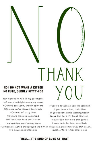
Broadside made by Shannon
The text of the broadside is about someone listing the many reasons why they do not want a kitten. The author goes on to say how they would much rather take other animals that could not even be pets rather than have a kitten. However at the end, Shel says, “well… it’s kind of cute at that”. Almost as if they had started to give in to the thought of having a kitten.
The mood conveyed in this poem/broadside seems to be almost stubborn or unreasonable. They have a firm stance on their view and give all the reasons they do not want a kitten. They even resort to mentioning lions, pigs, apes, boars and bats as potential pets over a kitten. But then at the end of the text, the author seems to have lost that firm stance and their stubbornness and has become more open to the thought of a kitten just from it being cute.
The visual hierarchy is presented and well defined. The No Thank You catches your attention from a distance and makes you want to read why this no thank you is as large as it is and what no thank you is being said to. The broadside keeps your attention because once you get closer you see the bolded text of underneath the No that shows why no thank you is being said and it makes you then want to read on and see what this person has against a cute, cuddly kitten. The bold text is at different parts of the poem (the start and the end) but without reading the poem you can see how the authors mood changes. The smaller text in the middle relates and describes the bolded the reasons for what was said in the bolded text.
The display level text (created text) seems to use an appropriate type style. The typeface made has a cartoony feel to it much like Shel Silverstein’s poems and his drawings in the poems. The typeface’s thick and thin contrast helps it to stand out. When I remove the serifs, the typeface doesn’t seem to have that cartoony feel to it anymore especially with the letter O. Also, Shel Silverstein’s poem titles utilized a typeface with serifs in books like Falling Up and Where the Sidewalk Ends. As for the running text’s type style, the typeface difference in the bolded text and the thin paragraph text contrasts and displays nicely. The main aspects are more prevalent and noticeable. There is only one line that is overly long that seems to be almost connecting with another line. Spacing of the two bodies of text could solve this or moving some of the text from that line to a new one could also help. The one long line is the only thing that could distract or throw off the reader as there is no excessive hyphenation within the text.
The size of the display level text grabs your attention from afar and draws you towards the broadside and has a different scale for each word to draw your eyes down the broadside. The bolded words start to become more visible as you inch closer to the piece. When you are within reading distance of the running text, your attention has been brought to the main body of text through the 3 different scales of text used. The alignment of the main body of text is centered and utilizes two columns for display. As for the leading, the consistency of it is used in the running text. The leading for the display level text seems to be different as the scale of each word decreases but when looking more into it, the line spacing seems to be same throughout except for the last line which has a little more but this helps to separate the author’s change or understanding. The tracking of the No Thank You is noticeably different. The No has major letter spacing, the “thank” has minimal letter spacing, and the “you” has some large letter spacing also. This could be due to the scale of the text being used. The kerning is done nicely though within the display text as the word Thank displays nicely and does not have noticeable difference in spacing because of letter shapes.
The piece uses black and white. You could interpret this as though its black and white like there is no medium or gray area about it, there is only yes or no and no in between. The use of space though could give a feeling that even though there is this main point of NO, there is room for change like the how the author started to change his mind on kittens at the end of his poem.


 The images I have chosen to show here are all going along with the poem and have a
  semblance of narrative interplay that I feel would have a profound impact on the broadside. The images of hands were chosen because they are only ever mentioned once, but more so because the narrator of the text seems to be less whole and more broken. They’re rubbed raw from the weight of the world arou
 nd them, seeking solace in things to try and make themselves feel less empty. I added more than one because I feel like all of the
 m have a weight to the imagery that would lend itself to the poem itself. The words of the poem are meant to be fragile and quiet. The imagery will lend something to draw readers to it.