Weekly Blog: Living In Line: Anna Davenport

Comic Made by Anna Davenport 2020

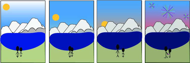
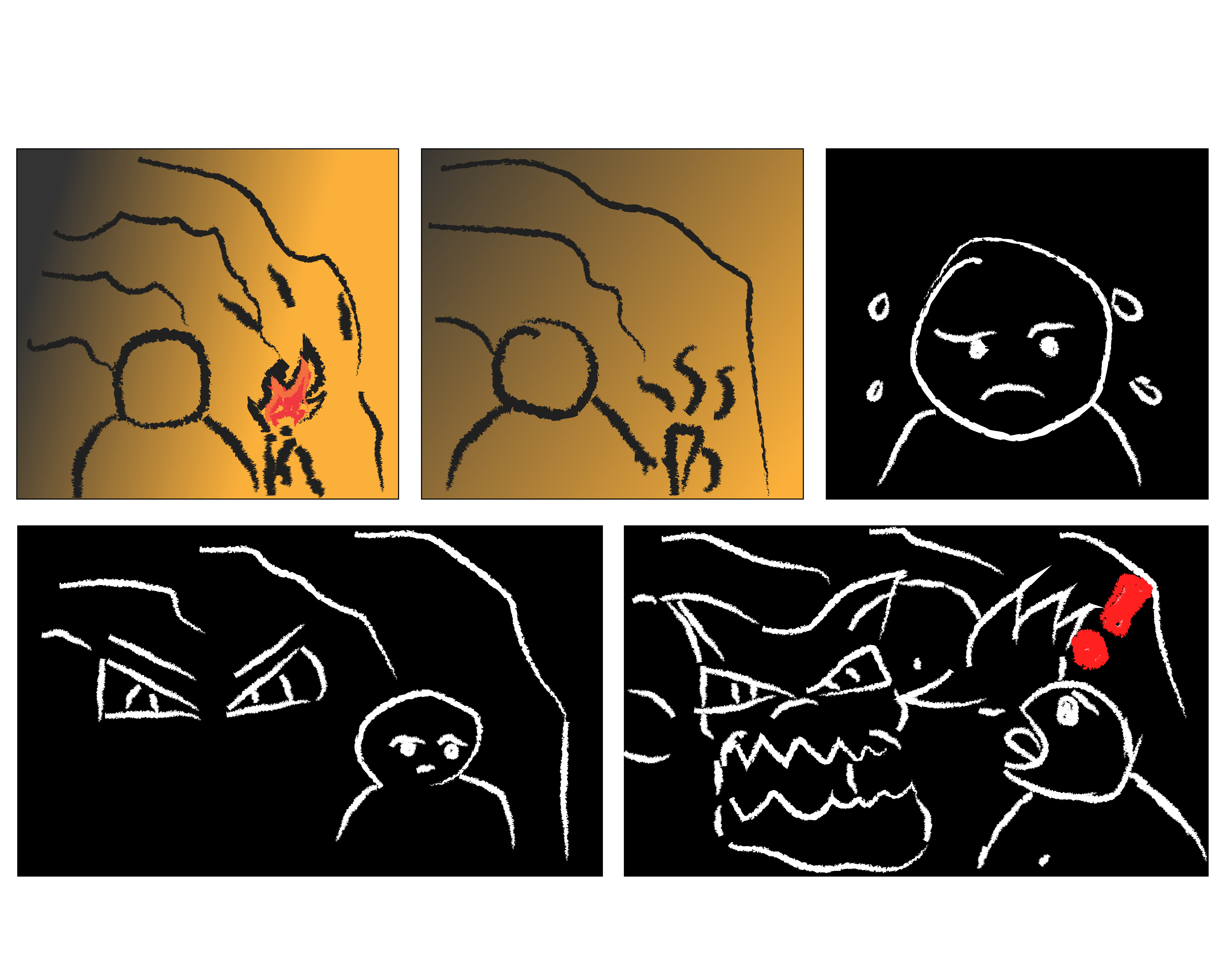
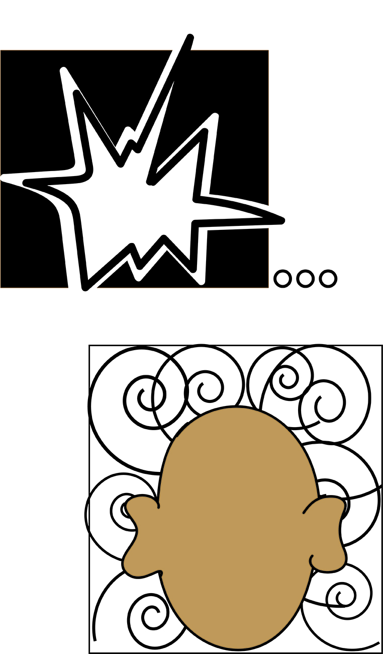
I tried to convey two different emotions without using visible senses. The way I did that was I started with the human figure. I was going to put some emotions on his face but I remembered that in the reading in chapter five, McCloud talks about how there is not always going to be a face to convey the feeling that the reader should fee. Therefore, I left the facial features off of the character. Next, I worked on what I wanted to convey. I knew that I wanted to work with what the book explained to see if I could recreate the things from the reading because that is the best way, I learn is by doing what we learn. Therefore, I chose to do an image that felt loud by using thick lines with drastic color changes. To create this is used the brush tool in a
thick setting to make the explosion looking shape. With a dark black background, the loud looking shape looks more drastic making it the first thing that someone looks at when they see my comic. They then should move to the next box on my picture that has the character’s head and a ton of swirls. The reason I used the swirl tool was to make the reader see that the character was confused and or startled. The way that I made the character was also with the brush tool but with a less thick brush mode. As for closure that is taking place in my comic I think that the only part would be that you can tell that the character is human but you can’t see his facial features, therefore, you have to imply that this is either the back of their head or that they are human because of the shape of the character. I don’t think that I used time inventively except for that I did not have any time between the two frames. In chapter four McCloud talks about how if the author is meaning for there to be a lot of time between frames, they can add multiple frames of the same image. However, I wanted things to feel like they were going fast and so I went right from the loud shape to the confusion and startled character.

Posted in 201 Blog, Living in Line | Leave a comment

Weekly Blog: Living in Line: Shira Feinberg

For this weekly comic, I have decided to tell a short story about how a couple is sitting on the beach as the sun is setting, with a view of the mountains beyond the lake. Also, the short comic tells the story about an engagement. Throughout this strip, I tried to convey a calming feeling which then rapidly becomes an exciting feeling as the proposal happens. I tried to show the calming feeling with the stereotypical beach setting, with the mountains and sunsetting. Furthermore, I tried to use simple lines to represent the calmness and how they are sitting down watching the calming scenery change. In contrast, when I try to show excitement in the last slide, I added in fireworks and moved the sitting person’s hands up to their face.

Weekly Comic by Shira Feinberg

In order to create this comic, I tried to use the pen, brush, and shape tool, in order to try and convey the proposal story. Since I am new to Illustrator, I ran into a lot of issues using the pen tool and so my comic ended up being much simpler than I hoped for, originally. But this worked towards my advantage as it helped provide a calming feeling in the comic further helps to convey the calming feeling. I also tried to use the anchor and erase tool, to try and fix my mistakes, but again, I still ran into some trouble. Another tool I used, was the gradient tool, which helped me create the change in color, in the background.

In the comic that I made, there are several closure properties that can be seen. There is the obvious moment to moment, with the sunsetting and the people sitting closure together. There is also somewhat of a scene to scene as the sun is setting and the gradient in the sky is changing. Furthermore, there is an action to action, as the person stands up and pulls out the engagement ring to propose to the other person.

Lastly, I did not really question time in this comic, it is all fairly linear in time with the sun setting and the person moving towards the other person and proposing.

Posted in 201 Blog, Living in Line, Sample Posts by Students | Leave a comment

Weekly Blog: Living In Line: Feifan Li

In the comics of the thirteenth week, I want to convey the appearance of many students around me online classes, they often make a perfect plan but ignore the homework due to sufficient time. They are gradually lazy. The first picture I want to show is that this person has particularly sufficient time and perfect schedule to complete all his homework, but in the next three pictures, he chooses to play, choose to sleep and go out to relax. When I finally found out that there was not enough time, I was anxious and annoyed.

Weekly Comic by Feifan Li

The tools I chose this time were pencil and sketch paper because I took an art class this year and wanted to practice drawing techniques. The comics drawn with the pen will give people a simple sense of happiness and familiarity, and it is very convenient to watch. In a comic, I indicated the passage of time and the choices made by students by a wall clock. The reason why I did not use Illustrator for this assignment is that I am not skilled enough to use Illustrator. I think I may not be able to make comics that I think are good. Although the comics that I drew by hand are also not very nice.

Posted in 201 Blog, Living in Line | Leave a comment

Graphic Novel Review: Mitchell Delmage

Good-bye Chunky Rice is a story, written by Craig Thompson, about a turtle named Chunky Rice and a mouse deer named Dandle. The story shares a message about how people need love and relationships in their life to be happy. 

The story begins with Dandle and Chunky heading to the beach where they stay the night together for the last time. Dandle asks Chunky why he is leaving, and Chunky says he does not feel like he belongs here. Chunky wants Dandle to come with him on his travels but Dandle cannot.

 The next day, Chunky is packing his belongings and listening to a Motown record. In the apartment next door, Solomon is telling a bird, Mertle, the ancient story of Orpheus and Eurydice. The story is about a married woman who dies, and the husband travels to the underworld to see her. 

Chunky and Solomon go down to the harbor for Chunky’s departure. On the way, Solomon tells Chunky about when he was a kid. Solomon had a dog named Stomper, who had eight puppies. Solomon’s dad tells him that Stomper can’t take care of the puppies because the dog is old and weak. Solomon is forced to drown the puppies in a lake. 

When they arrive at the harbor, Solomon greets his brother Charles, who is a sailor. Chunky pays Charles $200 to take him to the Kahootney Islands. Before Chunky can get on board, Charles tells him he can only bring the essentials with him on board. Charles throws away Chunky’s records and all the important things to Chunky. 

Charles has lived on the sea ever since his wife Glenda died. He lives on his boat with a woman that he is together with, but he will never be fully happy again without Glenda. 

Onboard the ship, Chunky meets Siamese twins named Ruth and Livonia. Ruth tells Chunky that people who feel regret etche their name in a turtle shell, and let the shell float down the river. This is a metaphor because Chunky lives in a turtle shell, and he realizes how much he regrets leaving his home with Dandle behind. 

After Chunky left, Dandle was sitting at the ocean’s edge. She says that life means nothing without Chunky. Dandle throws message bottles into the ocean in hopes they will reach Chunky. 

Broken panels

Later, Solomon flashes back to his childhood and when he killed the puppies. The next day, Solomon takes Stomper to the ocean. The dog swims out in the waves but never returns to shore. Solomon’s dad said, the ocean took Stomper. But, Solomon knew Stomper gave up on life because she lost her puppies.  

The book ends with Dandle throwing message bottles in the ocean. She says she is never going to stop sending Chunky messages. Throwing bottles day after day. On the boat, Chunky looks over the side to see one of Dandle’s bottles floating in the water. 

The major theme in the story is that everybody needs somebody, and the important things in life can be overlooked. 

Thompson uses the ocean to evoke emotion in the story. Thompson draws the ocean dark and depression. It conveys the negative emotion Chunky has when he’s on the boat. This relates to Scott Mcloud’s chapter, living in the line. 

In one scene when Solomon’s bird flies away, Thompson uses a lot of panels for one picture to show that Solomon is in pieces or broken.

Isolation

Another sequence shows Solomon in a box but the whole page is dark to give the feeling of isolation.

Posted in 201 Blog, Graphic Novel Review | Leave a comment

Weekly Blog: Living In Line: Luis Trejo

Week 13 comic by Luis Trejo

With the week thirteen comic I was hoping to convey the sense of being afraid and scared of the unknown. It starts of with someone walking alone in a cave with a torch and it suddenly turns off, they are left alone in the dark when something from the dark sneaks up on the person. I used Adobe Illustrator to create this comic and used the rectangle tool, paintbrush tool, and the gradient tool. I used the rectangle tool to create the panels of the comic, then I used the paintbrush tool changing the style to a charcoal pencil, it gave the story in the comic a certain feel also making it easy to view because the art was simplistic without many detail. Then I used the gradient tool to create the effect of having brightness in the cave because of the torch, then having darkness because the torch light turned off, which is why the background color changed. I used facial features and symbols to display emotion. I displayed emotion and symbols at the final three panels with showing sweat fall from the characters face and using his eyebrows and mouth to show that the character is afraid, I also used dramatic facial features and a symbol on the last panel to show how afraid the character is from the beast in the darkness. I have only used Adobe Illustrator a few times and one thing that I observed is that all the tools work much like they do in Adobe Photoshop. Because I am very familiar with Photoshop, it was easy to create what I was envisioning. The type of closure that I used in the comic is moment to moment. Every panel in the comic happens right after one another. I found that using a moment to moment closure throughout the comic would work best if I wanted to make an unknown creature sneak up on the person that is walking in the cave. 

Posted in 201 Blog, Living in Line, Sample Posts by Students | Leave a comment

Weekly Blog: Living In Line: Rachel Fox

Designed by Rachel Fox, April 2020

For this week’s comic I portrayed the struggle of procrastination that I typically go through with most of my assignments. Starting off with a plan and schedule to falling down a rabbit hole of the internet to then resorting to immense panic and attempting to race the clock to finish whatever assignment that I had spent the day trying to work on. I chose to do this comic because I was able to portray the anxiety that I experience while procrastinating. By using jagged lines like McCloud in chapter 5 I was able to show the steady growth of anxiety as time passes and the due date draws closer. I was also able to use line to create more movement, when the person in the comic is typing you can see movement lines around their hands on the keyboard, and in the panel where the person is vacuuming there are suction lines in going into the vacuum as well as push lines behind it to show its movement forward. Knowing which shape of lines show what made creating movement and feeling much easier. 

Between the panels there are also big leaps in time but not much story is lost in the gutter, for example when the person starts to vacuum you are able to tell that it is the same character who was just on the computer getting up to do something else more productive than simply watching youtube at their computer. I mapped out the time until the assignment that my character had an assignment due at the top of each panel so the comic has its own sense of time in it and the reader can be aware of the rate that things are occuring in the comic. Lastly I chose to use color very minimally in this, I chose to stick to black and white because I felt it was easier to add more detail without the comic quickly becoming overly busy and difficult to process. I only used color in the eyes when the character is watching youtube and I did this to show what they were watching on their screen in a way that was able to stand out to the reader. 

Posted in 201 Blog, Living in Line | Leave a comment

Graphic novel review: Henry Igwala

The graphic novel that I chose to read was American born Chinese by Guen Lueng Lang. This was a unique novel as it had 3 different storylines, which were random and unrelated to each other until the end. 

The first storyline involved a kung fu fighting monkey king who seeks out to prove to his doubters that he is the best. He goes through many trials and tribulations, and later becomes too prideful in himself which causes him to be entrapped in rocks as a punishment. Only after he showed humility and realized he was no more than a monkey was he able to free himself.

The second storyline is about Jin Wang, a Chinese American boy. He was the only Chinese student in his school, which made it hard to fit in. He soon becomes friends with Wei-chein who just immigrated from Taiwan. Jin often ridiculed Wei-Chein for not speaking english, as Jin was trying to fit in with his white classmates. Jin finally asks out his long time crush Amelia, but is soon asked by her white friend to leave her alone. This causes Jin to resent his asian heritage even more and a mysterious woman asks him who he wants to be, and next thing you know, he wakes up to find himself a white boy named Danny.

The third storyline is about Danny, who had an annoying cousin who embodied the typical asian stereotypes named Chin-Kee. Danny is embarrassed of Chin-Kee’s antics and lack of American cultural norms. They soon get into an argument that turns into a fight that reveals that Chin-Kee was actually the monkey king who was trying to help Jin realize that he is perfect the just the way he is and he doesn’t need to conform to anybody.

Iconography

The Iconography of the story was traditionalistic with the comic boxes and structure. There were important aspects that helped identify the real issues and themes throughout the story, and there was a lot of symbolism. For example, Chin-Kee represented everything Jin hated about himself. These were the stereotypes that asian’s have pointy eyes and speaks broken english, saying things like ‘Herro’. All in all, Iconography was very prevalent in this graphic novel.

Chin-Kee from American Born Chinese by Gene Luen Yang

Posted in 201 Blog, Graphic Novel Review, Uncategorized | Leave a comment

Weekly Blog: Living In Line: Jasper Contreras

Illustrator is one of the first programs I learned how to use in the Creative Cloud a year ago and so I feel like I can work it fairly well. Since the whole quarantine thing has been happening, I’ve been watching a lot of anime and my inspiration was watching all of Haikyu!! so I made my version and interpretation of short little cut scenes that are in the show. 

Weekly Comic by Jasper Contreras created in Adobe Illustrator

I introduce the comic with clean lies — as best as I could, at least — and try to evoke a sense of seriousness, focus, and concentration with the first two panels. The next one has the same line work style, but I muted the colors a bit to lead into the last two panels. The last two panels are only in black, grey, and white with more sketch-like lines to try to create more stress and an anxiousness. 

I used the geometric tool to make the panels only. A large part of this was create with the paintbrush tool. A few times I did use the pen tool to get extremely straight lines that also needed to bend into a curve (the eyebrows, specifically, in the second panel). While I do know how to use Illustrator and I’ve used it the most, I tend to stick with the pen and curvature tools and work exclusively with geometric shapes. By mostly using the paintbrush tool, I think it allowed more of a smooth and free-flowing style that I wanted than the geometric tools would have. 

My experience in Illustrator is making logos or flat designs, any digital-freehand drawing I use Photoshop and so it was a new experience to have to make a comic in Illustrator instead. I think this program is a little more forgiving because it sort of cleans up the line-work and smooths things out — but it also allows you to change that setting a bit — and it does take a bit of finessing to get exactly what you want sometimes. 

Posted in 201 Blog, Living in Line, Sample Posts by Students | Leave a comment

Weekly Blog: Living in Line Kirk Brown

This week I attempted to convey emotion through the line work in my comic. The theme I chose for this comic is regarding senior classes and the climate in which they graduated. More specifically, I took historical moments in American history and made each panel of a snapshot of what those seniors in high school could have potentially gone through. For example, I begin in 1945 which was at the tail-end of the second World War. Many enlistees lied about their age to join the war effort earlier. Undoubtedly there were high school seniors on the front line. Then I chose 1962 which was a time of political unease. I wanted to show that the idea of nuclear warfare was a very real and scary thought for the seniors that lived through the period. In the image I added a fallout shelter on the side of the house, which was hard to see. Then I chose 1972 which had the Vietnam War and a lot of political unrest. Finally, I made a panel for the senior class of 2020. This week seniors in Washington and Oregon were told they would not be finishing the year in the classroom, but rather in online formats due to the outbreak of COVID-19.

As far as the technical terms go, I used colored pencils and a sharpie to create this comic. I have been unable to find more materials to incorporate into this piece. I free-hand drew all the images from famous photos of the era in which they were taken. For next week I want to use collage in my comic to give a different artistic style. The closure used in my panels go from era to era. In some cases it jumps multiple decades. I would say this comic is very inventively regarding the time frame used.

Posted in 201 Blog, Living in Line, Uncategorized | Leave a comment

Weekly Blog: Living in Line: Jennifer Engelke

Weekly comic created on Adobe Illustator by Jennifer Engelke.

For my weekly comic this week I chose use Illustrator to create and tell the story about a bug. The bug is relaxing in a warm bowl of soup and has just made a new friend; however, they are quickly separated! The bug meets (what the reader thinks) to be an unfortunate fate. Luckily, it is the bug’s lucky day as he escapes from the mouth of the human. I convey a lot of different components from various chapters into my first weekly comic. From chapter 3 I used closure in the panels where we see the human holding the spoon with soup and the bug, then in the next panel over the spoon is empty and the human’s mouth is full. This type of closure is action-to-action. In addition to chapter 3 knowledge, I worked with the ideas learned in chapter 4 about time frames. In the long bottom panel, the bug is being spat out by the human. We see droplets of the soup and the bug in a curled up position, bracing for impact with the table. Since this is a long panel I was able to convey that this scene was to be viewed in slow motion for a dramatic effect. With these two chapters under my belt, I additionally thought about how I could incorporate lines into my comic. I use lines in the first panel as heat. The steam from the soup is in a different pen stroke than any other stroke seen in the comic to give the effect of warmth. In addition to the meaning of lines in this panel, I also use lines to convey motion later on. As seen in the third-panel lines are being used to show the spoon (and new friend of the bug) is rising away from the bowl. While the reader could most likely put together what is happening with the bug’s speech bubble the lines help solidify the movement. Seen again in the last panel is movement. The bug is being spat out by the human and having the soup droplets and lines help solidify the idea that the bug has been removed from the human’s mouth. In this week’s comic, I focused on using different ellipses. I varied my strokes throughout and shifted the anchor points so that I was able to obtain the shapes I desired. This strategy makes the bug seem friendly, a rounded bug-like character portrays a kinder appearance rather than one with many sharp edges and spikes. Along with the ellipses I used many pen marks that were rounded. This helped with my friendly emotions. With thought put into every shape I created I am quite proud of my first weekly comic as I think I have accurately portrayed the emotions, movement, and senses I aimed to show.

Posted in 201 Blog, Living in Line | Leave a comment