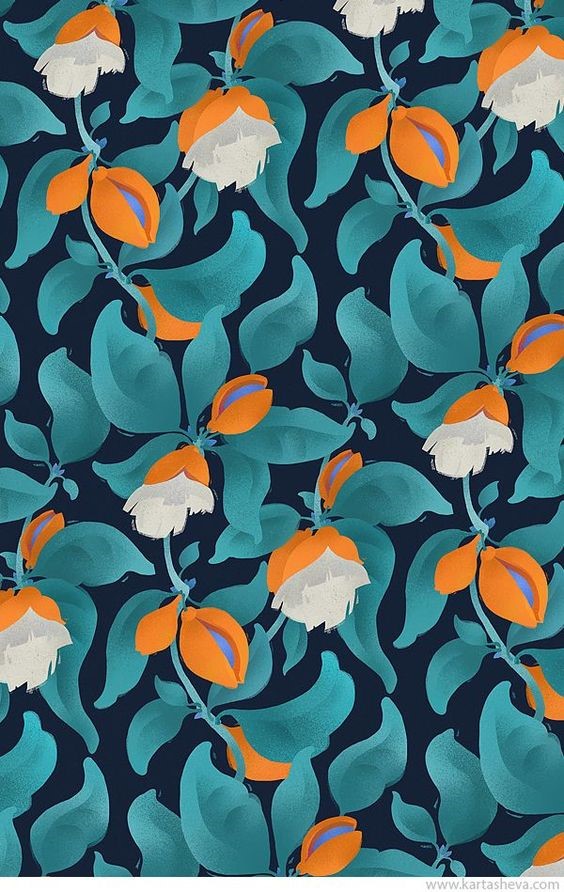
Color Interaction: Claire Martin

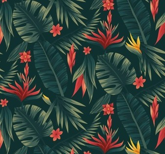
Both the shapes and the pattern they create are quite organic. The dark background intensifies the bright orange and blue of the flowers and the teal of the leaves. The bright hues of the orange and teal and the darkness of the background accentuated the white of the flowers. This color has a lot of visual energy because of the contrast within the image.

The contrast of the colors in this image creates multiple layers within the image. The orange of the image pops out because it is the only warm tone in the photo. While the saturation and values of the teal leaves and the dark navy background differ quite a bit, they blend together as cool colors when compared to the warm orange flowers. The blue inner portion of the flowers are also a cool color which makes it standout against the orange.

The white flowers, while not truly white, stand out against the vibrance and saturation of the orange flowers, leaves, and the darkness of the background. I find the use of shading within the image very interesting, the shading is used on the flowers and leaves to accentuate the brighter portions of the shapes. Overall, the colors of this image are not analogous, as the orange is on the opposite end of the color spectrum from teal and blue. However, there is an analogous color interaction between the teal leaves, the bright blue of the background, and the inner blue of the flowers. The orange of the flowers and the navy of the background are compliments. The inner blue portion of the flowers and the orange flowers are also compliments. This image is an example of a stable figure/ground relationship. The orange and white flowers stand out clearly against the leaves and background of the rest of the image.

Posted in Fall 2018 Archive (336) | Leave a comment

Color Interaction – Grey Kumar

tropical-flowers-pattern_52683-51

I chose this pattern of tropical leaves and flowers because the pattern has a great contrast between warm and cool colors. The bright red flowers stand out against the dark green background, yet they are not overpowering due to the lighter green tones on a few of the leaves. This creates a nice balance between the dark and light values in the image.

If the leaves were to not have any sort of light green on them, the image would be too dark and the leaves would blend in with the background, leaving the red flowers to overpower the image. The yellow flowers in this image stand out as well, but are not as prominent as the red, which adds to the warm tones in the image.

Because of the complexity of this pattern, and due to the small image size, it is hard to identify any lines that may be present. However, it looks like the round leaf with the small red flower on the bottom right could easily be a line if the image was blown up and expanded.

Overall, the pattern in this image is fairly subtle, yet can be identified by the repeating red flowers that are placed within each tile. Although one cannot see much of the rest of the pattern due to small image size, there are enough repeating elements and colors to show multiple tiles.

Posted in Fall 2018 Archive (336), Uncategorized | Leave a comment

Color Interaction: Mikaela Thomas

Pattern Design from Creative Market

This pattern is a geometric pattern with lots of bright hues. I would describe this pattern as very exciting and bright. The dark blue stands out aginst the brighter oranges and pinks. The contrast between the dark versus bright brings my attention to the darker blue. The colors in the pattern becomes more saturated when the same hue overlap. The darker pink is like a more saturated version of the lighter pink and the darker orange is like a more saturated version of the lighter orange. The pink and orange is also a warm temperature color whereas the blue is a cool color. This makes the contrast even greater between the two colors. There is an analogous color interaction between the pink and the orange, as they are near each other on the color wheel. There is a complementary color interaction between the orange and the blue as they are on opposite sides of thw color wheel. This makes the colors stand out against each other even more. The high saturation of all the colors lends to more contrast between the two hues in the pattern.

Posted in Fall 2018 Archive (336) | Leave a comment

Color Interaction: Hunter Kozol

This pattern is deepened by the blue and green, but those cool colors also make the yellows reds and light oranges stand out. The Bezold Effect happens when a lighter color is interwoven with darker contrasting colors and it makes the whole piece seem lighter. In contrast to this theory, another theory is at play. The Vibration and Value theory inserts that when two colors with strong value differences are on top of each other it makes the lighter color darken.  This mix of colors is difficult because they are all slightly desaturated. It continues it be difficult because it is made up of the three primary colors, red, blue, and green, but there are two different shades of both blue and green in this design. The only true complementary colors are red and one of the hues of green, and blue and one of the hues of blue and the light yellow hue. The peach color could be an analogous color with the hue of yellow. Few of these colors are their original value. All the colors seem to be a lighter value. Another factor that makes the peach and yellow hues stand out is their juxtaposition. The two colors, in the crisscrossing pattern, are mostly on top of the other colors. They are only in the background at three spots, but even still, mostly in the foreground.

Posted in Fall 2018 Archive (336) | Leave a comment

Digital Collage: Rachel Lentz

Here I present a challenge to you: pick out the elements in the photo shown that are fake. Depending on the skill of both the observer and the artist, this can be a difficult task. However, the fact that one even can make such a challenge is a commentary on not just the technological advancements photography and other affiliated art has seen but also the skills that one must know to navigate our changing world.

“Real, A Challenge” by Rachel Lentz

Photography itself is a modern invention, starting as the technological wonder of chemical compounds registering light, first invented in the 19th century. Photography was the ability to record the world exactly as it was around us in contrast from artists renditions of subjects, no mater how realistic. However, people soon took this technology and changed our perspectives.

Collage and other alteration of photos and material allowed for the presumptions of photos to be changed, not only from what is being photographed but to the pictures themselves. Changing photos allows for one’s opinion to be settled into this otherwise impartial documentation of the world.  With the invention of digital photography (registering of light through a device that converts it to electronic signals), normally seen today, we get even more adaptability in photographs. Digital photography allows us to more easily and swiftly change and adapt our photos, making for a more interesting, and deceitful, world.

The challenge presented above is a comment on how changing usually explicit documentation, such as photos, into something that is changeable makes us ask questions about what is real and what is fake. People today have subconsciously and deliberately developed skills to determine the truth of something, or at least determine something they could believe is true. Such is the world that fact checking is having to become a necessary and much used skill. With epidemics like fake news, the erasure of varied perspectives and the whitewashing of history, it can be difficult to tell what is real and what is not.

The imagery for this collage comes from my own collection of photos. I wanted this collage to be hyper realistic so these pictures come from my own life and experiences. The pictures are then melded together to form something that i would see on someone’s Facebook or Instagram page. The design of the piece draws the eye to the center of the photo, taking focus away from the elements I have tried to incorporate in seamlessly. I hope viewers interpret this collage as an almost seamless photo, something one of them could take and put on their social media. This is because I want this photo to be a commentary on how very realistic altered photos can be, for either good or ill. I had to use many layers and masking tools to be sure to blend and match the photos and elements as best as I could. This work needed to be constructed digitally as it is a commentary on how effective digital technology is.

Posted in Fall 2018 Archive (201) | Leave a comment

Color Interaction – Sean Mirts

Photo from Vecteezy

This pattern is comprised of four different colors, red, pink, orange and blue. All of these colors are heavy in their saturation but appear light due to the hue change adding more white to their bases. This whole pattern feels quite warm with primary colors in it being naturally warm while the blue is very light and feels warmer with the intense red directly next to it. In a very similar fashion the red and light blue amplify the presence of both with such a strong level of contrast between the two. In this color pallet the colors are mostly complimentary with the orange and red being more of an analogous set. The light blue compliments the rest of the colors chosen for this pattern giving a good contrast in values compared to the rest of the colors chosen. Due to the pattern covering the whole image there appears to be no negative space in this design. While the whole space is used it makes the positive space less intense then say a black box surround by a white plane. There are several points in this pattern, the light red triangles with a smaller red triangle inside make some points; when used with the other triangles in red vertical lines can be formed as well.


Posted in Fall 2018 Archive (336) | Leave a comment

Color Interaction: Julia Midkiff

bed-sheet-patterns-2

The high contrast between the red and green creates a clear diagonal yet also floral sort of design. Found at:  fabric-textile-design.blogspot.com

In this pattern, we see a complex floral-like design that utilizes various values of green, red, yellow, which are the main hues, and an off-white color. There is an analogous color interaction between the red and yellow, as they are near each other on the color wheel, which creates high contrast between the green. Also, as red and green are complementary colors, there is further enhancement of the red against the green. Although most of the colors are very bright and highly saturated, the bright colors are placed next to a different or darker color so that all o the lines and shapes in the design are clearly visible. In other words, if the light green clover shape was not surrounded by dark green, it would probably be very hard to see. This use of differing value in the colors also applies to the use of yellow and off-white to enhance the red shapes. The brightness of the light green and the heavy use of red creates  warmer temperature in the pattern, even though green tends to be associated with cool colors. If a touch of blue or purple was added into the green part of the design, it would likely have a lower temperature to contrast the high temperature of the red and yellow.


Posted in Fall 2018 Archive (336) | Leave a comment

Digital Collage: Milo Larson

This collage was created with the use of many images, all blended together with Photoshop. Created by Milo Larson.

The imagery within my collage comes from a range of different themes. Various textures such as space and static can be seen around the edges of the collage with a colorful image covering peoples faces. The main background is an image of a mall containing an escalator as a main focal point.  I chose these images because they could be easily blended together to create the illusion of a single image.

There are many elements and principles of design that make this image blend together. At first glance it is easy to see that deep purple lights on the escalator that contrast with the dark figures surrounding it. Also, the glowing faces of the figures contrast with their dark body. There is also a good sense of balance with the jagged pieces outlining the image. The size of each of the figures allows the viewer to perceive depth because the front two people appear larger than the figure on the escalator and the figures behind the escalator. Originally this background image had blue colored lights appearing on the escalator. I was able to change the hue of the figures, the textures and the background itself to blend together. When looking at this image your eyes are drawn to the lightest areas that stand out. This includes the faces of the figures along with the lighted escalator. Once your eyes adjust to the image they start to see the subtle details such as the static and space textures. I hope people viewing this work feel that it is centered around the future and contains a technological theme. The figures represent people within the society that wear a figurative mask. The static screen represents the future of technology. With the development of new technology people become so attached to their devices, they are almost guided by its presence. Most of the layers in the collage were cut-out with the use of the pen or selection tool. Once these images were placed on top of each other I used the hue/saturation tool to blend the colors and lighting to match its surroundings. This specific image would most likely have to be constructed digitally because of the colors being blended by various Photoshop tools.


Posted in Fall 2018 Archive (201) | Leave a comment

Digital Collage: Seth Muck

A lot of my collage images are inspired by Pacific Northwest themes. The Picture of the bridge, which includes both the bridge and the water beneath it, is of the I-5 bridge connecting Portland and Vancouver, the ladder which I am from. I think this piece was mainly inspired by my love for wildlife and my home city. The beta fish and the fish in

Digital Photo Collage

the star are both representative of my love for aquatics. I think one of the main aspects of my collage is line. There is an obvious line where the bridge splits the image horizontally. I think with the addition of the bridge, and aside from the bright red fish, the image looks at first like it may be real. The background merges with the bridge and is sort of cut off from having an abrupt transition.

I hope viewers interpret this collage as saying something about the state of the world. By adding in the double background that catches ones eye, it makes the viewer think about how the world being covered in water could be a reality. I think also the images of fish both above and below the bridge add to this theme. What was especially helpful in creating this image was the lasso tool. Both the polygonal lasso and the normal lasso tool helped me carve out the small portions of the bridge to show the stone backdrop. I think that is the tool I spent the most time using. I think overall this image could be recreated physically, but without the lasso tool it would be impossible to get the realistic effect of the stone background showing through the bridge.

Posted in Fall 2018 Archive (201) | Leave a comment

Digital Collage: Leah Henry

For my collage, I started with two of my own photos that I took of the Seattle skyline. I happened to have these pictures of the city, both during the day and night, taken from the same location. Every other image, except for the fireworks and skylines, that I used in my project was found on google images or pexels.com. Some images, like the sunset and stars, I chose to emphasize the difference between day and night. All of the smaller images placed in the collage were chosen to represent the city of Seattle and display what popular features it has to offer.

Day vs Night in Seattle
Collage by Leah Henry

The one principle of design that I focused on the most was contrast. I wanted the colors and values on each half of my collage to be dramatically different. For example, on the ‘day time’ side I chose lighter and softer colors, whereas on the ‘night time’ side I used darker, brighter, and more intense colors. I also wanted to incorporate a sense of balance in my collage, so I tried to place an even number of images on each side. There are many elements of design used as well, such as the lines, shape, and direction of the city skylines. The size of each image was specifically chosen to ensure my project looked balanced. I wanted the skylines to be the main focus so that my viewers eyes would see that first then look around at the images on either side.

When viewers look at my project I would hope that they see I am trying to show how Seattle has fun things to do during any time of the day. In addition, I wanted to display the fact that Seattle is constantly busy and there is always a lot going on. Since I live there, this collage is very meaningful to me and I hope that others can see that as well. I chose to add images that exhibit the places I’ve visited or experiences I have had. This includes visiting the Pacific Science Center, the Great Wheel, and Pike Place Market. I also have seen the Blue Angels during Seafair, New Year’s fireworks at the Space Needle, and visited Starbucks headquarters. I placed a Boeing jet painted with the ‘12thman’ Seahawks logo in my collage to represent Boeing as a company and the Seahawks. There are many companies and landmarks that symbolize the city of Seattle and I really wanted to demonstrate that through my project.

Some of the tools in Photoshop I used the most frequently were the quick selection tool along with Select > Color Range. These two functions helped me to crop each of the images that I placed in my collage. I also adjusted the Color Balance, Hue/Saturation, Curves, and opacity of my images to make them look somewhat realistic. I believe that this collage needed to be constructed digitally and that it would be nearly impossible to recreate it with another method. I was influenced by photography and the photos that I have taken on my own. When I saw the pictures, I took of Seattle I decided to add images to represent everything that I love about my city.

Posted in Fall 2018 Archive (201) | Leave a comment