Shawn Stephens – Digital Collage

stephens-shawn-project-01-low-res

I based my piece off of a photo I found in the WSU photo archive. I immediately loved the photo when I saw it; the way the students are framed, the way some stick out of the crowd higher than others, the way they all look like they’re looking towards something. I thought it was a really poetic representation of the feeling we as underclassmen have looking towards our future here at WSU, and the way we perceive the adventures and challenges ahead. And since it’s a photo from the previous century, I thought it was an interesting way to draw a parallel between our predecessors’ experiences and ours.

As for value, I wanted to balance out the bright students so I used a really dark background to separate the students from the bright night sky. I wanted the direction to be consistent too, I wanted the horizon to match up with where all the students were looking, like they were trying to see past the trees.

I wanted it to be relatable for other students here at WSU; for me this image encapsulates all of the anticipation and excitement I’ve felt leading up to and during my time here at WSU. Putting actual buildings or places that were significant to me would have left too much to me, I wanted it to be up to the viewer’s interpretation, so I let the fluorescent sky represent whatever the viewer saw in it.

I used the color selection function we were shown in class, that made it easy for me to crop out the sky easily and quickly. I also used the mask function when cutting out the students from the background, it made it really easy to move around and make decisions about how much of it I did or didn’t want in the photo.

This work probably didn’t need to be constructed digitally, if I had the photos themselves printed it could’ve easily been done by hand, but making it digitally definitely made it a lot less time-consuming and way more convenient than it would’ve been otherwise.

Posted in Uncategorized | Leave a comment

Digital Collage: Andy Snow

This digital collage project was fun for me because I had the opportunity to learn about Adobe Photoshop, a program I have not used before. With this project, I used many different tools that helped me create my collage. First, I used the eraser tool for photos to get rid of the excess around the man and the other objects I added. I wanted to make the man bigger because people travel a lot and it is something that I want to do after I graduate. The man in a sense, is my muse because he represents me and my goals post-graduation. Then, I used the zoom tool to narrow down on the photo that I wanted to blend. the balance and contrast helped set the location of the photographs so that the photos were located and positioned the way I pleased. The goal was to put the photos around the ousnow-amanda-project-low-restskirts of the main map photo, which is the background of the collage. Next, I used the blur tool for edges of the passport photo and the airplane. With this collage, I aimed for simplicity because I did not want to add too much, I wanted to emphasize the few photos that I added along the map of the collage. The spot healing brush tool was very useful because it removed marks that were unwanted in the completed project. The lasso and quick selection tools helped me narrow down the pixels I wanted to select. the last three tools I used were the layers, dodge, and text box tools. The layers tool assisted me in easily viewing all of the layers so I could separate them and view them individually. The dodge tool helped me lightened the middle of the airplane. Lastly, the text box tool was used to write a quote by Dr. Seuss, “Oh! The Places You’ll Go!” I chose this quote because it is a reference to traveling and that is the theme of this digital collage. I had a frustrating time blending and feathering the airplane image because I did not want to ruin the plane edges. I feel that although my plane did not turn out the way I had hoped, it has character and portrays a rusty, broken down airplane. The airplane represents the struggles of traveling. I love to travel, but sometimes vacations and traveling does not go as planned. There are moments where I feel broken down or a part of me feels torn on vacation because I am a perfectionist. This digital collage is a good representation of vacation for me which is why the plane and the man are the center pieces of the collage with the map in the background. I am proud of how this collage turned out considering the frustration and effort I put into this. Overall, it was entertaining to learn how to use Adobe Photoshop.

Posted in Fall 2018 Archive (201) | Leave a comment

Digital Collage: Brandon Bliesner


brandon-project-01-hi-res.jpg

Final Digital Collage by Brandon Bliesner, October 2018

For this project, I knew immediately that I wanted to create something that would pay respect to Mac Miller as he passed away recently. I wanted to create a retro, colorful image that had something to do with Mac. So, I came up with “Legends Die Young.” Instead of just using Mac Miller, I also chose to use pictures of James Dean, Aaliyah, Jimi Hendrix, and John Lennon. These celebrities all died at a rather young age, and all were artists in their own ways, so I thought that they fit well together.

I found all of these images by using Google. I tried to find pictures that contained a lot of emotion in the character’s faces or a specific vibe they gave off. The color also fits the retro vibe I was going for, as well as the way the characters are styled in their individual pictures. I also tried to place the characters and background images in a way that made the eye follow from the bottom to the top. I feel that the horizontal line from the left corner in conjunction with the guitar and the second horizontal line under Hendrix allows for a well-created composition overall.

I hope that viewers can see that this is in homage to legends that have died young as that was my main purpose in creating the image. By including the snippets of fans throughout the image, I was trying to show that they had fame. However, I understand that some people may not know the people I have chosen to showcase, and so if there is confusion in that area I apologize. At the same time, these people were very famous and so it should be rather easy to understand the image without having too much background context. Either way, I wanted the viewer to also appreciate the work that I did to make the background of the image come together. I just used basic shapes in Photoshop but I was really happy with the end result.

In Photoshop I used a lot of the selection tool, messing with that, figuring out how I wanted to cut things out. I went through each picture individually to get my selections cleaner and then I applied color filters to each picture to make them look better as a whole. I used a bunch of basic shapes that Photoshop already had and then changed the colors to something that would work with the character’s colors. I also added a bunch of grain to the picture to give it a more vintage feel. There was a lot of moving things around, erasing parts of each image, cutting, pasting, some more cutting, and then finally I was left with the end piece.

I tried to make this piece look as though it could be created digitally or by using physical materials. I think that the image looks as if someone might have just cut pictures out of a magazine and then pasted it all together. I’ve seen a lot of collages on Instagram where they will put a bunch of pictures of the same artist into one image, and I thought that looked pretty cool. But I also wanted it to have a vibe to it, which many of those do not. I was also influenced by the work we saw in the readings. I wanted to make it look like it was cut and pasted, which I believe it does.

Posted in Fall 2018 Archive (201) | Leave a comment

Digital Collage: Melody Huerta

The imagery that I found for this project was found through Pixabay.com and they consist of desert landscapes and man made structures such as wind turbines and an oil rig. I chose these photos for my collage because I felt they could help me send the message I was trying to convey.

Collage by Melody Huerta

Using these desert landscapes in conjunction with an choppy ocean view one can see that these do not belong. My main inspiration for the construction of the separate piece was the painting by Sandro Botticelli “The Birth of Venus”. In my research of the painting I found that interpretations of this painting have to do with the beauty that is the goddess Venus in that moment. In pairing that message with the images that I chose I want to viewers to thinking about the beauty that we may be losing to climate change. In the story of the “The Birth of Venus” the god of wind is pushing her towards her keeper on her right side. In my interpretation there are wind turbines pushing a polar bear to a charachatured Al Gore who is the creator of the popular documentary film “Inconvenient Truth” warning of the impending doom caused by climate change. Although there was research/ background information used to create this I still believe the message is clear and stands alone through the images I chose. I believe my image to have good contrast all of the image stand out from the different blues in the background. I feel my collage employs a good balance between all of the images on the page, they do not over power the eye in one specific direction. Another element of design I used was repetition as most of the background repeats it self to shape the background that can be seen.  The specific tools that were implemental in creating this piece were many selection tools. For the smaller selections with one or two colors I used the Select> Color range option, this was very helpful for the things that were too thin or small to capture using quick select or cut it out with any of the lasso tools. For the background I used just a selection tool so I could copy the same chunk of background over and over. This caused me to lose the work aka the layers for the background as I did not know that flattening the image is not something one does till the end of the project as to not lose layers. For the larger parts of my collage such as the desert cut outs and other rocky structure cutouts I used the the regular lasso tool to cut out the shapes that I wanted since I did not need to select specific pixels I used that tool to get the shapes and cutouts that I wanted.For this work specifically I do think that creating it under a digital medium adds to its message and construction. Someone the piece in the work are too thin to be able to translate into a non-digital medium.

Posted in Fall 2018 Archive (201) | Leave a comment

Digital Collage: Emily Burns

This photo collage is created through 5 different images of eyes which I manipulated through Photoshop to make it look like a kaleidoscope.

For my collage, I wanted to make something that looked like a kaleidoscope. I decided to take pictures of my friends’ eyes and use them as the main focus in my collage. Before creating this collage, my friends and I were talking about how we use to play with kaleidoscopes when we were younger. This inspired me to mimic a kaleidoscope through Photoshop to display how a toy I used to play with when I was younger can be digitally replicated. I chose to use pictures of my friends’ eyes in this art collage because they inspired me to create this kaleidoscope. I wanted to create an interpretation of our generation. Our generation has become so digitalized and I thought by creating a kaleidoscope on Photoshop this would depict how our generation has taken toys, such as a kaleidoscope, and digitalized it.

Some design elements I used in this collage is repetition. When creating this art collage, I selected five eyes from different photos to put on a new layer of Photoshop. I then duplicated this layer three times and flipped each horizontality, vertically, or a combination of both. This created repetition in my collage. Another element of design I focused on when creating this collage is value. There is a wide range of colors and contrast in my photo collage that makes up the value in my image. The multiple layers in my collage create lighter and darker shades, causing a depth of value throughout the photo.

When I first look at the photo my eye is drawn to the center blue eye and then works around it. The blurred eyes in the background help my eyes flow throughout the collage. When looking at images of kaleidoscopes, I noticed there are strong shapes in all of the photos. I thought the use of a circular eye would be interesting and different. The repetition of the circles creates new shapes throughout the collage, such as triangles and diamond shapes. I wanted to outline the eyes in a white boarded to draw more attention to these shapes made through the repetition of the eyes. Some tools I used on Photoshop to make this collage was the quick section tool, ellipse tool, radical blur effect, and I also adjusted the contrast and saturation. For my collage, I believe it would have to be done digitally. For each layer of the eyes, I put a hard-light effect on it so you could see each of the layers. This would have to be done digitally to get the same effect.

Posted in Fall 2018 Archive (201) | Leave a comment

Digital Collage: Melissa Urueta

This is a collage made up of images of nature put together for a DTC 201 collage project.  Collage created by Melissa Urueta September 2018


My collage all comes from images of nature. They are all bout different beautiful pieces of nature that can all happen in real life. The wave, the pink moon, and the snow in the background are all things that can happen in real life. In terms of what design principles and elements I wanted to used contrast in my collage. The contrast between the water and the mountains with the snow storm behind it. I also wanted to contrast the setting sun with a pink moon. I chose a pink moon to add more contrast to the collage and the pink color to balance the colors in the sunset and the colors of the water. I wanted the moon to not only mimic the sun, but also to stand in the middle to have the reader’s eyes follow the wave and crash on the moon and then focus on the contrast of the snow background with the warm beach environment. All together the image is in the shaper of an ellipsis with the moon being in the center. My goal was for it to resemble an eye with snow in the middle. My hope was that the viewers would see my collage and understand my personal interpretation. The eye symbolizes my eye. I come from southern California and I grew up on the beach, but I had always wanted to experience the snow. The collage symbolizes my eye looking from a sunny beach place into a snowy place, somewhere I had always wanted to be, this is why I ended up at Washington State University. My collage consists of all real elements of nature because they were all a reality for me.

In order to create this piece I used adobe photoshop and I used quite a bit of tools that the program offers. First I used the transform tools a lot in order to get my images to the size that I wanted it to be while also keeping in proportional. I also used the eraser tool, although this may be seen as risky I used it in moderation and while being carefully zoomed in in order to get the shape that I wanted the image to be (constantly saving as I went). I also used the contrast and saturation levers and changed the opacity on a few of my images in order to blend them in as much as I wanted. This helped me create a more balanced collage. This collage in particular needed to be made digitally because I wanted to use all of these real elements of nature than you cannot capture this kind of imagery without using actual picture of it. This is because nature and my longing for something different were my key influencers when creating this collage.


Posted in Fall 2018 Archive (201) | Leave a comment

Pattern: Peyton Taffe

Blocks, Strips, Strings, And Half Squares
Quilt by Mary Lee Bendolph
2005

This quilt by Mary Lee Bendolph features geometric patterns. The shapes in the pattern are repeating triangles and rectangles. Bendolph uses mainly black and white elements to create shape out of negative space but has elements of brighter colors sparingly throughout the peace. The pattern is mainly made up of repeating rectangles on the outside, and a mixture of short and long triangles, as well as more rectangles on the inside. There doesnt seem to be a lot of organization, although all of the elements of the quilt fit well together and there is a physical rhythm. There are no sections or patches that are exactly repeated. When reading the section on Mary Lee Bendolph, she said that she just went fast and didnt follow any patterns, which I think shows in this piece. Because of this, I think that the inspiration behind her pattern probably came from her surroundings or family. In the section about her mentioned before its easy to see family was a huge part of her life, and her relatives were also quilt makers so I could see a lot of inspiration coming from them. Also, all of her other works seem to feature the same repeating geometric elements, so shes probably just sticking with a style she likes and enjoys doing.

Posted in Fall 2018 Archive (336) | Leave a comment

Digital Collage: Emily Bruckner

Digital collage for project one depicting a progression of time narrative in the form space exploration. Done by Emily Bruckner, September 2018.

The images I chose for my collage were exclusively sourced from NASA’s photo database, the New York Public Library, and Google Images. All of the space related objects, or the planets, background, space shuttle, and the astronauts all came from NASA’s database. The characters that appear drawn were taken from the New York Public Library. The three sets of different wings were the only elements drawn from Google images, but were however used under the appropriate licensing. I chose the planets and the starry background for their beauty; they were the most stunning images of planets I could find, and I wanted them to appear ethereal and majestic to better enhance my narrative. The three sets of wings, I wanted to match with their planet counterparts, I also chose them for their realistic appearance. I sought to make a statement with the clearly visible astronauts especially the one holding the American flag. The space shuttle I used to give a greater sense of direction to where the narrative was going. The pictures of the early astronomers and the goddess, I chose were meant to look starkly different from the rest of the scene, almost out of place. This difference was meant to show the progression of time.

This collage’s composition is fairly unified so that one side does not overpower the other in the number of elements. The biggest aspect of this collage that the eye notices first it the stark contrast between the goddess and astronomers and the rest of the piece. These characters are colored differently from everything else in the collage and are clearly hand-drawn while the other elements are photographs. This was meant to catch the eye and direct it from the hand-drawn characters to the planets and then finally the astronauts and rocket. I wanted it to feel like a compete story or evoke the feeling of a progression of time with this contrast. The size of the astronaut facing the viewer was intentional to help draw attention back to the bottom left side in order to be a functional end to the narrative. The astronaut is larger in size than most of the characters to convey a closeness to the viewer and appears to be more self-aware by looking directly out of the collage.

I would hope this collage is seen as a narrative and a progression of time. It shows that the planets we once long ago misinterpreted as supernatural beings are simply objects floating in space that we can now visit and explore. I would hope this collage shows the viewer that the things we once worshiped as gods, we now conquer, explore and tread upon. It also shows the progression of science and knowledge across the years, from using primitive telescopes to the creation of specialized suits and vehicles meant to take humans into space. The reason why I used wings on the planets and the goddess figure was to even further drive home the heavenly or godlike portrayal of the planets as seen by early astronomers. The astronauts communicate a sense of power by conquering the moon with a flag and looking towards the viewer.

For the background and foreground I raised the exposure to appear brighter in order for them to stand out more. I used inner and outer glows for most of my planets and turned up the “noise” meter to make them appear to glow more. I used inner shadow selections for my characters and wings and softened hard edges with feathering, contrast, and smoothing tools. For the astronomers’ and astronaut’s shadows I copied their original forms, darkened them, used the Gaussian Blur affect, and positioned and distorted them until they appeared naturally occurring. I also used the lasso tool and the quick selection tool frequently to remove characters from their original backgrounds and scaled them down to the right size.

I would think my collage would have needed to be done digitally. The amount of tweaking for the exposure, softening of hard edges, generating accurate shadows, and the glowing aspects of the planets could not have been replicated manually without software. I think nature itself inspired me the most in this collage, I looked at different pictures of space and planets in different images to determine a suitable look for the piece.   


Posted in Fall 2018 Archive (201) | Leave a comment

Digital Collage: Chandhni Jayakanth

This is the final image of the digital collage that was created and manipulated using Adobe Photoshop for the DTC 201 class at Washington State University. This image is to show the travel expeditions and the countries I have been to and how it affects a whole of my life.

This is the final image of the digital collage that was created and manipulated using Adobe Photoshop for the DTC 201 class at Washington State University. This image is to show the travel expeditions and the countries I have been to and how it affects a whole of my life.

The imagery for this assignment used in this collage is to represent the countries I have lived in and the countries I value deeply in my heart because of that reason. The images I have used for this assignment shows maps, skylines, and other materials that closely remind me of these countries I have once called home. There are two kinds of maps displayed in this collage: a world map and the respective maps of each country. The skylines is to represent each city and how variant the skylines are for each city. Other images include an airplane because of how most of my life was determined by flying airplanes and it is still the case for me till this date. Other products that closely correlate with the cities and countries were also used as images for this project.

The colors used in this project were very colorful, to represent how various cultures and religions combined together can be very colorful and uplifiting. The colors also represent the future of my traveling. In terms of lines and shape, I added two buildings: a temple and a skyscraper. The temple represents the country I was born in and the skyscraper represents the first skyscraper I had been to, becoming an important building in my life. The direction these buildings point to is to the north, being the hemisphere above the equator that I have lived in all my life. The texture I was trying to achieve was to make it fade in and fade out with differentiating the past and the present. This was achieved using the opacity and this helped me achieve the texture, contrast, and gradation I was looking for.

I hope the viewers will look at this collage as a gateway to imagine their travel expedition, be it local or international. The effect I was trying to achieve was to reminisce and also make people think about the endless travel opportunities there is around the world. Also, people tend to forget where places are located geographically and this was an attempt to inform and educate through images and digital media the location of each country I have been to and the map of the same. The layer function really helped me to achieve the stitching because of I could add different layers and create a cohesive final image. Also, the opacity really helped me differentiate between the layers by making one very tough to see and making another image very bold. I also used the text tool to add in the names of the countries I have visited.

I feel like this image could have been done with print images but I feel like the effect trying to be achieved might have been drastically different. The opacity really plays a crucial role in my project, making the project solely a digitally possible feat as of now. If constructed as a physical collage, the layout, design elements, and effect might be different than my final product with this assignment.


Posted in Fall 2018 Archive (201) | Leave a comment

Digital Collage: Deyanira Tovar-Moreno

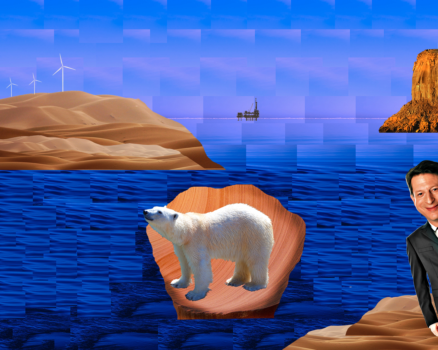
The imagery used in my collage comes from a variety of different sources. My goal when creating my digital collage was to depict the idea of leaving my families’ hometown of Seattle to pursue my dream of relocating to California. To portray this message, I decided to use an image of a rear view mirror, as you can see both was it ahead of you, and what is behind you. In the images used for the rear view mirror, I wanted to use images which would represent generations of my family living in Seattle, Furthermore, I needed to collect images of Seattle to depict leaving behind Seattle after my family had lived there for generations. To depict this idea, I chose to collect an image taken of Seattle decades ago, along with a more recent image of Seattle. To form my collage, the most important elements of design were contrast and unity.

tovar-deyanira-project-01-low-res
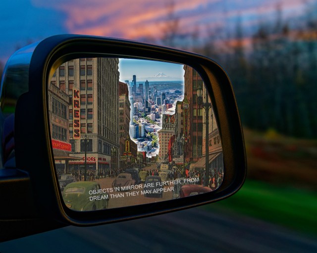
To emphasize the importance of leaving my current life, I chose to add a glowing border surrounding the newer image of Seattle to create a form of dominance. A form of contrast I used to draw focus to the newer image of Seattle was by increasing the brightness, saturation, hue, and lightness. In other words, the contrast of tone was depicted using different tones of light and dark to differentiate the significance of the future over the past. Additionally,, I used the idea of value to increase the darkness of my older image of Seattle.

To portray the message of leaving my life behind to pursue my dream  was the use of a rear view mirror to depict the idea of direction, the direction leading away from Seattle and towards a new destination. In the rear view mirror, you can clearly see cars moving in the opposite direction towards Seattle, which alludes to the message of moving away from Seattle, The rear view mirror also has writing on it which reads “Objects in mirror are further from dream than they may appear”. Hence, I plan on moving far away from Seattle to pursue my dream. Ahead of the rear view mirror, you see a blurred image of an environment which is not clear as to where the environment is located. I purposefully chose a blurred image because I wanted it to be up to the viewer to decided where they wanted to imagine the car was headed to, in terms of their own dreams.

While creating my digital collage, important functions used in Photoshop included different lasso tools, the use of layers, and the use of the adjustments tab to change different setting on my images. Because I needed to place different images within the rear view mirror, layers were arguably the most important aspect when designing my collage. In addition, the use of the lasso and magnetic lasso tools were important in the placement of my images. I wanted to blend my images and align them together to represent a sense of unity within my collage, and not allow one image to hover over another. Furthermore, these tools were highly important in allowing me to place images over one another while blending them into one another and not drawing attention on the placement of one image over the other. The different adjustment tools allowed me to center the focus on the new image of Seattle by allowing me to increase the effects such as brightness, lightness, hue, and saturation, while lowering those effects on my older image.

I believe that my collage did need to be created digitally in order to depict my message properly. Without the effects provided above, I would not be able to think of a manner to increase the focus of one image over another without editing them digitally. I could however still crop the images and place them over another in the way that I wanted by printing them and manually cutting and placing images where I wanted, like a traditional collage. As a matter of fact, the idea of a manually created collage inspired my idea of cutting images and placing over them one another. Photoshop allowed me to do this while using different adjustments to allude to a center of focus.


Posted in Fall 2018 Archive (201) | Leave a comment