Digital Collage: Kaleb Parrish

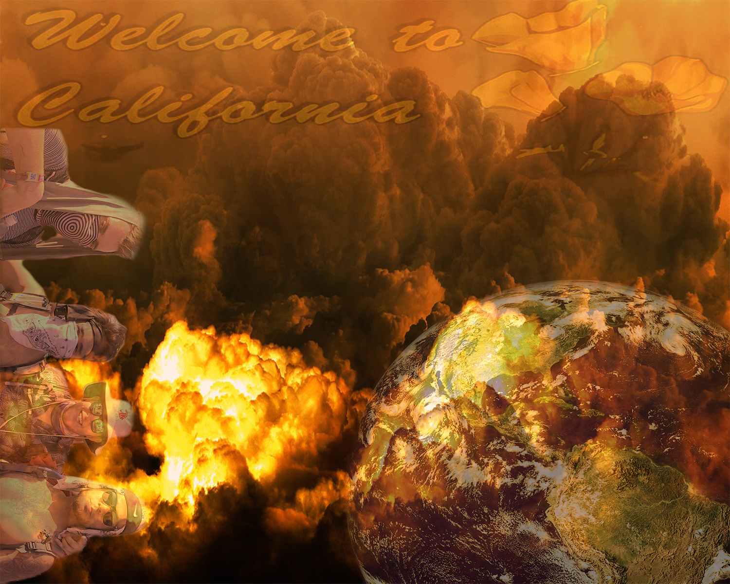
The imagery used in this collage appear to come from my personal iPhone 7 plus, and on Google, by modifying the image – tool settings so that the usage rights are labeled for noncommercial reuse with modifications. I chose the image of my friends and I, along with the “Welcome to California” sign because I wanted to show where we were when we took the picture, hence somewhere in the world. . Along with the apocalypse and world photo, I wanted to kind-of create this dystopia of a destruction-type-world that we (us in the photo) are a part of yet show a unique spin-off to it.

A digital collage that I threw together for Project 1 in DTC 201. Collage created by Kaleb Parrish, September 2018.

The elements that I used in this project were size, texture, colour, and value. I wanted to make the apocalypse and world the main focus of the collage, so I made them the biggest. However, the cropped-out picture of my friends and I, as well as the “Welcome to California” sign, I wanted it to still have a big enough size to still play a part in the collage, so I had it scaled to a definite smaller size. The texture, colour, and value, I wanted them to kind-of intertwine each other so I played with the hue so that it would come off as a glossy collage. My eye moves from the center of the composition where the apocalypse and world destruction meet, but one could also look from left to right or right to left when looking through the composition because everything seems to fit together, especially if the image took a 90-degree turn, or even 180-degree turn.

As for Principles that were incorporated in my piece, I would say the gradation and contrast both play a part in which some parts of the collage transition from lighter to darker tints and vice versa. Also, I hope that viewers would interpret this collage like I mentioned before, I wanted to create this dystopia of a destruction-type-world, but also have a spin-off off creativity by adding my friends. To me, it means that no matter what is going on in our world today, we still can come together and make the most out of our lives by traveling and having fun. The specific tools and function that I mostly used in this piece were the eraser tool when I had to erase most of the photo where my friends and I are posing which took the longest to try to make it erase all of the nonsense that was already in the photo. Then I added another layer to the world and wanted to make that color, as well as the color of my friends and I the same as the apocalypse so I had to mess with the hue and opacity so it blended in. Same for the “Welcome to the California” sign so everything would flow but because of the original photo of the sign, I had to use the blending tool to help blend it in the background, so it would all flow.

This work needed to be constructed digitally because I wanted to make it seem as if it could be printed out as a poster. Granted, some of the artwork like the apocalypse and the world could be from a magazine or maybe drawn by hand, but I think it looked better digitally because I could bring out the colors and make it seem as if one.

Posted in Fall 2018 Archive (201) | Leave a comment

Digital Collage – Ryan Ferrell

All my images are from Google Images that allow for reuse and modification. The images I selected best represent the message of my collage while fitting well with the them that displays the message. The biggest element in my image is how the base photos blend together to represent the realism of the message. The bright, vibrant city in the background represents pollution-free society in which the air was clean and society was thriving. The smoggy city in thDigital Collage-low rese windshield represents the air pollution all around the world and how the air soon won’t be breathable. The little car and nuclear plant represents the main impactors/causes of the pollution in the world.  I used color contrast and blending to make the image look realistic and as if the car dashboard and the rearview mirror are actually part of the image.

I want people to look at my collage and see that what we as humans are doing to the Earth and what our main causes are. The lack of a road in front of the driver represents that no matter where you go, there will be pollution.

I used the magnetic lasso tool for most of my selections, and I used the eraser rather than masking to put the city inside the rearview mirror and the smoggy city inside the windshield.The cartoon car with the skull and cross bones in the exhaust represents that smog is fatal to us and our environment. The nuclear plant cartoon represents not only the air pollution it makes, but also land and water pollution as well. I used layer masking to blend the car dashboard and the rearview mirror into the image of the polluted city.

This collage could not have been made with paper, it had to be done digitally to emphasize the effect of the realism and reality of the situation. The pictures would not blend the same and would appear as very hard-put.

Posted in Uncategorized | Leave a comment

Digital Collage: Jaclyn Erickson

For my digital collage project I wanted my collage to look like it was edited in photoshop rather than a more realistic approach. While working on this project I was back home with my nephew and he inspired me to make the collage have a childlike feel to it. All the images i used were from primary search engines with public domain sites such as Bing and Google. Wanting that child friendly feel to it i made sure that the pictures i pulled from the internet were colorful and and all different things that kids enjoy.

While creating this collage i started it with the young boy whom reminded me of my nephew. He has such a large smile in this image its almost hard not to smile back creating the emotion i wanted from the audience. I began asking my nephew what his favorite toy was and he said an airplane and his pikachu so i then decided to incorporate those in my image. I then began thinking back to when i was a child and how my brother and i used to catch caterpillars and bring them home to our nanny. The next image that came to mind was a giant lollipop because what little kid doesn’t like a giant lollipop? I also included my favorite flower the sunflower, Sunflowers are large, bright, and absolutely beautiful when in full bloom. The background of this collage is a rainbow with a man at the end and raising his hands in the air. While first assembling i wasn’t sure i wanted to include the man or just cover him up with another image. As i played around with the occupancy of the lollipop i decided it looked more interesting when you can see the man very subtly through the lollipop.

I hope when people look at this collage they begin to think back to their childhood and what they used to play with as kid. There is so much going on in this image that your eye jumps all over the place almost not sure what to look at and i did this because it made me think about children minds and how they are constantly thinking about 1000 different things at once. I also hope the audience recognize how colorful these images are and almost all of them including a yellow. Yellow is color in which brings hope, happiness, remembrance, and optimism which is exactly the emotion the audience should feel when looking at this collage.

Posted in Fall 2018 Archive (201) | Leave a comment

Digital Collage Timmy Huynh

The images I used came from google images and websites that allowed for re-purposing and reuse of the images. I chose these images because I believe they helped portrayed my message very well and they seemed to flow together nicely with the lighting. The biggest elements in my collage is the color and the shape. The contrast in color between the galaxy man and the background catches the eye of the viewers and for my collage represents the difference between man and nature. The shape of the galaxy is one of a man and represents the potential for humans. The size of the man also plays a role of making sure that he isn’t too big as to overwhelm the background but also not too small as to ensure it’s the main focus of the collage. For design I used balance and contrast as best as I could. Balance is used through the main image being in the center at a considerable size and it is offset with the castle towards the edge at a much smaller size in order to blend and make a difference in the background.

Huynh-Timmy-project-01-low-res

A photo collage to portray a freedom of mind from body and the world. Created by Timmy Huynh September 2018

When people see this collage I hope for them to see that humans are so much more than what is around us and what we are currently limited to. The galaxy man is to represent that we are capable of so much more than what our simple bodies and environment constrain us from. The castle represents two things, one is to convey an example of us being able to conquer mother nature with something great and impervious to nature. The other is to show that we can do better than our past as castle are considered impractical now and mainly used as art or a piece of history now. It was made small to convey that it is now a small piece of our ever growing lives and legacy. The magnetic lasso was extremely helpful with selecting and masking the silhouette of the man. As for the masking tool it really allowed me to pick and choose the man and how I wanted the galaxy image to overlay it. I also balanced parts of the background with the burn tool due to its high exposure and brightness. This collage could have been made outside of Photoshop, but it definitely made it easier. It could have been made by simply cutting and pasting the images onto the background, but it would not have looked as clean as the images were retouched for the lighting and contrasts. There were a few collages that influenced me, I knew I wanted to portray humans as far greater than we are but wasn’t sure how. This is when I saw an image of a galaxy through the silhouette of a building and immediately I decided I wanted to do the same, but with a person.

Posted in Fall 2018 Archive (201) | Leave a comment

Digital Collage: Tori Bredy

A digital collage for the first project. This collage brings emphasis to the curiosity and mystery in children’s minds. Collage created by Tori Bredy, September 2018.

For my collage, I chose to create a landscape and make it realistic using Photoshop. I am quite familiar with Photoshop so I wanted to challenge myself by creating a collage that could be perceived as just one photograph. Prior to enrolling in DTC 201, I had done research and learned a lot about famous photographer Ansel Adams. Adams created amazing black and white photographs of landscapes which is where I got some inspiration from. When designing my collage, I wanted to curate a piece that was in black and white because I found it more helpful in creating a natural-like collage if the images are within the same color scheme.

The imagery used in this collage comes from the Internet. I chose to use images from online instead of my own because I wanted to use variety of different landscape images.

Elements of design used in my collage are organic form with the abandoned car and the two boys in the distance, color with the emphasis on black and white images, texture is seen on the car and the viewer can feel the rusty, grainy coating. For principles of design, there is proportion/scale with the location of the car and with the two boys in the distance, and there is balance with the location of the car being in the middle. All of the elements and principles of design are being used to understand the image as an abandoned car on some old railroad tracks. With the children in the background running, it brings the understanding of the image that the car is in a location where children run off to play in.

My hope when viewers look at this collage is that my work is interpreted as what could be a real life image. I enjoy using my creativity to make pieces that can be interpreted as actual reality. This piece has meaning to me because I love the work done by Ansel Adams. Even though Adams didn’t use collages, I wanted to create a piece that was a real-life looking landscape. By adding the picture of the two little boys in the background, I hope it is interpreted how children have such an imagination and are curious explorers when they are able to roam around outside playing their make believe games. My goal is to share through this collage how youth, mystery and curiosity fall hand in hand.

For this collage, I relied on using layer masks for most of my images, but for a couple, tried selecting and feathering the image to place into the main Photoshop document. I used the Hue/Saturation tool to make the car look more realistic and the same with the children and the curves tool.

This work did not need to be done digitally since I gathered all of my images from the Internet. I could have printed off the images and manually cut and pasted them together but the digital aspect helped me make it as realistic as I could.


Posted in Fall 2018 Archive (201) | Leave a comment

Digital Collage: Jessica Harja

For my project, most of the images i used were from a website called Pixabay. This website described itself as a collective of creators that share their content for freedom of use. I chose these images because they helped to form the narrative I was trying to put together for this artwork.

harja-jessica-project-01-low-res

A digital collage created for the first project that tries to bring the feeling of vulnerability when opening up to someone, to an image. Designed by: Jessica Harja, September 2018.

In terms of elements of principles and design, there are varying degrees of lines, shapes, textures, and colors. There are the lines of words that overlap each other and fall behind the hands. The haphazard layout for the repetitive shapes of the words create a kind of unsettled mood combined with the actual words themselves. The heart, the object with the most color, is placed in the center of the image to place an emphasis on why it is important. This heart, with its rough wooden textures, looks worn and used. When the two different subject matters are combined, it helps to understand the purpose of the image a little better by directing the viewer throughout the text and the image itself.

What I hope that viewers get from this image is a sense of what we all feel when it comes to being vulnerable with others. Originally, it was intended for romantic relationships but could also be applied to platonic ones. We all have a wall of insecurities we may be hiding behind when we first get to know someone. Sometimes it takes a long time in order to get through that wall that we’ve built to protect our damaged hearts; to offer up a bit of ourselves to the person we are getting to know. So the words are representative of that wall of insecurities that we’ve built to protect ourselves from while the hands are meant to be reaching out from that wall to offer up the heart of vulnerability to the reader.

Most of the tools used for this project were the use of layers, the magnetic lasso tool, move tools, opacity, and eraser, blur, and smudge tools. At first, this project didn’t really need to be constructed digitally until I started playing around with the opacity, blur, and smudge tools. It’s very difficult to use those techniques with printed images rather than with other materials. In the end, I tried to create a semi-surrealist landscape of how someone would feel with the internal battle of trying to open up to people.


Posted in Fall 2018 Archive (201) | Leave a comment

Digital Collage: Kameryn Skillingstad

Collage created by Kameryn Skillingstad

  1. My collage started with an image of the sky, in the clouds, then I slowly added picture of squirrels, a gumball machine filled it with nuts, and pennies laying around. I chose these images to create a humorous yet dream like feel to the collage.
  2. Color is a prominent element present in my collage, the yellow and purple hues of the sky draw the eyes attention. Along with color, the contrast of the squirrels and nut machine against the white cloudy background make the squirrels stand out. Also, I think my piece has balance because the nut machine is in the middle amongst the clouds and the squirrels and pennies lay around it which creates a nice balanced collage. Lastly, I have repetition of all the squirrels which creates interest in the viewer.
  3. I hope viewers interpret this collage as a piece that is light hearted and humorous. While creating this piece I was inspired by the scene in Ice Age of the squirrel running through squirrel heaven to find his nut and I put my twist on that idea. To me this piece resembles that everyone, or every animal, can find their happy place.
  4. While creating this piece I used quick selection to cut all my objects from different pictures, eraser tool to erase the left-over background from my images, layers and masks to insert the items I cut into my sky background, adjusting the brightness to make the items look like they fit better with the background, and the move tool to adjust where all my objects are.
  5. I think this piece could have been drawing by someone who is a very skilled artist, however I don’t believe it would have the same dream like effect had it been created any other way than digitally.
Posted in Fall 2018 Archive (201) | Leave a comment

Digital Collage: Christian Solovey

  1.  These Images appear from Day N Night festival (2017), I attend a lot of music festivals and concerts and happened to take this image while in the crow of Travis Scott’s performanSolovey-Christian-project-01-hi-resce. I chose these images because of my passion for music and witnessing artist’s perform live. With that, I always like to use my own images, paintings, hand constructed items when creating any sort of piece; whether it is for class or for something personal, and I thought this imaged captured what artists don’t like seeing at there shows, everyone on their phones
  2. Repetition and direction are used heavily in this photo. The stacking of layers (people) in a circular fashion lead the eyes around the photo then to the empty center. Texture is in this photo as well, I burned the inside of the image with a lighter then tore and taped over ripped edges to make the poster seem more authentic.
  3. I will hope viewers view this image as a creative/unique way of someone telling them to get off their phone and enjoy life. This photo means a lot to me because it came very organically and similar but not perfect to what I had in mind. I titled this piece “what is your purpose? because I certainly do not believe that it is for us to be taking pictures/videos of everything and posting them, because what do they matter anyway.
  4. Selecting and masking were pretty much all I needed to use in the photoshop application.
  5. Yes, I needed to use a scanner to really compose the full image and add and take away things with the masking tool, however the deconstruction of the image with fire, tares, and tape needed to be done without a computer.
Posted in Fall 2018 Archive (201) | Leave a comment

Digital Collage: Juan Guzman


In my collage, I chose to use primarily digital search engines. These search engines include the public domain of sites like Google, Bing and Flickr. The piece was composed and helps the audience move through the composition through color contrast. The colors of the cars (black and white) are create a balance between the bright hues of the Gameboy and the Space Jam sign. The size and overlap of the images are place to create a unified form and establish their significance to this 90s style of collage. I hope that the readers see the importance of all the components of the piece.

Project 1 Rough DTC 201

The Great 90s By Juan Guzman

Every part can contribute to the collage as a whole. The Nissan GTR (gray car) is an iconic Japanese import car that was widely popular in the car world during the early 90s. Shakur Tupac was arguably the most influential rapper of that decade; and The Gameboy was adored by many 90s kids growing up and extended into the early 2000’s. I hope this collage is more than a bunch of random 90s images on a white and purple background but that it can also provide a sense of nostalgia. This collage is what I can consider to be a few things of the 90s that were enjoyed by many at the time, but can are also enjoyed today. As far as its process, I believe that the quick selection tool and the eraser were the most important tools used. I used the alt + scroll tool a lot to zoom manually and erase any un wanted areas of color or imperfections. I used some shift frequently to resize the images and try and find what worked best by also rotating the images. I spent a lot of time angling and aligning the images to try and create a dynamic that leads the viewers to all parts. I believe that this work could possibly be made with images from magazines, books and print outs to really catch that 90s feel. If it were to be reproduced in another form I would use more vintage 90s colors like yellows, and pinks. The collage from my last blog really did influence me for this project, which is why some of the photos have a little ‘older’ effect to them. I really did enjoy doing this project on photoshop, and this makes good practice for future projects.


Posted in Fall 2018 Archive (201), Uncategorized | Leave a comment

Digital Collage: Jenna Walker

For my digital collage, the background image is a photo that I took of Seattle near Post Alley and the others come from google and pixabay. I chose these images because I wanted to create something that could potentially be real but is also explicitly fake. I believe direction is a big element in this photo because I wanted the artists to look like they were all walking different ways, which also plays in to the size of the artists as well

unspecified

Stayin’ Trippy in Seattle by Jenna Walker

because to make it seem like they were either close or far was determined on the size of them. With Travis Scott and Mac Miller, you can tell that they are closer because you can’t see their legs, whereas A$AP Ferg is looked to be farther away because of the size of his body compared to the others and you can see more of his legs. There is also contrast in this photo compared to the street behind them and the background used for the sky. I believe the background creates this euphoria and allows the audience to create different interpretation of the photo. Using all these artists creates a harmony throughout this photo, Mac Miller plays a big part because he recently just passed, but it stills shows that he is a part of the Seattle music scene as well as the others. As for how the eye moves throughout this collage, I feel like the eyes are directly pulled in to the background because it is out of the ordinary. Then it would move to A$AP Ferg because he is in the center of the three artists, then to Travis Scott and finally Mac Miller. I hope my audience interprets this collage as an appreciation of music and the music industry. These artists are very well known and have all performed in Seattle or the Washington area at some point. What this collage means to me is that no matter where they go or what they do they are people that have a heavy impact on their listeners. This collage can trigger memories for people simply because they are fans of the artists’ music in this photo. The tools used were, magnetic lasso, layering, adjusting the opacity, and resizing the images of the artists in the collage. This collage did need to be constructed digitally because if it wasn’t, wouldn’t flow as well together. Creating this digitally versus another method allowed me to be more creative with the message I was trying to convey.

Posted in Fall 2018 Archive (201), Uncategorized | Leave a comment