Digital Collage: Josue Cuevas


The imagery for my collage are images that represent my culture and what I grew up loving. Each image has it’s purpose and special meaning to my heart that’s why I choose them specifically. With the Mexican food in the corner represents the great food that comes out of my culture and food that I grew up eating. I decided to put three different icons from Mexican culture. First is Vicente Fernandez in the bottom left corner and he is the most iconic out of everyone in the collage. He is the most famous Mexican music artist of all time and he specializes in Mariachi music the distinct style of music from Mexico. On the other side there is Roberto Gomez Bolanos and he was an actor, producer, director, and writer of tv shows. He made some of the most famous characters in latin tv where his shows and characters where spread across all of Latin America. Above him I put a sports icon from the sport of boxing and that is Julio Cesar Chavez Sr. He is one of the greatest boxers of all time and definitely one of the greatest Mexican athletes of all time. The four cards are from the most famous Mexican board game I grew up playing with my family. The background is of course the Mexican flag which is incredible. I really hope people get a sense of what makes my culture special and why I love it so much. This is why I’m proud to be Mexican some of these items make me who I am. The tools I used from photoshop were the lasso tool, quick selection, eraser tool and I used a little of the spot healing tool as well. This collage did not need to be made digitally this kind of collage could’ve easily be made the old school collage way, like back when in middle school cutting up magazines and gluing them to a board.

Posted in Fall 2018 Archive (201) | Leave a comment

Digital Collage: Aidan Aumell

For my Digital Collage assignment, I decided to use a majority of my own photos for the college because it was a more meaningful experience creating the collage. All the images of humans in this photograph are my actually friends from my high school and I thought they would all fit perfectly in this college because of the emotions they are displaying.  The background of Earth in space is the only photo I used from an Online source, and it came directly from NASA. I thought this photo would work well with the overall theme of the image. Throughout the collage, elements and principles of design are seen in many different aspects of the project. To start there is a great balance between the sun and the black hole at the top of the collage. Both images contrast well, with one image being brighter then the other. This is probably my favorite part of my collage because it took me awhile to figure out the prefect ratio from light to dark. The man walking in the middle on the collage in my opinion creates a great amount of harmony throughout the collage. It almost looks like he is about to walk into space itself and I think this effect crates harmony with the entire universe. Also, the size of the earth fits perfectly with the size of the man walking in the middle. It flows very well together, and it makes my eye focus on where the man is walking to.

I hope that when people see this collage they interpret as seeing a very trippy and out of this world photo. Most people wouldn’t recognize the ancient sacred geometric symbol of the flower of life, but it appears twice in this photo. If you know the background knowledge of the Flower of life, then you would know it’s a very spiritual symbol and supposedly there is a connection with this symbol to how the world and us came to be. So, after knowing all that, I created this collage to show that my friend is not just walking into space or the unknown. He is walking to find spirituality and the truth about everything. There is two sides towards his final destination, achieving spirituality or getting sucked into a black hole which ultimately relates to failure. The tool I used most throughout my collage was the magnetic lasso tool. It was very useful for cropping out images of humans. I used the eraser tool after the magnetic lasso tool to clean up the image. I also used some blending effect with the images in the sky. Specifically, the stroke effect and blighting the darkness of the flower of life symbol in the sun. The smug tool and blur tool worked well with forest trail going through the middle of the collage. I wanted to make the forest trail look like it was blended with the earth and that tool really helped with that.

This image could have been made nondigitally, but I would have been really hard to make all the images flow together well without using any blending tools that a computer offers. This collage was all inspired from digital photos besides the flower of life symbol. I actually drew that symbol and took a picture of it to use in my college. Sacred geometry had a large influence in this piece.

Aumell-Aidan-project-01-low-res.jpg

Created by Aidan Aumell, September 2018


Posted in Fall 2018 Archive (201), Uncategorized | Leave a comment

History of Collage & Photomontage: Brianna Esqueda

The World at Weekend is a collage crafted from scissors and glue from 46-year old Matthias Jung. His work is easily recognizable for his style of combining dream like landscapes with ornately architecture. His use of negative space plays to the effect of the open landscapes he uses as his background. The background of the piece consists of two main colors, a washed out blue and muted brown. Contrast, in many forms, is highly present in this work. The shapes of the building are refined and symmetrical which is highlighted and intensified against the expansive space presented in the background. Jung also manipulates shapes and the fluidity of the ones eye movement across the piece by including a stark line with the use of the natural horizon juxtaposed to the circular, industrial looking, platforms upon which the buildings rest.

Although the two worlds from which the image stems are different, they translate with cohesion. I find this to be indicative of Jung’s color selection as well as the value of the color he prefers to use. Almost every detail in the collage exists within the same intensity of light and brightness. Only subtle things, like the trees and windows, stand out against the pastel colors. There is also a great sense of unity in the collage. Aside from that fact that there is a literal Venn diagram in the image, the special awareness of height and size relativity of the two buildings brings forth a balances front. The crisp lines that form the intricate grooves and indents of the buildings are not over powering, yet still prominently displayed. The piece also has a logical understanding of space in relation to distance. The buildings seem proportionate to one another as well as from the perceived point of distanced that the viewer is looking at the piece. It eliminates distraction and allows one to interpret the image for its ethereal obscurity rather than its improbability of existence. Matthias Jung clearly understands the appeal of unique balance and effervescent ease that attracts the eye, and it is for these reasons that I personally greatly enjoyed The World at Weekend.

Posted in Uncategorized | Leave a comment

Digital Collage: Aidan Aumell

For my Digital Collage assignment, I decided to use a majority of my own photos for the college because it was a more meaningful experience creating the collage. All the images of humans in this photograph are my actually friends from my high school and I thought they would all fit perfectly in this college because of the emotions they are displaying.  The background of Earth in space is the only photo I used from an Online source, and it came directly from NASA. I thought this photo would work well with the overall theme of the image.Throughout the collage, elements and principles of design are seen in many different aspects of the project. To start there is a great balance between the sun and the black hole at the top of the collage. Both images contrast well, with one image being brighter then the other. This is probably my favorite part of my collage because it took me awhile to figure out the prefect ratio from light to dark. The man walking in the middle on the collage in my opinion creates a great amount of harmony throughout the collage. It almost looks like he is about to walk into space itself and I think this effect crates harmony with the entire universe. Also, the size of the earth fits perfectly with the size of the man walking in the middle. It flows very well together, and it makes my eye focus on where the man is walking to.

I hope that when people see this collage they interpret as seeing a very trippy and out of this world photo. Most people wouldn’t recognize the ancient sacred geometric symbol of the flower of life, but it appears twice in this photo. If you know the background knowledge of the Flower of life, then you would know it’s a very spiritual symbol and supposedly there is a connection with this symbol to how the world and us came to be. So, after knowing all that, I created this collage to show that my friend is not just walking into space or the unknown. He is walking to find spirituality and the truth about everything. There is two sides towards his final destination, achieving spirituality or getting sucked into a black hole which ultimately relates to failure. The tool I used most throughout my collage was the magnetic lasso tool. It was very useful for cropping out images of humans. I used the eraser tool after the magnetic lasso tool to clean up the image. I also used some blending effect with the images in the sky. Specifically, the stroke effect and blighting the darkness of the flower of life symbol in the sun. The smug tool and blur tool worked well with forest trail going through the middle of the collage. I wanted to make the forest trail look like it was blended with the earth and that tool really helped with that.

This image could have been made non-digitally, but I would have been really hard to make all the images flow together well without using any blending tools that a computer offers. This collage was all inspired from digital photos besides the flower of life symbol. I actually drew that symbol and took a picture of it to use in my college. Sacred geometry had a large influence in this piece.


Aumell-Aidan-project-01-low-res.jpg

Created by Aidan Aumell, September 28th


Posted in Uncategorized | Leave a comment

Digital Collage: Luke Schauble

This Is a collage showing and university building, sitting on an island, and a city way off in the island with no way to get there.                           By Luke Schauble

For my collage, I wanted to create something that showed one of the things that I find important. Something that I believe to be true, and most importantly, something that impacts the world around us in a serious way. The defining images I used in this collage, were of a university building, an island surrounded by water, a broken boat, sinking in the water, and in the background, a faded out city skyline. I used these images because I wanted to show my belief that there is a disconnect between going to college, learning the information and material that will help us in our careers, and the actual real world where we go out and use what we’ve learned. The broken boat is used to show that there is a way to connect these two things and make our way into the real world, however, it is placed outside the school to show that what we need to make that connection is not taught in school.


The elements of design that I used to create this collage are mainly size, and value. Size is used when looking at the city skyline in the background of the collage. The city appears large in comparison to the university building in the foreground, almost towering over and “looking down” upon the school building. This is done to show the difference in the unique problems and solutions to those problems that occur in school. It shows that when you transition into the working world, the information you learned in college, is only a small piece of being successful in your career. Value is also a important part of this collage when looking at the differences in lightness and darkness, between the city skyline, and the island with the universityy building is on it. The brightness of the island and university building shows the promises that university’s make about preparing you for work in your specific field, comparative to the darkness of the city showing that in my opinion, no amount of preparation in college will actually prepare you for the challenges that the working world has in store.

On a more surface level, there were many tools that helped me to create this collage, and make it look as “blended together” as I could. The 3 lasso tools were used extensively throughout the collage. For example, the polygonal lasso tool was used to help cut the unnecessary parts out of the city skyline. Because of the many straight lines on the buildings and even on the university building, this tool worked perfectly for that. Oddly enough, I also found myself using the smudge tool a lot. The biggest challenge I faced, was getting the city skyline and the trees and bushes to blend seamlessly as to make them look like they were not separate images pasted into one. The smudge tool helped me to blend the skyline with the tops of the trees. Although it was not a perfect job, because the city skyline is translucent, it was a good enough job that anyone viewing the collage on paper, would not be able to tell without be told. These tools did definitely help me to create this collage with much more ease, but it could have been done by hand. Although the shrubbery would have been difficult to cut out, and you cannot make a real life image “translucent”, it would have been possible to do.


Posted in Fall 2018 Archive (201) | Leave a comment

Digital Collage: Liz Kurtz

Created by Liz Kurtz, September 2018.

This collage was one of the most advanced projects I have done on photoshop so far. The complexity of creating an overarching idea, and then using images to portray it was one of the hardest elements. I started over time and time again, trying to come up with an idea that could portray itself through my collage. After many drafts I decided to leave the message out of it and create something purely based on my preference of design. To my surprise the art I created seamed to communicate many meanings depending on the viewers interpretation. One of my favorite responses was the idea of being lost in your own thoughts, or the feeling of incomplete or loneliness. My design consisted of a black and white man representing man kind or an individual. The background I selected was a personal photograph taken in Hawaii, here the sea looks dark and stormy adding a depressed, dark emotion to the collage. Most of the images I used were ones that I found on the internet. As an artist I enjoy geometrical designs, this resulted in my use of straight lines. To add some life I decided to strategically place roses along the collar of the man. This added color and complexity to the meaning of my piece such as beauty and or love. In my eyes my collage gives off a feeling of heartbreak, it seems to tell a story rather than directly giving the viewer a simple meaning. In my design I used an exponential amount of the paint tool, this allowed me to select curtain elements of am image I wanted to place in my collage. Because my collage has an unrealistic geometrical look, It needed to be created on Photoshop. It would be impossible to take a realistic photograph that looks like my design. I spent a lot of time and thought in creating this collage, and I loved every second.

Posted in Fall 2018 Archive (201) | Leave a comment

Digital Collage: Ashley Cole

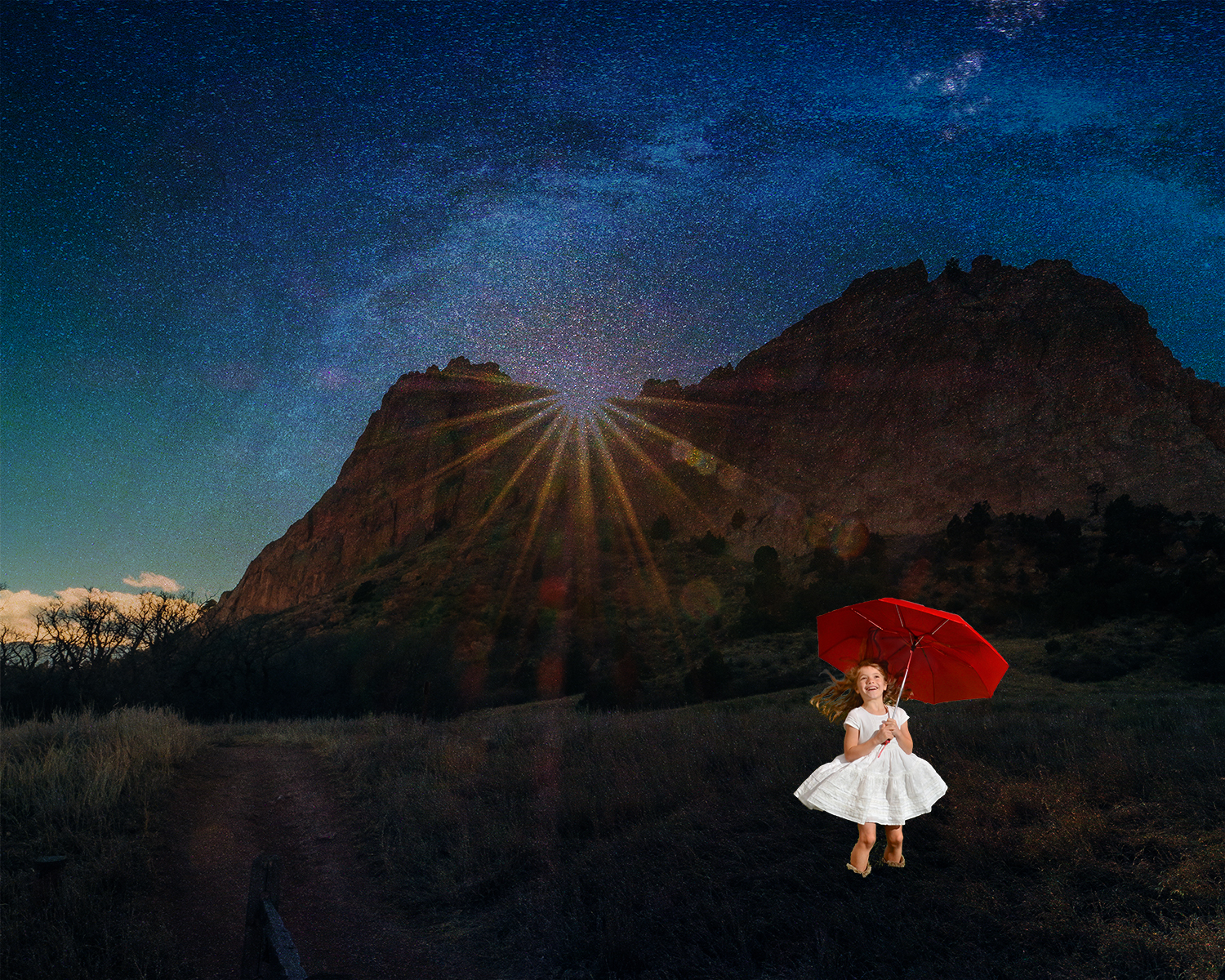
This is my digital collage featuring a Colorado mountain range, a young girl holding an umbrella, and a starry sky. This collage was made using photoshop.

The imagery that I used in my collage is meant to appear as though it is very natural in essence. I wanted to take three pieces of nature that felt personal to me in some way. The background of my collage is a mountain scene taken in Colorado. I spent most of my childhood there so this image in particular makes me feel very at home. The next image that I chose to add was the little girl holding an umbrella. This little girl is supposed to represent me as a young girl moving to Seattle. It was a bit of a shock due to the different social culture—which most people don’t realize—as well as the weather. The last image that I chose to incorporate into my collage was the starry sky. This image takes a bit more explaining…

I was born in Kansas which is where my parents lived all of their lives. They were both born and raised in very small towns and this is simply what they were accustomed to. And sometimes it is hard to move to a new place because there are things that are much different, and you seem to be the only one who notices because everyone else is accustomed to that certain way of life. For my mom, it was the stars. When we moved to Seattle she was constantly talking about how she missed looking up and seeing a full sky of stars. None of her new friends understood this because they had never been used to looking up at the stars every night before they went to bed. My mom saying this really stuck with me and that it why I wanted to incorporate it into my collage. I feel as though my collage as a whole represents my life from the time I was born to the present through images. I tried not to use images that made what I was trying to say extremely obvious. I think that I left a lot of things open to interpretation which is what I wanted.

I think one of the elements of design that stands out in my collage is the value: the lightness or darkness of a color. My collage is extremely dark, and this is very intentional. This is due to the fact that Seattle is so dark because the stars and moon are often encased by clouds. This is why, in my collage, the sun is trying to escape from under the clouds and cannot fully do so. The scene is in a constant state of darkness.

Another element of design that I very purposefully incorporated was size. The little girl is obviously much smaller than the vast mountain range that encapsulates the majority of the scene. This goes to show that people are powerless to both the forces of nature as well as culture when moving to or visiting a new place.

I really hope that viewers will interpret this collage in any way that makes them feel personally “at home”. I purposefully left my message somewhat vague in hopes that people would be able to find a personal connection to my work rather than pulling a message from it that I was explicitly trying to feed to them. This collage is very important to me because it represents three places that are very close to me in an abstract sense. Hopefully people can get this general idea from it, but as long as they get something from it, even if it is a little off base from what I was trying to convey, I think that that would be a success.

I used several tools that are necessary for almost any photoshop work such as the quick select tool and the feathering tool (for hair). However, I made it my goal to use tools that I did not know anything about in hopes to make my piece really professional even though I have never used photoshop before. This is why I only used three images. I wanted to do the best work I could possibly do, so I spent most of my time trying to make my collage as flawless as I could rather than trying to just incorporate the most images possible. I spent a lot of extra time in the lab because of this—but I think that it was well worth it. Since I really had no idea what I was doing, I found YouTube to be extremely helpful. I would think about what I wanted to do in my collage, look up how to do it on YouTube, and then follow a tutorial step by step until I got the effect that I wanted. The most difficult thing that I did in my collage was changing the sky completely. I had no idea how to do this, but I found a tutorial that helped me a lot. In order to replace my sky, I put the starry image over the original image, duplicated the image by pressing “flip vertical”, merged the layers, and then put it in multiply mode. This is something that I had no idea how to do before, but it was actually quite simple.

I think that, yes, this work did need to be constructed digitally because of the way that the sky looks. I don’t think that I could have gotten this same effect if the collage had been constructed in any other way. I really love the way that the sun is trying to shine through the clouds and this is something that I think can only be achieved—successfully at least—using photoshop.

Posted in Fall 2018 Archive (201) | Leave a comment

Pattern_Alex_Allen

The quilt I choose to write this blog post about comes from Mary Lee Bendolph collection. Her quilt blocks, strips, strings, and half squares really jumped out to me because the way she used shapes, spacing, and color scheme to create aesthetic designs and lettering. The patterns and imagery used in this quilt made me think of three separate designs combing to make one. She used rectangular lines to help her in spacing these 3 designs out on the quilt. Example being the red rectangular line in the bottom middle section and a black rectangular line in the top left section. Also, while looking at this quilt, I noticed she emphasized letters which probably means something much greater in her culture or everyday life. But what really stood out to me was her organic shapes and the use of colors as seen in the design to the left with the H’s. I think it looks the way it does for a couple reasons. One being her African style of art which really helped me better understand art different cultures art patterns and two being her ability to take separate pieces of art she created and merge them into one piece.

Mary’s, rich African American improvisations, pattern redirections, and syncopation I think gives this piece a more cultural meaning. Her inspiration for this quilt came from a two week stay with Louisiana Bendolph at Paulson Press in Berkeley California. Mary, staying true to her style of African American improvisations, pattern redirections, and syncopation wanted her quilt to give off her ingenious take on what Gee’s Benders call “Strings”- interlaced wedge shapeds of cloth. Not having a extensive knowledge of quilt making I couldn’t tell that this quilt was made in pieces and then brought together until after reading more about her style of working.

Posted in Uncategorized | Leave a comment

Digital Collage: Angela Basinger

“Life, Liberty, and the Pursuit of Followers” (2018) Collage by Angela Basinger

This collage is my first work created in Adobe Photoshop. Though challenging at times, it was certainly a relief when it finally came together. I titled my collage “Life, Liberty, and the Pursuit of Followers”, a parody of the United State’s Declaration of Independence’s line, as an expression of my experiences within Washington State’s college culture. Since I transfered to WSU last fall, I’ve been continually disgusted by the careless, haphazard lifestyle of my peers and of the university administration that feeds into these misaligned ideals for profit. Every day I’m surrounded by students that place greater importance on social trends than their own education, concerned with their popularity on social media and ability binge drink at parties. Having been down that road myself, so concerned with my social image, I used to get blackout drunk until my experiences with alcohol poisoning and sexual assault became my wake-up call. Seeing students each day fall into these same patterns disheartens me, and knowing that the university benefits from these cultural trends financially, makes me absolutely sick. I created this collage to express my frustration with this blind-following of popular trends. All the images I used came from internet searches for images allowing all creative commons and in the public domain. In terms of design conventions, my project uses dominance, given to the vintage woman in the foreground. Harmony is created with the red in the stadium frame, the red within the stars, and the red in the coke advertisement, and the red in the cans/cups. Repetition is seen with the men (cans and cups) carrying the C-O-U-G-S flags as the elements are different, but similar in style. In Photoshop itself, I relied heavily on the selection tool to paste elements of photos in as layers. I also used the eraser tool to refine the edges on many layers. The transformation tool was essential to help me rotate and distort my selections. I struggled with using layer masks, and used a hue/saturation adjustment instead to create the effect I desired. Though I had a lot of initial trouble with functions in Photoshop, I was able to figure out some uniquely digital effects that helped me construct a collage that could not be replicated in print.

Posted in Fall 2018 Archive (201) | Leave a comment

Digital Collage: Shengjie.wu

Shengjie.wu project#1 Low-res

‘The Impact of Air Pollution’ by shengjie.wu

Continue reading

Posted in Fall 2018 Archive (201) | Leave a comment